
ABSTRACT
We discuss the learning goals, content, and delivery of a University of Plymouth intensive module delivered over four weeks entitled MATH1608PP Understanding Big Data from Social Networks, aimed at introducing students to a broad range of techniques used in modern Data Science. This module made use of R, accessed through RStudio, and some popular R packages. After describing initial examples used to fire student enthusiasm, we explain our approach to teaching data visualization using the ggplot2 package. We discuss other module topics, including basic statistical inference, data manipulation with dplyr and tidyr, data bases and SQL, social media sentiment analysis, Likert-type data, reproducible research using RMarkdown, dimension reduction and clustering, and parallel R. We present four lesson outlines and describe the module assessment. We mention some of the problems encountered when teaching the module, and present student feedback and our plans for next year.
Background, Learning Goals, and Some Topics Covered
In 2014, as a part of the University of Plymouth's Curriculum Enrichment Project, the authors proposed a module entitled “MATH1608PP Understanding Big Data from Social Networks” for students in the first academic year, known as Stage 1, of a range of UK degree programmes with three taught years.
The module had three broad learning goals (LG):
| • | LG 1: Manipulate, visualize, and analyze large datasets including questionnaire results using well-constructed R code run in RStudio; | ||||
| • | LG 2: Extract information from contemporary social media sources, presenting meaningful analyses in insightful ways; | ||||
| • | LG 3: Report code and results reproducibly and professionally using RMarkdown. | ||||
We decided to use R (R Core Team Citation2016) for this module not only because of our experience with this free software environment for statistical computing and graphics, but also because R runs on Windows, Mac, and Linux platforms. R requires students to input commands rather than to click on drop down menus as is the case with some other statistical software. We accessed R through RStudio (RStudio Team Citation2016), which provided students with an easy to use editor for their commands. RStudio also provides access to RMarkdown (Citation2016), which allows students to write up their work in a reproducible way as reports or slide-based presentations using a variety of output formats.
Among many topics associated with these LGs, we introduced students to the following: the R packages ggplot2 (Wickham, Citation2016a) for data visualization, and dplyr (Wickham and Francois, Citation2015) and tidyr (Wickham, Citation2015b) for data manipulation; the interrogation of data bases using simple SQL queries; and the use of basic statistical, dimension reduction, and clustering techniques. We selected the topics to provide students with a broad, forward-looking set of modern Data Science concepts that can be used to extract meaning from ever increasing amounts of high-dimensional or unstructured data. Many evidence-based disciplines and careers view these concepts, together with the ability to report associated results clearly, as fundamental requirements.
Module Delivery, Materials Provided, and Some Lesson Outlines
We delivered the MATH1608PP module over the first four weeks of Semester 2 of the 2015/16 academic year, starting on 1st February, 2016. MATH1608PP was the only module that students studied during these four weeks. We set the assessment deadline for the Thursday of the fifth week of Semester 2.
Almost 40 students were registered for MATH1608PP, all of whom attended two one-hour expository lectures and four or five two-hour tutorials each week. We operated an open-door policy outside these hours. We presented lectures using slides produced by RMarkdown that were made available to students at least 48 hr before the lecture. Tutorials generally comprised a detailed explanation of a topic based on R code, again supplied at least 48 hr in advance, followed by exercises designed to consolidate the material being studied. During the first two weeks, three members of staff were available in each tutorial so that problems could be quickly resolved. The number of staff was reduced to two in the third and fourth weeks. Every tutorial had a substantial period of time dedicated to practical exercises to check student understanding. All the exercise sheets showed clearly the numerical results and graphs that should be obtained, so that students could see what they were working toward.
In addition to the lecture slides, tutorial code, exercise sheets, and (after a short pause) their solutions, we also developed and supplied booklets of notes entitled “An Introduction to R,” “An Introduction to Data Bases,” “Data Dimension Reduction and Clustering,” “Extracting Information from Facebook using R,” and “Parallel R.” This material is available upon request from the correspondence author. RStudio Cheat Sheets for “Data Visualization with ggplot2,” “Data Wrangling with dplyr and tidyr,” and “RMarkdown,” were also made available.
In the appendix (see the online supplementary material), we supply four possible lesson outlines to which we will refer later. These provide concrete examples of some of the tutorials, a timed lesson structure, and an indication of how student understanding can be checked.
The Student Demographic
The Stage 1 students studying MATH1608PP came from the following University of Plymouth BSc (Hons) programmes: Accounting and Finance, Computer and Information Security, Computing, Computing & Games Development, and Mathematics with High-Performance Computing (HPC). The majority of students therefore had computing backgrounds and were fairly familiar with command-line software and computational thinking. Students coming from Accounting and Finance, however, did not have this background, although they were highly numerate, and, as they had opted to take MATH1608PP, were also very well motivated. These students made good use of the support offered, especially one-to-one help available through the open-door provision, and quickly got used to basic concepts, such as how to work with RStudio and the precise nature of coding. After two weeks of more intensive support, these students required a level of help similar to other students.
Setting Up the Module
The main practical module set up task was to ensure that students had access on the University of Plymouth Windows-based PC software system to all the software they needed. This included R itself together with a large number of contributed packages and RStudio. In addition, we installed MiKTeX (Citation2016) so that students could produce PDF documents and make use of LaTeX (Lambert Citation1994). Texmaker (Citation2016), for example, could provide an alternative to MiKTeX on other platforms.
Getting Started: Tutorial 1
The aim of the first tutorial was to whet students’ appetite and to fire their enthusiasm by showing them something of what they would meet and achieve in MATH1608PP. We provide some details of what was done in Lesson Outline 1 in the appendix. We built the first part of the tutorial around two motivational visualizations.
Because the majority of students were on computing degrees, we based our first motivational visualization on data about how the number of transistors on a processor has changed over time. We supplied students with information about the processor name, the number of transistors it contained, the year it was introduced, and its manufacturer, which we obtained from https://fusiontables.google.com/DataSource?docid=1hRaR4o4z9nITGpAQDDoHRWa3fbmxuteHl6RPEhQ#rows:id=1. We also provided ggplot2 (Wickham, Citation2016a) code to produce . We asked students to run this code without offering them detailed explanation so that they did not get bogged down with its technicalities at this stage.
Figure 1. Our first motivational example based on the transistor count data.
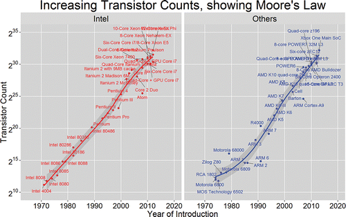
We then used to highlight and explain several visualization design features. First, the variable “Year of Introduction” is mapped to the x-axis, while the variable “Transistor Count” is assigned to the y-axis. The data are displayed through visualization geometries that include points and an estimate of the underlying relationship between transistor count and year. Processor names are placed next to the data points. We used red and blue colors to distinguish Intel processors from those produced by other manufacturers, with a separate panel being used for these two manufacturing groups. We emphasized that ggplot2’s facility for automatically producing panels, known as facets, is one of its many powerful features.
We used a logarithmic scale labeled in powers of 2 on the y-axis of to illustrate Moore's Law (Moore, Citation1965). Moore's Law essentially says that transistor counts approximately double every two years. The period 1970–2010 comprises 40 years, or 20 two-year periods. We can see from the y-axis that transistor counts have increased from around 210 in 1970 to around 230 in 2010, in other words, by a factor of 220 that indeed represents 20 doublings in this period. We used the gray confidence bands associated with the underlying relationship between transistor count and year to introduce a brief discussion of uncertainty. There are a lot of points in the top right corners of the panels in . The ggrepel package (Slowikowski Citation2016) was used to reduce the number of overlapping processor names.
We based our second motivational visualization on data from a large group of children. The dataset comprised three variables: a measurement of visual acuity taken on the left and on the right eye, together with each child's age group. Positive/negative values of visual acuity correspond to long/short sight. Again, we asked student to run code to produce and offering little explanation so that they could focus on getting an immediate feel for the visualizations. In , the visual acuity for the right/left eye is assigned to the x-/y-axis, with color being used to represent the third variable age group. We chose a sequential color palette, in this case YlOrRd from the RColorBrewer package (Neuwirth, Citation2014), so that the differences between children of different ages can be clearly seen. We can easily see from that older children are more short sighted than their younger counterparts.
Figure 2. Our second motivational example based on the child eye data. A sequential color palette represents child age. Positive/negative values of visual acuity correspond to long/short sight.
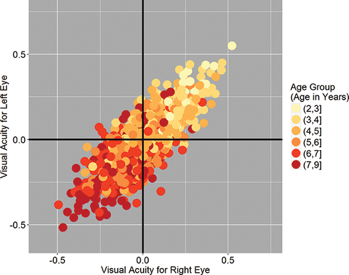
Figure 3. Our second motivational example based on child eye data. The use of faceting shows in detail how children become more short sighted as they grow.
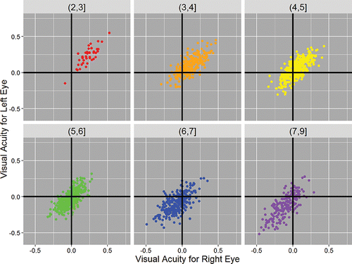
Although is a two-dimensional plot, it shows all three variables together, with the effect of the third variable, here age group, being represented by the use of color. Another way to present such three-dimensional data is to use separate two-dimensional facets with the same scales for each age group, as illustrated in . We can see in detail how the point cloud changes with age group. Different colors are not needed, but help to make a more attractive display.
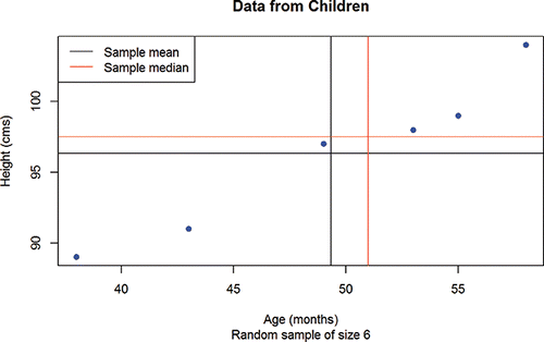
Finally, for the first tutorial session, we took students step by step through commented code to introduce basic R data structures, such as vectors, subscripting, and data frames. We showed them how to compute and display summary statistics on a scatterplot produced in base R, as presented in . This plot has a legend, the construction of which we also explained in detail. Although we almost exclusively concentrated on producing visualizations using ggplot2 in MATH1608PP, we believe that students need to have a notion of the existence of base R graphics. This also helps them to appreciate the power and ease of use of ggplot2. For example, the legend in has to be hand coded, while in it was automatically produced using ggplot2. We essentially agree with the view that it is better to focus on ggplot2 because it provides a more structured and intuitive way of thinking about data; see Wickham (Citation2016c) and Robinson (Citation2014) who supports the view that it is better to teach ggplot2 rather than base R graphics to beginners because of the abstraction and automation that it offers and the quality of the plots that it produces.
Figure 4. A simple plot, produced using base R functions, with a legend. This can be used to explain the meaning of simple summary statistics.
Therefore, at the end of the first two hour tutorial, students had a good idea of what could be achieved with a few lines of R script, together with a design understanding of three data visualizations. They had also gained some knowledge of R data structures and seen detailed examples of straightforward R code for computing and displaying summary statistics. They then applied their newly acquired R syntax knowledge to different small datasets so that their understanding could be checked. They had made a good start toward achieving LG 1.
Working with ggplot2: Tutorial 2
In Tutorial 1, students met ggplot2 code to produce , , and , together with several visualization design features. These included the relationship of variables in the data to chart components and the existence of different visualization geometries. The ggplot2 plan of attack that we implement in Tutorial 2 is built on this foundation, is strongly relevant to LG 1, and is described in Lesson Outline 2 in the appendix. In CitationWickham (2016a, sec. 2.3), the three key components of every ggplot2 chart are stated as “data, a set of aesthetic mappings between variables in the data and visual properties, and at least one layer which describes how to render each observation. Layers are usually created with a geom function.” We explained these key components by producing a plot of a simple dataset step by step. Next, we explained code for faceting and students were asked to produce plots faceted in different ways. At this point, students were equipped with sufficient ggplot2 philosophy and knowledge to produce a range of useful data visualizations. What they lacked were tools to customize their plots. To complete the introductory picture, we used examples to describe how users can define their own axis and color scales, and how they can perform detailed plot customization by specifying a theme. Finally, we consolidated and checked student understanding by asking them to reproduce several visualizations.
What Else was Covered
In the third tutorial, we covered the topics of summary statistics, regression, and correlation, all relevant to LG 1. We explained the ideas underlying hypothesis testing and p-values in a conceptual, but not a mathematical way so that students could see their use in extending conclusions from a small sample to a larger population. We used data collected from students (about their height, age, sex, coffee and beer drinking preferences, rent paid, accommodation distance from the university, and travel time) to motivate the analyses and modeling. For example, it was seen that in the group females were on average shorter than males. We explained that a hypothesis test could potentially be used to extend this conclusion from the group to a larger population of similar students.
In the last tutorial of the first week, students gained experience with using dplyr (Wickham and Francois Citation2015) and tidyr (Wickham Citation2015b) to manipulate and prepare data for further analyses. They practiced what they learnt on data supplied in Excel spreadsheets, so that they also knew how to read data from this common source into R.
During the first part of the second week, we covered other graphical displays, including histograms, boxplots, and the use and interpretation of logarithmic scales. We also got students working with data bases by explaining some simple SQL queries and the functionality supplied by dplyr, including its two-table verbs to work with a number of tables at a time.
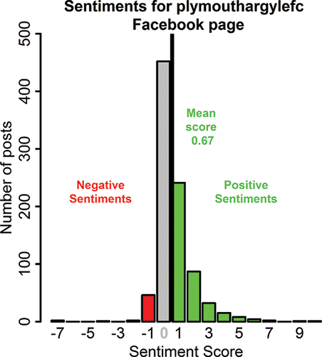
Next, we turned our attention to LG 2, and, in particular, to data extraction from social media, as described in Lesson Outline 3 in the appendix. Students saw how to download posts from a public Facebook page using the Rfacebook package (Barbera and Piccirilli Citation2015), and how to clean text using the stringr package (Wickham Citation2015a). They then worked with a document “Corpus” using the tm text mining package (Feinerer and Hornik Citation2015) to produce word counts. These word counts were displayed as a wordcloud, as shown in , using the wordcloud package (Fellows Citation2014). Next, we discussed how to perform and report a simple sentiment analysis, typical results of which are shown in . When students were asked to apply the analyses developed to Facebook pages of their choices, there was a buzz in the room caused by a lot of discussion, and groups of students started to form naturally. We discussed their results with the students and made suggestions for extended analyses.
Figure 5. A wordcloud for the plymouthargylefc Facebook page. Plymouth Argyle is a local football club, known as the Pilgrims. The size and prominence of a word depends on the number of times that it appears.
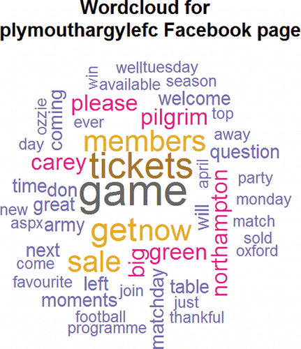
Figure 6. A sentiment analysis for the plymouthargylefc Facebook page. Each post was assigned a sentiment score calculated as the number of positive minus the number of negative words that it contained.
The third week began with an introduction to Likert scale data and its presentation using the likert package (Bryer and Speerschneider Citation2015), which even permits group comparisons to be made. An example of a plot produced by the likert package is shown later in .
After this, we presented a session, related to LG 3, on producing reports and presentations using RMarkdown. First, we explained that the value of an excellent analysis may be lost if it is not understandable or usable by a client. Then, we emphasized some of the features of a good report. A good report, as Baumer et al. (Citation2014) discussed in detail, describes a reproducible workflow that allows scientific and other studies to be replicated. RMarkdown allows the user to create fully reproducible analyses, with computations and descriptions logically interwoven. It ensures a professional presentation quality, eliminates copy-and-paste errors, and reduces the scope for less than honest reporting.
We acknowledge that it may be difficult to convince Stage 1 students of the importance of reproducible research because of their lack of experience. One part of our approach consisted of explaining the difficulties that can arise from a copy-and-paste approach, especially when working in groups. A reproducible methodology guarantees that each group member can recreate the analyses performed by the others, and so helps the group to work in a consistent and organized way. Indeed such an approach is the “lifeblood of scientific collaboration” (Baumer et al. Citation2014). It should also be remembered that we are all collaborators of our future selves, so tools that allow us to understand and reproduce quickly what we did previously are of great importance.
To help them to learn RMarkdown, we gave the students an example document, including R code, lists, tables, and figures, together with the RMarkdown file that made it. They were then asked to produce a similar document in RMarkdown from just its text. LaTeX was introduced here, and at the end of the session students were able to create simple mathematical equations.
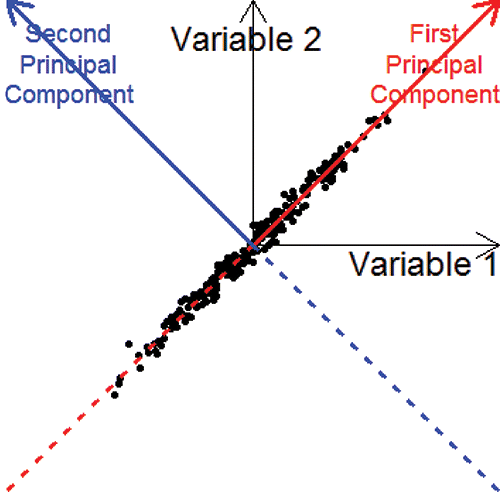
Next, we covered some further Data Science topics relevant to LG 1. In particular, we discussed data dimension reduction and clustering as described in Lesson Outline 4. These topics are important in today's Big Data world, in which high-dimensional datasets, rather than data comprising two or three variables, are ubiquitous. Students need to be familiar with the use of tools, such as principal component analysis and the k-means clustering algorithm to visualize and discover structures in high-dimensional datasets. The mathematics behind principal component analysis is advanced, but the underlying ideas are quite simple and can be explained visually using , which illustrates the connection between axis rotation and dimension reduction with only some information loss. We also discussed the interpretation of the principal components.
Figure 7. An illustration of principal component analysis. Retaining only the values along the first principal component preserved 99% of the information in the data points.
The final sessions of the module were also motivated by Big Data and provided some forward-looking insights relevant to many of the students’ future studies and careers. First, students worked with an illustration of parallel R using the multidplyr package (Wickham Citation2016b), which enables many of the features of dplyr, now familiar to the students, to be parallelized. They saw how a large dataset could be sensibly divided into parts for processing on different cores. They worked with an effective illustration of this based on the fitting of many generalized additive models, although these were presented in a nontechnical visual way. This led on to a presentation by an expert in HPC. A variety of topics were covered beginning with Moore's Law, with which students were already familiar through , and including the design, implementation, and future of HPC.
The Assessment
The module assessment comprised two exercises. Students could work in groups of up to four people. We designed the first exercise to assess LG 1 and LG 3. Students were asked to analyze a data base from a commercial transport company. The data base had been slightly protected due to disclosure control considerations. Information about customers and their travel purchases, together with the results of a satisfaction questionnaire were available. We provided guidelines and open-ended suggestions for possible analyses. Students were asked to prepare a report of their findings using RMarkdown. They were assessed on the appropriateness of their analyses and the precision of their R code (LG 1), together with the quality and clarity of their report (LG 3).
We designed the second exercise to assess LG 2 and LG 3. Students were required to select two contrasting Facebook pages and to perform full analyses on them, using the techniques outlined above, to allow meaningful and interesting conclusions to be drawn. Students were asked to prepare a slide-based presentation of their findings using RMarkdown. They were assessed on the appropriateness and insightfulness of their analyses (LG 2), and again on the quality and clarity of their slides (LG 3).
We provided feedback electronically by means of comments written on the submitted documents and an overall feedback sheet with more general suggestions for improvement and detailed marks. We also gave oral feedback to students requesting it. The overall average module mark was 62.3% (standard deviation 21.7%), well in line with other University of Plymouth Stage 1 modules.
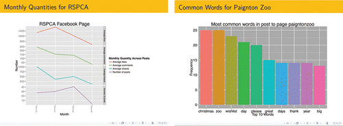
Students produced some very good reports and presentations. For example, one group provided a critical analysis for the data base exercise, well illustrated with Likert and other plots exploring the relationship between variables. For the Facebook exercise, the group compared and contrasted the Royal Society for the Prevention of Cruelty to Animals (RSPCA) and the Paignton Zoo pages. shows an example of two slides from their presentation. They produced a graph showing how the number of posts and the average number of likes, comments, and shares changed across time (, left plot). The group also displayed the ten most common words extracted from the Paignton Zoo page (, right plot). They noted a “high frequency toward many topics” and concluded that “Paignton Zoo shares views on a broader range of topics than the RSPCA.” They also discussed a possible “Christmas effect.” As can be seen from , the group used an attractive color theme, different from the default, showing their capacity to extend the base material presented in class.
Figure 8. Slides from a group presentation based on the RSPCA and Paignton Zoo Facebook pages. Left plot: the average number of likes, comments, and shares, and the number of posts across four months for the RSPCA page. Right plot: the top 10 words on Paignton Zoo's page.
Problems Encountered When Teaching the Module
One problem that we encountered while teaching MATH1608PP was the different speeds at which students worked. We overcame this problem by resourcing the module with three R experts in the first two weeks to facilitate rapid trouble shooting and by adopting an open-door policy. Another problem was the desire of some students to follow the material during the tutorials on their own machines. Often these machines did not have the required packages or MiKTeX (or equivalent) installed, and some had operating systems that were unfamiliar to staff. We spent considerable time, both during sessions and after them, ensuring that students could reproduce all the material covered on their own machines. A related problem was caused by the fact that students were running different versions of R and of the packages on their own computers than were available on University machines.
An alternative to setting up R, all its packages, and other software on individual machines is to use RStudio Server (Citation2016). Although this approach requires additional expertise, it also has many advantages. These include the facts that it is not necessary to deploy a lot of software on a fleet of student lab machines, that students and staff have guaranteed access to the same R installation and package versions, that operating system specific issues are eliminated, that students cannot cause themselves problems by installing a later package version on an earlier R installation, and that it is possible to give students access to larger datasets via a server than on a desktop PCs. This is all in line with the requirement of Brown and Kass (Citation2009) to “minimize prerequisites to research,” as discussed by Cobb (Citation2015) who argued that “research” should be understood as using data to study an unanswered real-world question that matters and that teaching based on such research can be very effective. Our MATH1608PP experience is strongly in line with Cobb's view.
An additional problem that we encountered was that Facebook changed its system of “likes” during the module so causing issues with the quantity of posts that could be downloaded. We had to develop quickly special code to overcome this.
Student Feedback
The standard University of Plymouth Module Feedback Questionnaire was handed to student toward the end of the module and 20 students responded. , produced using the likert package, presents some of the feedback.
Figure 9. Some student feedback results. The number on the left is the percentage strongly disagreeing or disagreeing, while the number of the right is the percentage agreeing or strongly agreeing. The percentage who responded neutral is also shown in the middle.
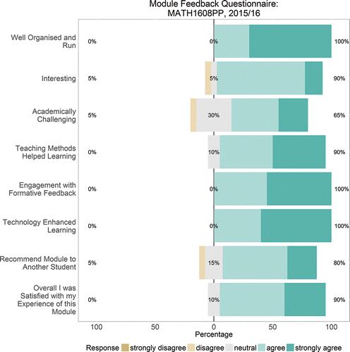
As can be seen from , feedback was generally very positive, with 90% agreeing or strongly agreeing with the summary statement “Overall I was Satisfied with my Experience of this Module.” This compares well with two other modules that we taught during the 2015/16 academic year: a new Semester 2 Stage 4 (final taught year) module MATH3613 Data Modelling, for which 88% agreed with the summary statement and a well-established Semester 1 Stage 2 (second taught year) module MATH258 Quantitative Finance, for which there was 89% agreement. Students on MATH1608PP reported that the teaching methods used helped them to learn (90%, MATH3613 88%, MATH258 90%), they found the module interesting (90%, MATH3613 69%, MATH258 79%), all agreed that the module was well organized and run (100%, MATH3613 81%, MATH258 96%) and that the use of technology enhanced their learning (100%, MATH3613 81%, MATH258 79%), and most would recommend the module to another student (80%, MATH3613 75%, MATH258 71%). This feedback was particularly pleasing as this was the first time that we had run this module. The average percentage of students agreeing or strongly agreeing across all questions was 82.6% (MATH3613 81.3%, MATH258 80.3%). There were many positive written comments about the teaching style, the structure of the module and the resources available. Students were asked to state the best aspects of the module. Responses include “using RStudio as it is a new, exciting software,” “learning how to interpret data using the R Code software as it was something new for me,” “being able to learn a new skill that will be useful for future prospects,” and “learning a new programming language.”
Plans for Next Year
Next year we will ask students to present their slides physically, rather than only to submit a PDF version of them. This will provide students with valuable presentation making experience, relevant to many potential careers including Data Scientist. As these student presentations will have to take place in the last week of the module, we will have to rearrange the material somewhat in order to place students in a position to produce their slides by Week 4.
In response to an emailed suggestion, we will provide more work that can be done outside of the class so that students who are making good progress can be further challenged. We will also provide additional opportunity for students who get behind, perhaps due to illness, to catch up.
Conclusions
The University of Plymouth MATH1608PP Understanding Big Data from Social Networks module ran for the first time in the 2015/16 academic year. The module was designed to present a wide range of modern Data Science material in an intensive four-week block in accordance with three broad Learning Goals. We covered the following topics using R within the RStudio environment: the visualization and manipulation of data with the packages ggplot2, dplyr, and tidyr; the presentation of Likert type data; an introduction to working with data bases with a brief mention of SQL; the extraction of information from social media including handling text data; basic statistical inference including hypothesis testing, simple linear regression, and correlation; principal component analysis; cluster analysis; dividing big data into parts for processing on different cores; some notions of HPC; and reporting reproducible research using RMarkdown. Student performance and feedback indicated that this wide ranging, intensive Data Science module was successful and well received.
Supplementary Materials
Supplemental data for this article can be accessed on the publisher's website.
UJSE_1322474_Supplementary_File.zip
Download Zip (23.1 KB)Acknowledgments
We thank the Editor, Associate Editor, and two referees for very helpful and constructive suggestions that have led to a major improvement in this article. We are grateful to Dr. John Eales (University of Plymouth) for the support that he has given us in his role as PP (Plymouth Plus) Facilitator.
References
- Barbera, P. and Piccirilli, M. (2015), “Rfacebook: Access to Facebook API via R,” R package version 0.6. http://CRAN.R-project.org/package=Rfacebook.
- Baumer, B., Cetinkaya-Rundel, M., Bray, A., Loi, L., and Horton, N. J. (2014), “R Markdown: Integrating a Reproducible Analysis Tool into Introductory Statistics,” Technology Innovations in Statistics Education, 8, 1–29.
- Brown, E. N. and Kass, R. E. (2009), “What is Statistics?,” The American Statistician, 63, 105–110.
- Bryer, J. and Speerschneider, K. (2015), “likert: Functions to Analyze and Visualize likert Type Items,” R package version 1.3.4. http://jason.bryer.org/likert, http://github.com/jbryer/likert.
- Cobb, G. (2015), “Mere Renovation is too Little too Late: We Need to Rethink our Undergraduate Curriculum from the Ground Up,” The American Statistician, 69, 266–282.
- Feinerer, I. and Hornik, K. (2015), “tm: Text Mining Package,” R package version 0.6-2. http://CRAN.R-project.org/package=tm.
- Fellows, I. (2014), “wordcloud: Word Clouds,” R Package Version 2.5. http://CRAN.R-project.org/package=wordcloud.
- Lambert, L. (1994), LaTeX: A Document Preparation System, Reading, MA: Addison-Wesley.
- MiKTeX (2016), http://miktex.org/.
- Moore, G. E. (1965), “Cramming More Components onto Integrated Circuits,” Electronics, 38 (8), April 19.
- Neuwirth, E. (2014), “RColorBrewer: ColorBrewer Palettes,” R package version 1.1-2. https://CRAN.R-project.org/package=RColorBrewer.
- R Core Team (2016), R: A Language and Environment for Statistical Computing, Vienna, Austria: R Foundation for Statistical Computing, URL https://www.R-project.org/.
- RMarkdown (2016), http://rmarkdown.rstudio.com/.
- Robinson, D. (2014), http://varianceexplained.org/r/teach_ggplot2_to_beginners/.
- RStudio Server (2016), https://support.rstudio.com/hc/en-us/articles/200552306-Getting-Started.
- RStudio Team (2016), RStudio: Integrated Development for R, Boston, MA: RStudio, Inc., URL http://www.rstudio.com/.
- Slowikowski, K. (2016), “ggrepel: Repulsive Text and Label Geoms for ggplot2,” R package version 0.5. https://CRAN.R-project.org/package=ggrepel.
- Texmaker (2016), http://www.xm1math.net/texmaker/.
- Wickham, H. (2015a), “stringr: Simple, Consistent Wrappers for Common String Operations,” R package version 1.0.0. http://CRAN.R-project.org/package=stringr.
- ——– (2015b), “tidyr: Easily Tidy Data with spread() and gather() Functions,” R package version 0.3.1. http://CRAN.R-project.org/package=tidyr.
- ——– (2016a), ggplot2: Elegant Graphics for Data Analysis (2nd ed.), New York: Springer-Verlag.
- ——– (2016b), “multidplyr: Partitioned Data Frames for dplyr,” R package version 0.0.0.9000. https://github.com/hadley/multidplyr.
- ——– (2016c). https://www.quora.com/Do-you-think-its-valuable-for-beginners-to-learn-the-base-functions-like-plot-even-though-they-have-superior-tidyverse-alternatives/answer/Hadley-Wickham.
- Wickham, H., and Francois, R. (2015), “dplyr: A Grammar of Data Manipulation,” R package version 0.4.3. http://CRAN.R-project.org/package=dplyr.