
Abstract
Although the use of tables, graphs, and figures to summarize information has long existed, the advent of the big data era and improved computing power has brought renewed attention to the field of data visualization. As such, it is crucial that introductory statistics courses train students to become critical authors and consumers of data visualizations. To that end, we have developed a semester-long, instructor-supported, group project that exposes students to this growing field. We have found this project to be an exciting and effective way to teach students the power of statistics and, more importantly, the critical role context plays when interpreting statistics. Among the many benefits of this project are hands-on learning, improved mathematical reasoning, and better collaboration and communication skills. In this article, we describe the project structure, project assessment, and techniques for facilitating effective group work.
1 Introduction
In his 1977 book, Exploratory Data Analysis, John W. Tukey writes “the greatest value of a picture is when it forces us to notice what we never expected to see” (Yau Citation2007). The need to visualize data to learn about the world and solve problems has existed for centuries and is just as important today. William Playfair, often considered the founder of statistical graphics, created the line graph, bar chart, pie chart, and circle graph to display economic data (Sack Citation2014; Norman Citation2016). Who can forget John Snow’s map of the 1854 cholera outbreaks in the London area that were used to pinpoint the source of the epidemic (ASA and RSS n.d.; Frerichs n.Citationd), or Minard’s famous graph of Napoleon’s March on Moscow, which is widely regarded as the quintessential example of a multivariate data display (Tufte Citation2006)? Graphical displays continue to evolve and develop alongside our technological capabilities. In 1977, when computer graphics were lacking, John Tukey developed the now ubiquitous box-and-whisker plot, which is easy to draw by hand. Standards for the visual display of data many rely on today were developed in 1982 by Edward Tufte. The amount and type of data that we are able to collect, display, and analyze also continues to grow and evolve. Indeed, in 1996, before the phrase “big data” was coined, it became more economical to store data digitally than through the use of a physical medium (Morris and Truskowski Citation2003; Press Citation2013). Shortly thereafter, in 2002, the amount of data stored digitally surpassed that stored non-digitally (Press Citation2013). Big data, characterized by the “3 Vs” (volume, velocity, and variety) presents both opportunities and challenges to statistical analysts and consumers alike (Press Citation2013). Ultimately, researchers need to be able to understand and communicate the limits of a set of data, those questions that can be answered from the data, and appropriate interpretations of the data (Boyd and Crawford Citation2012).
It is clear that the field of data visualization has been around for a very long time. However, advances in technology and the advent of the big data era have brought renewed focus on data visualization as it offers the best medium for parsing the patterns, signals, and underlying structure in large datasets. So what is data visualization? Perhaps one of the best definitions is one proposed by Alberto Cairo: “A [data] visualization is any visual display intended to reveal evidence, making the invisible visible” (2015). In essence, a data visualization allows us to delve into complex datasets to glean meaningful insights through the use of graphical displays. In describing data visualizations, Cairo highlights an important, albeit subtle, difference between data visualizations and infographics; a distinction that lies in their purpose. Infographics are designed with a particular narrative and guide the audience to a specific conclusion. As such, infographics are often subjective and have a narrow focus. In contrast, data visualizations are primarily concerned with furnishing evidence and allowing the audience to explore and come to their own conclusions about what the displays reveal about the data (Cairo Citation2014).
Data visualization is a perfect vehicle for teaching students the importance of context in statistics (Boyd and Crawford Citation2012) while also teaching them graphical techniques. We believe it is imperative that students in introductory statistics courses learn to make sense of data around them, to thoughtfully analyze data displays, and, consequently, become critical consumers of data and statistics. To that end, we have developed a semester-long data visualization group project in which students begin by learning to critique data visualizations that surround them online, in print, and in the media. Then, we provide students with the tools to create their own data visualizations. Our data visualization project has the following objectives:
To promote hands-on learning and equip students with a relevant and marketable skill: In today’s age of big data, the ability to visualize data and communicate their story is a crucial skill to possess.
To build communication skills: Students must present and communicate their process and results.
To facilitate team-building and group work: Students will be required to work on teams in future work environments.
To develop critical thinking and statistical thinking: Students are encouraged to think deeply about data and information.
To identify misleading visualizations: Students become critical/careful consumers of statistics.
To avoid misleading visualizations: Students will communicate the story of the data in a truthful, insightful, and enlightening manner.
To encourage creativity and engender an appreciation for the application of statistical/mathematical thinking to analyzing and exploring data: Students work with datasets of their choosing and see how statistics is applicable everywhere.
Due to its collaborative nature, the data visualization project is a high impact practice, which leads to increased rates of student engagement and retention (Kuh Citation2008). The design of the data visualization project relies on recommendations from the Guidelines for Assessment and Instruction in Statistics Education (GAISE) College Report 2016, which were developed by the American Statistical Association (ASA) to guide college instructors in curriculum development (GAISE College Report ASA Revision Committee Citation2016). In particular, we have interwoven the following six GAISE recommendations throughout the project:
GAISE 1.Teach statistical thinking.
GAISE 2.Focus on conceptual understanding.
GAISE 3.Integrate real data with a context and purpose.
GAISE 4.Foster active learning.
GAISE 5.Use technology to explore concepts and analyze data.
GAISE 6.Use assessment to improve and evaluate student learning.
In the following project description, we demonstrate how each of the six GAISE recommendations are embodied in the data visualization project.
2 Project Description
The data visualization project is a semester-long group project in which students find data that interests them and generate a one-page suite of static graphical and/or tabular displays of that data. In keeping with Cairo’s definition, students are tasked with producing data visualizations that tell the story of the underlying data (Cairo Citation2015). The project consists of several components to be completed both in-class (during face-to-face sessions) and outside of the classroom. Key project deliverables include the dataset(s) that will be used to generate the data visualization, a rough sketch (either a drawing or text description) of the planned content and layout of the data visualization, and two drafts (one rough and one final) of the data visualization. Additional details about the project description, deliverables, and timeline are provided in Appendices A and B.
We have used this project in our algebra-based introductory statistics course. This course is for non-mathematics and non-statistics majors and meets our university’s quantitative reasoning general education requirement. The course is currently taught in a blended, flipped classroom format, in which 40% of the content is presented online and 60% of the content is taught face-to-face. We also use this project in our fully online course, which is offered in the summer over a period of six weeks. Our introductory statistics course covers topics such as descriptive statistics, simulation, probability, sampling distributions, inference for one and two samples, and regression. Please see Appendix B for additional details including student learning outcomes and a schedule of topics taught in the course.
Since our online introductory statistics course is offered during the summer over a 6-week period of time, we have had to streamline the project for that course. Students still work in teacher-created groups of 3–4 and are encouraged to meet over Google Hangouts. Given the time constraints in the summer, instead of having students find their own data, we provide them with four datasets to choose from for creating their data visualizations. Furthermore, we assign fewer components of the project. In the online course, students complete the group contract, project plan, rough draft, and final data visualization. While we have not had the online groups present their projects to the class, plans are underway to have the groups create a short video and post it in a discussion forum.
2.1 Motivation and Educational Goals
The data visualization project is an opportunity for hands-on learning. While we do spend some class time working on the project and checking-in with groups, the majority of the work on the project is completed outside of class. The benefit of having the project span the entire semester is that students have time to revisit their project and improve upon it as their statistical knowledge grows. While rich and rewarding, this project can initially feel quite overwhelming to students; particularly those who have never taken a statistics course before and are intimidated by the concept of data analysis. The project requires them to find at least one dataset pertaining to a topic of interest (GAISE 3), create several different displays to tell the story behind the data (GAISE 4, 5), illustrate the salient characteristics of the data (GAISE 1, 2, 3, 4, 5), work on teams with people from different backgrounds (GAISE 4), and, finally, present their work (GAISE 6).
Despite these challenges, we have found that requiring our students to choose their own data (GAISE 3) increases interest and motivation for the project. Assigning students to work on the project in groups of three or four provides support as well as diverse perspectives. We take great care when assigning students to groups. We want to ensure that each group is heterogeneous with respect to class level (freshman, sophomore, junior, senior), gender, domestic versus international, and major. To that end, we stratify by the aforementioned characteristics and then randomly assign groups. Furthermore, the project allows students to develop those soft skills, or interpersonal skills, that employers find so valuable: communication, teamwork and collaboration, adaptability, critical observation, problem-solving, leadership, and conflict resolution (Bortz n.Citationd; Mind Tools, Ltd n.d).
The beauty of this project is that it is scaffolded throughout the entire semester. Scaffolding, also referred to as instructional support (Lange Citation2002; Larkin Citation2002), makes the project less intimidating and assists students in successfully completing the project by breaking it down into more manageable tasks (Lipscomb, Swanson, and West Citation2004). Understanding students’ prior knowledge and abilities is crucial in using scaffolding effectively (Lipscomb, Swanson, and West Citation2004). According to Benson, when scaffolding is done correctly, it serves as a support, building upon what “students already know to arrive at something they do not know” (1997, p. 126). The process requires the instructor to gradually remove the scaffolding as the students learn more about the topic (Wood, Bruner, and Ross Citation1976; Vygotsky Citation1978). The structure of the project incorporates two steps of scaffolding; (1) leading students “from what they already know to a deep understanding of new material,” and (2) providing “support to the students at every step of the learning process” (Turnbull et al. Citation1999, pp. 641–642). Many students have superficial knowledge about data displays from previous math courses taken at the secondary level. This project helps students develop a deeper understanding of data displays as they work with their chosen datasets. We provide support for the students by giving them the time and opportunity to explore their chosen datasets in more detail as they learn about descriptive statistics and data visualization principles in class (GAISE 1–5). Throughout the semester, time is built-in for the project teams to conference with the instructor and receive both formal and informal feedback about their progress (GAISE 6). Additionally, the students are required to complete several activities and submit several deliverables (described in the next section and included in the appendices) to assist in their internalizing knowledge about statistics and data visualization as they work through the project (GAISE 1–6). As Garfield and Ben-Zvi exhort, it is the role of the instructor to “…provide a carefully designed learning environment, appropriate technological tools, and access to real and interesting datasets, as well as scaffolding guidance to students’ emerging statistical reasoning” (2008, p. 43).
2.2 Project Activities and Deliverables
In this section, we describe key components of the project and their sequence. A complete project timeline is provided in Appendix A. Information about where each component of the project fits within the scope of our course is provided in Appendix B. While this timeline works best for us, it can be adapted to fit the needs of your students.
2.2.1 Introduction to Data Visualization
Before introducing the data visualization project and assigning teams, a PowerPoint presentation which defines data visualization and explains the principles of graphic design based on work by Alberto Cairo (Citation2015) and principles of analytical design provided by Edward Tufte (Citation1982), is shared with the class (see ). The PowerPoint presentation includes positive and negative examples of data visualizations to help illustrate these principles in action. Our approach is to facilitate group discussion about these examples to encourage students to begin thinking about applying the principles of graphic and analytical design. By doing this, we also prepare our students for the next component of the project, which is described in Section 2.2.2. This in-class discussion is the first of many examples of scaffolding provided throughout the project (Benson Citation1997; Turnbull et al. Citation1999). Additionally, we introduce the data visualization project prior to teaching students about graphical displays as it helps to motivate students to learn about creating and interpreting data displays. Please note, we do not require multivariate displays as students do not formally learn about multivariate relationships (regression and multiple regression) until the end of the course. Students who wish to investigate multivariate relationships are exploring on their own and we provide individual guidance.
Table 1 Principles of graphic and analytical design.
2.2.2 Good Viz, Bad Viz
Having introduced data visualization and assigned project teams, teams are tasked with finding examples of good and bad data visualizations and writing brief critiques of each one. A student handout for this assignment is included in Appendix C. Teams are asked to apply the principles of analytical and graphic design from the PowerPoint presentation to differentiate between good and bad data visualizations. Furthermore, each team shares their good and bad examples for class discussion. This component of the project is a crucial first step because it gives students the opportunity to implement concepts they have learned about data visualization and learn from the examples and critiques presented by their peers (GAISE 2 and 4).
2.2.3 Data Submission
Next, students are required to find a dataset or datasets to use for creating their own data visualizations (GAISE 3). We encourage students to select data from subjects or contexts that interest them. It is imperative that students are given guidance in the data selection process; they need to know where to look for data, and what type of data is appropriate for analysis. Oftentimes, students will find data that is not usable due to having too few observations, being in aggregate, or not including enough different variables. To get our students started, we provide them with a list of places to find a variety of data (Appendix E). We continue to support their efforts (scaffolding) by checking in with them during class and answering their questions about the data selection process (Lipscomb, Swanson, and West Citation2004).
2.2.4 Project Plan
With suitable data in hand, the next step for the project teams is generating a sketch of the plan for their data visualization. This sketch can either be created by hand or through the use of technology. At this stage of the project students begin to think about which software they will use to create their data visualizations. In class, we demonstrate how to use StatCrunchTM—Data analysis on the Web (Pearson Education [copyright] 2007–2019). We suggest other software options for generating data visualizations, but students are free to use any software they wish for this project. In the past, students have used Microsoft Excel, Google Sheets, Piktochart (Malaysia Incorporated Company [copyright] 2019), StatCrunch, and + ableau public, which is available free online (Tableau Software [copyright] 2019). While we do not provide formal in-class training on any software, except for StatCrunch, we do assist individual groups with any software issues they may experience.
The Data Visualization Project Plan (instructions and rubric found in Appendix F) requires students to list the variables of interest, indicate which data displays they intend to create, provide a brief description of any statistics they intend to include, briefly describe the narrative, and create a working title for the project. In our experience, a key benefit of this exercise is that many students discover the data they have selected is not sufficient for creating all of their planned displays. Sketching a plan before generating displays alerts them to their need for supplementary data before it is too late. As part of this assignment, students give a brief presentation of their project plan to the class. This allows them to receive valuable feedback from their peers, which they can use to augment their own ideas for the project (GAISE 6). This process of giving and receiving feedback further encourages a spirit of collaboration and community in the classroom.
2.2.5 Rough Draft of Data Visualization Project
Another crucial component of the project is the rough draft (the directions and rubric can be found in Appendix G). At minimum, we require a working title, at least two data displays, some narrative, and a brief description of any additional data displays they intend to add to their final draft. However, we encourage our students to submit as complete a draft as possible; the more complete their rough draft is, the better feedback we can provide. There are several reasons for requiring the submission of a rough draft. First, the rough draft provides us an opportunity to check in with each project team and ensure sufficient progress is being made toward completing the project. If necessary, it allows for timely intervention. Additionally, the rough draft gives students an opportunity to receive valuable feedback regarding their ideas for the project (GAISE 6), which can therefore be incorporated before the submission of the final draft. Consistent and helpful feedback leads to better student learning (Garfield and Ben-Zvi Citation2008). Not only do students need to be given time to reflect on any feedback received, they should also be given time to make adjustments before receiving a final grade (Garfield and Ben-Zvi Citation2008). Accordingly, our project timeline allows four weeks between the submission of the rough draft and the presentations of the final Data Visualization projects. Finally, the rough draft familiarizes the instructor with each project and, consequently, provides a head-start on grading the final projects.
2.2.6 Presentation of Final Data Visualization Project
After receiving and incorporating feedback on their rough drafts, the project teams present their finalized Data Visualization projects to the class. These brief presentations give students the opportunity to showcase their work, answer questions from their fellow classmates, review the work of their classmates, and provide and benefit from feedback. In their presentations, each group discusses the data they used and their process in choosing data displays and statistics to tell the story behind the data. They also give a brief overview of where the data were obtained, the findings of the analysis, and suggestions for further analysis or exploration. The act of presenting one’s work and defending it (GAISE 4) is a skill that will serve them well throughout their academic careers. The Data Visualization Group Presentation Rubric can be found in Appendix H. While these presentations do take up precious class time, they are well worth the investment; rich discussions ensue as fellow classmates ask questions about the context of the data and give suggestions for different ways to display the data. Presenting their work in class also gives students one final round of feedback. We encourage our students to make further revisions to their projects based on the feedback they receive. To facilitate this revision process, there is one week between the presentations and the due date for their final projects. The rubric for the final Data Visualization project can be found in Appendix J. A grading checklist, used by graduate assistants and instructors to provide consistency in scoring projects, can be found in Appendix K. For examples of exemplary student work, please see Appendix M.
2.3 Facilitating Group Work
As many students and faculty will attest, group work can either be a wonderful or terrible experience for all involved. To increase the likelihood of the former, all project teams are required to submit a group contract before beginning the project. The group contract specifies a code of conduct all group members agree to follow (Weimer Citation2013; Huang Citation2014; Mind Tools and Ltd 2016). These contracts assist with developing group norms, creating individual and group accountability, improving group dynamics, and discussing issues that often cause groups to implode. When students are encouraged to establish expectations for individual and group behavior upfront, fewer miscommunications occur and group members are more apt to contribute their fair share of the work. Moreover, in the event of a conflict requiring the instructor’s mediation, the group contracts assist in understanding each individual’s role in the project, which in turn leads to more effective resolution.
The Group Contract instructions and discussion questions can be found in Appendix D. When creating a group contract, students discuss the following items:
a communication plan, specifically the mode and frequency of communication;
how the leadership role of the group will be filled;
a schedule for group meetings and a timeline for completion of the project components;
a specific plan for how they will collaborate on the various project components;
who will be responsible for submitting each of the project components; and
a plan for resolving any intragroup conflict that may arise.
Since these are introductory level students, for some this may be their very first college group work experience. Therefore, to maximize the probability of success, time is spent in class getting to know each other, creating the group contract, and brainstorming ideas for the project. We think it is imperative that the instructor be present to assist in the group process; discussing the benefits of working in a group, answering questions about the project, helping students to brainstorm ideas, and ensuring each member of the group has an opportunity for their voice to be heard. While spending one day in class sets a foundation for groups to succeed, we recommend building future in-class check-ins into the schedule where the project teams can discuss their progress with each other and the instructor. This can be done informally by just visiting with each group, or more formally by requiring groups to submit an assignment (e.g., data, a plan for the project, a graphical display). Checking in with groups periodically is another example of the scaffolding provided throughout the project (Turnbull et al. Citation1999). An effective way to ensure groups are working toward a common goal is to take some time to teach groups about the scrum principle, which allows teams to see how they actually work, and provides them with tools to improve the group process and the quality of their work (Sutherland and Sutherland Citation2014). We suggest requiring groups to share their answers to the following three questions on a weekly basis:
What have you done since the last report?
What do you plan to do before the next report?
What struggles and/or obstacles are getting in your way?
Many group projects are plagued by social loafing, “the tendency for individuals to expend less effort when working collectively than when working individually” (Karau and Williams Citation1993, p. 681). There are three ways to reduce social loafing; (1) limiting the size and scope of the project, (2) limiting the size of the group, and (3) incorporating peer evaluations (Aggarwal and O’Brien Citation2008). While limiting the size and scope of this project is not possible, we do have small groups of 3 or 4 students work together on the project, and we require students to evaluate their team members using a Peer Feedback form, which is available in Appendix I. On this form, students are asked to detail the contributions of each of their team members, including themselves. They are also asked to rate each person’s contributions relative to the other members of the group. Finally, to ensure more meaningful and constructive feedback, the form also includes a section soliciting examples of each team member’s contributions to the project.
2.4 Project Assessment
Assessment of the project can be challenging as there are many different ways to tell the story behind a set of data. Certainly, for students, one of the most difficult aspects of the field of statistics is its inherent ambiguity. Therefore, it is essential to utilize a rubric (Appendix J) to provide transparent and consistent grading of all submitted projects. It is imperative students are given clear guidelines for the project along with the instructor’s expectations (Garfield and Ben-Zvi Citation2008). When introducing the project, we give the students access to the rubric so they will know precisely how they are being assessed. We also remind students to look at the rubric often while creating their project. One way to assist students in understanding the rubric is to give examples of projects from previous semesters and have them grade the projects in their groups. Then, ask each group to submit their scores for the projects (using clickers to ensure anonymity). Finally, take time to discuss each of the projects and why it received the score it did. This is also a good way to train graduate assistants or other instructors in grading data visualization projects. When grading projects for large classes in which there are hundreds of students, consistently applying the rubric is paramount.
While the instructor uses the rubric to evaluate each of the submitted projects, assessment should extend beyond the final project deliverables themselves. Students need the opportunity to reflect on their own learning and their experiences throughout the entirety of the project. Reflection allows students to process what they do and do not know, which strengthens their capacity to learn (Moon Citation1999; Bransford, Brown, and Cocking Citation2000; Barrett Citation2007; Block Citation2014; Di Stefano et al. Citation2016). According to John Dewey, an American philosopher, psychologist, and educational reformer, “We do not learn from experience…we learn from reflecting on experience” (1933, p. 78). Indeed, the form of the reflection impacts its efficacy (Clark Citation2011). Oftentimes, students do not take time to reflect on what they have learned unless it is required, which is why we require students to complete a self-evaluation and look back on all they did for the project; objectives met, results obtained, and contributions to the group. The self-evaluation assignment (instructions and rubric in Appendix L) incorporates the three levels of reflection; reacting, elaborating, and contemplating, as identified by Surbek, Eunhye, and Moyer (Citation1991). In reacting, students have the opportunity to comment on how they felt about the project. While elaborating, students compare their experiences in the Data Visualization project with other group projects in which they have participated, and with other in-class activities that have been used to help them learn about descriptive statistics. Through contemplating, students focus on insights and challenges (Surbek, Eunhye, and Moyer Citation1991). Students choose at least one question from each of the three reflection categories for a total of five questions. Each question is graded on the depth of the response. Questions from the self-evaluation assignment are listed below.
REACTING
What is one part of your work that you are most proud of?
What did you like best about the project?
What did you like least about the project?
ELABORATING
What did you learn about descriptive statistics and data visualization?
How did the time and effort required to complete this assignment compare to what you learned?
How can we tweak the project to meet your needs?
CONTEMPLATING
What did you learn about working with others in a group?
What did you learn that you can transfer into your work or personal life?
What was the biggest challenge?
What suggestion would you give to others as they work on this project?
Students are often very proud of their efforts. Time and again, they attest to the value of the project and how the structure of the project provides them with the requisite support they need to complete it successfully. Included below is a selection of student comments taken from their reflections. For ease of reading, each reflection is entitled with its most salient point.
Applying the principles of design:
I learned that in data visualization, it is important to keep things simple yet varied. Too many words, colors, and pictures can distract a viewer from the real point of the project. At the same time, having too many of the same type of graph can become boring and repetitive. Therefore, in order to portray one’s message effectively, you have to be simple yet diverse in the visualization of data, which requires more forethought than I originally expected.
Value of receiving feedback for each iteration:
The time and effort correlated to the amount learned. We learned from the mistakes we made in the drafts previous to gain a deeper understanding on data visualization from the long period of time assigned to work on the project. After each draft and feedback received, we learned more and more about what was expected in a data viz display.
Scaffolding:
I liked how this project had a due date every week that pertained somewhat to the progression of class. For example, we had to gather data right after we had an assignment in lab pertaining to gathering and cleaning good data. The way the due dates are set up allow us to focus on one aspect at a time which i [sic] found to be very helpful.
Positive group experience:
This was one of the first times where I was involved in a group project and ALL of the group members actually contributed in a positive manner. So I learned that was possible and I learned to trust others to get their delegated work done. Normally when working with others, one or two people are usually stuck doing all the work. That’s why I’ve always preferred to do things on my own anyway. But through this experience I’ve realized the prevailing efficiency of teamwork among 4 people who genuinely care about the product they put out.
Application of statistics:
Statistics can be applicable to relatively any subject, so it can definitely benefit me to continue to gain a better and better understanding for how to present data for different subjects and classes. Furthermore, group projects are prevalent in a variety of classes and I’m sure I will have many more to come. That being said, I think the lessons I learned about group work can be carried over into those future situations.
Strengths of diverse groups:
I learned that all group members bring different strengths to the table. For example, some bring good ideas to the table while other bring strong analytical skills to the also learned how hard it is to coordinate group activities. Alot [sic] of college students have crazy schedules so coordination was hard.
3 Conclusion and Future Research
This is one of the most relevant, interesting, and exciting projects that we have had the opportunity to share with our students. The quality of work and resulting level of student learning continues to impress. This project truly opens our students’ eyes to just how much statistics and data are infused into their daily lives. To celebrate their achievements, we hold a small contest. We select the best six data visualization projects (one from each large lecture section) and award each group member from the winning projects a certificate and a small gift card to a local restaurant. Students are genuinely excited and look forward to seeing the winning projects. Actually, last semester one of the students who was awarded a certificate said he was so proud of what he and his group accomplished he was going to frame his certificate. Taking a few minutes to celebrate their achievements in class is time well spent as it serves to motivate the students throughout the semester.
As data visualization continues to evolve, we anticipate this project will also change and grow to meet the ever-changing needs of our students. While our project currently focuses on the creation of static data displays, one could certainly create a project in which the focus is on more dynamic and interactive displays (for example, in a course with students who have more advanced programing skills). Or, in a class in which you have more time, you could have students suggest a research question, collect their own data, create visualizations, and even perform inferences to answer their questions. Our hope is that by sharing our project with you, you will be inspired to incorporate data visualization in your own class and give your students a chance to tell you a story.
Fig. M1 First example of exemplary student work. This data visualization employs a grid layout and makes good use of color. While the graphs are simple, they are clean and easy to read. The narrative adds to the story and does not reiterate characteristics that can easily be read from the graphs.
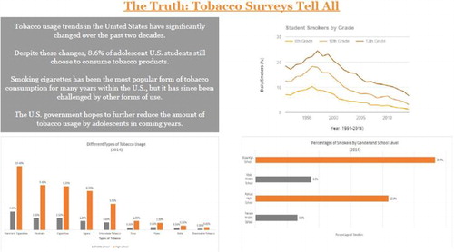
Fig. M2 Second example of exemplary student work. Students used Tableau to construct this data visualization. They have employed a variety of different graphs to tell their story. While the use of clip art is generally discouraged, the addition of the clip art stork works with this data visualization. The students have used color effectively. The justified text lends a clean, crisp look to the visualization.
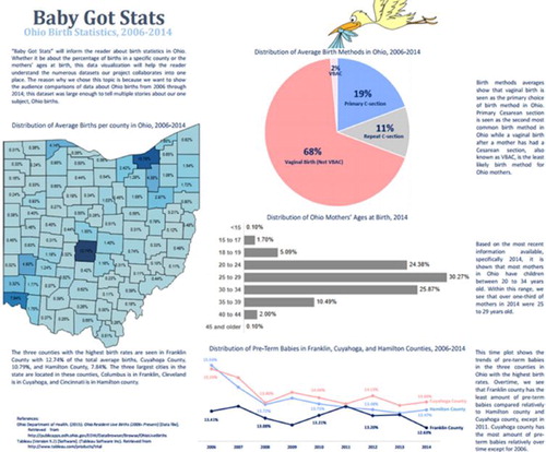
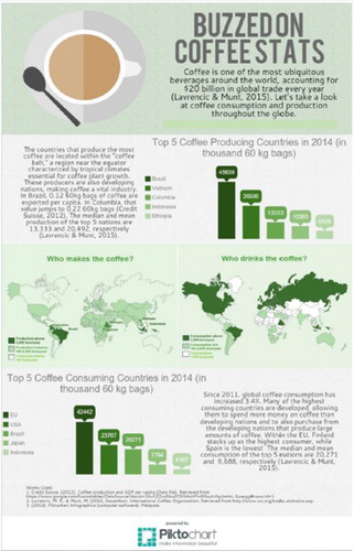
Fig. M3 Third example of exemplary student work. Students used Piktochart to create this data visualization. Notice the clean layout, good use of color, and playful designs created with the text.
References
- Aggarwal, P., and O’Brien, C. L. (2008), “Social Loafing on Group Projects: Structural Antecedents and Effect on Student Satisfaction,” Journal of Marketing Education, 30, 255–264. DOI: 10.1177/0273475308322283.
- American Statistical Association (ASA) and Royal Statistical Society (RSS) (n.d), Timeline of Statistics [Poster].
- Barrett, H. (2007), “Researching Electronic Portfolios and Learner Engagement,” The REFLECT Initiative, IRA Journal of Adolescent and Adult Literacy [White Paper Online], available at http://electronicportfolios.org/reflect/whitepaper.pdf.
- Benson, B. (1997), “Scaffolding (Coming to Terms),” The English Journal, 86, 126–127. DOI: 10.2307/819879.
- Bortz, D. (n.d), “Soft Skills to Help Your Career Hit the Big Time,” available at https://www.monster.com/career-advice/article/six-soft-skills-everyone-needs-hot-jobs.
- Boyd, D., and Crawford, K. (2012), “Critical Questions for Big Data,” Information, Communication & Society, 15, 662–679, DOI: 10.1080/1369118X.2012.678878.
- Block, J. (2014), “Let it Marinate: The Importance of Reflection and Closing” [Edutopia Web Log Post], available at https://www.edutopia.org/blog/let-it-marinate-reflection-closing-joshua-block.
- Bransford, J., Brown, A. L., and Cocking, R. R., eds. (2000), How People Learn: Brain, Mind, Experience, and School, Washington, DC: National Academy Press.
- Cairo, A. (2014), “Infographics to Explain, Data Visualizations to Explore. The Functional Art: An Introduction to Information Graphics and Visualization,” available at http://www.thefunctionalart.com/2014/03/infographics-to-reveal-visualizations.html.
- Cairo, A. (2015) “Visualization: Communicating With Charts, Maps, Diagrams, and Infographics,” Workshop Presented at Miami University, Oxford, OH.
- Clark, D. (2011), “Learning Through Reflection” available at http://www.nwlink.com/∼donclark/hrd/development/reflection.html.
- Dewey, J. (1933), How We Think, Boston, MA: D. C. Heath and Co.
- Di Stefano, G., Gino, F., Pisano, G. P., and Staats, B. R. (2016), “Making Experience Count: The Role of Reflection in Individual Learning,” Harvard Business School NOM Unit Working Paper No. 14-093; Harvard Business School Technology & Operations Mgt. Unit Working Paper, No. 14-093, available at SSRN: https://ssrn.com/abstract=2414478 or 10.2139/ssrn.2414478.
- Frerichs, R. R. (n.d), “John Snow,” UCLA Department of Epidemiology, Fielding School of Public Health, available at http://www.ph.ucla.edu/epi/snow.html.
- GAISE College Report ASA Revision Committee (2016), “Guidelines for Assessment and Instruction in Statistics Education College Report 2016,” available at http://www.amstat.org/education/gaise.
- Garfield, J. B., and Ben-Zvi, D. (2008), “Developing Students’ Statistical Reasoning: Connecting Research and Teaching Practice,” Springer.com.
- Huang, L. S. (2014), “Lessons Learned From Team-Facilitation in ELT: Strategies for Navigating the Challenges and Making it Work,” IATEFL ES(O)L Newsletter, pp. 13–17.
- Karau, S. J., and Williams, K. D. (1993), “Social Loafing: A Meta-Analytic Review and Theoretical Integration,” Journal of Personality and Social Psychology, 65, 681–706, DOI: 10.1037/0022-3514.65.4.681.
- Kuh, G. D. (2008), “High-Impact Educational Practices: What They Are, Who Has Access to Them, and Why,” Association of American Colleges & Universities, available at https://www.aacu.org/leap/hips.
- Lange, V. L. (2002), “Instructional Scaffolding,” available at https://cmapspublic3.ihmc.us/rid=1KDMQQ3X2-N5J29C-W4P/Scaffolding{\%}20Paper.pdf.
- Larkin, M. (2002), Using Scaffolded Instruction to Optimize Learning, Arlington, VA: ERIC Clearinghouse on Disabilities and Gifted Education. Retrieved from ERIC at EBSCOhost, ERIC No. ED. 474 301.
- Lipscomb, R., Swanson, J., and West, A. (2004), “Scaffolding,” in Emerging Perspectives on Learning, Teaching, and Technology, ed. M. Orey, available at http://epltt.coe.uga.edu/index.php?title=Scaffolding.
- Malaysia Incorporated Company ([copyright]2019), Piktochart, available at https://piktochart.com/.
- Mind Tools, Ltd (2016), “Improving Group Dynamics: Helping Your Team Work More Effectively,” available at https://www.mindtools.com/pages/article/improving-group-dynamics.htm.
- Mind Tools, Ltd (n.d), “Why Soft Skills Matter: Making Sure Your Hard Skills Shine,” available at https://www.mindtools.com/pages/article/newCDV_34.htm.
- Moon, J. (1999), Reflection in Learning and Professional Development, London: Kogan Page.
- Morris, R. J. T., and Truskowski, B. J. (2003), “The Evolution of Storage Systems,” IBM Systems Journal, 42, 205–217. DOI: 10.1147/sj.422.0205.
- Norman, J. (2016), “William Playfair Founds Statistical Graphics, and Invents the Line Chart and Bar Chart (1785–1786),” Jeremy Norman’s HistoryofInformation.com available at http://www.historyofinformation.com/expanded.php?id=2929.
- Pearson Education ([copyright]2007–2019), StatCrunchTM —Data Analysis on the Web, available at https://www.statcrunch.com/.
- Press, G. (2013), “A Very Short History of Big Data,” Forbes, available at http://www.forbes.com/sites/gilpress/2013/05/09/a-very-short-history-of-big-data/\#644dfff055da.
- Sack, H. (2014), “William Playfair and the Beginnings of Infographics,” yovista blog: daily blog on history in science, tech, and art available at http://blog.yovisto.com/william-playfair-and-the-beginnings-of-infographics/.
- Surbek, E., Eunhye, P., and Moyer, J. (1991), “Assessing Reflective Responses in Journals,” Education Leadership, 48, 25–27.
- Sutherland, J., and Sutherland, J. J. (2014), Scrum: The Art of Doing Twice the Work in Half the Time, New York: Crown Business.
- Tableau Software ([copyright]2019), “+ableau public,” available at https://public.tableau.com/en-us/s/.
- Tufte, E. R. (1982), The Visual Display of Quantitative Information, Cheshire, CT: Graphics Press LLC.
- Tufte, E. R. (2006), Beautiful Evidence, Cheshire, CT: Graphics Press LLC.
- Turnbull, A., Turnbull, R., Shank, M., and Leal, D. (1999), Exceptional Lives: Special Education in Today’s Schools (2nd ed.), Upper Saddle River, NJ: Prentice-Hall, Inc.
- Vygotsky, L. S. (1978), Mind in Society, Cambridge, MA: Harvard University Press.
- Weimer, M. (2013), “Defining and Promoting Teamwork in the Classroom,” The Teaching Professor Blog available at http://www.facultyfocus.com/articles/teaching-professor-blog/defining-and-promoting-teamwork-in-the-classroom/.
- Wood, D., Bruner, J. S., and Ross, G. (1976), “The Role of Tutoring in Problem Solving,” Journal of Psychology and Psychiatry, 17, 89–100. DOI: 10.1111/j.1469-7610.1976.tb00381.x.
- Yau, N. (2007), “About FlowingData,” available at https://flowingdata.com/about/.
Appendix A
Project Instructions
Data Visualization Group Project
Introduction
One of the challenges faced by anyone who works with data, be they a statistician, journalist, research scientist, business analyst, etc., is to tell the story of the data. Often when working with data, it is difficult to discern patterns and gain insight by simply looking at data tables. The current era of big data has brought with it an increased emphasis on the need for effective data visualization. A successful data visualization is one that reveals new insights about the data, is elegant, sparks curiosity, and generates new questions by challenging the audience to think about the data in a way they haven’t done before. As John Tukey so eloquently said:
The greatest value of a picture is when it forces us to notice what we never expected to see.
Overview of the Project
You will be working in teams of three or four to create an original visualization using data of your own choosing. Your objective is to tell the story of your chosen data through a variety of graphical displays and numerical summaries. Below is a list of general requirements for the final draft of your data visualization:
The project must include enough context and background information: There should be a good balance between text and graphics so that the text does not overwhelm the graphics.
The final project must fit on a single page (it can be poster size).
All data sources must be cited directly below each graph or table.
The final project must be submitted in Canvas as a PDF. Only one member of the group needs to submit the final project.
***Please refer to the rubric for more detailed information about the expectations and evaluation criteria for the final project. Please refer to the data visualization PowerPoint for analytical and graphic design principles to guide your project.
This project consists of the following components. Please refer to the rubric and instructions provided in Canvas for details concerning each component.
Group Contract
Data Submission
Rough Sketch of Plan
Critiquing Data Visualizations
Rough Draft
Group Presentation
Final Draft
Peer Evaluation
Self-Reflection
Appendix B Semester Schedule with Project Components Bulleted
Appendix C
Critiquing Data Visualizations Assignment
An Exercise in Critiquing Data Visualizations
Objective
The purpose of this exercise is to ensure that you are able to critique data visualizations that exist in the world around you. In this exercise, you will use the concepts and principles outlined in the Data Visualization PowerPoint to identify successful and unsuccessful visualizations and then evaluate how they succeed or fail.
Tasks
Find one good example and one bad example of a data visualization.
Write a brief (3-4 sentence) critique of each visualization. Be sure to incorporate specific principles from the Data Visualization PowerPoint in your evaluation. Submit your critique on Canvas by **insert due date here**.
On two separate pages, print each critique with the corresponding visualization and bring them to class on **insert due date here**.
During Thursday’s class, each group will compare each member’s examples and choose the “best” good example and the “best” bad example from their group. After the group discussion, each group will report out to the class and share the examples they chose from their group and describe what made them either good or bad.
Please note: Don’t forget to cite the sources of your data visualization examples using APA format.
Appendix D
Group Contract Instructions
Data Visualization Project—Group Contract
Now that you’ve been assigned to a group, it’s time to determine how your group will operate. We want the group projects in this class to be an enjoyable experience for all of you. One way to ensure that you have a better experience is by taking the time to carefully fill out a good group contract and code of conduct. A good group contract and code of conduct will include, but are not necessarily limited to, the following items. You are welcome to include any other additional information.
Please read all instructions carefully before making a copy of this document and completing the contract.
Instructions
You must complete all items thoroughly as a group.
One person may not complete this contract on behalf of the entire group. All group members must be involved. Each group member is required to type his/her name at the end of the contract. Typing your name serves as your signature that you have read and accepted the terms of the contract. Students that do not participate in the group contract will not receive credit for the group contract.
Please note: Typing another group member’s name for him/her is a form of academic dishonesty.
Communication is key.
You can meet in person, online via Google Hangout, call each other on the phone, exchange emails, do groupme texts, etc. I strongly recommend that you make a copy of this document on Google Docs and complete it together as a group.
Only one person in the group needs to submit the group contract (as a PDF) on Canvas.
It is imperative that you include as many specific details as possible when you fill out the contract.
Group Contract and Code of Conduct
How will you communicate? Will you communicate via a mass email list, where anything that one group member sends is received by all? Will you exchange cell phone numbers? Will you meet in person? Any or all of the preceding?
How often will you be expected to check for updates from your group members?
Will there be a group leader, or will this task be rotated in some way? How will you ensure that all project deadlines are met?
Create a group calendar to set a schedule for group meetings according to the project due dates and include it here. Include a timeline of when you will complete the various components of the project.
How will all group members work collaboratively on this project throughout the course of the project? Will you share ideas using Google Docs? Some other way? Please explain.
Who will be assigned to submit the Group Contract on Canvas?
Who will upload the different components of the Group project (i.e., data, rough draft) into Canvas?
What will be your group’s policy, if any, on covering for one another if need be?
**Important**
You may use the instructor as a higher court of appeals – but you will first be expected to document that you implemented your initial conflict resolution plans per your contract and to update the instructor on the outcomes of your own attempts to resolve the conflict.
All group members must type their names below to indicate that they have participated in this group contract and understand the group’s expectations.
Group Member #1:
Group Member #2:
Group Member #3:
Group Member #4:
Appendix E:
Places to Find Data
Appendix F:
Project Plan Instructions and Rubric
Data Visualization Project Plan
Create a sketch and written description of your plan for the project. Your plan should include:
the variables of interest
the different data displays you intend to use (at least by name)
a brief description of any statistics you intend to include
a brief description of your narrative
a possible title for your project
Appendix G:
Rough Draft Instructions and Rubric
Data Visualization Rough Draft
Please upload a copy of the rough draft of your data visualization group project as a PDF by **insert due date here**.
For full credit your rough draft must be submitted on time and include a working title, at least two data displays, and some narrative. (Please note: the more of your project that you have completed, the more valuable the feedback you receive will be.)
Additionally, please give a brief description of any additional displays you plan to include in your final project.
Only one person per group needs to submit a copy of the rough draft.
Appendix H:
Presentation Rubric
Data Visualization Group Presentation Rubric
Appendix I:
Peer Feedback Form
Peer Feedback for Data Visualization Group Project
Directions: Please fill out this form completely. Use one column for each group member and the last column for your self-evaluation. Be sure to include specific examples when required.
Thank you in advance for providing honest feedback! Please note: only the instructor will see your comments.
Appendix J:
Final Project Rubric
Data Visualization Group Project Rubric
Appendix K:
Final Project Grading Checklist
Data Visualization Group Project Grading Checklist
Title—4 points
Does the project have a title? Yes (1) No
Does the title describe the data, or explain what the project is about? Yes (1) No
Does the title stand out clearly in the project? Is it large enough in comparison to the project? Yes (1) No
Is the title interesting? Does it grab the reader’s attention? Yes (1) No
Context and Narrative—8 points
Is there enough background information for the reader to understand the data viz? Yes (1) No
If any abbreviations are used, are they defined? Yes (1) No
Is the context for the data provided in the narrative so that the reader can understand the graphs and data displays? Yes (1) No
Is there a topic sentence? Yes (1) No
Are enough details provided so that the reader can understand the data without including information that can be read from the graphs? Yes (1) No
Is there a conclusion? Yes (1) No
Has statistical terminology been used correctly? Yes (2) No
Balance Between Text and Graphics—20 points
Is there a good balance between text and graphics? Yes (4) No
Are graphics the focus of the Data Viz and not overwhelmed by text? Yes (4) No
Are the font sizes appropriate for each part (i.e., title, narrative, graph titles, etc…) Yes (3) No
Can graphics stand alone? [Opposite is needing text to understand graphics.] Yes (3) No
Text does not explain characteristics of the data that are visible in the graphs? Yes (3) No
Is the text concise? Yes (3) No
Organization (Layout), Transition, and Appearance—20 points
Is the project carefully organized? Yes (2) No
Does the project flow from statistical summaries, graphical displays and narratives? Yes (2) No
Does the project fit on a single page? Yes (2) No
Is the project neat in appearance? Yes (2) No
Does the project make good use of space and color? Yes (2) No
Is the project a cohesive whole? [Note: opposite is individual displays piecemealed together.] Yes (2) No
Does the project utilize the grid layout? Yes (2) No
Does the project make use of visual hierarchy to guide the audience through the story of the data (i.e., font sizes and sizes of graphs)? Yes (2) No
There are no distracting fonts? Yes (2) No
There is no unnecessary clip art? Yes (2) No
English Mechanics—4 points
Is the narrative grammatically correct? Yes (1) No
Is the narrative punctuated properly? Yes (1) No
There are not any spelling mistakes? Yes (1) No
Does the narrative flow logically from one point to the next? Yes (1) No
Accuracy of Graphical Techniques—8 points
1. How many graphs are created correctly? _____________
(a)Which graphs are not created correctly? _____________ (-1 point for each)
2. How many graphs are titled? _______________
(a)Which graphs are not titled? _____________ (-1 point for each)
3. How many graphs are labeled correctly? _______________
(a)Which graphs are not labeled correctly? _____________ (-1 point for each)
4. How many graphs use direct labeling instead of using legends? _______________
(a)Which graphs do not use direct labeling? _____________ (-1 point for each)
Best Way to Graphically Represent the Data (Efficient)—8 points
(e.g., using a pie chart to display categorical data with 12 categories is not the best way)
1. How many graphical displays are appropriate for displaying the data? ____________
(a)Which graphs are not created appropriately? _____________ (-1 point for each)
2. How many graphs highlight key features of the data? _______________
(b)Which graphs do not highlight key features of the data? _____________ (-1 point for each)
3. Are variables plotted on the same graph when comparisons between them are desired? Yes (2) No
Variety of Graphical Displays—12 points
How many types of graphical displays are there? _______________ (1 point for each)
How many different displays present unique (different) perspectives about the data? _______________ (1 point for each)
How many different displays highlight different key features of the data? _________ (1 point for each)
Does the visualization answer an interesting question, or tell a compelling story? Yes (3) No
Appropriateness and Accuracy of Summary Statistics—12 points
Are summary statistics reported (either in a table or in the narrative)? Yes (3) No
Are the reported statistics used correctly? Yes (3) No
Do the reported statistics help to tell the story? [For example, just tacking statistics on somewhere does not help to tell the story.] Yes (3) No
Has the rounding rule been applied consistently? Yes (3) No
Utilized Feedback—8 points
Is it evident students have utilized feedback, if applicable, from the rough draft? Yes (4) No
Is it evident students have utilized feedback, if applicable, from the presentation? Yes (4) No
Source Documentation—4 points
Are the data sources cited? Yes (2) No
Are direct URLs for data sources provided for ALL graphs and tables? Yes (1) No
Are URLs for data sources included below the corresponding graph or table? Yes (1) No
Appendix L:
Self Reflection Instructions and Rubric
Self Reflection for Data Visualization Group Project
There are three levels of reflection; reacting, elaborating, and contemplating. Share your reflections on the Data Viz Group Project by choosing and answering at least one question from each reflection category, for a total of 5 questions. In order to receive full credit, your responses must be written using complete sentences. Your responses must be well thought out and include specific examples! (10 points)
Reacting
What is one part of your work that you are most proud of?
What did you like best about the project?
What did you like least about the project?
Elaborating
What did you learn about descriptive statistics and data visualization?
How did the time and effort required to complete this assignment compare to what you learned?
How can we tweak the project to meet your needs?
Contemplating
What did you learn about working with others in a group?
What did you learn that you can transfer into your work or personal life?
What was the biggest challenge?
What suggestion would you give to others as they work on this project?
Data Viz Self Reflection Questions Rubric
ORCID
Lynette M. Hudiburgh http://orcid.org/0000-0002-6919-4005