
 ?Mathematical formulae have been encoded as MathML and are displayed in this HTML version using MathJax in order to improve their display. Uncheck the box to turn MathJax off. This feature requires Javascript. Click on a formula to zoom.
ABSTRACT
In a previous work we developed GISwaps, a novel method for geospatial decision-making based on Even Swaps. In this paper, we present the results of an evaluation of a visualization framework integrated with this method, implemented within a decision support system. This evaluation is based on two different studies. In the quantitative study, 15 student participants used GISwaps with no visual features, and 15 participants used GISwaps with the integrated visual framework, as the tool in a solar farm site location case study. The results of the quantitative evaluation show positive impact of the visualization in terms of increased coherency in trade-offs. The results also show a statistically significant difference in average trade-off values between the groups, with users from the non-visual group setting on average 20% higher trade-off values compared with the users in the visual group. In the qualitative study, we had one expert in GIS, two experts in decision-making and two experts in solar energy as a focus user group. Data in this study were obtained by observations and semi-structured interviews with the participants. The impact of the visualization framework was assessed positively by all participants in the expert group.
1. Introduction
The main goal of interactive visualization in decision-making is to help the decision-maker understand the impact of choices and partial decisions made within each step of the process. Due to a large number of alternatives, the need for interactive visualization in spatial decision-making based on continuous choice models is very important. It is crucial that the decision-maker has insight into the positioning of options in the geographical and in the attribute space, as well as in the mutual relations between options (Andrienko and Andrienko Citation2003). Also, Malczewski and Rinner (Citation2015) state the importance of interactive visualization in geospatial multi-criteria decision-making (GIS-MCDM). They make a distinction between geovisualization of MCDM input (visualizing criteria, visualizing alternatives and visualizing scaled values and criterion weights) and geovisualization of MCDM results (visualizing combination rules and parameters, and visualizing model sensitivity). Each of the five types of visualizations should assume and support interactivity (Malczewski and Rinner Citation2015). Jankowski et al. (Citation2001) raise the question of effective means of using maps as a support to spatial problem exploration and structuring. In geospatial decision-making, maps are used for the consideration of geographical locations of alternatives. As the decision-maker’s preferences are based not only on the attribute data but also on geography, understanding the structure of the decision situation would be enhanced by simultaneous interactive depiction of both attribute and geographical decision spaces. It is important to note that the attribute ‘geographical’, as used in terms geographical space and geographical decision space, is used throughout the manuscript to refer exclusively to the locational dimension of geography.
In the study presented in this paper, we undertake an evaluation of the interactive visual framework that is an integral part of GISwaps, a novel GIS-MCDM method developed by the authors. The method is based on the concept of Even Swaps, a trade-off-based method for multiple criteria decision-making under certainty (Hammond et al. Citation1998). The aim of this study is to obtain new insights into the effects of interactive visualization on geospatial multi-criteria decision-making based on GISwaps. The objectives of the study are:
to determine whether visual feedback has any impact on the magnitude of and variation in compensation values when making trade-offs in GISwaps
to gain insight into how useful different visualization techniques are perceived by users
2. Related work
This section is structured as follows. In Section 2.1 we explain the GISwaps method. The visual framework evaluated in the present study is presented in Section 2.2. A brief overview of visual decision support systems is given in Section 2.3. In Section 2.4 we give a brief overview of studies covering the issue of maps as analytical decision tools. Previous research on visualization evaluation is covered in Section 2.5. Finally, in Section 2.6 we give an overview of empirical studies concerned with evaluation of visual decision support tools and discuss the issue of evaluation methods.
2.1. GISwaps
GISwaps is a novel method for geospatial multiple criteria decision-making presented in Milutinovic et al. (Citation2018). It is based on the concept of Even Swaps, a trade-off-based method for multiple criteria decision-making under certainty (Hammond et al. Citation1998). The essence of the issue of trade-offs under certainty is described as ‘How much achievement on objective 1 is the decision-maker willing to give up in order to improve achievement on objective 2 by some fixed amount?’ (Keeney and Raiffa Citation1976). The main principle of the Even Swaps method is adjusting the consequences of considered alternatives in terms of a chosen response criterion, to render them equivalent in terms of a chosen reference criterion, thus making the reference criterion irrelevant for further analysis (Hammond et al. Citation1999). A simple example is presented in .
Table 1. Even Swaps applied on a simplified house buyer decision problem.
In the example, the goal is to find the best of four alternatives considering price, size and distance to city center. In step one, the alternatives are rendered equal in terms of price, by setting the value of each alternative to $135,000, thus making the price irrelevant. The needed adjustments are compensated by adjusting the values in terms of size. In step two, the alternatives are rendered equivalent in terms of size by setting the value of each alternative to 115 , thus making the size irrelevant. The needed adjustments are compensated by adjusting the values in terms of distance to city center. As the distance to city center is the only relevant criterion left, the alternative with the best value in terms of distance, A4, is considered the overall best alternative.
GIS-related decision problems often concern quasi-continuous choice models, i.e. there exists a large number of alternatives, only constrained by the limits of the data representation model used. Being based on the pairwise comparison of alternatives, the Even Swaps method is obviously not suitable for such decision situations. GISwaps automates the swap-process by using a manageable number of virtual alternatives representative of the entire set of all alternatives, to calculate a trade-off value for any alternative in the set. In that way, the concept of even swaps may be applied to any set of alternatives as long as it is discrete, i.e. as long as the number of alternatives is finite, which makes it applicable to geospatial decision-making in quasi-continuous choice models.
Virtual alternatives do not necessarily exist in the set. They are hypothetical alternatives used to determine the value update function for the actual alternatives. The number of virtual alternatives and their values in terms of the current reference and response criteria are set in each step. The set of virtual alternatives is defined by two arrays: array containing pivot-values in terms of the reference criterion, and array
containing pivot-values in terms of the response criterion. For m pivot-values in
and n pivot-values in
, the set of virtual alternatives contains
entries, as shown in .
Table 2. For a reference criterion with containing three pivot-values, and a response criterion with
containing three pivot-values, the decision-maker needs to decide the trade-offs for nine virtual alternatives.
A compensation value in terms of the response criterion, referred to in as M (adj.), is explicitly assigned by the decision-maker for each virtual alternative
. The value is assigned so that it compensates for the adjustment on
with respect to the reference criterion to the assigned value
.
is the value, chosen by the decision-maker, to which the values in terms of the reference criterion for all virtual alternatives will be adjusted, to render them equivalent in terms of that criterion. From the obtained input values, the compensation coefficient for each virtual alternative is calculated as
The compensation coefficients for the virtual alternatives are then used to calculate the compensation coefficient, and from it the compensation value in terms of the response criterion, for each actual alternative in the set. For an alternative , the compensation coefficient
is calculated as follows:
For pivot points in
and
pivot points in
, indices
and
are determined as follows:
The updated value of in terms of the response criterion
,
, is calculated as
The method is presented and explained in detail in Milutinovic et al. (Citation2018).
2.2. Visual GISwaps
As an integral part of GISwaps, the interactive visualization evaluated in this paper allows the decision-maker to explore the consequences of trade-offs and costs accepted during each step of the iterative decision process, supporting visualization in both attribute and geographical space. It is presented in detail in Milutinovic and Seipel (Citation2018). In this section, we give a brief summary of the visualization, needed for understanding the performed evaluation study. The visualization framework consists of three conceptual units:
Scatterplot for visualization of alternatives in the attribute space (, 1). The alternatives are plotted on a 2-dimensional diagram, with the value in terms of the response criterion on the x-axis, and the value in terms of the reference criterion on the y-axis. This representation gives the decision-maker an insight into the distribution of values. An extra dimension may be added by color-coding alternatives, to show their values in terms of a third criterion that we refer to as the comparison criterion, if one is selected. When an adjustment is made, the positions for the affected alternatives are updated in the plot. The original positions, i.e. the positions mirroring the values of the alternatives in terms of the response and reference criteria prior to the adjustment, are shown in light blue. A vector representing the magnitude of change for a selected point in the plot, induced by the proposed trade-off, is shown as the difference between the original and the current value in terms of the response criterion.
Interactive maps for visualization of alternatives in geographical space (, )). The left map is colour-coded using values in terms of the response criterion. The right map is a comparison map, color-coded using values in terms of the chosen comparison criterion, if any. If a point is marked in the scatterplot, the geographic positions for all alternatives with the values in terms of the reference and the response criteria as the marked point are shown in the left map. Extra information about a specific alternative may be obtained by clicking on a marker (, )).
Figure 1. Visual GISwaps main window consists of an adjustment panel (4) and the visualization framework consisting of three units: a scatterplot for visualization of alternatives in the attribute space (1), interactive maps for visualization of alternatives in geographical space (2a) including a detail-on-demand feature (2b), and a multi-line chart for visualization of the trade-off value functions (3). Sliders in the adjustment panel are used to make adjustments in terms of the response criterion for maximum improvement in terms of the reference criterion for each virtual alternative (sixteen,in this example). Lists for selection of reference and response criteria are not visible, as the sequence of reference/response turns was preprogrammed in the applications to reduce the risk that the choice and/or the order of reference and response criteria influences the results (see Section 3.3).
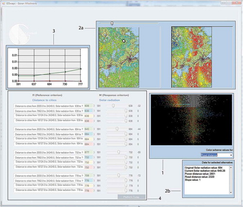
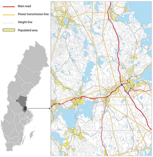
Figure 2. Area of interest for the hypothetical decision scenario used in the study.
Multi-line chart for visualization of the trade-off value functions (, ). The values of virtual alternatives in terms of the response criterion are plotted on the
-axis, and the compensation coefficients for virtual alternatives on the
Figure 3. GISwaps Basic; main window contains only an adjustment panel. The panel is identical to the adjustment panel in Visual GISwaps (see , ).
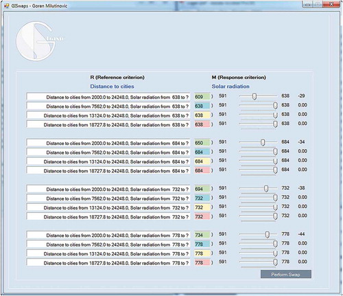
Figure 4. An example of deciding trade-offs with Distance to power transmission lines as the reference and Solar radiation as the response criterion.
2.3. Visual decision support systems – an overview
In the last decade, numerous interactive decision support systems have emerged, based both on standard and novel decision-making methods. Rouse et al. (Citation2017) introduced a visualization design methodology based on Rasmussen’s abstraction-aggregation hierarchy. Li and Ma (Citation2008) developed the Decision Ball model which visualizes a decision process based on even swaps. Analytical Hierarchy Process (AHP, see Saaty Citation1980) was used as a base for different interactive decision support tools, such as PriEsT (Siraj et al. Citation2015) and AHP-GAIA (Ishizaka et al. Citation2016). VIDEO (Kollat and Reed Citation2007) allows visual navigation through large sets of alternatives, as well as exploring and visualizing trade-offs. In Carenini and Loyd (Citation2004) the authors introduced, and in Bautista and Carenini (Citation2006) further developed ValueCharts, a set of interactive visualization methods aimed to facilitate the decision-maker in inspecting linear models of preferences and evaluation. Vallerio et al. (Citation2015) presented the Pareto Browser, an interactive decision support system for the multi-objective optimization of non-linear dynamic processes with uncertainty.
In the context of geospatial multi-criteria decision-making, one of the first systems that addressed the need for interactive visualization that applies to the choice phase of the decision-making process was CommonGIS (Andrienko and Andrienko Citation2003, Citation2004, Andrienko et al. Citation2003b). CommonGIS is a software system for exploratory analysis of spatial data including spatiotemporal data. It is based on interactive maps as a means of visual data exploration suggested in Andrienko and Andrienko (Citation1999), and also includes various statistical graphs: dot plot, frequency histogram, scatter plots, parallel coordinate plot (Andrienko and Andrienko Citation2003) as well as temporal features such as animated thematic maps, map series, value flow maps and time graphs (Andrienko and Andrienko Citation2004). The developments in the area of interactive visualization as a support for geospatial decision-making have more recently led to a number of novel methods and concepts. Hamilton et al. (Citation2016) presented the Geocentric Environment for Analysis and Reasoning (GEAR), a web-based system that uses heterogeneous sources for the discovery, organization, aggregation, analysis, and visualization of geospatial data. Waser et al. (Citation2014) proposed a visual decision support framework for decision-making in flood management. The framework is constructed as a combination of multidimensional ensemble simulations and logistic computations with interactive visualizations. In Zhang et al. (Citation2013), the authors presented a real-time interactive simulation framework based on a virtual environment (VERTISF) which combines a virtual reality platform with a numerical model used for watershed simulation. Kienberger et al. (Citation2013) used ArcGIS Explorer OnlineFootnote1 as a base for an interactive visualization tool for exploring socioeconomic vulnerability. Bonnet et al. (Citation2015) suggested interactive visualization using Google Maps and a web-based user interface to allow decision-makers to evaluate coverage and cost of placement of public-access Automated External Defibrillators.
2.4. Maps as analytical decision tools
The influence of information presentation formats on decision-making have been analyzed in a number of studies. In an early study of the effects of using geographic information systems as a support system for spatial decision-making, Crossland et al. (Citation1995) compared GIS maps and paper maps on two different levels of task complexity, and found that using GIS integrated maps yielded faster time and higher accuracy than paper maps on both levels. Smelcer and Erran (Citation1997) examined maps by comparison to tables, manipulating both task complexity and geographic relationships. The results showed that problem solving was generally faster with maps, and the problem-solving time for proximity and adjacency geographic relationships was kept low when using maps, but was increasing significantly with tables. This finding was confirmed in Dennis and Carte (Citation1998), who found that using map-based representation made not only faster, but even more accurate decisions if there was adjacency relationships among the geographic areas. However, they found maps inferior to tables in terms of accuracy when there were no such relationships. In a more recent study, Speier (Citation2006) found that, while spatial formats are superior to symbolic in terms of both time and accuracy for all spatial tasks, simple-symbolic tasks were best supported by symbolic formats. Jankowski and Nyerges (Citation2001) carried out a comprehensive study to examine the usage of different presentation formats in the context of collaborative decision-making. They used a decision support tool that integrated a GIS/mapping component with a decision modelling component. The results showed that maps were mainly used to visualize the results, and much less in the process of structuring the decision problem. One interesting finding was that the participants more often used maps independently (disjunctive map use) than together with MCDM aids (conjunctive map use). This finding was based on the analysis of the frequency and type of interaction between maps and MCDM models. The results showed that maps were used more frequently in simpler tasks, while MCDM aids were used more often in complex collaborative decision tasks.
2.5. Visualization evaluation
Evaluating visualizations is a complex and demanding task, even outside the context of decision-making. An overview of different quantitative and qualitative evaluation methodologies, as well as their advantages and disadvantages, is given in Carpendale (Citation2008). According to Carpendale, one advantage of quantitative methods is that they have relatively high precision, and that using those methods, we can make some declaration about the possible generalization of our findings. However, she points out a number of issues that can compromise the validity of a quantitative study, such as conclusion validity, internal validity, construct validity, and external validity. Qualitative approaches include a number of methodologies, such as think-aloud protocol, collecting opinions, in situ observational studies, participatory observation and contextual interviews.
Most previous studies on evaluating visualization have been focused on how to use different methods, without prescriptive advice on when it is appropriate to use a particular method (Munzner Citation2009). In a recent study on the subject, Lam et al. (Citation2012) introduced a scenario-based look at visualization evaluation. Through a systematic analysis of over 800 visualization research papers, they derived seven evaluation scenarios (extended to eight in Isenberg et al. (Citation2013)) that distinguish different study goals and types of research questions. Although they give examples of common approaches used for different scenarios, the authors do not prescribe specific methods for specific types of evaluation. Instead, the scenarios are meant to ‘be used as a practical context-based approach to exploring evaluation options’.
2.6. Evaluation of visual decision support tools
Of all decision support tools listed in Section 2.3, only two have been evaluated through user performance studies. In Bautista and Carenini (Citation2008), the authors presented the results of an evaluation of two different versions of ValueCharts. They performed both a quantitative usability study to assess the user performance on low-level tasks, and a qualitative study based on subject observations in real decision-making context. The tool was rated high in usefulness, learning and understanding. CommonGIS was evaluated in two separate studies. In Andrienko et al. (Citation2002), a quantitative study was carried out to evaluate the tool for usability of interactive maps in terms of tool learnability, memorability and user satisfaction. They found that the ideas of map interactivity and manipulability could not be learned by examining the tool interface, but needed to be introduced to users, who then were able to understand them, and were willing to use them. In Andrienko et al. (Citation2003a), the authors evaluated a number of tools and techniques in CommonGIS. They used a process tracing-based approach, where the participants were observed while discussing, selecting and using appropriate tools for different tasks with guidance from the developers. The participants’ evaluation of the tool was positive. The mean value for subjective estimation of understanding of the functions and the interface was 4.9, estimation of ease of use 5.8, and estimation of the effectiveness of the system 6.0, on a 7-point scale. The feedback from the participants helped the authors improve the tool design, so that it meets the needs of different types of users, with different styles of decision-making.
One of the reasons that there are few comparative evaluations of visual decision support tools is that decision tasks usually do not come with an objectively best alternative, which makes evaluating the ability of visualizations to support decision-making difficult (Dimara et al. Citation2018). Depending on their preferences and knowledge, different decision-makers will prefer different outcomes. This leads to the conclusion that visual decision support tools are best evaluated through qualitative studies. Indeed, in cases where a visualization tool is evaluated without comparison to other tools or techniques, a qualitative method is usually applied (e.g. Jankowski and Nyerges Citation2001, Gratzl et al. Citation2013, Pajer et al. Citation2017), and studies focus on project dynamics, rather than outcomes. In most cases, the assessments are based on user opinion and perception, focusing on users’ satisfaction and ease of use (e.g. Andrienko et al. Citation2002, Andrienko and Andrienko Citation2003, Arciniegas et al. Citation2011), usability in the context of human-computer interaction (e.g. Jankowski et al. Citation2001, Salter et al. Citation2009, Arciniegas et al. Citation2011), and users’ perception of the usefulness of the tool.
Quantitative methods are usually applied in comparative studies, when different versions of a tool are compared (e.g. Bautista and Carenini Citation2008), or when a visualization tool is compared to another tool or technique (e.g. Williamson and Shneiderman Citation1992) with a focus on performance. Commonly used measures include decision time, subjective ratings, choice satisfaction and choice confidence. The study presented in Arciniegas et al. (Citation2013) is, to our knowledge, the only study in which the effectiveness of a decision support tool was evaluated on the basis of objective measurements of performance. They tested three different tools, showing trade-offs between objectives in three different ways (colors on multiple maps, numbers on a single map, and letters on a single map). The tools were tested for usefulness, clarity of information, and impact on decisions. The impact on decisions was measured by comparing choices that participants made using different tools with the values of alternatives obtained by weighted summation, with the criterion weights specified using expert judgement. The evaluation results suggested that different ways of presenting the results of multi-criteria analysis lead to different outcomes.
3. Methods
The visual framework evaluation presented in this paper is based on a user performance study to obtain data for quantitative analysis, and a user experience study as the basis for qualitative analysis of the framework. In both studies, the participants were assigned a multi-criteria decision-making task on which they worked using GISwaps. The task assigned to participants was a hypothetical decision scenario in which they would use GISwaps to find the optimal location for a solar plant in the southern part of Gävleborg County, Sweden.
3.1. Decision problem scenario
Gävle municipality has decided to invest in setting up a solar panel farm with a moderate capacity of 1 MW in Gävleborg County. Gävleborg County is situated in the middle part of Sweden, on the Baltic Sea coast. It is Sweden’s seventh largest county, with a total area of 18 191 . There are 1270 cities, towns and villages in the county, with a total population of approximately 286 000, which gives a population density of approximately 16 inhabitants per square kilometer. Water areas in the county are densely distributed, with over 1200 lakes and rivers. The farm is to be situated in the southern part of Gävleborg County. The area of interest, presented in , is situated between latitudes
and
, and between longitudes
and
, with the total area of 2415
. The land surface in the area is mainly flat, with slope less than
in over 90% of the land. The parts of the area of interest considered suitable for establishing a solar farm are defined by the following set of constraints:
The farm is not to be established on agricultural areas.
There must be a minimum 2000 m buffer zone to cities, and a minimum 500 m buffer zone to smaller populated areas (villages).
There must be a minimum 500 m buffer zone to facilities such as military objects, sports fields, etc.
There must be a minimum 200 m buffer zone to railways and roads.
There must be a minimum 100 m buffer zone to buildings outside cities and/or villages (villas, churches or chapels, etc.).
There must be a minimum 300 m buffer zone to water areas.
The slope of the terrain must not exceed 15
After applying the constraints above, the final area of interest is reduced to 623 . There is a large number of aspects that may need to be taken into consideration when deciding on a solar farm location. Besides orographic, geographic and climatic factors, even social factors, such as policy support, may be relevant. While the number of relevant factors may vary depending on case-specific issues, there are some factors that should always be considered in a solar farm location case:
Solar radiation. Solar radiation levels in the area of interest are rather low, ranging from 591 to 778
Slope of the terrain. Slope over 15
Distance to urban areas. Due to possible negative environmental impacts, a solar farm should not be placed near residential areas. Thus, the suitability of an area increases as the distance to urban areas increases. The values of the distance to urban areas in the area of interest range from 2000 m to 24 248 m.
Distance to power transmission lines. Transmission costs and power losses increase as the distance to power transmission lines increases. Thus, due to the overall increased costs, the suitability of an area decreases as the distance to power transmission lines increases. The values in the area of interest range from 40 m to 5203 m.
Distance to main roads. Just as with the distance to power transmission lines, the suitability of an area decreases as the distance increases, due to the overall increased costs. The values of the distance to main roads in the area of interest range from 80 m to 24 000 m.
To keep the case manageable for the purpose of this study, we chose to limit the factor set to the listed five factors.
3.2. Software
Two different versions of GISwaps were used in the study: GISwaps Basic and Visual GISwaps. GISwaps Basic is a simple form-based application that contains no visual components, but only elements necessary to perform a trade-off task, such as text fields, sliders and buttons (see ). Visual GISwaps incorporates a visual framework aiming to facilitate the trade-off making task. The main Visual GISwaps window is shown in .
3.3. Constraints
Following different paths in a decision analysis process is likely to yield different outcomes (see, for example, Koch et al. Citation2009). The results of the experiments presented in Lahtinen and Hämäläinen (Citation2016) show that, in the Even Swaps method, different paths systematically lead to different choices, due to the scale compatibility (the tendency to give extra weight to the response criterion) and the loss aversion (the tendency to prefer avoiding losses to acquiring equivalent gains) biases. They showed that, due to the scale compatibility bias, a swap process where the same criterion is used as the response in multiple turns favours the alternatives that are good in that criterion. Similarly, due to the loss aversion bias, a swap process favours the alternative in which the most swaps are conducted. To reduce the risks that a choice and/or the order of reference and response criteria influences the results, the decision path, i.e. the sequence of reference/response turns, was preprogrammed in the applications. For the same reason, the number and the values of reference and response pivot-values, i.e. and
arrays for each swap turn, were preprogrammed. In each turn, we used four pivot-values for the reference and the response criteria, respectively, as follows:
where
: minimum value with respect to R in the set of alternatives
: maximum value with respect to R in the set of alternatives
: minimum value with respect to M in the set of alternatives
: maximum value with respect to M in the set of alternatives
which means that the participants had to explicitly assign compensation values for 16 virtual alternatives in each turn.
3.4. Quantitative evaluation: user performance
To quantify user performance, an experimental study was designed with two groups of participants working on the same decision-making problem, described in Section 3.1. One group was using GISwaps Basic, and the other group was using Visual GISwaps. The objective of the study was to determine if, and in what way, visual feedback as provided in Visual GISwaps impacts the magnitude of and the variation in compensation values when making trade-offs.
3.4.1. Participants and data collection
The user performance evaluation was conducted with 30 participants. The precondition when choosing participants was that they have some knowledge in GIS. The participants were recruited from three different educational programs at the University of Gävle that have GIS-related courses in the curriculum. Each of the participants had taken at least two GIS-related courses prior to the study.
The participants were split into two equally sized groups. The participants in the first group used GISwaps Basic, and the participants in the second group used Visual GISwaps to work on the task described in Section 3.1. Half of the participants from each of the three educational programs were randomly assigned to the first group, and the other half to the second group. The study was carried out in four different sessions, with two participants in session one, four participants in session two, four participants in session three, and twenty participants in session four. Each session lasted approximately 1 h, and was split into two parts. During the first 30 min of a session, the basic concepts of trade-offs with even swaps, as well as the GISwaps method, were presented and explained, and the GISwaps applications were demonstrated to participants by an instructor. During the second part of a session, the participants worked on the task using the provided version of the application. In each of the four sessions, half of the participants were provided with GISwaps Basic, and the other half with Visual GISwaps.
3.4.2. User task
Since there were five criteria considered in the decision scenario, the actual decision-making task consisted of four turns. In each turn, participants were presented with two criteria chosen as the reference criterion and the response criterion, and 16 preprogrammed virtual alternatives. The reference and response criteria, as well as arrays and
for each turn, were preprogrammed as follows:
Turn One:
Reference: Distance to urban areas
Response: Solar radiation
Turn Two:
Reference: Slope of the terrain
Response: Distance to main roads
Turn Three:
Reference: Distance to main roads
Response: Distance to power transmission lines
Turn Four:
Reference: Distance to power transmission lines;
Response: Solar radiation
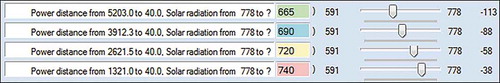
For each virtual alternative, participants were asked to choose a trade-off value in terms of the response criterion that would compensate for the maximum improvement of the value in terms of the reference criterion. The user task is exemplified in . In the example, Distance to power transmission lines is selected as the reference and Solar radiation as the response criterion, and trade-offs are made for four virtual alternatives (see ). In this example, for alternative a1, maximizing the value in terms of Distance to power transmission lines by decreasing it from 5203 m to 40 m, is compensated by decreasing the value in terms of Solar radiation by 113 , from 778
to 665
. Alternative a2 has the value of 3912 m in terms of Distance to power transmission lines, which is better than a1, thus maximizing it to 40 m may be compensated by lesser reduction of 88
. The same trend applies to a3 and a4, for which maximizing the value in terms of Distance to power transmission lines may be compensated by reducing the value in terms of Solar radiation by 58
and 38
, respectively.
Table 3. An example of deciding trade-offs with Distance to power transmission lines as the reference and Solar radiation as the response criterion. The table contains the original values and the adjusted values in terms of the response and the reference criterion for four alternatives.
Both applications included a short questionnaire for participants to fill in after completing the task. The Visual GISwaps questionnaire contained the following six statements that participants would grade from 1 (Disagree) to 5 (Fully agree):
The method is intuitive and easy to grasp and apply.
The application is easy to use.
The feedback from visual features helped me decide trade-offs.
I find the scatterplot very useful.
I find the geo-maps very useful.
I find the coefficient function diagram very useful.
The GISwaps Basic questionnaire contained two statements:
The method is intuitive and easy to grasp and apply.
Some kind of visual feedback would be helpful.
Answers from the questionnaires were not used for quantitative evaluation, but for qualitative analysis in the second part of the study. A log file was created and saved for each participant. The log file contains all trade-off values set by the participant during the session, times for each swap turn and the participant’s answers to questionnaire as well as comments, if any. The obtained answers and comments are used in the qualitative evaluation.
3.5. Qualitative evaluation: user experience
The second part of the study was carried out with another group of participants in the form of semi-structured interviews and observations. The interviews were carried out individually with each participant, in conjunction with performing the solar farm site location task.
3.5.1. Participants and data collection
Participants from different fields of expertise were recruited to obtain input from different points of view, from user groups that are commonly engaged in GIS-related decision-making: experts in the field that the decision-making task concerns, experts in decision-making, and experts in GIS. The sample for this part of the study consisted of five participants: two experts in the field of solar energy, two experts in decision, risk and policy analysis, and one GIS expert. The participants were recruited from the University of Gävle. The sample size was limited by the number of available experts in the respective field that are not engaged in our research project. It might be too small for the results to be generalizable, but they provide an insight into the usefulness of different visualization techniques used in Visual GISwaps.
The user sessions lasted approximately 60 min for the two participants with expertise in decision analysis and 80 min for the participants with expertise in the field of GIS or solar energy. During the first part of a session, participants were familiarized with trade-off thinking in decision-making (participants with expertise in a field other than decision analysis) and basics of the GISwaps method and the application, as well as the details of the decision scenario. In the second part of the study, participants worked on the previously described use case task using GISwaps Basic. In the third part, participants worked on the same case, this time using Visual GISwaps. During the second and the third part, participants were encouraged to speak out their reflections while working on the task. Finally, after finishing the third part, each user was asked to answer the following questions:
When working with GISwaps Basic:
Did you feel that you had a good understanding of the consequences of your choices?
Did you try to make consistent trade-offs?
Did you feel that some extra info or feedback was missing?
When working with Visual GISwaps:
Did you feel that you got a better understanding of the problem and the assigned task?
Did you feel that you got a better understanding of the method?
How important and useful for you was the scatterplot/maps/diagram?
Do you think that the visual feedback influenced your choices?
Is there anything in the visual framework that you think should be done differently?
Is there anything you miss regarding the visual feedback?
In general, would you say that you find the visual features useful?
Each session was audio recorded, and the recordings, as well as written down observations, were used in this evaluation.
4. Results
4.1. User performance
In this section, we present results of the comparative analysis of the data collected in sessions with student participants. The results for the group of participants working with GISwaps Basic and the group of participants working with Visual GISwaps are compared with respect to ranking results (4.1.1), compensation variation in deciding trade-offs (4.1.2) and the compensation level, i.e. the magnitude of trade-offs (4.1.3).
4.1.1. Highest ranked locations
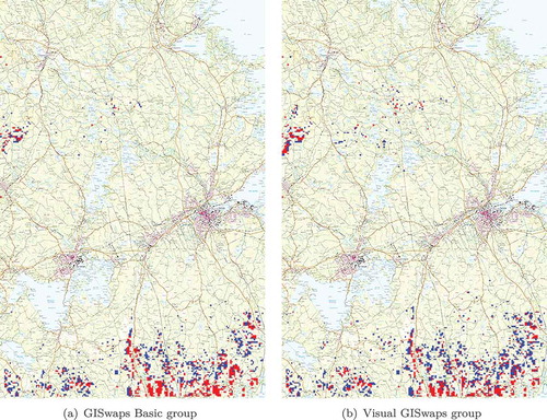
The result grids, i.e. grids with the alternatives ranked on the basis of the decided trade-offs, are derived by using the average trade-off value for each virtual alternative in each swap turn for the group working with GISwaps Basic and the group working with Visual GISwaps, respectively. The same alternative received the highest ranking by both groups. There was a compelling difference between groups regarding the rest of the five highest ranked locations, though. The highest ranked alternative is the only one of the five highest ranked that is common to both groups, i.e. both methods agree when it comes to the highest ranked candidate. For the group working with GISwaps Basic, all five highest ranked alternatives are concentrated in a narrow area, with the two most distant alternatives laying 3 km from each other (happens to be the highest and the next-highest ranked alternative). The second, the third and the fourth highest ranked locations are adjacent. For the group working with Visual GISwaps, the five highest ranked alternatives are spread across a wide area in the southern part of the area of interest. No two of those five are adjacent. The shortest distance between any two of those five is 1.5 km and the longest is 22 km. The next-highest ranked alternative lies approximately 20 km west from the highest ranked location.
The maps in show that the highest ranked alternatives for both groups are mainly located in the southern part and in the mid-western part of the area. The amount, as well as the scaled values of the top 5% and top 10% alternatives situated in the mid-west, is higher for the Visual GISwaps group.
Figure 5. Maps over 10% highest ranked alternatives for GISwaps Basic and Visual GISwaps group, respectively. The highest ranked 5% plotted in red.
4.1.2. Variation in compensation values in trade-offs
In this section, we present the results of the analysis of the variation in compensation values. We obtain a compensation variation index (CV-index) for assigned compensation values on three levels. On the top level, we obtain a compensation variation index , for the whole decision process. On level two, we obtain a swap turn compensation variation index
, for each of
swap turns. On the lowest level, we obtain an interval compensation variation index
in each turn
for each interval
between two consecutive pivot points
,
(array containing pivot values in terms of the response criterion). For
(array containing pivot values in terms of the reference criterion) containing
elements, there are
segments in each interval. The slope of a segment is calculated as follows:
where is the compensation coefficient for virtual alternative
,
is the number of elements in
and
is the number of elements in
. The compensation variation index for interval
in swap turn
,
, is calculated as the quotient between the steepest and the least steep segment in the interval.
The compensation variation index for a swap turn is given as the mean of the interval indices,
Finally, the compensation variation index for the decision process is obtained as
One example is given in and .
Table 4. The process of calculating the compensation variation indices.
Figure 6. Four compensation value functions with marked segments with the steepest and the least steep slopes in each interval between two consecutive pivot points ,
. The process of calculating the indices for the example is shown in .
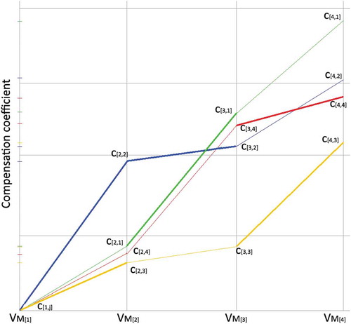
In a hypothetical scenario where the same adjustment in terms of the reference criterion always yields the same compensation amount in terms of the response criterion, regardless of the value of the alternative with respect to that criterion, compensation coefficients for all alternatives would be the same, and the compensation variation index would be 1.
For the array (pivot values in terms of the response criterion
) defined for the decision problem used in this study applies that
Since we are only interested in the quotients between the segment slopes, we assume that for each value of
. We then calculate a segment slope as
.
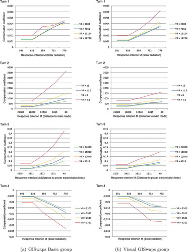
There is a noticeable difference between groups with regard to swap turn indices in all four swap turns. The swap turn indices for the GISwaps Basic group have higher values, i.e. vary more, in swap turns one (reference: Distance to cities; response: Solar radiation), two (reference: Slope of the terrain; response: Distance to main roads) and three (reference: Distance to main roads; response: Distance to power transmission lines). The ratio of the swap turn index for GISwaps Basic group to the swap turn index for the Visual GISwaps group is 2.21:1 in turn one, 2.33:1 in turn two, 1.49:1 in turn three. The interval indices for the GISwaps Basic group have higher values than the interval indices for the Visual GISwaps group in all three intervals in each of those three swap turns. In turn four (reference: Distance to power transmission lines; response: Solar radiation), the swap turn index for the GISwaps Basic group has a lower value than for the Visual GISwaps group. The ratio of the swap turn index for GISwaps Basic group to the swap turn index for the Visual GISwaps group in this turn is 1:1.68. The interval indices for the GISwaps Basic group have lower values than the interval indices for the Visual GISwaps group in intervals two and three of turn four, and higher in interval one. For the whole decision process, index is 3.87 for the GISwaps Basic group and 2.55 for the Visual GISwaps group, giving the ratio 1.52. A visual representation of the difference between the groups with regard to the compensation variation is given in .
Figure 7. Diagrams show the difference between the groups with regard to compensation variation. The reference and response criteria in different turns are: in turn one: R = Distance to cities, M = Solar radiation; in turn two: R = Slope, M = Distance to main roads; in turn three, R = Distance to main roads, M = Distance to power transmission lines; in turn four, R = Distance to power transmission lines, M = Solar radiation.
4.1.3. Difference between the groups regarding compensation levels
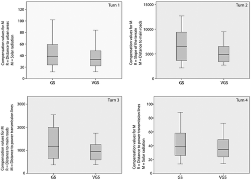
The analysis of the average trade-off values (compensation amounts) shows that participants in the group working with GISwaps Basic were on average much more inclined to accept larger compensations in terms of the response criteria throughout the decision process.
In 75% of all trade-offs (48 of 64) made during the decision process, the compensation value was larger in the group working with GISwaps Basic. In turn one, trade-offs in the group working with GISwaps Basic are on average 16% larger than in the group working with Visual GISwaps, in turn two 23%, in turn three 29%, and in turn four 11%. It makes trade-offs in the group working with GISwaps Basic 20% larger than trade-offs in the group working with Visual GISwaps for the whole decision process. Differences between the groups in average trade-off values are presented in . Statistical significance of the observed differences was confirmed by performing Wilcoxon signed-rank test with average trade-off values for each of the four swap-turns as input. The results are presented in .
Table 5. Difference in average trade-off values between groups.
Figure 8. Box-plots showing the variation in average trade-off values for all four turns.
4.2. User experience
4.2.1. Student group
The majority of users working with GISwaps Basic experienced a lack of visual feedback as a drawback and expressed the view that visual features would be helpful. The lack of visual features also influenced users’ perceptions of the GISwaps method. Users working with Visual GISwaps perceived the method more intuitive and easier to apply than users working with GISwaps Basic (see ).
Table 6. Average grades for the statements regarding the method, application and visual feedback, given by participants working with GISwaps Basic.
Users working with Visual GISwaps found (on average) visual feedback helpful. Average grades to the statements regarding visual feedback, given on the scale 1–5 (1: disagree; 5: fully agree) are presented in .
Table 7. Average grades for the statements regarding the method, application and visual feedback, given by participants working with Visual GISwaps.
4.2.2. Expert user group
Both participants with expertise in decision analysis had previous knowledge of the Even Swaps method, and had no difficulties understanding the details of GISwaps. The participants with expertise in fields other than decision analysis, however, found the concept of value trade-offs relatively easy to understand, but not as easy to apply on a concrete case using GISwaps. Even the participants with a decision analysis background thought that applying the method on this particular user case was not easy, mainly because of a lack of knowledge in the subject area. As expected, the participants with expertise in solar energy stated they were more confident in their trade-offs. To the question of whether or not visual feedback had any influence on their trade-offs all five participants answered affirmatively. It was mainly the matter of visual feedback helping the participants avoid inconsistency and unintentional variation in compensation values between intervals. Three of the users said that they would put more trust in trade-offs set with Visual GISwaps than in trade-offs set without visual feedback. Two of the users were indifferent in this matter. When it comes to the matter of appreciation of different parts of the visualization, we noticed one particular phenomenon: each of the five participants would fully concentrate on one of the visualizations, and more or less ignore the other two. The two participants with expertise in solar energy picked the interactive maps as most useful, whereas the remainder of the participants were mostly using multi-line chart with the visualization of trade-off value functions. None of the users picked scatterplot as the most useful visual unit.
All five participants were positive to the visualization. Some of the comments were that
it makes it easier to work with a concrete decision problem
it helps by pointing out ‘good’ alternatives
it helps detect potential outliers
it helps detect potential unintended compensation variations and inconsistencies in trade-offs
it makes the decision problem more interesting and more apparent
5. Discussion
5.1. User performance
There is an apparent matching of the final ranking of the alternatives between the groups. The highest ranked alternatives for both groups are mainly located in the southern part and in the mid-western part of the area of interest. The mid-western part of the area has the highest solar radiation, with values between 740 and 780
. Access to power transmission lines is good, with values between 300 m and 1500 m. Access to main roads is poor, though, with values over 15 km on average. The terrain slope in the area is not optimal, but it is acceptable, with values between 5
and 7
. The southern part of the area is inferior to the mid-west with respect to solar radiation, with values between 670
and 690
. It is superior to the mid-west with respect to the distance to main roads (between 7 km and 9 km) and slope (1–3 degrees). However, we cannot make a reliable conclusion regarding the potential superiority of Visual GISwaps over GISwaps Basic, or vice versa. As decision-making is based not only on factual values, but on the decision-maker’s knowledge, preferences and judgements too, there exists no objectively best alternative or choice that could be used as an objective metrics of decision quality. One possible way of dealing with this issue is to use the expert knowledge to calculate the ‘objective’ overall values of available alternatives, and then compare them with participants’ choices (Arciniegas et al. Citation2013). Dimara et al. (Citation2018) used a similar approach, but instead of calculating overall values based on the expert knowledge, they used participants’ own preferences and judgements of the importance of the criteria to calculate personalized ‘objective’ overall values for each participant.
The findings presented in Section 4.1.2 show that the participants using GISwaps Basic on average made trade-offs with more varying compensation values than the participants using Visual GISwaps. GISwaps does not assume linearity of trade-offs. Depending on the values of two currently swapped alternatives in terms of the response criterion, the compensation values may well vary even if the magnitude of adjustment in terms of the reference criterion is the same for both alternatives. For example, adjusting the distance to power transmission lines from 2.5 km to 500 m would by most decision-makers be considered worth more than adjusting it from 16 km to 14 km, even though the gained distance is the same. However, the analysis of the variations in adjustments for the group of participants using GISwaps Basic shows a tendency to set extra ‘generous’ compensation values for the adjustments from to
, which is the least significant adjustment, with an improvement of 25% of the value in terms of the reference criterion. This potential over-compensation is most transparent in turns two and three (see ; adjustments from
to
are represented by red lines). Furthermore, the adjustment for
from
to
(, turn 1, yellow line) is inconsistent with previous adjustments. The analysis of the variations in adjustments for the group of participants using Visual GISwaps shows more coherent compensations, with no inconsistencies. This clearly shows a positive impact of the visual feedback on making coherent and consistent trade-offs.
The findings presented in Section 4.1.3 show that the participants working with GISwaps Basic were on average more inclined to accept larger compensations in terms of the response criteria than the participants using Visual GISwaps throughout the decision process. In 75% of trade-offs made during the decision process, the average compensation values were larger in the group using GISwaps Basic. According to the scale compatibility principle, ‘the weight of a stimulus is enhanced by its compatibility with the response mode’ (Slovic et al. Citation1990). Our findings imply that participants using Visual GISwaps on average weighted criteria used as response more heavily than the ones used as reference, which indicates that visual feedback may have an impact on the scale compatibility bias. This is a very important finding that should be further tested. If confirmed in a user study with a large group of participants with good knowledge in the area related to the decision problem, this phenomenon should be investigated further. It may be worth considering even the potential impact of visualization on loss aversion. For a loss-averse decision-maker, a loss is worth more than a gain, meaning that he/she tends to prefer avoiding losses to acquiring equivalent gains (Kahneman et al. Citation1991, Tversky and Kahneman Citation1991, Lahtinen and Hämäläinen Citation2016). Our study, however, was not designed to test for the loss aversion bias; thus, we can not make any conclusions regarding the issue.
5.2. User experience
The impact of the visualization framework was assessed positively by all participants in the expert group and graded 3.33 of 5 on average by the participants in the non-expert group. There is a clear preference matching between the groups regarding the assessment of the usefulness of the specific parts of the visualization. The value function diagram and the interactive maps are considered as the most useful on average within the non-expert user group, graded 3.17 of 5, while the scatterplot received the lowest grade, 2.75 of 5. In the expert group, three participants selected the value function diagram as the most useful, two selected the interactive maps, and no one experienced the scatterplot as the most useful feature. This is a somewhat surprising result, as the scatterplot is the central part of the visualization. It is the starting point of interaction, where an alternative can be selected for further analysis in the maps and extra information on demand. This may be the result of participants with different fields of expertise being accustomed to different ways of visual representation of data and information. One of the participants, with expertise in the field of decision analysis, commented that concentrating on the value function diagram was probably due to being unaccustomed to interpreting maps and plots. Another possible explanation might be the lack of time, as another participant with background in decision analysis pointed out. The feedback from the function diagram and the maps is immediate and easy to interpret, while the proper use of the scatterplot requires some experimenting and learning. Finally, the users’ perception of the scatterplot usefulness may have been influenced by its layout. Typically, in a scatterplot, values of y are calculated and plotted in response to the values of x. In our application, we chose to plot the values of x in response to the values of y, as we found this approach more intuitive in the context. Even though none of the expert participants explicitly mentioned the plot layout as an issue, we can not rule out the possibility that it may have had some unconscious influence.
6. Conclusions
We conducted a user performance study and a user experience study using a hypothetical decision scenario to obtain new insights into the effects of interactive visualization on spatial decision-making based on GISwaps. The main objective of the user performance study was to determine whether visual feedback has any impact on the magnitude of and variation in compensation values when making tradeoffs in GISwaps. The results showed positive impact of visualization on the coherency and consistency of tradeoffs. They also showed that visual feedback made the participants more cautious, as they were less inclined to accept larger compensations than the participants working with GISwaps Basic. This indicates that visual feedback may have an impact on the scale compatibility bias, and on loss aversion. In this study, we did not attempt to compare the tools in terms of decision quality. Nonetheless, it would be interesting to make such a comparison, preferably using the consistency between participants’ choices and self-reported preferences as the decision accuracy metric.
We performed a qualitative evaluation through observations and semi-structured interviews, to get insight into how useful different visualization techniques available in Visual GISwaps are perceived by users. The participants, both non-experts and experts, assessed the interactive visualization as a welcome and useful part of the GISwaps method. However, we recognize the limitations of this approach. A more thorough, process-based study using mouse- and eye tracking should be carried out to obtain better insight into patterns of information acquisition – the decision makers’ behavior and the ways of examining and processing the information during the decision process.
The results of the qualitative study showed that the scatterplot unit was the least preferred of the three visualization units in Visual GISwaps. It would be interesting to investigate how scatterplot compares to other visualization techniques, such as parallel coordinates and tableplots, in different decision situations and on different levels of decision task complexity.
The results of the evaluation presented in this paper are positive and encouraging. However, for interactive visualization to be beneficial, one must be aware of the potential biases that may come with it. For example, there is a risk that the decision-maker concentrates more on making coherent trade-offs, than on making them reflect his/her knowledge and preferences. There is also a risk that the decision-maker adjusts the trade-offs so that the alternatives that he/she prefers to receive the highest ranking. It is critical that visualization features are used as a tool meant to provide a better overview of the decision situation and better insight into the decision process, and not as a tool that should control it.
Disclosure statement
No potential conflict of interest was reported by the authors.
Additional information
Notes on contributors
Goran Milutinović
Goran Milutinović studied philosophy at the University of Sarajevo, Bosnia and Hercegovina, between 1987 and 1992. He received the BSc degree in computer science from the University of Gävle, Sweden, in 2000, and MSc in decision-, risk- and policy analysis from the University of Gävle, Sweden, in 2015. He started his PhD studies in the field of geospatial information science at the University of Gävle in 2016. His main research interest concerns computational and visual tools for geospatial decision making.
Ulla Ahonen-Jonnarth
Ulla Ahonen-Jonnarth studied biology both at the University of Oulu, Finland and at the Swedish University of Agricultural Sciences, Sweden and she has a PhD degree in this subject. She also studied computer science at the Uppsala University and has a one-year master degree in this subject. She is a senior lecturer at the University of Gävle and her main subject since 2004 is decision risk and policy analysis. Her main research interest is the theory and use of decision support systems in different contexts, for example automatization of cleaning of young forests and location of wind power parks.
Stefan Seipel
Stefan Seipel graduated with an MSc in Medical Informatics from Heidelberg University, Germany, in 1992. He obtained a PhD in theoretical medicine from the medical faculty at Heidelberg University, Germany, in 1997 for his thesis on 3D simulation of surgical procedures and surgical instrument navigation. He was appointed professor of Computer Graphics at Uppsala University, Sweden, in 2003. He currently holds the position of a Professor of Computer Graphics and Head of the research group in Geospatial Information Technology at the University in Gävle, Sweden, as well as he has a part time position as Professor of Computer Graphics at Uppsala University, Sweden. Previous academic posts include Postdoctoral Researcher in Human-Computer Interaction, Senior Lecturer in Graphics, and Senior Lecturer in Visualization. His published research has been directed towards applied computer graphics and interactive visualizations within the medical field and various other fields of applications. His particular research interests include usability of interactive visualizations, spatial and temporal visualization techniques, virtual reality and augmented reality, as well as geographical visualization.
Sven Anders Brandt
Sven Anders Brandt is Docent (Associate Professor) in geospatial information science at University of Gävle, Sweden. He received his MSc and PhD degrees in physical geography from Uppsala University, Sweden, and University of Copenhagen, Denmark, in 1995 and 1999, respectively. His research has ranged from fluvial geomorphology, over river flood risk mapping, to geospatial multicriteria decision analysis.
Notes
1. ArcGIS Explorer Online was taken out of use on 10 December 2013 and replaced by Explorer for ArcGIS. (ESRI Citation2013).
References
- Andrienko, G., Andrienko, N., and Jankowski, P., 2003a. Building spatial decision support tools for individuals and groups. Journal of Decision Systems, 12 (2), 193–208. doi:10.3166/jds.12.193-208
- Andrienko, G.L. and Andrienko, N.V., 1999. Interactive maps for visual data exploration. International Journal of Geographical Information Science, 13 (4), 355–374. doi:10.1080/136588199241247
- Andrienko, N., et al. 2002. Testing the usability of interactive maps in commonGIS. Cartography and Geographic Information Science, 29 (4), 325–342. doi:10.1559/152304002782008369
- Andrienko, N. and Andrienko, G., 2003. Informed spatial decisions through coordinated views. Information Visualization, 2 (4), 270–285. doi:10.1057/palgrave.ivs.9500058
- Andrienko, N. and Andrienko, G., 2004. Interactive visual tools to explore spatio-temporal variation. In:Proceedings of the working conference on Advanced visual interfaces - AVI ’04, 417. New York, NY, USA: ACM.
- Andrienko, N., Andrienko, G., and Gatalsky, P., 2003b. Exploratory spatio-temporal visualization: an analytical review. Journal of Visual Languages and Computing, 14 (6), 503–541. doi:10.1016/S1045-926X(03)00046-6
- Arciniegas, G., Janssen, R., and Omtzigt, N., 2011. Map-based multicriteria analysis to support interactive land use allocation. International Journal of Geographical Information Science, 25 (12), 1931–1947. doi:10.1080/13658816.2011.556118
- Arciniegas, G., Janssen, R., and Rietveld, P., 2013. Effectiveness of collaborative map-based decision support tools: results of an experiment. Environmental Modelling and Software, 39, 159–175. doi:10.1016/j.envsoft.2012.02.021
- Bautista, J. and Carenini, G., 2006. An integrated task-based framework for the design and evaluation of visualizations to support preferential choice. In: Proceedings of the Working Conference on Advanced Visual Interfaces, AVI ’06, New York, NY: ACM, 217–224. doi:10.1145/1133265.1133308.
- Bautista, J. and Carenini, G., 2008. An empirical evaluation of interactive visualizations for preferential choice. In: AVI ’08: Proceedings of the working conference on Advanced visual interfaces, 28–30. New York, NY, USA: ACM.
- Bonnet, B., Kraus, K., and Ramirez-Marquez, J.E., 2015. Interactive visualization for optimal placement of public-access AEDs. In: 2014 IEEE Conference on Visual Analytics Science and Technology, VAST 2014 - Proceedings, 231–232. Paris, France: IEEE.
- Carenini, G. and Loyd, J., 2004. Valuecharts: analyzing linear models expressing preferences and evaluations. In: Proceedings of the Working Conference on Advanced Visual Interfaces, AVI ’04, New York, NY: ACM, 150–157. doi:10.1145/989863.989885.
- Carpendale, S., 2008. Information visualization. In: A. Kerren, et al., eds. Information visualization. lecture notes in computer science. Berlin, Heidelberg: Springer-Verlag, Ch. Evaluating Information Visualizations, 19–45.
- Crossland, M.D., Wynne, B.E., and Perkins, W.C., 1995. Exploring the next generation of decision supportspatial decision support systems: an overview of technology and a test of efficacy. Decision Support Systems, 14 (3), 219–235. Available from: http://www.sciencedirect.com/science/article/pii/016792369400018N.
- Dennis, A.R. and Carte, T.A., 1998. Using geographical information systems for decision making: extending cognitive fit theory to map-based presentations. Information Systems Research, 9 (2), 194–203. doi:10.1287/isre.9.2.194
- Dimara, E., Bezerianos, A., and Dragicevic, P., 2018. Conceptual and methodological issues in evaluating multidimensional visualizations for decision support. IEEE Transactions on Visualization and Computer Graphics, 24 (1), 749–759. doi:10.1109/TVCG.2017.2745138
- ESRI, 2013. Explorer for arcgis. Available from: http://www.esri.com/software/arcgis/explorer. [Accessed 20 Mar 2018].
- Gratzl, S., et al. 2013. LineUp: visual analysis of multi-attribute rankings. IEEE Transactions on Visualization and Computer Graphics, 19 (12), 2277–2286. doi:10.1109/TVCG.2013.173
- Hamilton, M.C., et al. 2016. Web-based geospatial multiple criteria decision analysis using open software and standards. International Journal of Geographical Information Science, 30 (8), 1667–1686. doi:10.1080/13658816.2016.1155214
- Hammond, J.S., Keeney, R.L., and Raiffa, H., 1998. Even swaps: A rational method for making trade-offs. Harvard Business Review, 76 (2), 137–149.
- Hammond, J.S., Keeney, R.L., and Raiffa, H., 1999. Smart choices - a practical guide to making better life decisions. 1st ed. New York, USA: Broadway Books.
- Isenberg, T., et al., 2013. A systematic review on the practice of evaluating visualization. IEEE Transactions on Visualization and Computer Graphics, 19 (12), 2818–2827. Available from: http://ieeexplore.ieee.org/document/6634108/.
- Ishizaka, A., Siraj, S., and Nemery, P., 2016. Which energy mix for the UK (United Kingdom)? An evolutive descriptive mapping with the integrated GAIA (graphical analysis for interactive aid)-AHP (analytic hierarchy process) visualization tool. Energy, 95, 602–611. doi:10.1016/j.energy.2015.12.009
- Jankowski, P., Andrienko, N., and Andrienko, G., 2001. Map-centred exploratory approach to multiple criteria spatial decision making. International Journal of Geographical Information Science, 15 (2), 101–127. doi:10.1080/13658810010005525
- Jankowski, P. and Nyerges, T., 2001. GIS-supported collaborative decision making: results of an experiment. Annals of the Association of American Geographers, 91 (1), 48–70. doi:10.1111/0004-5608.00233
- Kahneman, D., et al. 1991. Anomalies the endowment effect, loss aversion, and status quo bias. Journal of Economic Perspectives, 5 (1), 193–206. doi:10.1257/jep.5.1.193
- Keeney, R.L. and Raiffa, H., 1976. Decisions with multiple objectives - preferences and value tradeoffs. USA: John Wiley & Sons, Inc.
- Kienberger, S., et al. 2013. A WebGIS tool for visualizing and exploring socioeconomic vulnerability to dengue fever in Cali, Colombia. Geospatial Health, 8 (1), 313–316. doi:10.4081/gh.2013.76
- Koch, J., Eisend, M., and Petermann, A., 2009. Path dependence in decision-making processes: exploring the impact of complexity under increasing returns. Business Research, 2 (1), 67–84. doi:10.1007/BF03343529
- Kollat, J.B. and Reed, P., 2007. A framework for visually interactive decision-making and design using evolutionary multi-objective optimization (video). Environmental Modelling & Software, 22 (12), 1691–1704. doi:10.1016/j.envsoft.2007.02.001
- Lahtinen, T.J. and Hämäläinen, R.P., 2016. Path dependence and biases in the even swaps decision analysis method. European Journal of Operational Research, 249 (3), 890–898. doi:10.1016/j.ejor.2015.09.056
- Lam, H., et al. 2012. Empirical studies in information visualization: seven scenarios. IEEE Transactions on Visualization and Computer Graphics, 18 (9), 1520–1536. doi:10.1109/TVCG.2011.279
- Li, H.L. and Ma, L.C., 2008. Visualizing decision process on spheres based on the even swap concept. Decision Support Systems, 45 (2), 354–367. doi:10.1016/j.dss.2008.01.004
- Malczewski, J. and Rinner, C., 2015. Multicriteria decision analysis in geographic information science. New York, USA: Springer, 90–93.
- Milutinovic, G., Ahonen-Jonnarth, U., and Seipel, S., 2018. GISwaps - A new method for decision making in continuous choice models based on even swaps. International Journal of Decision Support System Technology, 10 (3), 57–78. doi:10.4018/IJDSST
- Milutinovic, G. and Seipel, S., 2018. Visual GISwaps - an interactive visualization frame- work for geospatial decision making. In: D. Bechmann, A.P. Cláudio, and J. Braz, eds. Proceedings of the 13th International Joint Conference on Computer Vision, Imaging and Computer Graphics Theory and Applications. Funchal, Madeira, Portugal: SCITEPRESS.
- Munzner, T., 2009. A nested model for visualization design and validation. IEEE Transactions on Visualization and Computer Graphics, 15 (6), 921–928. doi:10.1109/TVCG.2009.111
- Pajer, S., et al. 2017. WeightLifter: visual weight space exploration for multi-criteria decision making. IEEE Transactions on Visualization and Computer Graphics, 23 (1), 611–620. doi:10.1109/TVCG.2016.2598589
- Rouse, W.B., et al., 2017. Interactive visualizations for decision support: application of Rasmussen’s abstraction-aggregation hierarchy. Applied Ergonomics, 59, 541–553. doi:10.1016/j.apergo.2016.03.006
- Saaty, T.L., 1980. The analytic hierarchy process. New York, USA: McGraw-Hill.
- Salter, J.D., et al., 2009. The digital workshop: exploring the use of interactive and immersive visualisation tools in participatory planning. Journal of Environmental Management, 90 (6), 2090–2101. doi:10.1016/j.jenvman.2007.08.023
- Siraj, S., Mikhailov, L., and Keane, J.A., 2015. PriEsT: an interactive decision support tool to estimate priorities from pairwise comparison judgments. International Transactions in Operational Research, 22 (2), 217–235. doi:10.1111/itor.2015.22.issue-2
- Slovic, P., Griffin, D., and Tversky, A., 1990. Compatibility effects in judgment and choice. In: Robin M. Hogarth eds. Insights in decision making: A tribute to Hillel J. Einhorn. University of Chicago Press, 5–27.
- Smelcer, J.B. and Erran, C., 1997. The effectiveness of different representations for managerial problem solving: comparing tables a .. Reproduced with permission of the copyright owner . Further reproduction prohibited without permission. Decisions Sciences, 28 (2), 391–420. doi:10.1111/j.1540-5915.1997.tb01316.x
- Speier, C., 2006. The influence of information presentation formats on complex task decision-making performance. International Journal of Human Computer Studies, 64 (11), 1115–1131. doi:10.1016/j.ijhcs.2006.06.007
- Tversky, A. and Kahneman, D., 1991. Loss aversion in riskless choice: A reference-dependent model*. The Quarterly Journal of Economics, 106 (4), 1039–1061. doi:10.2307/2937956
- Vallerio, M., et al. 2015. An interactive decision-support system for multi-objective optimization of nonlinear dynamic processes with uncertainty. Expert Systems with Applications, 42 (21), 7710–7731. doi:10.1016/j.eswa.2015.05.038
- Waser, J., et al. 2014. Many plans: multidimensional ensembles for visual decision support in flood management. Computer Graphics Forum, 33 (3), 281–290. doi:10.1111/cgf.12384
- Williamson, C. and Shneiderman, B., 1992. The dynamic homefinder: evaluating dynamic queries in a real-estate information exploration system. In: Proceedings of the 15th annual international ACM SIGIR conference on Research and development in information retrieval - SIGIR ’92, 338–346. Available from: http://portal.acm.org/citation.cfm?doid=133160.133216.
- Zhang, S., Xia, Z., and Wang, T., 2013. A real-time interactive simulation framework for watershed decision making using numerical models and virtual environment. Journal of Hydrology, 493, 95–104. doi:10.1016/j.jhydrol.2013.04.030