
ABSTRACT
Attending to the role of visualizations in discourse formations allows for detecting the emergence of particular visual storylines. This article studies the emergence of visual storylines in energy policy, in particular shale gas controversies. The analysis is based on data gathered in three internet regions: the Netherlands, New York State, and South Africa. The analysis studies how visualizations may contribute to confirmation, disintegration, integration, or polarization of discourse coalitions due to similarities or differences between visual and discursive storylines. From the results, we suggest the notion of visual discourse coalitions (VDCs) to contribute to the study of visualizations and discourses in policy controversies. We define a VDC as a network of actors that share a similar discursive storyline and a similar visual storyline of the controversy. The article shows that visualizations and their graphic characteristics add another dimension to the formation of discourse coalitions and the way they develop, connect, or disconnect.
1. Introduction
The study of global politics engages more and more with aesthetics (Bleiker, Citation2017), and the visual is increasingly being addressed in the study of controversies – intractable policy disputes that are ‘immune to resolution by appeal to the facts’ (Schön & Rein, Citation1994, p. 4). More and more studies acknowledge the capacity of visual artefacts to influence our understanding of the world (Messaris & Abraham, Citation2011) and to shape dynamics of politics (Lilleker et al., Citation2019), to the extent that some perceive a visual turn (Bleiker, Citation2018). In controversies and networks, studies demonstrate, visuals play an essential role as they can exercise power, construct knowledge, affect attitudes, and mobilize publics (Latour, Citation1986; Latour & Weibe, Citation2005; Lilleker et al., Citation2019; Mattoni & Teune, Citation2014; Rommetveit & Wynne, Citation2017). Thus, the dissemination of visuals merits further investigation. And indeed, methodological, conceptual, and technical explorations have contributed to the emergence of various approaches in which the role of the visual in politically contested issues is analyzed (e.g. Campbell, Citation2007; Morseletto, Citation2017; Schneider & Walsh, Citation2019).
The study of using visuals in policy controversies usually focuses on the visual object: where and by whom images have been produced, with what aesthetic and graphic qualities, for what reasons, and with what effect (e.g. Clancy & Clancy, Citation2016; Krause & Bucy, Citation2018; O’Neill, Citation2013). This, to a large extent, overlooks the multidimensionality of the studied subject and decontextualizes the visual. Following recent work (Hendriks et al., Citation2017; Metze, Citation2018), we take notice of the particular ways in which visuals are being used and develop a comprehensive approach whereby we analyze visualizations as part of a collection of ideas, verbal statements, and storylines. Visualizations can be concrete visual objects that represent reality (e.g. a printed photograph, a diagram on a screen) or mental or imaginary ones (see, for example, Rommetveit & Wynne, Citation2017). Using these visual objects is the essence of the practice of visualizing. Thus, visualization as a practice is a dynamic process in which visual objects are (re)selected and (re)interpreted to give information or tell a story in ocular ways (see also van Beek et al., Citationin press). This conceptual approach is applied in this paper to controversies over shale gas.
The exploration of shale gas is controversial in most countries (Bomberg, Citation2017b; Dodge & Metze, Citation2017; Hopke & Simis, Citation2017; Metze & Dodge, Citation2016; Williams et al., Citation2017). Contestation in the shale gas case commonly revolves around two types of tensions between conflicting framing: that of shale gas as an economic and energy opportunity or as a threat to the environment, and that of shale gas as a ‘bridge fuel’ to a carbon-free energy future or a delayer of a transition to sustainable energy (Dodge & Metze, Citation2017). This contestation is reflected in the various discourses – the ‘ensemble(s) of ideas, concepts, and categorizations […] through which meaning is given to physical and social realities’ (Hajer, Citation1995, p. 44).
In the controversy over shale gas development, there are distinct alternative discourses and discourse coalitions. Discourse coalitions are networks of actors who share a meaning that is given to reality (Hajer, Citation1995; Metze & Dodge, Citation2016). This shared meaning of reality is important in the evolvement of policy controversies, as it may dominate how policymakers understand the issue and develop solutions for it (Feindt & Oels, Citation2005; Hajer, Citation1995; Hajer & Versteeg, Citation2005). The study of discourse has developed from being language-centered with a focus on the framing of issues to including various material relationships that establish discourses (Hansen & Machin, Citation2013). Yet, the role of the visual in the formation of discourse and discourse coalition deserves more attention and opens up particular ways to study the emergence of controversies.
In our study, we do not assume visualizations have a universal meaning; rather, they are being used to interpret the world and display it in a particular manner (Rose, Citation2001, p. 6), and therefore their meaning is negotiated. In a policy controversy, visualizations are used to tell a story that illustrates and depicts an issue. Hence, the study of the visual stories can reveal contested facts, normative concerns, and values that can be used for policy learning (Metze, Citation2018). For discourse coalitions, because of their multi-interpretability, visualizations may be able to bridge competing coalitions and possibly also break up these interpretive communities (see Metze & Dodge, Citation2016).
We study the shale gas controversy on the internet as the internet discloses online publics that are organized around a controversial issue and may affect the way it is being addressed (Marres & Rogers, Citation2005). Visualizations that are used by these online publics are part of a ‘web sphere’, an online space that is networked around an issue (see Rogers, Citation2013). This ‘issue network’, although virtual, is commonly territory-related, especially when controversial issues are debated (Rogers, Citation2013). Yet, visualizations have the capacity to transcend geographic contexts and create a global community (Campbell, Citation2007), as the visualization of a flaming faucet did. This visualization, originally a frame from the documentary film Gasland that was produced in the United States, associated drinking water contamination with nearby hydraulic fracturing (also called fracking) (Mazur, Citation2016; Metze, Citation2017, Citation2018). The visualization travelled from the United States to other countries, and accompanied by other visualizations that reproduced the scene from the film, created a global public of shale gas opponents (Mazur, Citation2016; Metze, Citation2018). In this article, we use the notion of online publics to study discourse coalitions. Hence, the research question of this article is: How do visualizations influence dynamics within a discourse coalition and between competing discourse coalitions in the shale gas controversy?
We selected the web spheres associated with the Netherlands, New York State, and South Africa as sites for collecting data. We expected to detect similarities and differences in discourse coalitions in these three ‘internet regions’, as the three shale gas controversies introduce the common aforementioned competing framings but have also site-specific characteristics (see also below). A mixed collection of discourse coalitions enables a better understanding of the (online) global publics in the shale gas controversy and demonstrating the advantages of our framework in a compelling way.
The article first presents the conceptual framework. Second, it describes the methods used. Third, it presents empirical examples from our study to illustrate our framework. We end with a discussion and conclusions.
2. Conceptual framework: discourse coalitions and visualizations
The first question is: how do discourse coalitions and visualizations relate to each other? Our framework draws on work about discourse coalitions (Bulkeley, Citation2000; Feindt & Oels, Citation2005; Hajer, Citation1995) and the role of the visual in framing and politics (Bleiker, Citation2017, Citation2018; Clancy & Clancy, Citation2016; Doerr, Citation2017; Hendriks et al., Citation2017; van Beek et al., Citationin press). We address policy controversies as struggles of competing discourse coalitions about the framing of a problem. Framing influences policy, as defining the problem is also defining possible solutions (Feindt & Oels, Citation2005; Hajer, Citation1995, p. 83). Hence, competing discourse coalitions negotiate the framing of a policy issue and try to gain support and credibility for their discourse, or challenge other discourses, through the usage of storylines (Metze, Citation2017; Metze & Dodge, Citation2016). In answering the research questions, we want to better understand how visualizations contribute to this process in a particular way by producing a visual storyline, a narrative or a plot that is constructed through the use of visual techniques (such as zooming) and visual elements (such as flames) in a certain context (see, for example, Rose, Citation2001, p. 151). We are interested in studying the dynamics between the discursive storylines of discourse coalitions and the visual storylines they employ.
The role of visualizations in understanding a policy issue is acknowledged by scholars in communication and media (Domke et al., Citation2002; Messaris & Abraham, Citation2011; O’Neill, Citation2013; Powell et al., Citation2015), social movements (Doerr et al., Citation2015), political science (Grabe & Bucy, Citation2009), visual studies (Ludes et al., Citation2014; Mirzoeff, Citation1999) and policy (Jasanoff, Citation2004; Morseletto, Citation2017). The investigation of a visual object often starts with the type of visualization that proposes a set of ‘rules’ that defines the relationship between a visual and ‘reality’ (Hansen, Citation2011). Thus, for example, maps represent elements from reality differently than photographs do. Viewers are aware of these rules and expect different information from maps and from photographs. Also, the place where the visualization is used, like an informative page or an advertisement, raises expectations (Rose, Citation2001, pp. 80–81). The text accompanying the visualization is often an element that helps the viewer to identify the specific use and to form his expectations accordingly (Rose, Citation2001, p. 81). Because of this nature of visualizations, they can narrate, when used within a particular context, a visual storyline and can influence how we understand issues (Hendriks et al., Citation2017). As such, they have an effect on political mobilization (Doerr, Citation2017) and governance of policy controversies (Jasanoff, Citation2004).
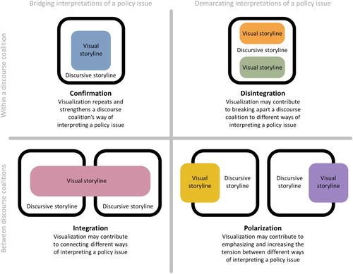
Studying visualization can add an ocular dimension (see Green, Citation2010) to the dynamic discourse coalitions approach (see Metze & Dodge, Citation2016). The degree of coherence between visual storylines and discursive storylines may contribute to four forms of discourse coalition evolution: confirmation, disintegration; integration; polarization (see ).
A single discourse coalition may confirm its storyline through visualization. When confirmation occurs, a discourse coalition strengthens the interpretation of a policy issue. For example, the circulation of the known photographFootnote1 from the documentary film Gasland confirms a storyline of a discourse coalition on environmental risk: that of fracking posing a risk to drinking water (see also below).
A single discourse coalition may be disintegrated when visualization communicates multiple distinct visual storylines. For example, Uggla (Citation2018) illustrates how using images in EU biodiversity policy brochures develops various, partly conflicting, themes (e.g. ‘humans appreciate and are comforted by nature’ and ‘humans both use and destroy nature’). These various visual themes might contribute to the disintegration of a single discourse coalition that focuses on policy as a means to preserve biodiversity.
Multiple discourse coalitions may be integrated when visualization communicates a single visual storyline. For example, Doerr (Citation2017) explores how far-right activists from different countries in Europe use cartoon images to create solidarity among publics from a spectrum of groups and countries. This might indicate the integration of different discourse coalitions.
Multiple discourse coalitions may be polarized when visualization communicates multiple visual storylines that are very different one from another. For example, Clancy and Clancy (Citation2016) illustrate how the dissemination of images via the internet by GMO opponents contributed to a shift away from rationality in the GMO political debate. This might contribute to a polarization between two coalitions, pro- and anti-GMO, in the GMO debate.
Figure 1. Four forms of discourse coalition evolution (adapted from Metze & Dodge, Citation2016).
3. Method of investigating the visual controversy
To explore how visualizations influence dynamics within a discourse coalition and between competing discourse coalitions in the shale gas controversy, we turned to the internet, as it is a source of studying society (Rogers, Citation2013) and a realm where controversial issues are debated (Marres & Rogers, Citation2005). We gathered data from webpages in the three selected internet regions. In the three regions, the two similar aforementioned discursive tensions are observed, one between the framing of shale gas as an economic opportunity and as an environmental risk, and another between the framing of shale gas as a transition fuel and as a delayer of the transition to renewables (De Wit, Citation2011; Dodge & Metze, Citation2017). However, in the literature, next to a similarity in mechanisms capable of influencing the dynamics of the controversy (see Metze & Dodge, Citation2016), notable regional differences are reported in the framing of the issue and the concerns about it; for example, in the USA the job-opportunity versus boom–bust economy framing was important (Dodge & Lee, Citation2017; Howell et al., Citation2017), in the Netherlands, ‘business as usual’ was a dominant frame when the controversy over shale gas arose (Metze, Citation2017), whereas, in South Africa, water shortages were a main environmental issue (Andreasson, Citation2018). Hence, webpages from this range of internet regions gave us (a) a broad variety in discourse coalitions and (b) diversity in the visualizations used by actors. Webpages are an ideal data source for collecting visualizations in their discursive context as they very often consist of both text and visuals.
3.1 Data gathering
Two different search strategies were applied to ensure a comprehensive actor list composed of traditional political actors and digital actors. First, an actor analysis was conducted based on descriptions of the evolution of the controversy in academic papers (Andreasson, Citation2018; Bomberg, Citation2017a; Cuppen et al., Citation2016; Dodge & Lee, Citation2017; Finkeldey, Citation2018; Metze, Citation2017). Second, a range of digital methods and tools was used (Rogers, Citation2013).Footnote2 These two strategies resulted in a list of 98 actors. We then used Google to locate each actor's website (URL).
From the list of websites, we identified webpages with text and visuals that their topic is hydraulic fracturing for shale gas extraction,Footnote3 and we downloaded these webpages.Footnote4 A total of 96 webpages and 205 visualizations on these websites were collected.
3.2 Data analysis
The downloaded in-text visualizations were coded in Atlas.ti software, that enables qualitative data analysis of both text and visual content. We first identified frames based on the text. Frames were coded deductively based on existing frame analyses of the shale gas controversy. We also identified themes in previous studies that have the potential to evolve into frames (candidate frames). Candidate frames that reflected ‘repeated patterns of meaning’ (Braun & Clarke, Citation2006, p. 86) were defined as frames.Footnote5 An analysis was conducted of the discursive storylines composed of collections of frames. Actors with a similar discursive storyline form a discourse coalition.
The next step was to conduct a visual analysis: in each visualization, we identified the type of visualization, for example, map, photograph, diagram, infographic, cartoon. In addition, we used a visual content analysis (Bell, Citation2001; Rose, Citation2001) to code what the visualization depicts, for example, natural landscape, industrial site, people, words. We then used the type and content to identify similar visualizations. Finally, in those similar visualizations, we coded the visual storyline by performing a detailed analysis of the key themes and the particular way they are represented in (see Rose, Citation2001, pp. 151–158).
4. Empirical examples: visual storylines
To show a possible interplay between the visual and textual storylines and to be able to make ‘grounded’ claims (meaning, claims that are associated with the controversy in the three locations, see Rogers, Citation2013), we selected as empirical examples three types of visualization: photographs, maps, and infographics. We ensured that these types of visualization, which occur the most in our dataset, are evenly distributed over the three internet regions. While photographs suggest a seemingly authentic representation of reality, maps and infographics are two types of data visualizations designed to communicate data in a more graphic and easily accessible way. We selected those cases that we believe illustrate in the most interesting way the four dynamics between the discursive storyline and the visual storyline discourse coalitions employ.
4.1 Confirmation of one discourse coalition: the example of photographs of flames in the NY controversy
In the NY shale gas controversy, previous research identified the environmental threat discourse coalition (Dodge & Lee, Citation2017). Actors belonging to this coalition – environmental organizations, members of the public, public officials, and lawmakers – use a discursive storyline that focuses on the undesirable environmental impacts of fracking by casting doubt on existing knowledge and the preparedness of institutions (Dodge & Lee, Citation2017, p. 21).
Two actors in this coalition, the Natural Resources Defense Council (NRDC) and Sierra Club, both use photographs of flames. NRDC uses a photograph of someone who ignites a flame from a flow of water on the ground and narrates a storyline of risk to our water sources (see (a)Footnote6); Sierra Club's photograph depicts the burning of natural gas from a well near a cornfield and narrates a storyline of risk to agricultural yield (see (b)Footnote7).
Figure 2. (a) NRDC photograph of David Headley igniting a flow of water, shot by director Joshua B. Pribanic of Public Herald Studios for the documentary Triple Divide, licensed under CC BY-NC-ND 2.0 , source: https://tripledividefilm.org. (b) Sierra Club photograph of a gas flare, shot by Karen Kasmauski, source: https://www.sierraclub.org/sierra/green-life/life-not-pretty-picture-fracking-epicenter-photography-people. (c) Discourse coalition and visualizations depicting flames in the NY controversy.
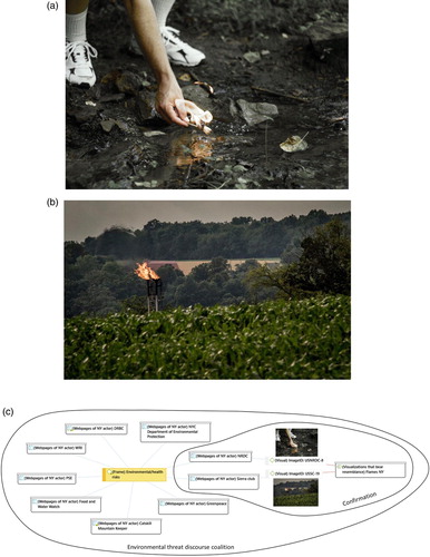
By narrating a storyline of environmental risk in both photographs, these actors contribute to the confirmation of the environmental threat discourse coalition (see (c)). The risk storyline, which is also part of the textual narrative accompanying the visualizations, is narrated through the photographs in two distinct ways. NRDC narrates a risk storyline by strengthening a connection that has already been made between a threat to drinking water and fracking. Sierra Club narrates a risk storyline by visually focusing on the proximity of an existing well fire to a cornfield. By using photographs that depict flames, members of the coalition repeat the narrative of environmental risk and thus confirm their discourse coalition's discursive storyline.
4.2 Disintegration of one discourse coalition: the example of maps in the SA controversy
In the SA controversy, an agnotological coalition can be identified. The name refers to what Proctor (Citation2008) calls agnotology – the production of ignorance, for instance by the publication of inaccurate or misleading data. Actors belonging to this coalition use a discursive storyline that focuses on the unknowns with regard to the technology and claim that more research is needed in the SA context in order to drill for shale gas safely. They do so by utilizing frames that reflect contradicting normative standpoints: the pro-frames – economic opportunity and geopolitics – according to which shale gas provides energy security and/or independence from other countries (see, for example, Andreasson, Citation2018; Ingle & Atkinson, Citation2015), and the anti-frame – environmental/health risks. The Department of Mineral Resources (DMR), a governmental actor, and the Council for Geoscience (CGS), a national science council, are members of the agnotological discourse coalition.
The two actors use similar data visualizations: maps. Such maps have often been used in the shale gas controversy (Metze, Citation2018) to communicate (seemingly) neutral information. These maps show the geological underground of the Karoo (see https://www.dmr.gov.za/mineral-policy-promotion/shale-gas Footnote8 and (a)Footnote9). However, the CGS adds an area in light blue that represents suggestions about ‘sweet spots’,Footnote10 the best places for shale gas exploration.
Figure 3. (a) CGS map showing the area earmarked as the shale gas sweet spot in Beaufort West, which is a chosen site for the Karoo Deep Drilling Program, source: the Council for Geoscience. (b) Discourse coalition and visualizations depicting maps with geological information in SA.
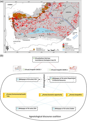
The two maps – one without and one with sweet spots – communicate two different visual storylines. According to the DMR's map, data show that there are geological potentials for shale gas retrieval, with no indication of whether this indeed should be done. The CGS communicates, using the map, data relevant to a successful shale gas retrieval. Two actors belonging to the same discourse coalition use visualizations based on different knowledge bases, thereby leading to different visual storylines and potentially contributing to discourse coalition disintegration (see (b)).
The fact that the visualizations of the DMR and the CGS are allegedly the same, but actually relate to two ways of interpreting reality, echoes the ambiguity in the way the DMR is acting in the context of SA's shale gas development. According to Atkinson (Citation2018), the DMR is supposed to collaborate with local offices in the provinces but in reality, its approach is rather central. This vague stance might cause the DMR's position within its discourse coalition to be indefinite and the coalition to be less coherent. Visualizations – this example shows – are an important indicator of this lack of coherence within a discourse coalition.
4.3 Integration of two discourse coalitions: the example of landscape photographs in the SA controversy
In the SA controversy, we examined two discourse coalitions: the abovementioned agnotological coalition and the environmental risk coalition. The latter focuses on the potential risks that fracking poses to communities and to the environment, given the unique characteristics of the Karoo basin (Atkinson, Citation2018; De Wit, Citation2011; Tucker & van Tonder, Citation2015). In our study, we identified three NGOs that belong to this coalition, and this example focuses on one of them: the Treasure Karoo Action Group (TKAG), which aims ‘to ensure awareness, advocacy, accountability and fair decision-making around the issue of shale gas mining in South Africa’.Footnote11 The TKAG was the first sign of civil opposition to shale gas and succeeded in mobilizing publics shortly after it was launched (Ingle & Atkinson, Citation2015, p. 540).
Another member of the agnotological coalition is a team of science councils who is working on a Strategic Environmental Assessment (SEA) for Shale Gas Development. This team consists of members of three science councils (one of them is the aforementioned CGS). The commission was launched in May 2015 by the Minister of Environmental Affairs, joined by other relevant authorities. The project aim was to deliver a scientific assessment of the Karoo region and to use the assessment as the evidence base from which to develop appropriate decision making.Footnote12
The two discourse coalitions – environmental risk and agnotological – have different discursive storylines, one that focuses on the potential risks to communities and to the environment and another that focuses on the unknowns and claims that more research is needed. However, they communicate a shared visual storyline by using a photograph depicting a water pumping mill, also called a wind pump or steel flowersFootnote13 (see (a), https://www.treasurethekaroo.co.za Footnote14, and http://seasgd.csir.co.za Footnote15). This mill symbolizes the identity of the Karoo, and it narrates how locals produce energy to pump up water in this dry area (Jorritsma, Citation2012; Marais, Citation2013).
Figure 4. (a) Water pumping mill, source: Pxfuel. (b) Discourse coalitions and photographs of wind pumps in the South African controversy.
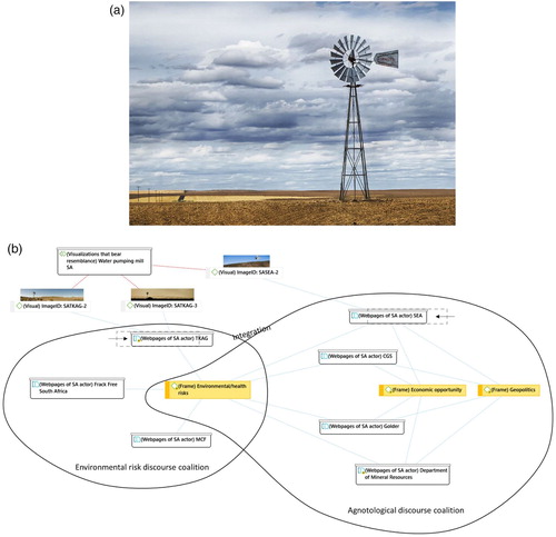
The use of this similar photograph of the Karoo wind pump narrates the story of energy-independent and dry Karoo. This shared visual storyline might contribute to an integration of two discourse coalitions – environmental risk and agnotological (see (b)). The textual analysis on the TKAG's webpage supports this finding: the text declares that the TKAG ‘stand(s) in opposition to the licencing of shale gas exploration’.Footnote16 Yet, it implies that the TKAG supports the SEA project, perhaps in the hope that it will provide proof that drilling for shale gas is harmful to the environment in the Karoo context.
4.4 Polarization of two discourse coalition
Among the examples that we chose to illustrate how visualization contributes to discourse coalition dynamics, we have three of possible polarization.
Example 1: infographics in the NY controversy
The first example compares two competing discourse coalitions in the NY controversy: the environmental threat discourse coalition (see section 4.1) and the gas rush discourse coalition. The latter frames fracking as an economic opportunity for landlords and local governments and consists of oil and gas industry representatives, the staff of the Department of Environmental Conservation in the Division of Mineral Resources, representatives of the Chemung and New York Farm Bureau, landowners, and local officials (Dodge & Lee, Citation2017, pp. 19–20).
Three actors belonging to these conflicting discourse coalitions depict similar infographics that describe a well construction. One actor is the New York State Water Resources Institute (NYSWRI), which belongs to the environmental threat discourse coalition. From the gas rush discourse coalition, we have the energy company Hess and Marcellus Shale Coalition (MSC) – a coalition that promotes shale gas production in the US.
The Hess and the MSC infographics depict the drilling technique. In the visualizations and the accompanying text, the two actors narrate about the safety of the technique and visually show the multiple casing that makes a shale well safe (see https://www.hess.com/sustainability/environment/shale-energy Footnote17 and https://marcelluscoalition.org/marcellus-shale/production-processes/casing-the-well Footnote18). By contrast, the NYSWRI infographic shows the multiple casing in context and as part of a complete well, including the subterranean layers through which it drills and the formation that it aims to reach (the hydrocarbon-bearing formation) (see (a)Footnote19).
Figure 5. (a) NYSWRI's infographic of a drilling well, source: the United States Environmental Protection Agency. (b) Discourse coalitions and visualizations depicting hydraulic fracturing well in infographics in the NY controversy.
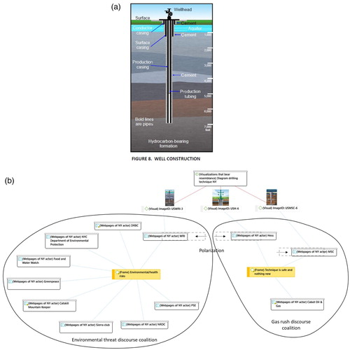
The impact of the visual technique of zooming out is twofold: first, it is showing more details about the subject (a well); second, it is informing the audience about the bigger picture, the broader context within which the subject is being used. Zooming out offers the viewer a particular viewing position and is a distinct and powerful visualizing technique (Rose, Citation2001, pp. 40–44). Through the use of this visual technique, differences between the discursive storylines of the two discourse coalitions are emphasized in the visual storyline; this may contribute to the polarization of the two discourse coalitions (see (b)).
Example 2: photographs in the Dutch controversy
The second example of discourse coalition polarization comes from the Dutch controversy. We examined two discourse coalitions with conflicting discursive storylines: business-as-usual and environmental risk. While the business-as-usual coalition frames fracking as an economic opportunity, given the long Dutch experience of producing and relying on natural gas, the environmental risk coalition expresses concerns about the negative environmental impact of fracking, mainly based on academic reports and incidents (Metze, Citation2017).
The actor Cuadrilla Resources, a gas company that received a local permit to test drilling for shale gas, belongs to the business-as-usual discourse coalition, which consists of mainly gas companies, national and local governmental actors, and experts (Metze, Citation2017, p. 42). The actor Schaliegasvrij Nederland (Shale Gas Free Netherlands, an NGO that opposes fracking), belongs to the environmental risk discourse coalition which consists of mainly activists, politicians, and journalists (Metze, Citation2017, p. 43).
Both actors use in their websites photographs of flames. Schaliegasvrij Nederland uses the well-known photograph of a flaming faucet from Gasland (see the second banner image of the website https://www.schaliegasvrij.nl Footnote20). This photograph goes beyond the simple depiction of what is photographed. It also communicates something intangible and experiential we cannot really see (see Mirzoeff, Citation1999, p. 5), namely the sensation of risk. It does so by depicting a particular image of flames: big yellow flames in a place where they do not belong. By contrast, Cuadrilla uses a photograph of a gas used for cooking and narrates a different storyline: one of a Dutch routine activity (see https://web.archive.org/web/20161109215926/http://www.cuadrillaresources.nl/boren-naar-schaliegas/film-gasland Footnote21). The flames depicted in the Caudrilla photograph are coming from an object from which they are supposed to come – a cooking stove (see (a)). This perhaps also narrates the necessity of having gas and the casual way in which we use flammable gas in our homes.
Figure 6. (a) Cooking stove flame, source: Pxfuel. (b) Discourse coalitions and photographs depicting flames in the Dutch controversy.
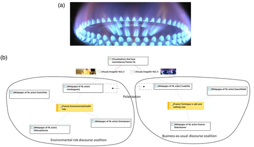
The two very different visual storylines, of risk and of a routine activity, stand out, given that they both use the same visual element – flames. The unique use of this visual element emphasizes the distance between different ways of interpreting the policy issue. Thus, the visual storyline increases the tension between the two discourse coalitions and may contribute to polarization (see (b)).
Example 3: use of maps in the Dutch controversy
A last example of polarization also comes from the Dutch controversy. Two discourse coalitions that we examined in this example are the environmental risk coalition and a coalition for which we borrow the term ‘agnotological’. Similar to the SA agnotological discourse coalition, the discursive storyline of the latter coalition reflects a balanced way of interpreting the shale gas issue. It does so by utilizing contradicting normative frames: in this case, the pro-frame – bridge fuel or cleaner energy source – according to which shale gas is relatively ‘clean’ and therefore a step toward a more sustainable energy future, and the anti-frame – environmental/health risks. From the actors belonging to this coalition, we focus in this example on RIVM, the National Research Institute for Public Health and the Environment.
The actor RIVM from the agnotological discourse coalition and the aforementioned actor Schaliegasvrij Nederland from the environmental risk discourse coalition use maps of shale gas reserves in the Netherlands (see (a,b)). RIVM uses a map made by TNO, the Netherlands Organisation for Applied Scientific Research. This map shows the geological layers where shale gas may be found in the Netherlands. Schaliegasvrij Nederland uses a similar map. However, on top of the layer showing potential shale gas reserves (in grey), it adds information about the areas in which exploration permits were issued (marked with a red line) and communities that declared themselves shale gas free (in green).
Figure 7. (a) RIVM map of shale gas reserves in the Netherlands, source: https://www.rivm.nl/schaliegas/schaliegas-en-winning (b) Schaliegasvrij map of shale gas reserves in the Netherlands and provinces and municipalities that have declared themselves shale gas free, source: https://www.schaliegasvrij.nl (c) Discourse coalitions and maps about shale gas in the Netherlands.
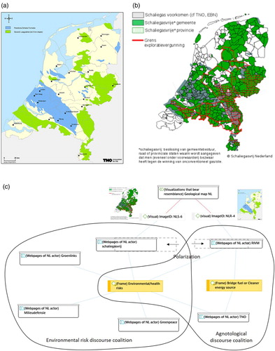
The two Dutch actors communicate two different visual storylines through using these maps. RIVM narrates a storyline of potential, either for an economically prosperous future for the Netherlands or for a future of energy security (or both). Interestingly, the text adjacent to the map points out uncertainties involved in exploiting the potential. But while this text, together with the map, communicates a balanced way of interpreting the shale gas issue, the visual narrates a promise. The other actor, Schaliegasvrij Nederland, narrates a different storyline. By showing three layers of information – the geological data, the drilling permits, and the opposition to shale gas – it narrates a complete story of geological potential, a legal act that follows it, and opposition to this legal act (see also Metze, Citation2018). Among these three layers, the visually most distinct one is of the communities that declared themselves shale gas free, making opposition the most dominant narrative of the map.
RIVM and Schaliegasvrij Nederland use similar visualizations. Yet, by narrating two conflicting storylines through these visualizations – one of potential, the other of opposition – the two actors are positioned at a distance from each other (see (c)). This repositioning of actors within their discourse coalition may contribute to polarization between the two coalitions and to increasing the tension between them.
5. Discussion of the visual storylines
The visual and the quality of seeing have been used as a means of engaging in a democracy as noticed, for example, in Rosanvallon’s (Citation2008) notion of counter-democracy, Keane’s (Citation2009) monitory democracy, and Green’s (Citation2010) ocular democracy. These writers emphasize the role of the eye in supervising political acts of governments and other actors. Green (Citation2010), specifically, assigns great importance to the visibility of unplanned occurrences that constitute a politician's everyday life. According to him, these unpredictable events and their uncontrolled visuality are inherently part of politics (Green, Citation2010, p. 20). What does the study of the degree of coherence between discursive and visual storylines contribute to this notion? The practice of visualizing by a discourse coalition makes the discursive storyline – the collection of ideas, verbal statements, and storylines – visible, perhaps in the same way that spontaneous events reveal something about political leaders. A high degree of coherence between the visual and the discursive storylines, especially when visualizing done unthinkingly, might reflect sincerity and honesty – ‘candor’, in Green’s (Citation2010) words. These qualities are valuable in policy controversies in a democratic society.
Our analysis shows that visual and discursive storylines can create a coherent whole. When this happens within a discourse coalition, actors that use the visual narrative form a visual discourse coalition (VDC), a network of actors that share a similar discursive storyline and a similar visual storyline of the controversy. Actors belonging to the same VDC interpret reality in a shared way and may also be connected to one another through shared associations – because visuals have a unique quality of relying on their audience's associative world in their reasoning (Clancy & Clancy, Citation2016). Thus, in the flammable faucet example, an association between yellow flames coming from a drinking water tap and risk is needed to strengthen a storyline of environmental risk.
Another quality of visualizations stands out due to the fact that they seemingly offer evidence of something that is currently happening or has happened in the past (Hansen, Citation2011). Thus, the maps of areas where shale gas could be retrieved suggest some form of ocular proof. At the same time, our map examples show how visual supplements can offer proof of different types of truths which are dependent on interpretation – both of the visualization and of the reality it represents. This makes visualizations a particular type of boundary object (see also An & Powe, Citation2015; Morseletto, Citation2017, p. 41; Metze, Citation2020, Citation2010). Their evidential nature and their multi-interpretability make them objects that are ‘weakly structured in common use, and become strongly structured in individual use’ (Star & Griesemer, Citation1989, p. 393). Our study adds to the study of the concept of boundary object by investigating it in a situation of conflict. As an exploratory study, it lays the foundation for future work that will investigate different meanings that actors assign to a visualization while engaging with it as producers or as viewers.
Discerning the type of visualization may lead to new insights about the contribution of visualizations to the evolution of discourse coalitions. Our empirical examples suggest that photographs and data visualizations (maps, infographics) produce a visual narrative in different ways. Photographs overtly narrate a storyline (of risk or of energy independence in a dry area), whereas data visualizations narrate a storyline more subtly. A careful look at the data visualizations is needed to decode their visual storylines and to reveal differences between them – perhaps because data visualizations commonly represent reality in a more abstract way than photographs. Moreover, in our empirical examples, differences between visual narratives in maps and in infographics are caused by different visual techniques: maps differentiate between two storylines by adding a layer of data; infographics do that by using the technique of zooming out. The zooming technique is acknowledged also in the literature (Schneider & Walsh, Citation2019) as a means of materializing a politically problematic issue. Further research is needed to better understand the role of the types (infographics, photographs, maps, and so on) of visualizations and their specific characteristics in discourse formation.
Our approach attends to the role visualizations play in creating online publics. Because of their unique characteristics and the affordance of the internet (see Rogers, Citation2013), online visualizations are capable of mobilizing publics and creating a global community. However, visualizations considered as ‘global’ to some audiences might narrate a different story to other audiences, as shown by Jasanoff (Citation2004). In addition, studies that use the internet as a source often consider the online space that is networked around an issue as a locative and demarcated space (Rogers, Citation2013). Our study uses the notion of differences in interpretations among audiences as a starting point. It does so by selecting different internet regions for studying visualizations employed by discourse coalitions. And indeed, in some of our empirical examples, the analysis reveals a distinct ‘local’ visual storyline such as an identity of an area or a routine activity. By remaining alert to a possible emergence of both domestic and global storylines, we contribute to a more nuanced understanding of the organization of publics around a controversial issue.
6. Conclusion
Visualizations play various roles in discourse coalition formation. Although our approach does not try to detect causal relations between the use of visualizations and the dynamic evolution of discourse coalitions, it does allow for the study of the delicate interplay between visual and textual storylines and reveals how and when visual and discursive storylines overlap and a VDC is formed. The analysis utilizes visual data to contribute to the understanding of the mechanisms shaping policy controversies and the emergence of publics and issues in them. These emerging publics are increasingly important in the governance of controversies. This study also responds to the call for increased attention to the effects framing of an issue has on the organization of publics (Marres & Rogers, Citation2005; van Beek et al., Citationin press), as it casts light on non-linguistic elements that may influence the dynamics of framing and the establishment of discourses.
The VDC concept opens up new ways of research as it integrates discourse analysis with visual analysis. The added visual dimension is not just an extra layer that gets draped over the controversies. By deploying the notion of VDCs and detecting the visual relations in the formation of discourse networks, it becomes possible to identify the visual formation of various coalitions, such as the environmental threat, agnotological, gas rush, business-as-usual, and environmental risk coalitions.
Acknowledgements
We would like to thank Elaine Teixeira Rabello, Gabriel Valerio-Ureña , and Andrea Benedetti for the collaborative actor analysis using digital methods conducted as part of a visit to the Digital Methods Initiative Summer School 2018 at the University of Amsterdam. Previous versions of this paper were presented at the General Conference of the European Consortium for Political Research (ECPR), Hamburg, 2018, the International Conference in Ideology and Discourse Analysis, Essex, 2019, and the International Seminar Visual Framing of Food Technologies, Wageningen, 2019. We are grateful to the participants in those conferences for their feedback. We are also greatly indebted to Jennifer Dodge, to Public Administration and Policy group members, and to two anonymous reviewers for their valuable comments and suggestions.
Disclosure statement
No potential conflict of interest was reported by the author(s).
Correction Statement
This article has been republished with minor changes. These changes do not impact the academic content of the article.
Additional information
Funding
Notes on contributors
Efrat Gommeh
Efrat Gommeh is a PhD candidate at the Public Administration and Policy group, Wageningen University & Research. She has been trained in Design Management and in Science, Technology and Society (STS). Her research focuses on the role of visualizations in controversies over technological developments.
Huub Dijstelbloem
Huub Dijstelbloem is Professor of Philosophy of Science and Politics at the University of Amsterdam (UvA) and Senior Research Fellow at the Netherlands Scientific Council for Government Policy (WRR) in The Hague. He works on the intersection of philosophy of science and technology and political philosophy. His research engages with questions concerning democracy and technology and the politics of border control and migration policies. Dijstelbloem has been affiliated to University of California San Diego and the Eduardo Mondlane University in Maputo, Centre for Policy Analysis, Mozambique. His research has been published in Nature, Security Dialogue, Geopolitics, International Political Sociology, and Journal of Borderland Studies.
Tamara Metze
Tamara Metze is associate professor in the Public Administration and Policy group, Wageningen University and Research. She works at the intersection of public administration and science and technology studies. Her research concerns questions about the possibility of democratic innovations, with special interest in deliberation, boundary objects, framing, scenario development, energy and food controversies, and urban planning. Metze is project leader of the NWO-MVI project Travelling of Framed Facts and Uncertainties. Her research has been published in a.o. Environmental Communication, Journal of Cleaner Production, Current Opinion in Environmental Sustainability.
Notes
1 In this article, we do not distinguish between a still camera and a motion picture camera, and we refer to the static images that are combined to create an illusion of motion, as photographs.
2 We used the digital snowballing technique (Rogers, Citation2013, p. 23) to find internet actors. We used Google scraper with the keywords ‘shale gas’, ‘hydraulic fracturing’, and ‘fracking’ (search terms based on previous studies, see Finkeldey, Citation2018; Hopke & Simis, Citation2017; Stoutenborough et al., Citation2016) to identify the top-ranked URLs discussing shale gas in each internet region according to Google PageRank metrics. These page-rank metrics indicate the most popular online voices. We extracted actors’ names (manually and with the help of Aylien Text Analysis API tool) from the results.
3 We used the menu of the website, and when that did not lead to any results we used Google search within a domain with the same keywords that were used to identify actors.
4 We excluded advertisements and other unrelated content on the websites.
5 Frame codes were: Bridge fuel or cleaner energy source (Bomberg, Citation2017a; Metze, Citation2017), David v Goliath (Bomberg, Citation2017a), Delay transition to sustainable energy (Metze, Citation2017), Drop in the ocean (Metze, Citation2017), Economic opportunity (Bomberg, Citation2017a; Dodge & Lee, Citation2017), Environmental/health risks (Bomberg, Citation2017a; Dodge & Lee, Citation2017; Metze, Citation2017), Geopolitics (Bomberg, Citation2017a; Cuppen et al., Citation2016; Dodge & Lee, Citation2017), Known risks (Weible et al., Citation2016), Landowner rights (Dodge, Citation2015; Dodge & Lee, Citation2017), Technique is safe and nothing new (Metze, Citation2017), Water scarcity (Andreasson, Citation2018; Atkinson, Citation2018).
6 See https://www.nrdc.org/stories/delaware-river-basin-partial-fracking-ban-partial-victory. For an archived copy of the webpage visit https://web.archive.org/web/20200718075153/https://www.nrdc.org/stories/delaware-river-basin-partial-fracking-ban-partial-victory.
7 For an archived copy of the webpage visit https://web.archive.org/web/20200818095925/https://www.sierraclub.org/sierra/green-life/life-not-pretty-picture-fracking-epicenter-photography-people.
8 For an archived copy of the webpage visit https://web.archive.org/web/20200614062027/http://www.dmr.gov.za/mineral-policy-promotion/shale-gas.
9 See http://www.geoscience.org.za/index.php/key-projects/754-the-karoo-deep-drilling-project. For an archived copy of the webpage visit https://web.archive.org/web/20200820185037/https://www.geoscience.org.za/index.php/key-projects/754-the-karoo-deep-drilling-project
10 According to Schlumberger's Oilfield Glossary, sweet spot is ‘a target location or area within a play or a reservoir that represents the best production or potential production [of shale gas]’ (https://www.glossary.oilfield.slb.com/en/Terms/s/sweet_spot.aspx, accessed 6 September 2019).
11 Source: https://www.treasurethekaroo.co.za/about, accessed 19 February 2020.
12 Source: http://seasgd.csir.co.za/12-may-2015-project-launch/, accessed 19 February 2020.
13 See for example http://karoospace.co.za/windmills-windpumps-or-windpompe/, accessed 12 February 2020.
14 For an archived copy of the webpage visit https://web.archive.org/web/20190921084552/https:/www.treasurethekaroo.co.za.
15 For an archived copy of the webpage visit https://web.archive.org/web/20200721221919/http://seasgd.csir.co.za.
16 Source: https://www.treasurethekaroo.co.za/, accessed 19 February 2020.
17 For an archived copy of the webpage visit https://web.archive.org/web/20200820185737/https://www.hess.com/sustainability/environment/shale-energy.
18 For an archived copy of the webpage visit https://web.archive.org/web/20200708025845/https://marcelluscoalition.org/marcellus-shale/production-processes/casing-the-well.
19 See https://wri.cals.cornell.edu/research-topics/shale-gas/groundwater-impacts. For an archived copy of the webpage visit https://web.archive.org/web/20190614151951/https://wri.cals.cornell.edu/research-topics/shale-gas/groundwater-impacts.
20 For an archived copy of the webpage visit https://web.archive.org/web/20191203151433/https://www.schaliegasvrij.nl.
21 Cuadrilla's Dutch site (www.cuadrillaresources.nl) was accessed in December 2018. The site is no longer available.
References
- An, K., & Powe, N. A. (2015). Enhancing ‘boundary work’ through the Use of virtual reality: Exploring the potential within landscape and visual impact assessment. Journal of Environmental Policy and Planning, 17(5), 673–690. https://doi.org/10.1080/1523908X.2015.1012757
- Andreasson, S. (2018). The bubble that got away? Prospects for shale gas development in South Africa. The Extractive Industries and Society, 5(4), 453–460. https://doi.org/10.1016/j.exis.2018.07.004
- Atkinson, D. (2018). Fracking in a fractured environment: Shale gas mining and institutional dynamics in South Africa’s young democracy. The Extractive Industries and Society, 5(4), 441–452. https://doi.org/10.1016/j.exis.2018.09.013
- Bell, P. (2001). Content analysis of visual images. In T. Van Leeuwen & C. Jewitt (Eds.), Handbook of visual analysis (pp. 10–34). Sage.
- Bleiker, R. (2017). In search of thinking space: Reflections on the aesthetic turn in international political theory. Millennium: Journal of International Studies, 45(2), 258–264. https://doi.org/10.1177/0305829816684262
- Bleiker, R. (2018). Mapping visual global politics. In R. Bleiker (Ed.), Visual global politics (pp. 1–29). Routledge.
- Bomberg, E. (2017a). Fracking and framing in transatlantic perspective: A comparison of shale politics in the US and European Union. Journal of Transatlantic Studies, 15(2), 101–120. https://doi.org/10.1080/14794012.2016.1268789
- Bomberg, E. (2017b). Shale we drill? Discourse dynamics in UK fracking debates. Journal of Environmental Policy and Planning, 19(1), 72–88. https://doi.org/10.1080/1523908X.2015.1053111
- Braun, V., & Clarke, V. (2006). Using thematic analysis in psychology. Antimicrobial Agents and Chemotherapy, 58(2), 7250–7257. https://doi.org/10.1128/AAC.03728-14
- Bulkeley, H. (2000). Discourse coalitions and the Australian climate change policy network. Environment and Planning C: Government and Policy, 18(6), 727–748. https://doi.org/10.1068/c9905j
- Campbell, D. (2007). Geopolitics and visuality: Sighting the Darfur conflict. Political Geography, 26(4), 357–382. https://doi.org/10.1016/j.polgeo.2006.11.005
- Clancy, K. A., & Clancy, B. (2016). Growing monstrous organisms: The construction of anti-GMO visual rhetoric through digital media. Critical Studies in Media Communication, 33(3), 279–292. https://doi.org/10.1080/15295036.2016.1193670
- Cuppen, E., Pesch, U., Remmerswaal, S., & Taanman, M. (2016). Normative diversity, conflict and transition: Shale gas in the Netherlands. Technological Forecasting and Social Change, https://doi.org/10.1016/j.techfore.2016.11.004
- De Wit, M. J. (2011). The great shale debate in the Karoo. South African Journal of Science, 107(7–8), 1–9. https://doi.org/10.4102/sajs.v107i7/8.791
- Dodge, J. (2015). The deliberative potential of civil society organizations: Framing hydraulic fracturing in New York. Policy Studies, 36(3), 249–266. https://doi.org/10.1080/01442872.2015.1065967
- Dodge, J., & Lee, J. (2017). Framing dynamics and political Gridlock: The curious case of hydraulic fracturing in New York. Journal of Environmental Policy and Planning, 19(1), 14–34. https://doi.org/10.1080/1523908X.2015.1116378
- Dodge, J., & Metze, T. (2017). Hydraulic fracturing as an interpretive policy problem: Lessons on energy controversies in Europe and the U.S.A. Journal of Environmental Policy and Planning, 19(1), 1–13. https://doi.org/10.1080/1523908X.2016.1277947
- Doerr, N. (2017). Bridging language barriers, bonding against immigrants: A visual case study of transnational network publics created by far-right activists in Europe. Discourse and Society, 28(1), 3–23. https://doi.org/10.1177/0957926516676689
- Doerr, N., Mattoni, A., & Teune, S. (2015). Visuals in social movements. In D. Della Porta & M. Diani (Eds.), Oxford Handbook of social movements (pp. 557–566). Oxford University Press. https://doi.org/10.1093/oxfordhb/9780199678402.013.48
- Domke, D., Perlmutter, D., & Spratt, M. (2002). The primes of our times? Journalism: Theory, Practice & Criticism, 3(2), 131–159. https://doi.org/10.1177/146488490200300211
- Feindt, P. H., & Oels, A. (2005). Does discourse matter? Discourse analysis in environmental policy making. Journal of Environmental Policy and Planning, 7(3), 161–173. https://doi.org/10.1080/15239080500339638
- Finkeldey, J. (2018). Unconventionally contentious: Frack free South Africa’s challenge to the oil and gas industry. The Extractive Industries and Society, 5(4), 461–468. https://doi.org/10.1016/j.exis.2018.08.006
- Grabe, M. E., & Bucy, E. P. (2009). Image Bite politics. Oxford University Press.
- Green, J. E. (2010). The Eyes of the people. Oxford University Press.
- Hajer, M. (1995). The politics of environmental discourse: Ecological Modernization and the policy process. Oxford University Press.
- Hajer, M., & Versteeg, W. (2005). A decade of discourse analysis of environmental politics: Achievements, challenges, perspectives. Journal of Environmental Policy and Planning, 7(3), 175–184. https://doi.org/10.1080/15239080500339646
- Hansen, A., & Machin, D. (2013). Editors’ introduction: Researching visual environmental communication. Environmental Communication, 7(2), 151–168. https://doi.org/10.1080/17524032.2013.785441
- Hansen, L. (2011). Theorizing the image for security studies: Visual securitization and the Muhammad cartoon Crisis. European Journal of International Relations, 17(1), 51–74. https://doi.org/10.1177/1354066110388593
- Hendriks, C. M., Ercan, S. A., & Duus, S. (2017). A picture worth a thousand words? Visuals in public deliberation.
- Hopke, J. E., & Simis, M. (2017). Discourse over a contested technology on Twitter: A case study of hydraulic fracturing. Public Understanding of Science, 26(1), 105–120. https://doi.org/10.1177/0963662515607725
- Howell, E. L., Li, N., Akin, H., Scheufele, D. A., Xenos, M. A., & Brossard, D. (2017). How do U.S. State residents form opinions about ‘fracking’ in social contexts? A multilevel analysis. Energy Policy, 106(April), 345–355. https://doi.org/10.1016/j.enpol.2017.04.003
- Ingle, M., & Atkinson, D. (2015). Can the circle be squared? An enquiry into shale gas mining in South Africa’s Karoo. Development Southern Africa, 32(5), 539–554. https://doi.org/10.1080/0376835X.2015.1044076
- Jasanoff, S. (2004). Heaven and earth: The politics of environmental images. In S. Jasanoff & M. L. Martello (Eds.), Earthly politics: Local and global in environmental governance (pp. 31–52). The MIT Press.
- Jorritsma, M. (2012). “Don’t Frack with Our Karoo”: water, landscape, and Congregational Song in Kroonvale. Safundi, 13(3–4), 373–391. https://doi.org/10.1080/17533171.2012.715420
- Keane, J. (2009). The life and Death of democracy. W. W. Norton & Company.
- Krause, A., & Bucy, E. P. (2018). Interpreting images of fracking: How visual frames and Standing attitudes shape Perceptions of environmental risk and economic Benefit. Environmental Communication, 12(3), 322–343. https://doi.org/10.1080/17524032.2017.1412996
- Latour, B. (1986). Visualization and cognition: Drawing things together. In H. Kuklick (Ed.), Knowledge and society studies in the Sociology of Culture past and Present (27, pp. 95–151). Jai Press. https://doi.org/10.22394/0869-5377-2017-2-95-151
- Latour, B., & Weibe, P. (2005). Making Things public: Atmospheres of democracy. ZKM Center for Art and Media Karlsruhe and MIT Press.
- Lilleker, D. G., Veneti, A., & Jackson, D. (2019). Introduction: Visual political communication. In A. Veneti, D. Jackson, & D. G. Lilleker (Eds.), Visual political communication (pp. 1–13). Palgrave Macmillan.
- Ludes, P., Nöth, W., & Fahlenbrach, K. (2014). Critical visual theory - Introduction. TripleC, 12(1), 202–213. https://doi.org/10.31269/triplec.v12i1.559
- Marais, C. (2013). Steel flowers – Windpumps of the Karoo. http://karoospace.co.za/steel-flowers-windpumps-of-the-karoo/
- Marres, N., & Rogers, R. (2005). Recipe for tracing issues and their publics on the Web. In B. Latour & P. Weibel (Eds.), Making Things public: Atmospheres of democracy (pp. 922–935). ZKM Center for Art and Media Karlsruhe and MIT Press.
- Mattoni, A., & Teune, S. (2014). Visions of protest. A media-historic perspective on images in social movements. Sociology Compass, 8(6), 876–887. https://doi.org/10.1111/soc4.12173
- Mazur, A. (2016). How did the fracking controversy emerge in the period 2010-2012? Public Understanding of Science, 25(2), 207–222. https://doi.org/10.1177/0963662514545311
- Messaris, P., & Abraham, L. (2011). The role of images in framing news stories. In S. D. Reese, O. H. J. Gandy, & A. E. Grant (Eds.), Public life: Perspectives on media and our understanding of the social world (pp. 1–30). Lawrence Erlbaum Associates. https://doi.org/10.1017/CBO9781107415324.004
- Metze, T. (2010). Innovation Ltd. Boundary work in deliberative governance in land use planning. Eburon Academic Publishers.
- Metze, T. (2017). Fracking the debate: Frame shifts and boundary work in Dutch decision making on shale Gas. Journal of Environmental Policy and Planning, 19(1), 35–52. https://doi.org/10.1080/1523908X.2014.941462
- Metze, T. (2018). Visual framing for policy learning: Internet as the eye of the public. In N. F. Dotti (Ed.), Knowledge, policymaking and learning for European cities and regions (pp. 165–180). Edwar Elgar Publishing.
- Metze, T. (2020). Visualization in environmental policy and planning: a systematic review and research agenda. Journal of Environmental Policy and Planning. https://doi.org/10.1080/1523908X.2020.1798751
- Metze, T., & Dodge, J. (2016). Dynamic discourse coalitions on hydro-fracking in Europe and the United States. Environmental Communication, 10(3), 365–379. https://doi.org/10.1080/17524032.2015.1133437
- Mirzoeff, N. (1999). An introduction to visual culture. Routledge. https://doi.org/10.1146/annurev.ps.29.020178.000335
- Morseletto, P. (2017). Analysing the influence of visualisations in global environmental governance. Environmental Science and Policy, 78(August), 40–48. https://doi.org/10.1016/j.envsci.2017.08.021
- O’Neill, S. J. (2013). Image matters: Climate change imagery in US, UK and Australian newspapers. Geoforum; Journal of Physical, Human, and Regional Geosciences, 49, 10–19. https://doi.org/10.1016/j.geoforum.2013.04.030
- Powell, T. E., Boomgaarden, H. G., De Swert, K., & de Vreese, C. H. (2015). A clearer picture: The contribution of visuals and text to framing effects. Journal of Communication, 65(6), 997–1017. https://doi.org/10.1111/jcom.12184
- Proctor, R. (2008). Agnotology: A missing term to describe the cultural production of ignorance (and its study). In R. Proctor & L. Schiebinger (Eds.), Agnotology: The making and unmaking of ignorance (pp. 1–33). Stanford University Press.
- Rogers, R. (2013). Digital methods. MIT Press.
- Rommetveit, K., & Wynne, B. (2017). Technoscience, imagined publics and public imaginations. Public Understanding of Science, 26(2), 133–147. https://doi.org/10.1177/0963662516663057
- Rosanvallon, P. (2008). Counter-democracy, politics in an age of distrust. Cambridge University Press.
- Rose, G. (2001). Visual methodologies. Sage.
- Schneider, B., & Walsh, L. (2019). The politics of zoom: Problems with downscaling climate visualizations. Geo: Geography and Environment, 6(1), 1–11. https://doi.org/10.1002/geo2.70
- Schön, D. A., & Rein, M. (1994). Frame reflection. Basic Books.
- Star, S. L., & Griesemer, J. R. (1989). Institutional ecology, ‘Translations’ and boundary objects: Amateurs and professionals in Berkeley‘s Museum of Vertebrate Zoology, 1907-39. Social Studies of Science, 19(3), 387–420. https://doi.org/10.1177/030631289019003001
- Stoutenborough, J. W., Robinson, S. E., & Vedlitz, A. (2016). Is “fracking” a new dirty word? The influence of word choice on public views toward natural gas attitudes. Energy Research and Social Science, 17, 52–58. https://doi.org/10.1016/j.erss.2016.04.005
- Tucker, A. R., & van Tonder, G. (2015). The Karoo fracking debate: A Christian contribution to the world communities of Faith. Science and Engineering Ethics, 21(3), 631–653. https://doi.org/10.1007/s11948-014-9563-7
- Uggla, Y. (2018). Framing and visualising biodiversity in EU policy. Journal of Integrative Environmental Sciences, 15, 99–118. https://doi.org/10.1080/1943815X.2018.1455714
- van Beek, L., Metze, T., Kunseler, E., Huitzing, H., de Blois, F., & Wardekker, A. (in press). Environmental visualizations: Framing and reframing between science, policy and society. Environmental Science & Policy.
- Weible, C., Heikkila, T., Ingold, K., & Fischer, M. (2016). Policy Debates on hydraulic fracturing: Comparing coalition politics in North America and Europe. In Policy Debates on hydraulic fracturing. Palgrave Macmillan. https://doi.org/10.22394/0869-5377-2017-2-95-151
- Williams, L., Macnaghten, P., Davies, R., & Curtis, S. (2017). Framing ‘fracking’: Exploring public perceptions of hydraulic fracturing in the United Kingdom. Public Understanding of Science, 26(1), 89–104. https://doi.org/10.1177/0963662515595159