
Abstract
Satellite observations of night-time emitted lights describe a geography of the spatial distribution of resource use. Measurements of nocturnal lights enable the calculation of the total light emitted from each country of the world, and the light emitted per capita. We consider different groups of countries that share a land or maritime border and whose light per capita can be more equally/unequally distributed. A sharp difference in light per capita among neighboring countries reflects marked differences in economic welfare and in the extent of built environments. We demonstrate how this geography of nocturnal lights informs our understanding of the dynamics of conflict at the national and regional scale. We propose an index of regional disparity and test its ability to detect conflict dynamics by relating the index score with the occurrence and intensity of conflicts as classified by the Heidelberg Institute for International Conflict Research’s Conflict Barometer 2012 for the countries of the world. This method can be used to produce a global available temporal sampling of “cold spots” of disparity where conflicts are likely to occur. This will help foresee the identification and monitoring of regions of the world,which are becoming particularly unstable, assisting in the definition and execution of timely and proactive policies.
1. Introduction
Night-time satellite observed lighting enables visualization of human enterprise and presence on Earth (Elvidge et al. Citation2009a, Citation2009b). The intensity of nocturnal lights has been related to resource use, economic production, carbon emissions, and population (Henderson, Storeygard, and Weil Citation2009; Ghosh et al. Citation2010a, Citation2010b; Oda and Maksyutov Citation2011; Sutton et al. Citation2012; Xie and Weng Citation2016; Shi et al. Citation2015). Night-time satellite observations are also used to measure the extent of urban areas and impervious surfaces (Elvidge et al. Citation2007; Sutton et al. Citation2009; Frolking et al. Citation2013). More recently, night-light spatial data have been used to assess trends in light pollution (e.g. Bennie et al. Citation2014), human impact on ecological systems (e.g. Bennie et al. Citation2015), and as a proxy measure of human well-being (Ghosh et al. Citation2013).
One of the advantages in using nocturnal satellite observations as a proxy of anthropogenic phenomena is that they provide a systemic view of a territory. At the same time, they allow the representation of spatial patterns at a more detailed resolution. Consequently, aggregated metrics (e.g. Gross National Product, population, national carbon emissions) can be spatially allocated within a territory. In general, the higher intensity of nocturnal lighting in urban areas corresponds with higher population density and intensive use of resources. Dimly lit or completely dark areas identify rural and wilderness settings. These spatially explicit representations inform our understanding and management of territorial systems, and can be used to support policymaking. Moreover, nocturnal light observations and measurements are available in time series and on a global scale.
Coscieme et al. (Citation2013) used night-time satellite observed lights to implement a “thermodynamic geography … in which a territory is interpreted as a continuum of physical and morphological elements, infrastructures and urban settlements, rather than a combination of separated systems” (Pulselli Citation2010). Different spatial combinations of natural and built environments and areas of energy use and production can be found in different parts of the world. In some regions of the world, this geography can be homogeneous. In other regions of the world, bright areas of intensive energy use and dispersed ecosystems border dark areas of scarce energy availability and an undeveloped built environment. When the gradient through this border is too sharp, economic discontinuities emerge. These discontinuities might be interpreted as due to differences in the rule of law (Pinkovskiy Citation2013). When the border divides different administrative or cultural regions (e.g. countries or provinces) conflicts may emerge. This is particularly true in specific geopolitical contexts where movements of people, goods, resources, and money are limited by containment policies.
A vast amount of literature links night-light trends with the dynamics of armed conflicts (e.g. Kemper et al. Citation2011; Giada et al. Citation2003; Bjorgo Citation2000; Lang et al. Citation2010; Sulik and Edwards Citation2010; Brown Citation2010; Agnew et al. Citation2008; Witmer and O’Loughlin Citation2011). Li, Chen, and Chen (Citation2013) demonstrated how the outbreak of war can reduce night-lights and ceasefire can increase it. Their analysis is consistent at the national scale for over 150 countries. Recently, Li and Li (Citation2014) used night-time light data to monitor the dynamics of the unfolding conflict and consequent humanitarian crisis in Syria. Their results show that the amount of night-light emitted and the lit area declined by more than 70% between 2011 and 2014. Furthermore, the same analysis has been performed at higher spatial resolution for the 14 provinces of Syria, highlighting one of the main advantages in using night-time imagery to investigate socio-economic patterns, i.e. a detailed spatial disaggregation.
Similarly, Shortland, Christopoulou, and Makatsoris (Citation2013) used nightlight images to show the contrast between stable and unstable regions of Somalia, also using specific metrics of light output as a proxy for the incomes of different social groups (see for the case study of Somalia presented in this article). Bharti et al. (Citation2015) used night-time imagery, together with mobile data, to monitor large-scale movements of people surrounding a 2010 humanitarian crisis in Côte d’Ivoire. A similar approach underlies the UN Global Pulse project in Sudan, which investigates the relationship between the distribution of nocturnal emitted lights and poverty (http://sudan-nightlights.unglobalpulse.net/).
In this article, night-light satellite observations are used to spatially visualize different gradients of resource use and economic welfare along shared political borders. At first, a time series analysis of emitted “light per capita” is performed for 200 countries. This “light per capita” of each country is then compared with the “light per capita” of its neighbors, defined as countries that share either a land or maritime border. This allows the identification of particularly unbalanced regions of the world, also providing a complementary method to monitor possible conflict dynamics and territoriality impacts in a timely and effective manner. Building on previous literature (mainly focused on the national and local scale), this article aims at extending the analysis of the relationship between night-lights, disparity, and conflicts, at the regional scale (also providing accessible data for further research; Tables S1 and S2).
2. Materials and methods
Visible emitted light at night can be detected by satellites equipped with specialized sensors. A repetition of the observations is needed to exclude areas obscured by clouds, remove ephemeral lights, and background noise (Elvidge et al. Citation2001). The longest available time series of night-light data is provided by six satellites within the Operational Linescan System (OLS) flown by the U.S. Air Force Defense Meteorological Satellite Program (DMSP). The DMSP OLS data are archived at the NOAA National Geophysical Data Center (NGDC) (Elvidge et al. Citation2009b). In order to effectively compare different data products in different years, an intercalibration is needed. The intercalibration performed on the data used in this analysis is based on an empirical procedure relying on the assumption that emitted lights changed little in a reference area (Elvidge et al. Citation2009c). Intercalibrated data are available at http://ngdc.noaa.gov/eog/dmsp/download_national_trend.html. Please refer to Elvidge et al. (Citation2009c) for a detailed description of the intercalibration procedure and the data extraction.
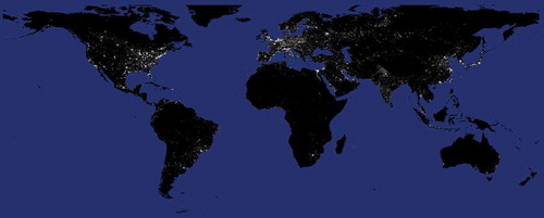
Annual data products of the world’s city lights have been assembled in a global latitude-longitude grid (Plate Carree projection) with a resolution of 30 arc seconds, or approximately 1 km2 at the equator (). The time series data products include an average digital brightness value for detected lights relative to each country of the world from 1992 to 2012. This value is a measure of the total brightness of nocturnal observed lights within a nation, after intercalibration, calculated for each 1 km2 pixel and stretching from 0, for completely dark areas, to 63, associated with the maximum brightness observable by the sensor before saturating.
Figure 1. DMSP stable lights for the year 2012. For fullcolor versions of the figures in this paper, please see the online version.
We converted national trends of DMSP OLS stable light into national trends of “light per capita” by dividing the average digital brightness value by population. This has been done for 200 countries by using population data available from the World Development Indicators database (WDI) hosted by the World Bank (World Bank Citation2015). The use of per capita values allows rightful comparisons between countries and among different years.
The “light per capita” of each country in each year has been compared with the “light per capita” of its neighbor countries for the same year. Neighbor countries have been identified as countries that share either land or maritime borders. We considered maritime borders as recognized by the United Nations Convention on the Law of the Sea (UN Citation1982), which includes boundaries of territorial waters, contiguous zones and exclusive economic zones (Jagota Citation1985; Prescott Citation1985; Anderson Citation2003; Charney, Colson, and Smith Citation2005). The choice of including maritime borders is motivated by the occurrence of maritime conflicts between neighbor countries for the control of crucial energy and food resources (Welch Citation2016; Aboultaif Citation2016; Morton Citation2016; Kaczynski and Fluharty Citation2002), as well as by the increasing concern over the effects of sea-level rise in future geopolitics (Lusthaus Citation2010; Caron Citation2009). Maritime boundaries define areas of the world such as the Mediterranean, the Gulf of Mexico, the Strait of Malacca or the Gulf of Aden, where inter-country disparities contribute to trigger conflictual dynamics like illegal migration and piracy (Aguirre Citation1998; Simon Citation2011; Lewis Citation2016; Piskunova Citation2015; Menefee Citation2008).
Every country-neighbor pair is characterized by the following ratio:
where lx is the observed value of “light per capita” in the country x, and li is the “light per capita” in its ith neighbor. Consequently, if Δli,x is higher than 1, the country analyzed has a lower value of “light per capita” than its ith neighbor. On the other hand, if Δli,x is lower than 1, the “light per capita” in the country analyzed is higher with respect to its ith neighbor.
A “lights-index of regional disparity” () is then calculated to characterize each country by the average value of the ratios with its neighbors:
where w is the total number of neighbor countries. When the index is equal to 1, lights are homogeneously distributed between country x and its neighbors. In this case, we can state that “light per capita” is balanced within the “region”. Values of the index lower/higher than 1 indicate that country x has a higher/lower “light per capita” value than the average value of its neighbors. In this case, “light per capita” is unbalanced within the “region”.
Very low values of the index indicate that country x plays a prominent role among its neighbors in terms of economic production and per capita use of resources. Very high values of the index indicate that country x has a much lower economic production than its neighbors. We classified countries in five categories according to the distribution of “lights-index of regional disparity” values. In particular, the first two groups are defined according to the first quartile and the median, while the last two are based on the third and fourth quartile respectively. Due to the characteristics of the index, and to its interpretation, a further class has been added to improve the level of detail around unitary values. We then investigated the possible relationship between the average value of the index for each category and the average number of occurring conflicts in the countries included in each category, by performing a regression analysis.
The occurrence of conflicts has been assessed by using the Conflict Barometer for the year 2012 (HIIK Citation2012), being the most recent year for which DMSP-OLS data are available. The Conflict Barometer is developed by the Heidelberg Institute for International Conflict Research (HIIK) at the University of Heidelberg, in cooperation with the Conflict Information System (CONIS) research group. The database includes quantitative and qualitative conflict data, on a global scale. In the database, conflict is defined as “a positional difference, regarding values relevant to a society (the conflict items), between at least two decisive and directly involved actors, which is being carried out using observable and interrelated conflict measures that lie outside established regulatory procedures and threaten core state functions, the international order or hold out the prospect to do so” (HIIK Citation2012). Conflict items include “Ideology/system”, “National power”, “Autonomy”, “Secession”, “Decolonization”, “Subnational predominance”, “Resources”, “Territory”, and “International power”. Each conflict is geographically located and a conflict intensity score is also assessed. Conflict intensity is evaluated in a five-level scale: “dispute”, “non-violent crisis”, “violent crisis”, “limited war”, and “war”. A “dispute” is a conflict carried out without using violence. A “non-violent crisis” implies that one of the actors involved is threatened with violence. “Violent crisis”, “limited war”, and “war”, imply the use of violence and are measured through five proxies that indicate the conflict means and consequences. Conflict means are assessed by considering the type and the manner of use of weapons, and the number of personnel employed. Conflict consequences are assessed by considering the number of casualties and refugees, and the amount of destruction. These five measures are aggregated in a single final score of intensity. The levels of intensity are then grouped into intensity classes: “dispute” and “non-violent crisis” are considered as “low intensity” conflicts, “violent crisis” conflicts are classified as “medium intensity” conflicts, “limited war” and “war” are “high intensity” conflicts (see HIIK Citation2012 for further methodological details on conflict actors, items, and intensity). In our analyses at the country level, we considered all the Conflict Barometer’s conflict intensity classes aggregated in a single number of occurring conflicts for each country. In the analysis at the continental level (see ), we only considered “high intensity” conflicts.
3. Results and discussion
3.1. National trends in “light per capita”
National trends of satellite observed night-lights have been computed for 200 countries from 1992 to 2012 on a per capita basis (data are available in Table SI and represented in Fig. SI). In , a time series is plotted for the U.S.A. as an example. In , Δli,x are plotted for the U.S.A.’s five neighbor countries (i.e. Canada, Cuba, Mexico, Russia and The Bahamas).
From it can be noted how “light per capita” in the U.S.A. oscillated around 0.18 and 0.16 from 1992 to 2000, during the so-called “1990s economic boom”. In this period, the U.S.A. experienced the longest economic expansion in their modern history, after the collapse of U.S.S.R. in 1991 and the end of the Cold War. In March 2001, the 1990s economic boom ended and the value of “light per capita” fell to 0.14 and began a slight but constant declining (it was 0.11 in 2012).
Figure 2. (a) 1992–2012 trend in ‘light per capita’ in the U.S.A. (measured in digital numbers); (b) Ratio of ‘light per capita’ in the U.S.A.’s neighbors over ‘light per capita’ in the U.S.A. Δli,x = 1 represents a perfectly equal distribution of ‘light per capita’ in the region.
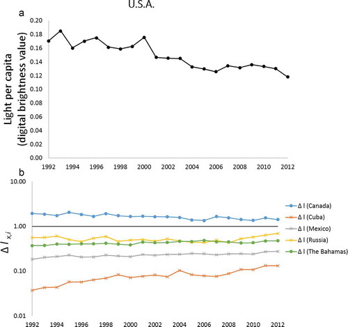
In , a horizontal line identifies a condition of perfect equality between the “light per capita” in the U.S.A. and the “light per capita” of neighbors (Δli,x = 1). It can be noted how the U.S.A. have a prominent role with respect to most of their neighbors. Among them, Cuba and Mexico show the highest gap in “light per capita”. Canada is the only country, among the U.S.A. neighbors, showing a higher value of “light per capita”. Values in in 2012 range from 0.27 for Mexico to 1.42 for Canada.
The same picture appears very different for China (). From it is clear that “light per capita” in China is rapidly increasing since 1992. However, China still has a lower “light per capita” than most of its neighbors (). This will probably no longer be the case in the very near future. In fact, the gap between China and its “brighter” neighbors in 2012 (in order: Russia, Kazakhstan, South Korea, Japan, Mongolia and Kyrgyzstan) is closing fast. China’s “light per capita” surpassed India’s in 2001.
Figure 3. (a) 1992–2012 trend in “light per capita” in China (measured in digital numbers); (b) Ratio of “light per capita” in the China’s neighbors over “light per capita” in China. Δli,x = 1 represents a perfectly equal distribution of “light per capita” in the region.
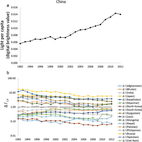
Particularly relevant is the catch up of China with respect to Russia and Kazakhstan between 1992 and 2004/2005. Values in in 2012 range from 0.06 and 0.07 for North Korea and Nepal to 5.82 for Russia. By confronting this range (i.e. 5.76) with the range observed in (i.e. 1.15) it can be noted how U.S.A. and its neighbor countries define a much more homogeneous region than China and its neighbors in terms of “light per capita”.
The relationships between the intensity of nocturnal lights and economic performance have been investigated at the global scale by Henderson, Storeygard, and Weil (Citation2009), and Gosh et al. (Ghosh et al. Citation2010a), among others. A case study for the U.S.A., China (and India) is reported in Kulkarni et al. (Citation2011).
It is relevant for political and conflict geography to observe national trends of night-lights in countries that suffered war during the time period investigated. Civil wars in particular represent the most destabilizing form of conflict within the developing world (Raleigh Citation2011; Raleigh et al. Citation2010). The economic characteristics’ of countries are the strongest indicators of civil war risk and the national economic growth rate is reduced by approximately 2.2% for each year of civil war (Collier Citation1999; Raleigh Citation2011). Furthermore, conflicts overwhelmingly occur in countries where population is directly dependent upon environmental resources, with few interactions with economic/industrial systems (Raleigh Citation2011; Papaioannou Citation2016; von Uexkull Citation2014). These links between civil war impacts and drivers with the economic/environmental dimensions suggest that “light per capita” is sensible to detect the effects of conflicts, being a good proxy of per capita GDP (Henderson, Storeygard, and Weil Citation2009; Ghosh et al. Citation2010b) and due to the fact that dimly lit or dark areas are a good signal of environmental assets and rural settings (Small et al. Citation2011). Several examples of how night-lights data are affected by conflicts are illustrated in –. These examples have been chosen based on the relevant overlapping between the time-frame of conflict events and the time-frame covered by the available night-lights data. Further case studies could be selected and explored by using data from Table S1 and S2.
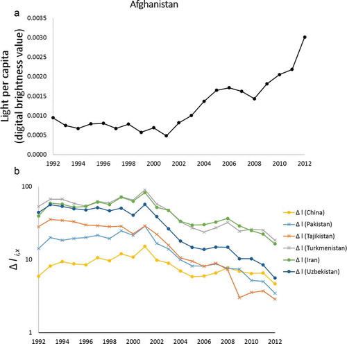
The impact of civil war in Afghanistan, from 1992 to 2001, is clear from . During that period, “light per capita” remained low, slightly decreasing (), and Afghanistan had the lowest values among its neighbors (). The very high values of Δli,x (up to 90) highlight how unbalanced the region was before 2001. After the United Front prevailed over the Taliban in Kabul and, soon after, in the rest of the country (between November and December 2001) “light per capita” rose fast () from 0.0004 to 0.003. Despite these developments Afghanistan remains the least prominent country in its region (conflicts officially lasted until the end of 2014). However, the distribution of “light per capita” among Afghanistan and its neighbors appears much more balanced in 2012 than it was between 1992 and 2001 ().
Figure 4. (a) 1992–2012 trend in “light per capita” in Afghanistan (measured in digital numbers); (b) Ratio of “light per capita” in the Afghanistan’s neighbors over “light per capita” in Afghanistan. Δli,x = 1 represents a perfectly equal distribution of “light per capita” in the region.
The case of the Southern African state of Angola () presents some similarities with the dynamics observed for Afghanistan. In fact, here also a civil war (started in the middle ‘70 s after de-colonialization from Portugal) ended in the early 2000s (i.e. 2002). The recovery of Angola, as observed by “light per capita” increase, is clearly visible in .
Figure 5. (a) 1992–2012 trend in “light per capita” in Angola (measured in digital numbers); (b) Ratio of “light per capita” in the Angola’s neighbors over “light per capita” in Angola. Δli,x = 1 represents a perfectly equal distribution of “light per capita” in the region.
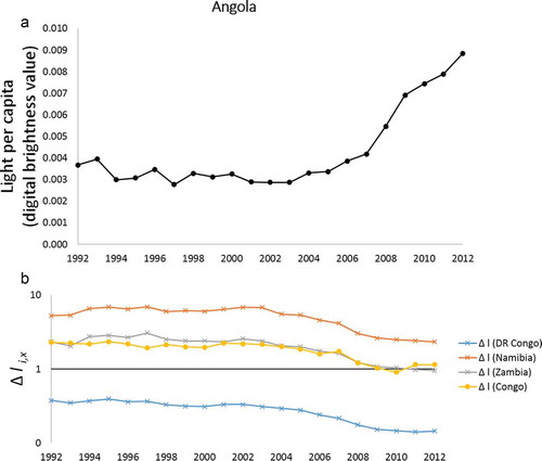
Compared to Afghanistan (), values of “light per capita” in Angola are higher (0.008 in 2012, for example) and expected to rise due to the remarkable mutual trade flow existing with China (Tan-Mullins, Mohan, and Power Citation2010). The shift from a very unbalanced situation to a more balanced one among the Angola’s neighbor countries is shown in .
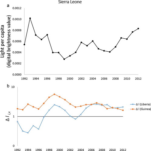
The last two cases reported ( and ) present different dynamics and are characterized by events that happened earlier in the time series, compared to what reported so far ( and ). The trend in “light per capita” of Sierra Leone has a negative slope from 1993 to 1999 (). Sierra Leone’s civil war escalated from 1991 to December 1992, and in December 1999 the UN peacekeepers began arriving in the country.
A number of UN troops were in force until the end of civil war in 2002. The effects of these events are observable from “light per capita” trend in and Sierra Leone Δli,x in . Sierra Leone and its neighbor countries are characterized in 2012 by a much more balanced distribution of “light per capita” compared to the values of Δli,x observed between 1998 and 2001 (). Notice however how both absolute and relative values of “light per capita” are not so different from the initial values of the series, at the eve of civil war.
Figure 6. (a) 1992–2012 trend in “light per capita” in Sierra Leone (measured in digital numbers); (b) Ratio of “light per capita” in the Sierra Leone’s neighbors over “light per capita” in Sierra Leone. Δli,x = 1 represents a perfectly equal distribution of “light per capita” in the region.
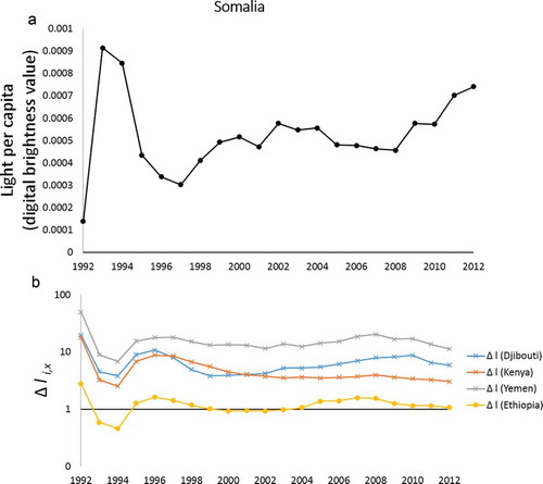
The last example reported is the case of Somalia (). The Somali Civil War started in 1988–1990, however, most of the fighting happened in 1990–92. In 1993 UN peacekeepers landed to retire in 1995. Despite the fact that the Somali Civil War is ongoing, fighting has become shorter, less intense, and more localized after 1995. A decreasing trend is observable between 1993 and 1997 in “light per capita” (). An oscillating increasing trend characterizes 1998–2012 time series. However, Somalia remains the country of its region with the lowest value of “light per capita”, and Δli,x in 2012 reached values of 1, 3, 5 and 11 with respect to its four neighbors ().
Figure 7. (a) 1992–2012 trend in “light per capita” in Somalia (measured in digital numbers); (b) Ratio of “light per capita” in the Somalia’s neighbors over “light per capita” in Somalia. Δli,x = 1 represents a perfectly equal distribution of “light per capita” in the region.
The detectability of the effects of war by observing nocturnal lights at the national scale can be explained by several factors: war produces a devastation of infrastructures and built environments in general (Li, Chen, and Chen Citation2013); during war, industrial production and commercial activities may be reduced; movements of people and nocturnal activity in urban areas are reduced as well; in some cases, city lights are deliberately switched off to avoid bombing; in case of long term events, migratory fluxes cause a decreasing population in the country at war; total population may also be sensibly reduced as a direct effect of conflicts (i.e. casualties). All these aspects cause a reduction in total emitted light that can be detected by night-time satellites. This affects at the same time night-lights within the country considered, and the homogeneity/heterogeneity of the distribution of night-lights in the region.
3.2. A geography of “light per capita” disparity
The effects of local conflicts can extend beyond national borders (e.g. as observed during the ongoing refugee crisis). It is thus relevant to monitor night-light trends at larger scales. In the “lights-index of regional disparity” () is mapped considering the most recent available data, i.e. 2012. Five categories have been identified, following the distribution of the index values. Green areas on the map identify balanced regions with an equal cross-country distribution of “light per capita”. Yellow, orange, and red areas identify unbalanced regions where the cross-country distribution of “light per capita” is unequal. is a list of the countries characterized by the highest values of the index, i.e. the countries represented in red in . According to Li, Chen, and Chen (Citation2013), countries with a population smaller than 500,000 people are not reported in due to the fact that countries with very small population may have very little amount of night-time light which can be easily impacted by data noise. After Li, Chen, and Chen (Citation2013), Comoros and Solomon Islands are also excluded from the analysis since they present very extreme high or low values in several years. A total of 29 over 31 countries listed in are experiencing ongoing violent conflicts in 2012 at the subnational, national, or extra-national level, according to the Conflict Barometer 2012 (HIIK Citation2012). Examples of the latter case are the autonomy conflict between the Albanian minority and ethnic Macedonians (in FYROM), or the Albanian supported secession conflict in Kosovo (HIIK Citation2012).
Figure 8. “Lights-index of regional disparity” in 200 countries of the world for the year 2012. Countries in yellow/orange/red have values of “light per capita” increasingly lower than their neighbor countries. Countries in green have values of “light per capita” higher than their neighbor countries.
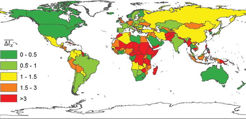
Table 1. List of countries characterized by a “lights-index of regional disparity” higher than 3.
From it can be noted how the most unbalanced region of the world is Africa, in particular Sub-Saharan Africa. Other regions of concern are Pakistan and Afghanistan neighborhoods and the region that includes, along a north-west/south-east axis, Nepal, Bangladesh, Myanmar, Cambodia, Vietnam, Indonesia and the Philippines, and Papua New Guinea. Central America plus Mexico and some Eastern European countries (Albania, Bosnia and Herzegovina, Moldova and Ukraine in particular) constitute unstable regions as well. Asia is also unstable, with North Korea showing the highest value of the overall 200 country dataset (, ).
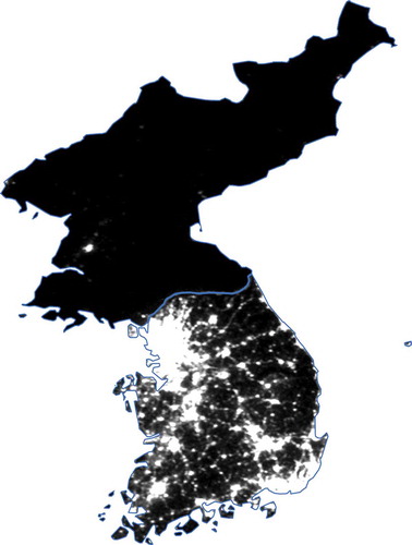
Figure 9. North Korea /South Korea difference in emitted night-time light as detected by DMSP OLS for the year 2012. North Korea shows the highest value among 200 countries considered in this study.
Southern Europe is characterized by a homogeneous distribution of “light per capita”, while northern Europe is more heterogeneous due to the high values observed in Scandinavian countries (see Letu et al. Citation2015). For this reason, some European countries sharing a border with Norway, Sweden or Finland have a high value of : this is particularly evident for Denmark, Germany and the U.K. However, countries grouped in the same category, and thus represented by the same colour in , can have significantly different values of
and can be found in very different geopolitical contexts. This is for example the case of Syria (with a
of 2.52) and Germany (with a
of 1.56). Please refer to Table S1 and S2 for specific values of “light per capita” and
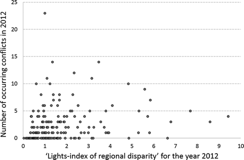
In , the overall dataset of countries is plotted. The total number of conflicts involving parties from a specific country has been considered as a measure of the level of conflict associated to that country (HIIK Citation2012). It can be noted that no clear relationship exists between the total number of conflicts and the “lights-index of regional disparity” on a cross-country level. This is mainly due to the very high heterogeneity of the conflicts considered and to the limited measures used to treat for outliers (further development options are explored in the Discussion section). Some countries present a very high number of occurring conflicts that, however, extend well beyond the geographical cluster composed by their neighboring countries. This is the case, for example, of countries such as the United States and Russia.
Figure 10. Scatterplot of the “lights-index of regional disparity” and the total number of occurring conflicts observed for the year 2012 in the 200 countries investigated. No relationship can be noted when these two variables are plotted together in a cross country analysis.
A clearer picture emerges by considering the five categories of “lights-index of regional disparity”, as highlighted in . In , a relationship can be noted between the average number of occurring conflicts and the average “lights-index of regional disparity” for each category. Countries with an index value between 0 and 0.5, are characterized by an average number of 1 occurring conflict; countries with an index of 0.5–1 have on average 2.5 conflicts, an index of 1–1.5 relates to an average of 2.4 conflicts, and an index of 3 or more relates to an average of 3.5 occurring conflicts.
Figure 11. Average number of occurring conflicts versus the average “lights-index of regional disparity” in each one of the five categories of the index (as indicated above bars). Data refer to 2012. The total number of conflicts involving parties from a specific country as reported in the Conflict Barometer 2012 (HIIK Citation2012) has been considered as a measure of the level of conflict associated to that country. A linear regression line and the relative correlation coefficient show the relationship between the variables.
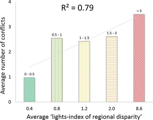
Despite the fact that no relationship emerges from a cross-country analysis, the relationship highlighted in shows how high values of the index (i.e. higher than 3) are linked on average with unstable conditions with a high risk of conflict occurrence/emergence. These observations are in line with the regional (versus national or local) characteristics of the index. Overall, the “lights-index of regional disparity” is more meaningful when considering single country’s trends (e.g. –), or when the high variability of conflict typologies and intensities is attenuated by aggregating groups of countries with similar values ().
Table 2. Average value of the maximum difference observed between neighbor countries in each continent in 2012.
In , the average value of the maximum Δli,x observed between each country and its neighbors () in 2012 is listed for each continental block. These numbers help quantify what is depicted in and extend the analysis from single neighborhoods to whole continents. Africa has the highest value of
, as justified by the very high differences in “light per capita” observed between Sub-Saharan Africa and both Northern African countries (Libya in particular) and Southern African countries (South Africa in particular). Asia has also a high value, mainly influenced by the highly unbalanced neighborhoods of North Korea, Yemen, Afghanistan and Nepal. Furthermore, high differences in “light per capita” exist between China and the “U.S.A.-supported” group of countries supposed to barrier its eastward economic expansion (i.e. Japan, South Korea and Singapore, plus Taiwan for which night-lights data are not available). Conversely, the Americas and Europe show a more homogeneous distribution of “light per capita” between countries. The intermediate value of the Americas (i.e. in between the heterogeneous Africa and Asia and the more homogeneous Europe) is mainly influenced by the considerable gap existing between Mexico and Cuba with the U.S.A.
From the contrast between Asia and the Americas is particularly interesting because it resembles what is observed when investigating income distribution in these two groups of countries. South America, in particular, is a region composed of very unequal countries that however do not differ much among each other in terms of average income. On the other hand, Asian countries are internally relatively equal but they are characterized by very large differences among each other in average income (Milanovic Citation2011). Furthermore, consider that data in do not include the rich Taiwan. By including Taiwan, the maximum observed difference in “light per capita” between Asian countries will probably rise. Notably, is in line with the distribution of high-intensity conflicts in the different regions of the world, as reported by the Conflict Barometer 2012 (HIIK Citation2012).
represents the change in during the whole time period covered by the available night-lights data, i.e. 1992–2012 (data on
national trends are available in Table SII). In this case, regions in yellow did not experience a relative change in “light per capita” distribution during the whole period. On the other hand, green regions experienced an improvement toward an equal distribution of lights. Regions in red are becoming more heterogeneous and unbalanced, due to opposite patterns of night-light per capita occurring within the different neighboring countries. This last dynamic characterized region with escalating national conflicts having increasing regional consequences during the time period investigated. Some notable examples are the Syria and Iraq neighborhood, as well as the Yemen and Eritrea neighbourhood and the overall increasing instability of the Mediterranean region (; de Haas Citation2011).
Figure 12. Change in the “lights-index of regional disparity” in 200 countries of the world from 1992 to 2012. Red regions are more unequal in 2012 than in 1992. Green regions are more equal in 2012 than in 1992. Yellow regions did not experience changes in the distribution of “light per capita” higher/lower than +0.1/-0.1.

The fast economic growth of China explains why it has in 2012 a value of “light per capita” more similar to its neighbors (see ). In Africa, the relative distribution of “light per capita” became less homogeneous in most of the Sub-Saharan countries, while more homogeneous in some of them. The whole American continent did not evolve much and the distribution of “light per capita” remained almost constant during the period of time investigated, with the exception of Guatemala and Honduras neighborhood and Bolivia.
A relationship exists between the 2012 values of “lights-index of regional disparity” () and the trends highlighted in . This is especially true for those countries showing a positive trend (i.e. countries in red in ). For these countries the Pearson correlation coefficient between the two variables is r = 0.64. The correlation is lost when considering countries with stable trend (r = – 0.03) and it is highly attenuated for countries with decreasing trend (r = −0.34).
This shows that regions that are becoming more heterogeneous and unbalanced are the ones where countries with the highest “lights-index of regional disparity” are located. At this stage, we cannot evaluate the existence and the direction of possible causal links between these two aspects. It is however plausible that this relationship is, partly, an expression of reinforcing feedbacks characterizing the exacerbation of inter-country disparities.
3.3. Relevance and possible applications
Despite the evidence that night-time lights are related to economic development (e.g. Doll, Muller, and Morley Citation2006; Zhao, Currit, and Samson Citation2011), Li, Chen, and Chen (Citation2013) demonstrated that the nature of the impact of armed conflict on night-time lights has an independent sense. They calculated that, at national scale, a sharp variation in night-time lights is highly related to the probability of suffering from armed conflict (–). However, conflicts can develop beyond national borders, can be triggered by boundary issues, and can thus be relevant at the regional scale. The “light-index of regional disparity” can provide information about regions of the world that are becoming increasingly unstable. High values of the index (e.g. approaching 3) are related to a high number of conflicts in the region (; ). Conversely, reducing the index below high-range values can be associated with processes of increasing regional stability that might be linked to effective conflict management or conflict prevention policies.
Compared to socio-economic indicators, such as GDP, night-light observations show a dynamic that is more in phase with the actual rhythm of human activities (Coscieme et al. Citation2013). Night-time light data constitute a complementary tool for policy formulation, being based on physical observations, not on statistics or forecasting that often proved to be unreliable and in need of continuous revision (The Economist Citation2015; Chew Citation2015; Zwijnenburg Citation2015). Furthermore, night-time imagery data will be increasingly available at different scales and higher resolution (e.g. Steele et al. Citation2012).
Together with other socio-economic indicators, meaningful information can be generated out of night-time imagery products, such is the case of global “light per capita” and the “lights-index of regional disparity” (Table SI, SII; Fig. SI). Further indices can be defined by, for example, comparing countries grouped by considering different criteria than sharing a border (e.g. OECD versus non-OECD countries; countries linked by an intense trade network; countries linked by international treaties; and so on). In general, this approach can provide complementary information, knowledge, and guidance needed for evidence-based decision and policy making for solving global and regional problems in response to the contemporary era of rapid change in globalization processes and huge environmental and social uncertainty. As useful metrics, the night-time lights derived “light per capita” and “lights-index of regional disparity” can be used within dedicated applications. One such example is the Globe Nocturne application, currently under construction (further details on this kind of applications can be found in Zhang et al. Citation2016; Li et al. Citation2015). These applications will provide data, maps and charts for displaying and analyzing the night-time lights derived measurements and their relationships with other socio-economic indicators. The two metrics developed in this article can be included in a database as time-series datasets and plotted against other socio-economic indicators to help identify critical trends and patterns, and reveal hidden relationships. Data on population density, economic development, energy consumption, environmental impacts, and the geography of conflicts can be displayed on top of the night-time satellite imagery, which can be queried in the map visualization. Beyond being informative for policy making, this will also facilitate interdisciplinary development through collaborative efforts between different groups of scientists.
3.4. Limitations and further developments
This paper presents a first formulation of a night-lights based index of regional disparity. Examples in – have been selected as representative of the kind of information that the proposed index can provide at the national scale when considered in time-series. However, due to the complexity of conflict dynamics, and to the different situations found in different geopolitical contexts, a general relationship between the index and the number of occurring conflicts did not emerge from a cross-country analysis, and each specific case study should be treated separately. For example, values of “light per capita” may not always differ between countries in conflict. Despite this limitation, this paper aims at presenting a global panorama of the “lights-index of regional disparity”, and provide data to be used in further research (Table SI, SII).
The definition of the index derives from a series of assumptions discussed throughout the paper. Different assumptions and improvements could be considered in further developments of the index. In particular, 1) different methods of intercalibration (Bennie et al. Citation2014; Letu et al. Citation2015) and data extraction have to be tested and the results compared with each other; 2) different weights have to be assigned to different land and maritime borders, on the basis of, for example, historical frequency of conflict occurrence along these borders; 3) median values could be used in the index formula instead of average values to limit the impact of possible outliers; 4) different conflict items should be treated differently (e.g. excluded or differently weighted), also taking into account different levels of conflict intensity.
4. Conclusions
Night-time lights satellite observations can be used to visualize a geography of built environments with intensive energy use and rural/wilderness areas (i.e. a thermodynamic geography; Coscieme et al. Citation2013; Pulselli Citation2010). At the national level, an abrupt decline in night-lights can be related to the occurrence of armed conflicts (Li, Chen, and Chen Citation2013). This relationship can be extended at the regional scale: when very dark areas border very bright ones, the overall region is characterized by high disparity and conflicts may occur (see –; Black et al. Citation2011; Seto Citation2011; Addleton Citation2009). In particular, these unbalanced regions are particularly prone to territorial conflicts and substantial migration flows. This geography of disparity and conflicts can be mapped and monitored by considering the “light per capita” emitted within different territorial contexts (for example, different countries of the world). A “lights-index of regional disparity” can be calculated, accounting for the more or less equal distribution of “light per capita” among neighbor countries that share either a land or a maritime border. Values of this index show that Africa and Asia are the least equal regions, while the Americas and Europe are the most equal. Particularly high values of the index characterize North Korea, Nepal-China border, and Pakistan and Afghanistan in Asia; the Mexico-U.S.A. border and Cuba-U.S.A. maritime border in America; Papua New Guinea-Australia maritime border.
This analysis helps understanding balanced and unbalanced groups of countries in terms of “light per capita”. However, emitted lights are good proxies of consumption levels, economic welfare, carbon emission, and the spatial extension of urban and industrial areas. Clusters of neighbor countries with similar values of “light per capita” span beyond continental borders as is happening in the Mediterranean. Countries within the same continent may be highly heterogeneous and unbalanced in the distribution of “light per capita” as in Asia, where very poor countries like Bangladesh, Nepal, Myanmar, Cambodia and Vietnam neighbor rich countries such as Japan, Malaysia, South Korea and the fast-growing China. Changes in the geography of “light per capita” can be monitored in order to identify potentially unstable regions; predict long-term conflict dynamics; monitor ongoing conflicts; and define adaptive policies. In fact, “light per capita” can be computed in time series from night-time satellite data produced at a global scale and can be allocated within a territory. The trend toward a more equal or unequal distribution of “light per capita” can be foreseen. Analyses of these data assist international policy formulation and response and inform our understanding of the causes and the geography of conflicts.
Supplemental_files_for_1260676.zip
Download Zip (1.7 MB)Acknowledgments
The authors are grateful to the two anonymous reviewers for their comments that helped to substantially improve the paper. The authors deeply thank Emily Skop and Karen Seto. LC is funded by an Irish Research Council (IRC) Postdoctoral Fellowship (GOIPD/2014/558).
Disclosure statement
No potential conflict of interest was reported by the authors.
Supplemental data
Supplemental data for this article can be accessed here.
Additional information
Funding
Related Research Data
References
- Aboultaif, E. W. 2016. “The Leviathan Field Triggering a Maritime Border Dispute Cyprus, Israel, and Lebanon.” Journal of Borderlands Studies. 1–16. doi: 10.1080/08865655.2016.1195700
- Addleton, J. 2009. “The Impact of the Gulf War on Migration and Remittances in Asia anthe Middle East.” International Migration 29: 509–526. doi:10.1111/j.1468-2435.1991.tb01037.x.
- Agnew, J., T. W. Gillespie, J. Gonzalez, and B. Min. 2008. “Baghdad Nights: Evaluating Theus Military ‘Surge’ Using Nighttime Light Signatures.” Environment and Planning A 40 (10): 2285–2295. doi:10.1068/a41200.
- Aguirre, M. 1998. “The Limits of Conflict Prevention and the Mediterranean Case.” Mediterranean Politics 3: 21–37. doi:10.1080/13629399808414663.
- Anderson, E. W. 2003. International Boundaries: A Geopolitical Atlas. New York: Routledge.
- Bennie, J., T. W. Davies, J. P. Duffy, R. Inger, and K. J. Gaston. 2014. “Contrasting Trends Inlight Pollution across Europe Based on Satellite Observed Night Time Lights.” Scientific Reports 4: 3789. doi:10.1038/srep03789.
- Bennie, J., J. P. Duffy, T. W. Davies, M. E. Correa-Cano, and K. J. Gaston. 2015. “Global Trends in Exposure to Light Pollution in Natural Terrestrial Ecosystems.” Remote Sensing 7: 2715–2730. doi:10.3390/rs70302715.
- Bharti, N., X. Lu, L. Bengtsson, E. Wetter, and A. J. Tatem. 2015. “Remotely Measuringpopulations during a Crisis by Overlaying Two Data Sources.” International Health 7: 90–98. doi:10.1093/inthealth/ihv003.
- Bjorgo, E. 2000. “Using Very High Spatial Resolution Multispectral Satellite Sensor Imageryto Monitor Refugee Camps.” International Journal of Remote Sensing 21 (3): 611–616. doi:10.1080/014311600210786.
- Black, R., W. N. Adger, N. W. Arnell, S. Dercon, A. Geddes, and D. Thomas. 2011. “The Effect of Environmental Change on Human Migration.” Global Environmental Change 21: S3–S11. doi:10.1016/j.gloenvcha.2011.10.001.
- Brown, I. A. 2010. “Assessing Eco-Scarcity as A Cause of the Outbreak of Conflict in Darfur: A Remote Sensing Approach.” International Journal of Remote Sensing 31 (10): 2513–2520. doi:10.1080/01431161003674592.
- Caron, D. D. 2009. “Climate Change, Sea Level Rise and the Coming Uncertainty in Oceanic Boundaries: A Proposal to Avoid Conflict.” In Maritime Boundary Disputes, Settlement Processes, and the Law of the Sea, edited by S.-Y. Hong and J. M. Van Dyke. Leiden: Martinus Nijhoff Publishers.
- Charney, J. I., D. A. Colson, and R. W. Smith. 2005. International Maritime Boundaries. Leiden: Hotei Publishing.
- Chew, J. 2015. “Chinese Officials Admit They Faked Economic Figures.” Fortune, December 14. Accessed 9 May 2016. http://fortune.com/2015/12/14/china-fake-economic-data/.
- Collier, P. 1999. “On the Economic Consequences of Civil War.” Oxford Economic Papers 51: 168–183. doi:10.1093/oep/51.1.168.
- Coscieme, L., F. M. Pulselli, S. Bastianoni, C. Elvidge, S. Anderson, and P. C. Sutton. 2013. “A Thermodynamic Geography: Night-time Satellite Imagery as a Proxy Measure of Emergy.” Ambio 43: 969–979. doi:10.1007/s13280-013-0468-5.
- de Haas, H. 2011. “Mediterranean Migration Futures: Patterns, Drivers and Scenarios.” Global Environmental Change 21: S59–S69. doi:10.1016/j.gloenvcha.2011.09.003.
- Doll, C. N. H., J.-P. Muller, and J. G. Morley. 2006. “Mapping Regional Economic Activity from Nighttime Light Satellite Imagery.” Ecological Economics 57 (1): 75–92. doi:10.1016/j.ecolecon.2005.03.007.
- Elvidge, C. D., P. Cinzano, D. R. Pettit, J. Arvesen, P. C. Sutton, C. Small, R. Nemani et al. 2007. “The Nightsat Mission Concept.” International Journal of Remote Sensing 28 (12): 2645–2670. DOI:10.1080/01431160600981525.
- Elvidge, C. D., E. H. Erwin, K. E. Baugh, D. Ziskin, B. T. Tuttle, T. Ghosh, and P. C. Sutton. 2009b. “Overview of DMSP Nightime Lights and Future Possibilities.” 2009 Joint Urban Remote Sensing Event 1–3: 1665–1669.
- Elvidge, C. D., M. L. Imhoff, K. E. Baugh, V. R. Hobson, I. Nelson, J. Safran, J. B. Dietz, and B. T. Tuttle. 2001. “Night-Time Lights of the World: 1994–1995.” ISPRS Journal of Photogrammetry and Remote Sensing 56: 81–99. doi:10.1016/S0924-2716(01)00040-5.
- Elvidge, C. D., P. C. Sutton, B. T. Tuttle, T. Ghosh, and K. E. Baugh. 2009a. “Global Urban Mapping Based on Night-time Lights.” In Global Mapping of Human Settlement, edited by P. Gamba and M. Herold, 129–144. Boca Raton, FL: CRC Press.
- Elvidge, C. D., D. Ziskin, K. E. Baugh, B. T. Tuttle, T. Ghosh, D. W. Pack, E. H. Erwin, and M. Zhizhin. 2009c. “A Fifteen Year Record of Global Natural Gas Flaring Derived from Satellite Data.” Energies 2 (3): 595–622. doi:10.3390/en20300595.
- Frolking, S., T. Milliman, K. C. Seto, and M. A. Friedl. 2013. “A Global Fingerprint of Macro-Scale Changes in Urban Structure from 1999 to 2009.” Environmental Research Letters 8: 1–10. doi:10.1088/1748-9326/8/2/024004.
- Ghosh, T., S. Anderson, C. D. Elvidge, and P. C. Sutton. 2013. “Using Nighttime Satellite Imagery as a Proxy Measure of Human Well-Being.” Sustainability 5 (12): 4988–5019. doi:10.3390/su5124988.
- Ghosh, T., C. D. Elvidge, P. C. Sutton, K. E. Baugh, D. Ziskin, and B. T. Tuttle. 2010b. “Creating a Global Grid of Distributed Fossil Fuel CO2 Emissions from Nighttime Satellite Imagery.” Energies 3: 1895–1913. doi:10.3390/en3121895.
- Ghosh, T., R. L. Powell, C. D. Elvidge, K. E. Baugh, P. C. Sutton, and S. Anderson. 2010a. “Shedding Light on the Global Distribution of Economic Activity.” The Open Geography Journal 3: 147–160. doi:10.2174/1874923201003010147.
- Giada, S., T. De Groeve, D. Ehrlich, and P. Soille. 2003. “Information Extraction from Very High Resolution Satellite Imagery over Lukole Refugee Camp, Tanzania.” International Journal of Remote Sensing 24 (22): 4251–4266. doi:10.1080/0143116021000035021.
- Henderson, V., A. Storeygard, and D. N. Weil. 2009. “Measuring Economic Growth from Outer Space.” Working Paper, Brown University, Department of Economics. 8: 1–36.
- HIIK. 2012. Conflict Barometer 2012. Heidelberg: Heidelberg Institute for International Conflict Research University of Heidelberg.
- Jagota, S. P. 1985. Maritime Boundary. Dordrecht: Martinis Nijhoff.
- Kaczynski, V. M., and D. L. Fluharty. 2002. “European Policies in West Africa: Who Benefits from Fisheries Agreements?” Marine Policy 26: 75–93. doi:10.1016/S0308-597X(01)00039-2.
- Kemper, T., M. Jenerowicz, L. Gueguen, D. Poli, and P. Soille. 2011. “Monitoring Changes in the Menik Farm IDP Camps in Sri Lanka Using Multi-Temporal Very High-Resolution Satellite Data.” International Journal of Digital Earth 4: 91–106. doi:10.1080/17538947.2010.512430.
- Kulkarni, R., K. E. Haynes, R. R. Stough, and J. D. Riggle. 2011. “Revisiting Night Lights as Proxy for Economic Growth: A Multi-Year Light Based Growth Indicator (LBGI) for China, India and the U.S.” GMU School of Public Policy Research Paper No. 2011–12. http://ssrn.com/abstract=1777546.
- Lang, S., D. Tiede, D. Holbling, P. Fureder, and P. Zeil. 2010. “Earth Observation (Eo)-Based Rex Post Assessment of Internally Displaced Person (IDP) Camp Evolution and Population Dynamics in Zam Zam, Darfur.” International Journal of Remote Sensing 31 (21): 5709–5731. doi:10.1080/01431161.2010.496803.
- Letu, H., M. Hara, G. Tana, Y. Bao, and F. Nishio. 2015. “Generating the Nighttime Light of the Human Settlements by Identifying Periodic Components from DMSP/OLS Satellite Imagery.” Environmental Science & Technology 49 (17): 10503–10509. doi:10.1021/acs.est.5b02471.
- Lewis, J. S. 2016. “Maritime Piracy Confrontations across the Globe: Can Crew Action Shape the Outcomes?” Marine Policy 64: 116–122. doi:10.1016/j.marpol.2015.11.012.
- Li, J., T. Zhang, Q. Liu, and M. Yu. 2015. “Predicting the Visualization Intensity for Interactive Spatio-Temporal Visual Analytics: A Data-Driven View-Dependent Approach.” International Journal of Geographical Information Science 0: 1–22.
- Li, X., F. Chen, and X. Chen. 2013. “Satellite-Observed Nighttime Light Variation as Evidence for Global Armed Conflicts.” IEEE Journal of Selected Topics in Applied Earth Observations and Remote Sensing 6 (5): 2302–2315. doi:10.1109/JSTARS.2013.2241021.
- Li, X., and D. Li. 2014. “Can Night-Time Light Images Play a Role in Evaluating the Syrian Crisis?” International Journal of Remote Sensing 35: 6648–6661. doi:10.1080/01431161.2014.971469.
- Lusthaus, J. 2010. “Shifting Sands: Sea Level Rise, Maritime Boundaries and Inter-state Conflict.” Politics 30: 113–118. doi:10.1111/(ISSN)1467-9256.
- Menefee, S. P. 2008. “An Overview of Piracy in the First Decade of the 21st Century.” Center for Oceans Law and Policy 12: 441–478.
- Milanovic, B. 2011. The Haves and the Have-Nots. New York: Basic Books
- Morton, K. 2016. “China’s Ambition in the South China Sea: Is a Legitimate Maritime Order Possible?” International Affairs 92: 909–940.
- Oda, T., and S. Maksyutov. 2011. “A Very High-Resolution (1Km × 1 Km) Global Fossil FuelCo2 Emission Inventory Derived Using A Point Source Database and Satellite Observations of Nighttime Lights.” Atmospheric Chemistry and Physics 11: 543–556. doi:10.5194/acp-11-543-2011.
- Papaioannou, K. J. 2016. “Climate Shocks and Conflict: Evidence from Colonial Nigeria.” Political Geography 50: 33–47. doi:10.1016/j.polgeo.2015.07.001.
- Pinkovskiy, M. L. 2013. “Economic Discontinuities at Borders: Evidence from Satellite Data on Lights at Night”. Unpublished Manuscript, Massachusetts Institute of Technology.
- Piskunova, N. 2015. “Pirates of Aden: A Threat beyond Somalia’s Shores?” Central European Journal of International and Security Studies 9: 191–203.
- Prescott, J. R. V. 1985. The Maritime Political Boundaries of the World. London: Methuen.
- Pulselli, R. M. 2010. “Integrating Emergy Evaluation and Geographic Information Systems for Monitoring Resource Use in the Abruzzo Region (Italy).” Journal of Environmental Management 91: 2349–2357. doi:10.1016/j.jenvman.2010.06.021.
- Raleigh, C. 2011. “The Search for Safety: The Effects of Conflict, Poverty and Ecological Influences on Migration in the Developing World.” Global Environmental Change 21: S82–S93. doi:10.1016/j.gloenvcha.2011.08.008.
- Raleigh, C., A. Linke, H. Hegre, and J. Carlsen. 2010. “Introducing ACLED: Armed Conflict Location and Event Dataset.” Journal of Peace Research 47: 1–10. doi:10.1177/0022343310378914.
- Seto, K. C. 2011. “Exploring the Dynamics of Migration to Mega-Delta Cities in Asia and Africa: Contemporary Drivers and Future Scenarios.” Global Environmental Change 21: S94–S107. doi:10.1016/j.gloenvcha.2011.08.005.
- Shi, K., B. Yu, Y. Hu, C. Huang, Y. Chen, Y. Huang, Z. Chen, and J. Wu. 2015. “Modeling and Mapping Total Freight Traffic in China Using NPP-VIIRS Nighttime Light Composite Data.” GIScience and Remote Sensing 52: 274–289. doi:10.1080/15481603.2015.1022420.
- Shortland, A., K. Christopoulou, and C. Makatsoris. 2013. “War and Famine, Peace and Light? the Economic Dynamics of Conflict in Somalia 1993–2009.” Journal of Peace Research 50 (5): 545–561. doi:10.1177/0022343313492991.
- Simon, S. W. 2011. “Safety and Security in the Malacca Straits: The Limits of Collaboration.” Asian Security 7: 27–43. doi:10.1080/14799855.2011.548208.
- Small, C., C. D. Elvidge, D. Balk, and M. Montgomery. 2011. “Spatial Scaling of Stable Night Lights.” Remote Sensing of Environment 115: 269–280. doi:10.1016/j.rse.2010.08.021.
- Steele, J. H., J. J. Puschell, C. F. Schueler, S. W. Miller, K. Grant, and T. F. Lee. 2012. “Expected Performance of the Visible Infrared Imager Radiometer Suite (VIIRS) without Detector Sample Aggregation.” In Remote Sensing System Engineering IV, edited by P. E. Ardanuy, J. J. Puschell, and H. J. Bloom, Proceedings of SPIE 8516, 1–8. SPIE, San Diego, CA.
- Sulik, J. J., and S. Edwards. 2010. “Feature Extraction for Darfur: Geospatial Applications in the Documentation of Human Rights Abuses.” International Journal of Remote Sensing 31 (10): 2521–2533. doi:10.1080/01431161003698369.
- Sutton, P. C., S. J. Anderson, C. D. Elvidge, B. T. Tuttle, and T. Ghosh. 2009. “Paving the Planet: Impervious Surface as Proxy Measure of the Human Ecological Footprint.” Progress in Physical Geography 33 (4): 510–527. doi:10.1177/0309133309346649.
- Sutton, P. C., S. J. Anderson, B. T. Tuttle, and L. Morse. 2012. “The Real Wealth of Nations: Mapping and Monetizing the Human Ecological Footprint.” Ecological Indicators 16: 11–22. doi:10.1016/j.ecolind.2011.03.008.
- Tan-Mullins, M., G. Mohan, and M. Power. 2010. “Redefining ‘Aid’ in the China-Africa Context.” Development and Change 41: 857–881. doi:10.1111/dech.2010.41.issue-5.
- The Economist. 2015. “Funny Numbers: America’s GDP Statistics are Becoming Less Reliable”. The Economist, October 24. Accessed 9 May 2016. http://www.economist.com/news/finance-and-economics/21676830-americas-gdp-statistics-are-becoming-less-reliable-funny-numbers?fsrc=scn/tw/te/pe/ed/Funnynumbers.
- UN. 1982. “United Nations Convention on the Law of the Sea of 10 December 1982.” United Nations, Division for Ocean Affairs and the Law of the Sea. http://www.un.org/depts/los/convention_agreements/convention_overview_convention.htm.
- von Uexkull, N. 2014. “Sustained Drought, Vulnerability and Civil Conflict in Sub-Saharan Africa.” Political Geography 43: 16–26. doi:10.1016/j.polgeo.2014.10.003.
- Welch, D. A. 2016. “The Justice Motive in East Asia’s Territorial Disputes”. Group Decision and Negotiation. doi: 10.1007/s10726-016-9500-z
- Witmer, F., and J. O’Loughlin. 2011. “Detecting the Effects of Wars in the Caucasus Regions of Russia and Georgia Using Radiometrically Normalized DMSP-OLS Nighttime Lights Imagery.” GIScience and Remote Sensing 48 (4): 478–500. doi:10.2747/1548-1603.48.4.478.
- World Bank. 2015. “World Development Indicators Database.” Accessed 13 July 2015. http://databank.worldbank.org/data/views/variableSelection/selectvariables.aspx?source=world-development-indicators.
- Xie, Y., and Q. Weng. 2016. “World Energy Consumption Pattern as Revealed by DMSP-OLS Nighttime Light Imagery.” GIScience & Remote Sensing 53: 265–282. doi:10.1080/15481603.2015.1124488.
- Zhang, T., J. Li, Q. Liu, and Q. Huang. 2016. “A Cloud-Enabled Remote Visualization Tool for Time-Varying Climate Data Analytics.” Environmental Modelling & Software 75: 513–518. doi:10.1016/j.envsoft.2015.10.033.
- Zhao, N., N. Currit, and E. Samson. 2011. “Net Primary Production and Gross Domestic Product in China Derived from Satellite Imagery.” Ecological Economics 70 (5): 921–928. doi:10.1016/j.ecolecon.2010.12.023.
- Zwijnenburg, J. 2015. “Revisions of Quarterly GDP in Selected OECD Countries.” OECD Statistics Brief 22: 12.