
Abstract
An important metric to monitor for optimizing water use in agricultural areas is the amount of cropland left fallowed, or unplanted. Fallowed croplands are difficult to model because they have many expressions; for example, they can be managed and remain free of vegetation or be abandoned and become weedy if the climate for that season permits. We used 250 m, 8-day composite Moderate Resolution Imaging Spectroradiometer normalized difference vegetation index data to develop an algorithm that can routinely map cropland status (planted or fallowed) with over 75% user’s and producer’s accuracies. The Fallow-land Algorithm based on Neighborhood and Temporal Anomalies (FANTA) compares the current greenness of a cultivated pixel to its historical greenness and to the greenness of all cultivated pixels within a defined spatial neighborhood, and is therefore transportable across space and through time. This article introduces FANTA and applies it to California from 2001 to 2015 as a case study for use in data-poor places and for use in historical modeling. Timely and accurate knowledge of the extent of fallowing can provide decision makers with insights and knowledge to mitigate the impacts of drought and provide a scientific basis for effective management response. This study is part of the WaterSMART (Sustain and Manage America’s Resources for Tomorrow) project, an interdisciplinary and collaborative research effort focused on improving water conservation and optimizing water use.
1. Introduction
The extent of planted croplands versus fallowed cropland within cultivated landscapes varies widely during drought and non-drought years. Discriminating among and mapping agricultural cropland status as the two distinct classes of either planted or fallowed has important implications for studying and assessing water and food security. Depending on the magnitude, intensity, and progression of drought, the areal extent of planted versus fallowed croplands and their magnitude vary. This in turn has a significant bearing on water use and quantum of food produced. Indeed, accurate mapping of planted croplands versus fallowed croplands is the very first step in understanding and studying food security and crop water use.
Human use of water is overwhelmingly dedicated to agriculture, with 70–90% of all human water use going towards producing food globally. Irrigation of cropland is the major consumer of human water use (Hoekstra and Chapagain Citation2007). Nowhere is this more exemplified than in the state of California, where over 80% of all human water use goes towards irrigating agricultural crops. With increasing population, water use for crops is expected to increase due to the need to produce additional food. Also, with increasing temperatures due to a warming planet, water use by crops is expected to increase due to higher evapotranspiration rates (Bates et al. Citation2008). Therefore, understanding the condition of croplands in a county, state, or country is vital for quantifying water use and its sustainability in a changing climate.
Persistent drought is creating water shortages throughout the Western United States, and is leading to an increase in the extent of unplanted agricultural land in California’s Central Valley, where almost all of the state’s agriculture takes place. The economic and social costs of fallowing cropland due to drought are considerable. There are direct economic costs due to the sales loss of produce commodities, wage losses due to lack of jobs for agricultural workers, and expenses due to payment of unemployment and other social benefits to affected workers and families. There are also indirect costs of drought, including the degradation (compaction) of aquifers and collapse of land surfaces resulting from over-pumping and mining of groundwater for cropland use as well as the loss of ecosystem services provided by natural ecosystems of the region (such as dust abatement, wildlife habitat, and water filtration) due to allocation of scarce water resources preferentially toward human uses – including irrigating cropland. Further, with about 25% of all fruits and nuts produced in the United States come from the California’s Central Valley (CDFA Citation2017), impacts on the food and nutritional security of the populations are very significant.
The dynamic nature of droughts, as well as their spatial and temporal variability, makes it challenging to predict and respond to drought-stricken areas. For example, Swain et al. (Citation2011) found land cover types respond differently to drought, with grasslands more sensitive than croplands, by comparing Terra- Moderate Resolution Imaging Spectroradiometer (MODIS)-derived cumulative land surface temperature and normalized difference vegetation index (NDVI) signals during a drought and a non-drought year. Yagci, Di, and Deng (Citation2015) showed that NDVI-based agricultural drought indicators are sensitive to crop rotation because NDVI values are crop-specific, thereby confounding long-term statistics. Park et al. (Citation2016) evaluated sixteen remote sensing drought factors and found that vegetation-related factors, such as NDVI, are more effective in capturing agricultural drought status in both arid and humid regions. Gao et al. (Citation2014) evaluated the equivalent water thickness (EWT), a measure of vegetation water content derived from the near-infrared (NIR) and the short-wave infrared bands, for regional drought monitoring. They found that EWT is strongly affected by vegetation density and cover type, and is therefore of limited use for monitoring moderate to severe drought conditions.
Remote sensing is widely used to classify and map croplands over regional areas (Thenkabail et al. Citation2009; Thenkabail, Gamage, and Smakhin Citation2004). The methods exploit both the absolute greenness as well as the greenness dynamics, or land surface phenology, of the disparate crop types (Chang et al. Citation2007; Shao et al. Citation2010; Turker and Arikan Citation2005; Wardlow, Egbert, and Kastens Citation2007; Zhong, Gong, and Biging Citation2014). Data from the MODIS is well suited for mapping crops worldwide because of its daily temporal and moderate spatial resolution (250 m in visible and NIR bands); MODIS data have been used to map crop types across different parts of the world (Teluguntla et al. Citation2017; Vintrou et al. Citation2012; Wardlow and Egbert Citation2008). There are also studies that combine MODIS data and moderate spatial resolution data, such as Landsat and the Indian Remote Sensing Advanced Wide Field Sensor (AWiFS), to discriminate crop types (Thenkabail and Wu Citation2012; USDA-NASS Citation2013). Other studies used higher spatial resolution imagery, such as Landsat and ASTER data, to differentiate crop types for a less extensive area (Peña-Barragan et al. Citation2011; Serra and Pons Citation2008; Turker and Arikan Citation2005). Image selection for crop type mapping largely depends on the size of the study area, image availability, cost, and the level of diversity in crop types and management.
This research is part of the WaterSMART (Sustain and Manage America’s Resources for Tomorrow), an interdisciplinary and collaborative research project designed to inform water conservation and water use management efforts and promote water sustainability in the Nation. The project adopted an early focus on the agricultural lands in California’s Central Valley in response to the ongoing drought as well as the abundance and diversity of crops represented in the region.
There are significant limitations in the existing studies mapping croplands that the WaterSMART team has been addressing. The primary focus of many cropland mapping efforts has been the accurate estimation of the different crop types planted and harvested, and earlier studies rarely account for fallowed cropland (Wu et al. Citation2014a). When they do so, the inaccuracies of mapping fallow land can be substantial. Even in the historical by United States Department of Agriculture (USDA)-Cropland Data Layer (CDL) maps, planted croplands are highly accurate with respect to crops and crop production, but fallowed croplands have been less accurate (Wu, Thenkabail, and Verdin Citation2014b). Plus the USDA-CDL classification relies in part on reports from farmers and the confidential reporting data are not available until after the harvest, resulting in a time lag for classification and results (https://www.nass.usda.gov/Research_and_Science/Cropland/SARS1a.php). Furthermore, the binary maps of planted versus fallowed cropland have been rarely produced (Wu et al. Citation2014a,b), and when produced, they were not automated.
Fallowed cropland can be difficult to model because it can have many expressions; for example, fallowed land can be managed and remain free of vegetation or it can be abandoned and become full of weeds if the climate for that season permits. Because of this, the WaterSMART collaborators have taken a suite of approaches to address accurate inventories of fallowed cropland. Both NASA and USDA researchers are refining classifications, with NASA scientists focused on advancing the availability of a highly accurate fallowed cropland maps in the current season (Melton et al. Citation2015). Researchers at NASA are accessing multi-scale remotely-sensed data and collecting field data at monthly time steps throughout the growing season to capture crop phenologies. These models, in progress, promise to be highly accurate and explicitly calibrated to California’s Central Valley (Melton et al. Citation2015). However, collecting such data is time consuming and, in some cases, unrealistic.
The focus of this study was to use the data-rich environment of California as a test case for creating a complementary model informed by the WaterSMART team data and efforts that can be used in data-poor places and also used to produce historical maps. Such a model could help monitor trends in fallowing of cultivated areas worldwide and alert the global community of regions and populations that are headed toward probable food insecurity and vulnerable to, for example, climate migration.
We developed the Fallow-land Algorithm based on Neighborhood and Temporal Anomalies (FANTA) using MODIS NDVI time-series data. FANTA can routinely map cropland status (planted or fallowed) with reasonable accuracies (over 75% user’s and producer’s accuracies) within and across years. The algorithm does not require up front training data and can be applied to past (hind-cast) and present (now-cast) scenarios as well as seamlessly scale up over large areal extents. The approach uses relative temporal and spatial greenness patterns for algorithm development, comparing the current greenness of a cultivated pixel to both: (a) its historical greenness and (b) the greenness of all cultivated pixels within its neighborhood. As a result, FANTA self-calibrates to new areas through a statistical analysis of observed greenness through time and across space.
This article introduces the FANTA algorithm, its conceptual framework, and demonstrates its applicability year by year for 15 years (2001–2015) for the State of California. FANTA is expected to routinely and automatically map both planted versus fallowed cropland with reasonable accuracies, using a method that is reliable and transportable, both across space and through time.
2. Study area
The study location comprises the cultivated lands of the Central Valley in California, a topographic depression filled with rich soils that averages 50 miles in width and extends over 400 miles from north to south (). The Central Valley produces over 25% of the nation’s food, growing over 250 different crops. The crops of the Central Valley are overwhelmingly irrigated; the valley contains 17% of the Nation’s and 75% of California’s irrigated lands. Additional facts about California’s Central Valley can be found here: http://ca.water.usgs.gov/projects/central-valley/about-central-valley.html
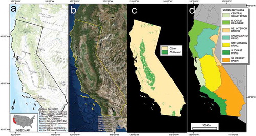
Figure 1. Study site. Map of the California’s Central Valley. California’s agricultural lands (c) are concentrated in the topographic depression formed between the coastal ranges to the west and the high Sierra Nevada mountains to the east (a). The extensive irrigated croplands are easily visible from space (b). Panel (a) is a standard USGS topographic map accessed through ESRI basemaps in ArcMap, panel (b) is an natural color satellite image accessed through ESRI basemaps in ArcMap, panel (c) is a map of cultivated lands developed for this project derived from USDA-CDL maps (see Section 3.2), and panel (d) shows the climate divisions in California from NOAA. A total of seven climate divisions occur in California (https://www.ncdc.noaa.gov/monitoring-references/maps/us-climate-divisions.php). For full colour versions of the figures in this paper, please see the online version.
3. Datasets and derivatives
All data used for this project are readily available and can be accessed over the internet for free. The datasets also reside on Google Earth Engine (GEE) cloud for manipulation and processing on high-speed inter-connected parallel computing. The raw data and processing applied to create derivative layers that were input to the FANTA model are detailed in the following.
3.1. Satellite data
MODIS data are collected daily and can capture phenology patterns over regional extents. To compile landscape-wide indications of vegetation greenness at a sub-monthly time step, we downloaded all available 8-day composite MODIS reflectance images (46 per year) for 2001 through 2015 from glovis.usgs.gov. MODIS products are compiled at a range of spatial resolutions; we accessed the highest resolution dataset (250 m; available as product MOD09Q1; this study used version v5). The composite dataset is produced by selecting the pixel obtained during the 8-day period that contains the best possible observation as evaluated on the basis of favorable coverage and view angle, the absence of cloud contamination, and aerosol loading (http://modis-sr.ltdri.org/products/MOD09_UserGuide_v1_3.pdf), resulting in data that are pre-filtered for quality.
We downloaded four tiles for each 8-day composite: h08v04, h08v05, h09v04, and h09v05. These tiles cover all of California for this study as well as all of Arizona for a parallel study. We retrieved MODIS bands 1 (red; 620–670 nm) and 2 (NIR; 841–876 nm); pre-processing of the data included mosaicking and reprojection to Albers conical equal area (NAD 83, GRS 1980) using nearest neighbor techniques.
Vegetation exhibits a distinctive spectral reflectance pattern, with low reflectance of red wavelengths due to chlorophyll absorption and strong reflectance in the NIR due to cellular structure. The NDVI exploits this distinctive signature to provide a measure of photosynthetically-active vegetation on the ground, calculated as follows:
where: NIR = near-infrared reflectance (%), red = red reflectance (%).
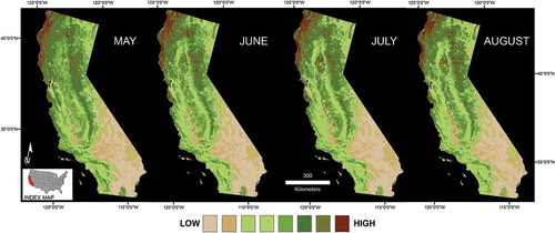
The red and NIR reflectance values of all 8 day, 250-m composite data for 2001 through 2015 were compiled and the NDVI was calculated. A few highly anomalous pixels were observed in extreme landscapes, such as waterbodies. We saturated each end of the NDVI spectrum to eliminate these anomalous values by setting pixels above 1.0 and below −0.2 to 1.0 and −0.2, respectively. For each month of each year, we extracted the four 8-day NDVI composite images that best represented that month, i.e., overlapped the month most completely. We then calculated two values: (1) the NDVI (month), which is the maximum of the four 8-day composites comprising that month and is, therefore, the monthly maximum-value composite NDVI, and (2) the NDVIrange (month), which is difference between the maximum and minimum values of the four 8-day composites comprising that month. We then calculated the historical mean, standard deviation and median for the NDVI (month) and the NDVIrange (month) for each of the 12 months based on the 13 years of data (2001–2013). shows the NDVI (month) for 4 months in 2012. All image processing was performed in ERDAS Imagine (v. 10.0) (Stockholm, Sweden).
Figure 2. Example of Moderate Resolution Imaging Spectroradiometer (MODIS) monthly maximum-value composite normalized difference vegetation index (NDVI) values for 4 months in 2014.
3.2. Cultivated mask layer
The analysis is constrained within a mask of cultivated lands ()). There are several existing land-cover products that could be used to develop a mask of cultivated lands, including products from Global Land Cover Facility (GLCF), USGS Land Cover Institute (LCI), Global Land Cover Network (GLCN), and others. A comprehensive listing of products, their characteristics and data access information is found at http://worldgrids.org/doku.php/source_data. In addition, cultivated lands are visually distinctive with respect to geometry and texture, so it is possible to either create a model or heads-up digitize a cultivated mask for a region if needed. Note that this mask provides only a frame within which the results are examined and summarized.
For this study, we derived the mask of cultivated lands from the USDA-CDL, which are considered the Gold Standard of cropland type mapping (http://nassgeodata.gmu.edu/CropScape/). CDL layers, available from 2007 to the present for the entire conterminous United States, are currently produced at a 30-m resolution. By masking our MODIS-based anomaly model with the 30-m grid, we impose a finer spatial scale on the final product, with MODIS-derived binary values transferred to the finer grid as a simple nearest neighbor mapping. In this way, roads, towns and other non-cultivated features in the landscape are effectively erased and not included in any aerial estimates of planted and fallowed cropland based on the MODIS model. Note, however, that the 250-m resolution of the MODIS pixels is still preserved in the pattern of cropland planted versus fallowed status.
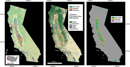
The USDA classifies cropland by coupling Farm Service Agency data with moderate spatial resolution (less than 30 m) multispectral satellite data, which currently includes Deimos and Landsat 8 (http://www.deimos-imaging.com/and http://landsat.gsfc.nasa.gov/landsat-8/, respectively). The classification contains detailed information about the crops grown as well as associated land cover, identifying up to 132 classes each year (, left panel). The CDL maps for 2007 through 2013 were used to create the mask of cultivated lands. The USDA classification was simplified for each of the 7 years, by recoding and collapsing land cover into 11 classes (, center panel) and the 3 cropland classes extracted (, right panel). As with all satellite-based classifications, the results include scattered “noise” representing misclassified pixels, so a statistical approach was applied to produce our mask, whereby all pixels that were classified as cultivated in at least 5 of the 7 years in USDA-CDL maps were preserved to create the final mask. The cultivated pixels were labeled as row crop, orchard or vineyard based on the majority classification during the 7 years (, right panel).
Figure 3. Creating cultivated mask: re-coding of USDA-CDL classification (132 classes) to 11 land-cover classes. The right panel shows the three cultivated cover classes.
3.3. Neighborhood shapefile based on climate divisions
Initial results revealed large differences between cropland dynamics in the north and the south of the Central Valley. This is an expected and reasonable result since there is a large difference in climate between the more temperate north and the more arid south. We, therefore, decided to conduct analyses within climate divisions as a logical way to delineate cohesive spatial units, or “Neighborhoods,” on a regional scale for agricultural purposes. Climate Divisions for California as defined by the National Oceanic and Atmospheric Administration (NOAA) (https://www.ncdc.noaa.gov/monitoring-references/maps/us-climate-divisions.php) are included in (a–c). The two climate divisions covering the Central Valley are the Sacramento Drainage in the north and the San Joaquin Drainage in the south.
3.4. Ground data for model development and validation for the year 2014
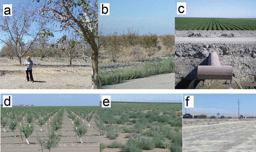
Field data used for model development and validation were collected in July 2014, including information on crop types and the varied nature of fallowed lands. Over 450 sites were visited, guided by preliminary analyses of USDA-CDL crop types and NDVI status. For example, a site might be characterized as “always a row crop, greener than average”; an effort was made to examine all combinations of annual and perennial crops of varied greenness conditions. One of the difficulties in creating an algorithm to classify fallowed croplands is that they can look very different, depending on their management. For example, cropland that is fallowed but still ready for future crops may be tilled and bladed, remaining free of vegetation. On the other hand, land that has been fallowed and abandoned may become full of weeds and appear quite green (e.g., )). (a–f) shows examples of field sites visited in 2014 and includes some of the varied expressions of planted (e.g., )) and fallowed croplands (e.g., ,)).
Figure 4. Examples of field sites visited in 2014. Top row (left to right): (a) abandoned walnut, (b) abandoned pomegranate, (c) irrigated corn. Bottom row (left to right): (d) newly planted almond, (e) fallowed field with weeds, (f) fallowed field barren. Photo Credit: Brett Goble.
4. Methods
4.1. Overview and exploratory analyses
This research was conducted to improve an earlier Automated Cropland Classification Algorithm (ACCA) for Tajikistan (Thenkabail and Wu Citation2012), and California’s Central Valley (Wu et al. Citation2014a; and Wu, Thenkabail, and Verdin Citation2014b), which used a decision tree classifier to evaluate the absolute greenness of 8-day time-series composites of yearly MODIS-NDVI data, utilizing specifically combinations of months during the growing seasons and, in case of California included a 30-m Landsat image for the month of July. ACCA model results were validated using the USDA-CDL classification as a reference. Although cropland accuracies were good (user’s and producer’s accuracies >80%), the fallow-land accuracies were poor. Initially, an effort was made to separate various categories of fallow land from the existing references to try to capture the complexity of fallowed lands in the decision tree classifier. As a result of this limitation, in this research, we concluded that it was most effective and expedient to collect new in situ field data for this study to capture all the varied expressions of fallowed croplands, such as tilled and weed-free versus abandoned and weed-filled.
Early analyses exploring the relative greenness of a pixel when compared to its history revealed patterns that seemed promising not only for identifying when a pixel was significantly “less green than average” (i.e., unplanted or fallowed) but also for developing a method to transfer easily to other locations. Historical measures of average greenness from MODIS data were initially calculated by including all years in the entire 13-year history from 2001 through 2013, which represents all years available when the research was initiated. The temporal greenness anomalies were calculated using a z-score transformation as follows:
Where:
TA13_NDVI (month) = the temporal anomaly based on 13 years of data of NDVI for the month in the year of interest.
NDVI (month) = the NDVI value for the month in the year of interest.
Mean_NDVI (all years) = the mean NDVI value observed at the pixel between 2001-2013.
SD_NDVI (all years) = the standard deviation of the 13 NDVI values observed at the pixel between 2001-2013.
TA13_NDVI (month) values close to zero represent absolute NDVI greenness that is average for that pixel when compared to its entire 13-year history. These values were displayed for California as monthly raster maps showing the value at each pixel.
Preliminary models using only temporal greenness anomalies produced better results in the southern portion of the Central Valley, prompting the inclusion of spatial greenness anomalies within neighborhoods, which we defined using climate divisions. The resulting algorithm presented here strengthens the fallowed cropland mapping using novel methods. The FANTA uses: (a) accurate ground data for both planted and fallowed croplands, (b) unique methodological approach that compares the greenness and dynamics of a pixel to both its historic values and to all cultivated pixels within its neighborhood. This methodological approach is explained in detail in the following.
4.2. Temporal greenness anomalies, pure crop
Examination of temporal anomalies based on the entire 13-year history (2001–2013) revealed interesting patterns, especially in natural areas, that provide insight to the context within which agricultural crops are being cultivated. However, the fact that cultivated lands can occupy extreme values of crop (changing from bare soil to very green throughout the growing season, i.e., very dynamic) and managed fallowed (bare soil throughout the growing season, i.e., not dynamic) confounds an approach that considers all historical years; the percent of the time a field is fallowed can vary from place to place and year to year. We, therefore, made the assumption that each cultivated pixel in the study area was planted at least half of the years and extracted a set of “pure crop” NDVI and a set of “pure crop” range values at each pixel.
To extract a “pure crop” subset of values at each pixel for each month, we calculated the median value of the 13 observed and selected all values that were greater than or equal to that value. A second set of temporal anomalies was then calculated using a z-score transformation as follows:
The pure crop NDVI temporal anomalies were, therefore, calculated at each pixel using a z-score transformation as follows:
Where:
TA_NDVI (month) = the temporal anomaly of NDVI for the month in the year of interest compared to a pure crop signal.
NDVI (month) = the maximum NDVI value for the month in the year of interest.
Mean_NDVI (pure crop) = the mean of the monthly maximum NDVI values of the ~7 value subset of the 13 values that are greater than or equal to the median greenness observed at the pixel between 2001-2013.
SD_NDVI (crop subset) = the standard deviation of the monthly maximum NDVI values of the ~7 value subset of the 13 NDVI values that are greater than or equal to the median greenness observed at the pixel between 2001-2013.
Similarly, the pure crop NDVI range temporal anomalies were calculated as follows:
Where:
TA_NDVIrange (month) = the temporal anomaly of NDVI range for the month in the year of interest compared to a pure crop signal.
NDVIrange (month) = the NDVI range value (i.e., max – min) for the month in the year of interest.
Mean_NDVIrange (pure crop) = the mean of the monthly range NDVI values of the ~7 value subset of the 13 values that are greater than or equal to the median greenness observed at the pixel between 2001-2013.
SD_NDVIrange (pure crop) = the standard deviation of the monthly range NDVI values of the ~7 value subset of the 13 NDVI values that are greater than or equal to the median greenness observed at the pixel between 2001 and 2013.
These z-score transformations convert the observed NDVI and NDVIrange values at a pixel from absolute values to relative values compared to the history at that pixel. Values close to zero represent observed NDVI and NDVIrange values that are average for that pixel when compared to a “pure crop” subset represented by the greenest 7 (or more) years. TA_NDVI(month) values were displayed as yearly histograms showing the average value for each month of all pixels classified as either annual (row) crops, perennial crops (orchards and vineyards), or all cultivated areas.
The FANTA model examines the temporal anomaly at each pixel and asks how it compares to its history, both in terms of greenness and dynamics during the growing season.
4.3. Neighborhood (spatial) greenness anomalies, pure crop
For each month, the current greenness was compared to the greenness of a “pure crop” signal of cultivated pixels within its neighborhood. We identified characteristic crop NDVI greenness by calculating and extracting the median NDVI greenness value of all annual row crop pixels within each climate division neighborhood ()). This assumes that at least half of the cultivated pixels within the climate division are planted, which is almost always true in irrigated areas of California; the median value, therefore, represents a lower NDVI value to be expected in a “pure crop” pixel. The observed NDVI greenness at each pixel was then compared to the “pure crop” signal as an absolute greenness value. The different climate divisions host a different suite of crop types that will influence this median greenness signal.
The FANTA model examines the spatial anomaly at each pixel and asks how it compares to its neighbors, both in terms of greenness and dynamics during the growing season.
4.4. Fanta’s four questions
The FANTA examines relative historical and neighborhood greenness values calculated above for each pixel and asks the following four questions:
Does the pixel LOOK like a crop based on its history? (TEMPORAL)
Does the pixel ACT like a crop based on its history? (TEMPORAL)
Does the pixel LOOK like a crop compared to its neighbors? (SPATIAL)
Does the pixel ACT like a crop compared to its neighbors? (SPATIAL)
To produce an annual model of fallowed cropland, the four questions are asked for months comprising the middle of the growing season in California as well as months comprising an early growing season. The calculations and rationale corresponding the four questions are as follows:
(1) Calculation:
OR
Where:
TA_NDVI(Month) = Temporal NDVI anomaly for the month (see Equation (3)). The value of −3 is empirical.
Rationale: During the main growing season, the NDVI of a fallowed pixel will be consistently low compared to a “pure crop” signal for every month, based on its history. Similarly, the NDVI of a fallowed pixel during each month of an early growing season will be consistently low.
(2) Calculation:
Where:
TA_NDVIrange(Month) = Temporal NDVI range anomaly for the month (see Equation (4)). The value of −3 is empirical.
Rationale: During the main growing season, the dynamic range of the NDVI in a fallowed pixel will be consistently low compared to the dynamics of a “pure crop” signal for every month, based on its history. Similarly, the dynamic range of the NDVI of a fallowed pixel during each month of an early growing season will be consistently low.
(3) Calculation:
where:
NDVI(Month) = the NDVI value observed at a pixel for the month.
MedianCD(Month) = the median NDVI value observed for all annual row crop pixels within a climate division for the month. The value of 0.8 is empirical.
Rationale: During the main growing season, the absolute NDVI value of a fallowed pixel will be consistently lower than the NDVI of planted (“pure crop”) pixels within its neighborhood for every month.
(4) Calculation:
where:
NDVIrange(Month) = the NDVI range value observed at a pixel for the month.
MedianCD(Month) = the median NDVI range value observed for all annual row crop pixels within a climate division for the month
Rationale: During the main growing season, the dynamic range of NDVI values during a month for a fallowed pixel will be consistently lower than the dynamic range of planted (“pure crop”) pixels within its neighborhood for every month.
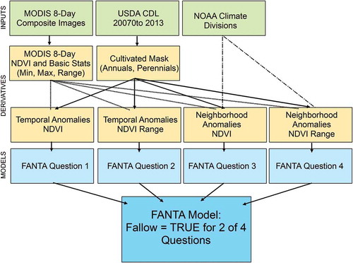
A flowchart of the methods is shown in . Note that the input images are available for free on the internet. Comparable inputs are also available for most parts of the world; if anything, it may be necessary to classify or digitize a cultivated mask layer mask.
Figure 5. Flowchart of FANTA methods.
4.5. Validation
The FANTA model for the year 2014 was validated using the field data collected during the growing season in July 2014. Error matrices were constructed and standard metrics of omission/commission errors and overall kappa were calculated to quantify model performance. The performance of each model was also compared to the performance of the USDA-CDL for mapping fallowed cropland only in 2014.
5. Results
5.1. Exploratory analyses
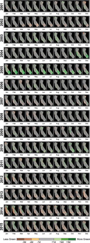
The monthly NDVI anomalies of the California landscape relative to the 13-year (2001–2013) average historical NDVI reveal the context within which cultivation is occurring in California. These are mapped on a pixel-by-pixel basis in . The wet year of 2005 stands out as one of the greenest in the time period, visible especially as strong greenness in the deserts of southern California. Los Angeles reported 38 in of rain for that year, which is 23 in above average (/www.laalmanac.com/weather/we13.htm) and the New York Times featured the “Technicolor Season” in Death Valley due to the unusual wildflower bloom that year (New York Times, 4 March 2005). The drought of 2002 is apparent, with brown colors especially in the south and only rare green, “above-average” areas. Note how much worse the 2014 drought appears in these images. The beginning of the year reveals a striking contrast between the foothills surrounding the Central Valley that are extremely brown (i.e., over 2σ below-average NDVI) and the high Sierra Mountains that are extremely green (i.e., over 2σ above-average, located along the east edge of California). Above average greenness in high mountains in the winter months reflects a lack of snow cover, another indicator and symptom of the drought. El Nino conditions beginning at the end of 2014 and persisting through 2015 resulted in improved greenness, especially in northern California, but areas in southern California returned to below-average greenness values throughout the 2015 growing season. The temporal anomalies observed are certainly consistent with this drought being “the worst in at least 1200 years” (Griffin and Anchukaitis Citation2014; Summer Citation2014).
Figure 6. California greenness anomalies. Areas that are “average” (within one standard deviation of the mean) are displayed as gray, with areas greener than average (“green”) in shades of green and less green (“brown”) in shades of brown.
5.2. Temporal greenness anomalies
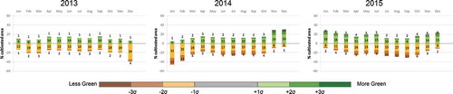
Regional drought conditions will affect the vigor of planted crops as well as the acreage of cultivated areas that are planted or left fallowed if farmers do not have access to reliable water, i.e., do not have groundwater or appropriate water rights. The overall status of cultivated areas in the Central Valley from 2013 to 2015 is depicted as a histogram in . This plot shows the average monthly anomaly for all crops relative to the “pure crop” average condition observed historically (2001–2013). Note the strong contrast between the 2013–2014 winter and the 2014–2015, with extremely brown and extremely green conditions, respectively. The observed strong winter greenness in 2014–2015 was not a harbinger of better cropland conditions, however; the growing seasons for the 2 years were similar, with over 20% of cultivated lands in below-average greenness condition between May and August. Despite persistent El Nino conditions throughout 2015, anticipated enhanced rainfall patterns shifted north, producing one of the wettest winters in Seattle but offering little drought relief for California and the Central Valley.
Figure 7. Temporal greenness anomalies for all cultivated lands in California, shown by month for 2013, 2014, and 2015. The green colors show the percent of cultivated land that is at least 1 standard deviation (1σ) above the average greenness value observed historically (between 2001 and 2013). The brown colors show the percent of cultivated land that is at least 1 standard deviation (1σ) below the average historical greenness value.
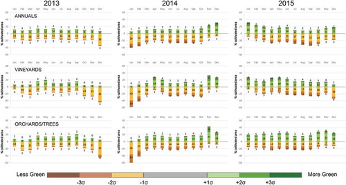
Separating the annual row crops from the perennial crops (orchards and vineyards) reveals some interesting patterns. During the more normal year (2013), the three crop types () are similar, with 10–15% or crop area both above and below 13-year average greenness. During the extreme drought years (2014 and 2015), all crops have more below-average greenness, but row crop percentages exceed the perennials during growing season months July and August. It is reasonable to expect that the row crops would have higher below-average values due to intentional fallowing or abandonment of fields, and to assume perennial crops would be preferentially irrigated. Another feature of note is the large dynamic between summer and winter greenness for perennial crops – far exceeding that of the annuals. This likely reflects both the increased vigor of the trees and vines as well as the observed growth of grasses and other ground cover between perennial rows during wetter periods and total absence of ground cover during dry periods; the contribution of these accessory plants to the greenness signal appears to be significant. Another factor may be the range of perennial age classes and associated differences in canopy cover and density; such diversity would not be expected in annual row crops, which all range from bare soil to full crop canopy.
Figure 8. Temporal greenness anomalies for all cultivated lands in California, shown by month for 2013, 2014, and 2015. The green colors show the percent of cultivated land that is at least 1 standard deviation (1σ) above the average greenness value observed historically (between 2001 and 2013). The brown colors show the percent of cultivated land that is at least 1 standard deviation (1σ) below the average historical greenness value.
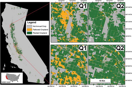
The temporal anomalies are used to answer questions 1 and 2 of the FANTA Model. These results are shown in . Note that these results are only for cultivated lands within the Annual Row Crops mask ().
Figure 9. The FANTA model for 2014 is shown in the left panel. The zoomed insets show details of applying Equations (3) and (4) to the MODIS images of 2014, thereby calculating temporal anomalies for NDVI and NDVI range. These temporal greenness anomalies reveal areas that do not look like crops based on their history (Q1) and do not “act” like crops based on their history (Q2).
5.3. Spatial greenness anomalies
The result of the neighborhood analysis is illustrated in (a–d), which maps the median NDVI value of annual row crop pixels in climate division neighborhoods observed in June, 2014. Global statistics identified the median NDVI observed in all annual pixels ( and )) of each climate division ()). This value was then applied to all pixels of the climate division for input to the model ()). In June, 2014, the median greenness of row crops in the Sacramento Drainage climate division is seen to be higher than those in the San Joaquin neighborhood. Median NDVI values were also identified for the perennial crops.
Figure 10. Illustration of calculating neighborhood anomalies. (a) NOAA climate divisions. (b) Cultivated mask derived from USDA-CDL for 2007–2013. (c) The median NDVI range value for all pixels classified as row crops calculated within each climate division, June 2014. (d) The median row crop NDVI range value extrapolated throughout the entire climate division. Global statistics were used to calculate the median NDVI and range values within each climate division, or neighborhood.
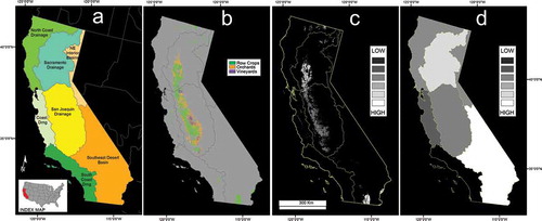
The process was repeated to produce a median range value within each climate division, capturing the monthly NDVI dynamics. For each month of each year, therefore, the median NDVI and range values were extracted and applied to the entire climate division. These values served as absolute NDVI threshold values against which all pixels in the analysis window were compared for that time period.
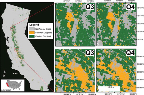
The neighborhood anomalies are used to answer questions 3 and 4 of the FANTA model. These results are shown in . Note that these results are only for cultivated lands within the Annual Row Crops mask ().
Figure 11. The FANTA model for 2014 is shown in the left panel. The zoomed insets show details of applying Equations (5) and (6) to the MODIS images of 2014, thereby calculating neighborhood anomalies for NDVI and NDVI range. These neighborhood greenness anomalies reveal areas that do not look like crops compared to their neighbors (Q3) and do not “act” like crops compared to their neighbors (Q4).
5.4. FANTA results in California 2014
The FANTA model was developed using all annual row crop pixels, with good validation results. We then applied the model to perennial crops, but discovered that it overmapped fallowed lands. Better results were obtained applying the signal developed for annual row crops to all cultivated pixels (annual plus perennials), but fallowed land in perennial crops was still overmapped. We, therefore, report only the results of the model applied to annual row crops here. Recommended model refinements for perennial crops is in the discussion.
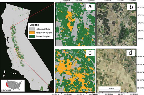
The models produced binary maps of planted or fallowed cropland for every year. (a–d) shows the results for 2014. Recall that a pixel is considered fallow if any two of the four questions are “no” and it, for example, does not look or act like a crop based on its history or does not look or act like a crop compared to its neighbors.
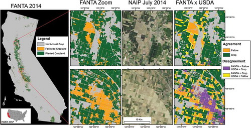
Figure 12. FANTA Model for 2014. The FANTA model for 2014 is shown in the left panel. The zoomed insets (a–d) show details of the FANTA model (a and c) with the 2014 natural color NAIP imagery on the right (b and d).
5.5. Validation results FANTA 2014
The validation results of the FANTA model applied to annual row crops for 2014 are shown in . The model is more than 85% accurate overall when compared to the field data, with producer’s and user’s accuracy of fallowed-land 75% and 80%, respectively. This is a 26% improvement in producer’s accuracy over the 2014 USDA model when validated with field data collected for this study (). However, USDA mapping of fallowed cropland is improved in 2015 as a result of refinements due to WaterSMART activities, with user’s and producer’s accuracies reported as 70% and 85%, respectively.
Table 1. Accuracy of FANTA Fallowed-land mapping compared to 2014 field data.
Table 2. Accuracy of USDA Fallowed-land mapping compared to 2014 field data.
Although the FANTA model for the binary status of planted versus fallowed is produced at an effective resolution that is coarser than USDA (250 vs. 30 m, respectively), FANTA achieves comparable validation results and requires no input training data. Keep in mind, however, that FANTA is only a binary model. This is in contrast to the USDA-CDL, which is a crop type model at 30 m resolution reporting excellent overall accuracies of 84.6% and 82.3% in 2014 and 2015, respectively, (https://www.nass.usda.gov/Research_and_Science/Cropland/metadata/metadata_ca14.htm and /metadata_ca15).
A visual comparison of the 2014 FANTA and USDA models with July 2014 NAIP imagery is shown in . The FANTA excludes the edges of some fields, likely due to the coarseness of the MODIS pixels, but does include areas that appear to be fallowed in the July NAIP, but which are mapped as crop by the 2014 USDA model. Note that USDA examines the winter growing season in addition to the summer growing season, so winter crops would not be evident in the July 2014 NAIP.
Figure 13. Annual model for 2014 (far left). insets compare the model (L) to 2014 NAIP true color imagery (C) and the 2014 USDA fallow-land mapping (R). USDA model uses Farm Service Agency data coupled with Deimos and Landsat 8 satellite data from 2013 and 2014.
5.6. Historical FANTA results in California, 2001 to 2015
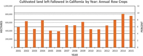
. Percentage of cultivated land left fallowed in California by year. 1% ~80,000 ha, based on the annual row crop mask derived in Section 3.2.
Figure 14. summarizes fallowed croplands in California on a yearly basis. Year 2014 is seen to be a worse year than 2015, with over 10% of the annual row crop fields fallowed, 1.5% more than the following year. Comparing the percent row crops fallowed from 2001 reveals that 5–8% has been more typical for 15 years analyzed. Each of the last 3 years analyzed (2013, 2014, and 2015) has more fallowed-land than any of the prior years. Note that these results are only for row crops within the cultivated mask created in Section 3.2.
5.7. County FANTA statistics
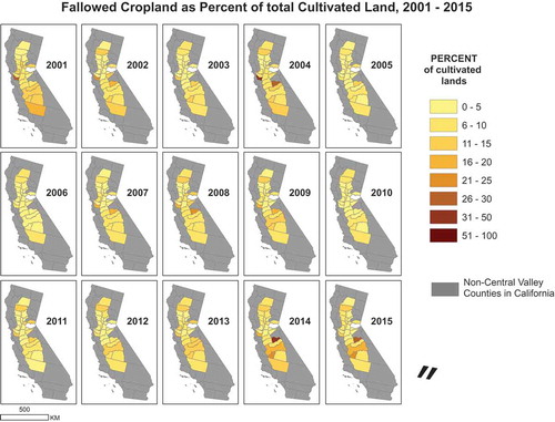
and summarize FANTA model results by county, mapping the acres, and percent (respectively) of cultivated land left fallowed for every year from 2001 to 2015. The largest number of acres fallowed is commonly in Fresno County (displayed red in 2009, 2014, and 2015 in ). The three counties south of Fresno (Kings, Tulare and Kern) also commonly contain many fallowed acres (). The percentage of acres fallowed () is highest in Alameda county in the west (2001) and Mariposa county in the east (2014), with a higher range of values across counties appearing especially in 2004, 2014, and 2015.
Figure 15. FANTA model results by county: acres of fallowed crop land for row crops, 2001–2015.
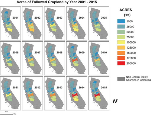
Figure 16. FANTA model results by county: percent of fallowed crop land for row crops, 2001–2015.
6. Discussion
The current California drought is unprecedented in recent history, impacting water resources for human and ecological use. The extent of planted croplands versus fallowed croplands within cultivated landscapes varies widely during drought and non-drought years; mapping fallowed land on a routine basis can inform water and food security. In the United States, there are various efforts to successfully classify croplands, which are facilitated by the availability of public records including USDA data and access to field data. Many methods require inputs that are time-consuming to collect, such as the USDA model that requires post-harvest farmer survey input. In contrast, the FANTA model can be calculated for a year once MODIS data for August are available (assuming access to a mask of cultivated areas and climate divisions). The FANTA model can potentially benefit management due to its earlier forecast.
FANTA’s strength is that it requires no field data for training, relying instead on temporal and spatial anomalies, i.e., comparing a pixel to its history and its neighbors. This will likely prove beneficial for monitoring agricultural status in countries where it is difficult to conduct field work. Although FANTA has only been applied in California, it is expected to translate readily to new areas given the distinctive reflectance and characteristic dynamics of most agricultural crops. Ideas to apply FANTA for global security include tracking percent fallowed of cultivated lands in developing countries to see what threshold might be an indicator of climate migration.
The research found good results applying FANTA to annual row crops, but not as strong for perennials. Confounding our results is the conversion of row crops to new perennial orchards and vineyards; we are looking to improve FANTA through strategies to identify these conversions earlier. The temporal anomaly results and observations in the field reveal that perennial crops are much more diverse in the character of their growth cycle than annual row crops. Annual row crops always have a bare soil condition and then typically achieve close to 100% canopy. In contrast, orchards range from fields of newly planted trees through all age classes up to old mature trees, some with widely space rows and some with large amounts of continuous canopy cover, some with understory grasses and some with bare soil substrate. To address this diversity, we are exploring refinements to FANTA that include separating annuals and perennials, separating orchards from vineyards, isolating a mid-range subset of perennials, and applying the z-score conversion to the spatial domain in addition to the temporal domain to characterize anomalies. Most of the agricultural lands in the United States are annual row crops, however, so the current FANTA is expected to be widely applicable. Furthermore, row crops are the first to be impacted through intentional fallowing in response to drought (Gianelli Citation2015).
7. Conclusions
This article presented the FANTA, which used MODIS NDVI 250-m 8-day time-series data coupled with a mask of cultivated lands and a neighborhood data layer of NOAA climate divisions. FANTA was applied in California to map cropland status (planted vs. fallowed) for the years 2001–2015. Validation results for 2014 reveal FANTA has good overall accuracy of 86%, with reasonable user’s and producer’s accuracies of 75% and 80%, respectively. The model examines relative temporal and spatial greenness patterns, comparing the current greenness and dynamics of a cultivated pixel to both its historical condition and to all cultivated pixels within its climate division neighborhood. As a result, FANTA is expected to self-calibrate to new areas through a statistical analysis of observed greenness and dynamics through time and across space.
FANTA allowed us to compare drought years, when cropland fallows increased significantly, to normal and wet years. Such results enable assessment of crop water use and will be valuable in food security analysis. The FANTA model can be run with little user interaction once the MODIS time-series NDVI data are available, making it novel and valuable in cropland studies, and water and food security analysis.
The FANTA model can supplement the current suite of cropland classifications, with advantages of same-year results and simple inputs. We are confident the FANTA model will prove valuable, especially for historical assessments and for areas where it is difficult to collect field data for training more data-intensive classifiers.
Acknowledgments
We are grateful for the funding we received from the waterSMART (Sustain and Manage America's Resources for Tomorrow) project by Department of Interior (DOI) of the United States of America. The funding came through Land Change Science (LCS) Program of the United States Geological Survey (USGS) and the Western Geographic Science Center of USGS. We are grateful for this funding. We are also thankful to our many collaborators from NASA, and USDA. We thank NASA-AMES collaborators Forrest Melton and Carloyn Rosevelt who shared 2015 field data and USDA-NASS collaborators Rick Mueller and Patrick Willis who shared CDL fallowed cropland results. James Verdin and Jeanine Jones provided programmatic support for this research effort and funding. We appreciate the thoughtful and constructive comments from our anonymous reviewers.
Disclosure statement
No potential conflict of interest was reported by the authors. Any use of trade, firm, or product names is for descriptive purposes only and does not imply endorsement by the U.S. Government.
Additional information
Funding
References
- Bates, B. C., Z. W. Kundzewicz, S. Wu, and J. P. Palutikof, eds. 2008. “Climate Change and Water. IPCC Technical Paper VI. Geneva, Switzerland: Intergovernmental Panel on Climate Change, 29 and 70.
- CDFA. “California Agricultural Production Statistics.” CALIFORNIA DEPARTMENT OF FOOD AND AGRICULTURE. Accessed January 06 2017. https://www.cdfa.ca.gov/statistics/
- Chang, J., M. C. Hansen, K. Pittman, M. Carroll, and C. DiMiceli. 2007. “Corn and Soybean Mapping in the United States Using MODIS Time-Series Data Sets.” Agronomy Journal 99 (6): 1654. doi:10.2134/agronj2007.0170.
- Gao, Z., Q. Wang, X. Cao, and W. Gao. 2014. “The Responses of Vegetation Water Content (EWT) and Assessment of Drought Monitoring along a Coastal Region Using Remote Sensing.” Giscience and Remote Sensing 51: 1–16. doi:10.1080/15481603.2014.882564.
- Gianelli, W. R. 2015. Water Leaders 2015 Class Report: Managing Drought for the Economy and the Environment. Sacramento, CA: Water Education Foundation. http://www.watereducation.org/post/2015-class-report.
- Griffin, D., and K. J. Anchukaitis. 2014. “How Unusual Is the 2012–2014 California Drought?” Geophysical Research Letters 41: 9017–9023. doi:10.1002/2014GL062433.
- Hoekstra, A. Y., and A. K. Chapagain. 2007. “The Water Footprints of Nations: Water Use by People as a Function of Their Consumption Pattern.” Water Resource Management 21 (1): 35–48. doi:10.1007/s11269-006-9039-x.
- Melton, F., C. Rosevelt, A. Guzman, L. Johnson, I. Zaragoza, J. Verdin, P. Thenkabail, et al. 2015. “Fallowed Area Mapping for Drought Impact Reporting: 2015 Assessment of Conditions in the California Central Valley”. The NASA Applied Sciences Program the NOAA National Integrated Drought Information System Program Office. USA. https://nex.nasa.gov/nex/resources/371/
- Park, S., J. Ima, E. Janga, and R. Jingyoung. 2016. “Machine Learning Approaches to Drought Monitoring and Assessment through Blending of Multi-Sensor Indices for Different Climate Regions.” Agriculture and Forest Meteorology 216: 157–169. doi:10.1016/j.agrformet.2015.10.011.
- Peña-Barragan, J. M., M. K. Ngugi, R. E. Plant, and J. Six. 2011. “Object-Based Crop Identification Using Multiple Vegetation Indices, Textural Features and Crop Phenology.” Remote Sensing of Environment 115: 1301–1316. doi:10.1016/j.rse.2011.01.009.
- Serra, P., and X. Pons. 2008. “Monitoring Farmers’ Decisions on Mediterranean Irrigated Crops Using Satellite Image Time Series.” International Journal of Remote Sensing 29: 2293–2316. doi:10.1080/01431160701408444.
- Shao, Y., R. S. Lunetta, J. Ediriwickrema, and J. Liames. 2010. “Mapping Cropland and Major Crop Types across the Great Lakes Basin Using MODIS-NDVI Data.” Photogrammetric Engineering & Remote Sensing 76: 73–84. doi:10.14358/PERS.76.1.73.
- Summer, T. 2014. “California Drought Worst in at Least 1,200 Years.” ScienceNews, December 6. https://www.sciencenews.org/article/california-drought-worst-least-1200-years.
- Swain, S., B. D. Wardlow, S. Narumalani, T. Tadesse, and K. Callahan. 2011. “Assessment of Vegetation Response to Drought in Nebraska Using Terra-MODIS Land Surface Temperature and Normalized Difference Vegetation Index.” Giscience and Remote Sensing 48 (3): 432–455. doi:10.2747/1548-1603.48.3.432.
- Teluguntla, P., P. S. Thenkabail, J. Xiong, M. K. Gumma, R. G. Congalton, A. Oliphant, J. Poehnelt, K. Yadav, M. Rao, and R. Massey. 2017. Spectral Matching Techniques (Smts) and Automated Cropland Classification Algorithms (Accas) for Mapping Croplands of Australia Using MODIS 250-M Time-Series (2000–2015) Data. International Journal of Digital Earth 1–34. IP-074181. doi: 10.1080/17538947.2016.1267269 http://www.tandfonline.com/doi/full/10.1080/17538947.2016.1267269
- Thenkabail, P. S., C. M. Biradar, P. Noojipady, V. Dheeravath, Y. J. Li, M. Velpuri, and M. Gumma. 2009. “Global Irrigated Area Map (GIAM), Derived from Remote Sensing, for the End of the Last Millennium.” International Journal of Remote Sensing 30 (14): 3679–3733. doi:10.1080/01431160802698919.
- Thenkabail, P. S., N. Gamage, and V. Smakhin 2004. The Use of Remote Sensing Data for Drought Assessment and Monitoring in South West Asia. IWMI Research report # 85. Pp. 25. IWMI. Colombo, Sri Lanka.
- Thenkabail, P. S., and Z. Wu. 2012. “An Automated Cropland Classification Algorithm (ACCA) Using Fusion of Landsat, MODIS, Secondary, and In-Situ Data.” Remote Sensing 4: 2890–2918. doi:10.3390/rs4102890.
- Turker, M., and M. Arikan. 2005. “Sequential Masking Classification of Multi-Temporal Landsat7 ETM+ Images for Field-Based Crop Mapping in Karacabey, Turkey.” International Journal of Remote Sensing 26 (17): 3813–3830. doi:10.1080/01431160500166391.
- USDA-NASS. 2013. “Cropland Data Layer Metadata.” USDA-NASS. Accessed 6 January 2017. http://www.nass.usda.gov/research/Cropland/metadata/meta.htm
- Vintrou, E., A. Desbrosse, A. Bégué, S. Traoré, C. Baron, and D. Lo Seen. 2012. “Croparea Mapping in West Africa Using Landscape Stratification of MODIS Time Seriesand Comparison with Existing Global Land Products.” International Journal of Applied Earth Observation and Geoinformation 14 (1): 83–93. doi:10.1016/j.jag.2011.06.010.
- Wardlow, B. D., and S. L. Egbert. 2008. “Large-Area Crop Mapping Using Time-Series MODIS 250 M NDVI Data: An Assessment for the U.S. Central Great Plains.” Remote Sensing of Environment 112 (3): 1096–1116. doi:10.1016/j.rse.2007.07.019.
- Wardlow, B. D., S. L. Egbert, and J. H. Kastens. 2007. “Analysis of Time-Series MODIS 250 M Vegetation Index Data for Crop Classification in the US Central Great Plains.” Remote Sensing of Environment 108: 290–310. doi:10.1016/j.rse.2006.11.021.
- Wu, Z., P. S. Thenkabail, R. Mueller, A. Zakzeski, F. Melton, L. Johnson, C. Rosevelt, J. Dwyer, and J. P. Verdin. 2014a. “Seasonal Cultivated and Fallow Cropland Mapping Using MODIS-Based Automated Cropland Classification Algorithm (ACCA).” Journal of Applied Remote Sensing 8 (1): 083685. doi:10.1117/1.JRS.8.083685.
- Wu, Z., P. S. Thenkabail, and J. Verdin. 2014b. “An Automated Cropland Classification Algorithm (ACCA) Using Landsat and MODIS Data Combination for California.” Photogrammetric Engineering and Remote Sensing 80 (1): 81-90. doi:doi:10.14358/PERS.80.1.81.
- Yagci, A. L., L. Di, and M. Deng. 2015. “The Effect of Corn–Soybean Rotation on the NDVI-Based Drought Indicators: A Case Study in Iowa, USA, Using Vegetation Condition Index.” Giscience and Remote Sensing 52 (3): 290–314. doi:10.1080/15481603.2015.1038427.
- Zhong, P. Gong, and G. S. Biging. 2014. “Efficient Corn and Soybean Mapping with Temporal Extendability: A Multi-Year Experiment Using Landsat Imagery.” Remote Sensing of Environment 140: 1–13. doi:10.1016/j.rse.2013.08.023.