
ABSTRACT
In lighting practice, light level is seldom considered when specifying light source color rendition. Many past studies found that sources that can enhance color saturation within a certain range, especially for red colors, were preferred, but the experiments were typically carried out with an illuminance between 200 and 500 lx and the illuminance was seldom varied in individual studies. This article reports a psychophysical study that was designed to test whether illuminance affected color preference. Four nearly metameric stimuli with a correlated color temperature (CCT) around 3000 K and a Duv of −0.005 were produced to illuminate an oil painting at two illuminance levels (that is, 20 and 500 lx). These four stimuli were carefully designed to cover a range of relative gamut (that is, IES Rg) from 100 to 125 and enhance the saturation of red and green colors (that is, Rcs,h1 and Rcs,h8). Observers compared pairs of light stimuli at a same illuminance level in a sequential mode and selected the one under which he or she preferred the color appearance of the painting. It was found that the Rg of the most preferred stimulus decreased as the illuminance increased. The stimulus with an Rg ≈ 117 was the most preferred at 20 lx, whereas the one with an Rg ≈ 100 was the most preferred at 500 lx. The interaction between illuminance and saturation enhancement caused by the stimuli with larger gamut areas revealed the importance of considering illuminance when specifying light source color rendition, especially when an application requires a low light level and good color rendition.
1. Introduction
Color preference, an important dimension of light source color rendition, has been of practical interest for decades. Manufacturers, specifiers, and designers would like to produce and specify products that can enhance color preference. The efforts made on color preference enhancement by adjusting light source spectral power distribution (SPD) can be traced to 1975, when the neodymium incandescent lamp was invented (Airola Citation1975; James Citation1984). In recent years, the adjustment of SPD is much easier for light emitting diode (LED) lighting products, which provides more opportunities to enhance color preference. On the other hand, researchers conducted psychophysical studies to further understand how human color preference varies with light source color rendition and tried to develop better measures to characterize color preference of light source for guiding manufacturers, specifiers, and designers (David et al. Citation2015; Houser et al. Citation2013).
The CIE General Color Rendering Index Ra, the most widely used measure to characterize light source color rendition, is indeed a color fidelity measure. It quantifies how similar a source can render eight test color samples in comparison to a reference illuminant (CIE Citation1995). Psychophysical studies clearly suggested that sources with higher Ra values may not always be preferred (Smet et al. 2011b; Wei, Houser, Allen, and Beers Citation2014), because any color shift regardless of direction is panelized in Ra. Sources that can enhance color saturation were found to lead to higher preference, especially those that can enhance the saturation of red hues (Royer, Wilkerson, and Wei Citation2017; Royer, Wilkerson, Wei, et al. Citation2017; Smet et al. Citation2011a; Wei and Houser Citation2017; Wei et al. Citation2017), and there should be a limit of enhanced saturation (Wei and Houser Citation2017; Wei et al. Citation2017). Thus, it is believed that the color rendition of a source can be better characterized using a relative gamut area measure to quantify the average change of saturation and a color vector graphic (or local chroma shift values) to quantify the change of saturation for different hues, in addition to a fidelity measure (Royer, Wilkerson, Wei, et al. Citation2017; Wei et al. Citation2017). Wei and Houser (Citation2017) studied six metameric light stimuli with a similar fidelity value (that is, CQS Qf) but different relative gamut values (that is, CQS Qg) and found that oversaturation may reduce color preference. Later, Wei and his colleagues (Citation2017) used two sets of light stimuli that had similar color fidelity and relative gamut values (that is, IES TM-30-15 Rf and Rg) but different gamut shapes characterized using IES TM-30-15 color vector graphic in two psychophysical experiments and revealed the importance of gamut shape on color preference. Furthermore, Royer, Wilkerson, Wei, et al. (Citation2017) systematically varied the fidelity, relative gamut, and saturation of red colors (that is, IES TM-30-15 Rf, Rg, and Rcs,h1) of 26 light stimuli in a psychophysical experiment and concluded that a source with Rf ≥ 74, Rg ≥ 100, and Rcs,h16 between 2% and 16% can provide good color preference, which was later relaxed to Rf ≥ 75, Rg ≥ 98, and −7% ≤ Rcs,h1 ≤ 15% (Royer, Wilkerson, and Wei Citation2017).
Most psychophysical experiments investigating color preference, including those described above, were conducted under a single illuminance level between 200 and 500 lx (Islam et al. Citation2013; Jost-Boissard et al. Citation2009, Citation2015; Lin et al. Citation2014, Citation2015; Liu et al. Citation2013; Ohno et al. Citation2015; Rea and Freyssinier Citation2010; Royer, Wilkerson, and Wei Citation2017; Royer, Wilkerson, Wei, et al. Citation2017; Szabo et al. Citation2014; Teunissen et al. Citation2016; Veitch et al. Citation2014; Wei and Houser Citation2016, Citation2017; Wei, Houser, Allen, and Beers Citation2014; Wei, Houser, David, and Krames Citation2014; Wei et al. Citation2017). Such a range not only ensured that the illuminance was within the range of photopic vision but also covered most of the recommended illuminance levels for general illumination (DiLaura et al. Citation2011). The recommended illuminance levels for some applications, however, are much lower than this range, yet the color appearance of the illuminated objects is critically important. For example, the illuminance for museum artworks is commonly below 50 lx (Chen et al. Citation2016; Huang et al. Citation2017; Scuello et al. Citation2004) and can be as low as 10 lx (Bhattacharjee and Pal Citation2017; Loe et al. Citation1982). Standards set an upper limit annual luminous exposure (that is, lx·h) for conservation purposes, with an illuminance of 50 lx for achieving a balance between visibility and conservation. The display period for an artwork, however, is allowed to be extended if a lower illuminance is applied (European Committee for Standarization Citation2014; CIE Citation2004). When specifying light source color rendition for such a low illuminance, it is unclear whether the criteria identified in the past studies can be used, because none of these past studies investigated how color preference under a source varies with illuminance. Given the Hunt effect (Hunt Citation1952), it can be speculated that a higher saturation is desired under a lower light level.
In this article, we report a psychophysical study to compare the color preference of an oil painting under the illumination of four 3000 K metameric light stimuli that were systematically varied in relative gamut area (that is, IES TM-30-15 Rg) with well-controlled gamut shapes at two illuminance levels (that is, 20 and 500 lx) to test an a priori hypothesis that a light stimulus that has an excessively large gamut may not be preferred at 500 lx but may be preferred at 20 lx.
2. Methods
The experiment protocol was approved by the Hong Kong Polytechnic University’s Institutional Review Board.
2.1. Apparatus
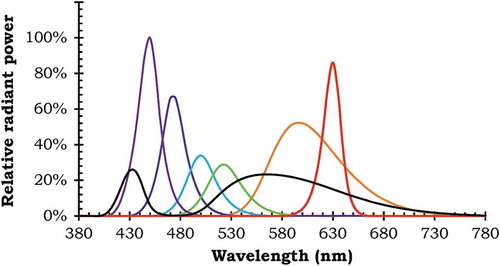
The experiment was conducted in a dark room, using an oil painting as the object for color appearance evaluation. The oil painting, as shown in , was purposely selected to include various fruits with colors that are familiar to humans, as past studies suggested the importance of using objects with familiar objects for preference evaluations (Wei et al. Citation2017). Two spectrally tunable LED fixtures (Electronic Theatre Controls D22 Lustr+), with two layers of diffusers on each fixture, were used to produce a uniform illumination to the painting. The fixtures contained seven LED channels (that is, six color channels and a white channel, with SPDs shown in ) whose intensities can be individually adjusted through a Digital Multiplex (DMX) control interface connected to a computer. During the experiment, the oil painting was placed 1.2 m from the observer, as shown in , and the observer fixed his or her chin on a rest to keep the viewing geometry unchanged.
Fig. 1. (a) Photograph of the oil painting under the illumination and (b) schematic layout of the experiment setup (not to scale).
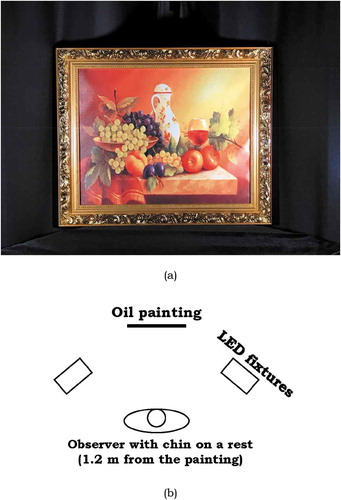
Fig. 2. Spectral power distribution of the seven channels in the spectrally tunable LED fixture.
2.2. Light settings and observers’ evaluations
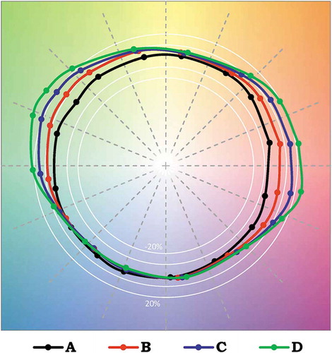
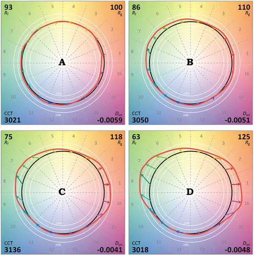
The study included eight light settings organized as a 2 × 4 factorial design, including two levels of vertical illuminance (that is, 20 and 500 lx) and four levels of relative gamut area characterized using IES TM-30-15 Rg (that is, stimulus A: 100, stimulus B: 110, stimulus C: 118, and stimulus D: 125). More important, the gamut shapes of the four stimuli were carefully controlled, so that an Rg of 100 (that is, stimulus A) resulted in a gamut shape similar to that of a reference illuminant and the increase in Rg value was caused by enhancing the saturation of red and green colors (that is, hue angle bin 1 and 8), as shown in . The change of the gamut shape was purposely designed, because both red and green were dominant colors in the painting and past studies have clearly suggested the important role of red in color preference evaluations(Royer, Wilkerson, and Wei Citation2017; Royer, Wilkerson, Wei, et al. Citation2017; Wei and Houser Citation2017; Wei, Houser, Allen, and Beers Citation2014; Wei, Houser, David, and Krames Citation2014). All of the light settings were designed to be metameric, with a correlated color temperature (CCT) of 3000 K and a Duv of −0.005. We initially planned to have light settings with chromaticities on the Planckian locus, but the LED fixtures can only produce such light settings with an Rg of 120, which may not be high enough to test the hypothesis. Thus, we slightly moved the chromaticities below the Planckian locus, so that a wider range of Rg can be covered (Wei and Houser Citation2016). The colorimetric characteristics of the stimuli are summarized in .
Fig. 3. Comparison of the gamut shapes (IES TM-30-15 color vector graphics) of the four stimuli.
The intensities of the seven LED channels were carefully adjusted, so that the SPDs and the colorimetric quantities of each stimulus at the two illuminance levels were as close as possible. shows the relative SPDs of the eight light settings, which were measured using a calibrated JETI specobos 1211 telespectroradiometer and a standard reflectance placed at the center of the painting. The vertical illuminance was calibrated and measured using a calibrated Minolta T-10 illuminance meter being placed at the center of the painting. summarizes the colorimetric characteristics derived from the SPDs; and show the color vector graphics of the SPDs.
Table 1. Summary of colorimetric characteristics of the four stimuli at the two illuminance levels.
Table 2. Percentage of the observers (n = 21) who selected each stimulus within the pairs of stimuli for producing a preferred color appearance of the oil painting. The values with an asterisk represent the judgements that were significantly different from 50%, as tested using a chi-square goodness-of-fit test with a df = 1 at the α = 0.05 level. These P values have not been adjusted for multiple comparisons; three of the five pairs (A vs. C and B vs. D at 500 lx and C vs. D at 20 lx) are at the border of significance and would not be significant if adjusted for multiple comparisons.
Table 3. Summary of results for McNemar test comparing the judgments made at the two illuminance levels. The shaded cells represent the results that were significantly different at the α = 0.05 level.
Fig. 4. Relative spectral power distribution of the four light stimuli at the two illuminance levels.
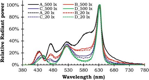
Fig. 5. IES TM-30-15 color vector graphics of the four light stimuli at 20 lx.
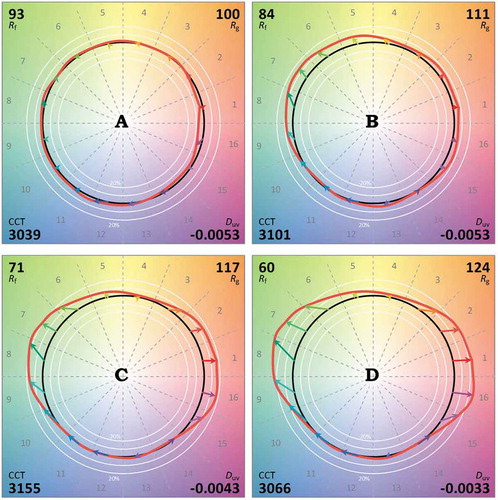
Fig. 6. IES TM-30-15 color vector graphics of the four light stimuli at 500 lx.
In the experiment, the observers were instructed to compare the color appearance of the painting under pairs of light settings at a same illuminance and select the one under which they preferred the color appearance. Each observer compared all possible pairs of light settings, with a total of 18 pairs, including two practice pairs, 12 pairs of different light settings (that is, six pairs at each illuminance), and four pairs of null condition (that is, two pairs at each illuminance).
2.3. Observers
Twenty-one observers (15 males and six females) between 18 and 26 years of age (mean = 21.6, SD = 2.0) were recruited for the study. All of the observers had normal color vision, as tested using the Ishihara Color Vision Test.
2.4. Experimental procedures
Upon arrival, the observer completed a general information survey, read a description of the experiment, and completed the Ishihara Color Vision Test under the illumination of a 3000 K LED source at 50 lx, which allowed the observer to adapt to a low light level.
The observer was then escorted to the experiment area and was seated in front of the painting, with his or her chin placed on a chin rest, so that the distance between the painting and the observer was 1.2 m and all of the observers experienced a same viewing geometry. The fixtures were set to produce stimulus A at 20 lx and the observer was asked to look at the painting for 2 min to further adapt to the low illuminance level. Then the experimenter explained the experimental procedure, proceeded with two practice pairs, and answered the questions raised by the observer. The two practice pairs included a null condition pair (that is, the first and second light settings were identical) and a pair of stimuli A and D (that is, the pair for largest difference); both practice pairs were at 20 lx. Thus, the observer was expected to be completely adapted to the low illuminance level at this point. All observers completed the evaluations under the 20 lx first, because it requires a longer time period to adapt from a high to a low light level.
The experimenter then presented eight pairs of light settings at 20 lx in a predetermined random order that was listed on the recording sheet. For each pair, the two light settings within a pair alternated every 3 s with a dark period of 6 ms between each alternation, which was included to let the observer know that the lighting was alternating, especially when null condition pairs were presented. With the lighting alternating, the experimenter spoke aloud “A, B, A, B, …” and the observer was instructed to compare the color appearance of the painting under the two light settings at least five alternations before making the judgement. The observer, however, was free to observe for as many alterations as necessary. The experimenter recorded the observer’s response and proceeded to the next pair. After completing all eight pairs at 20 lx, the same procedure was repeated for the eight pairs at 500 lx. The entire experiment took around 25 min for each observer.
The order of the two light settings within each pair was counterbalanced between observers. Each observer evaluated four of the eight null condition pairs, with two pairs at each illuminance level.
3. Results
3.1. Possible interval bias
Because the order of the light settings within each pair was counterbalanced between observers, the selection for the first and the second made by the observers should not be statistically different from 50% versus 50%. For the entire 336 pairs of light settings, the first and the second light settings were selected 175 and 161 times, respectively, which was not significantly different from 50% as tested by a chi-square goodness-of-fit test at the α = 0.05 level (P = 0.445). Similar results were found for the 84 null condition pairs, with the first and second light settings being selected 44 and 40 times, respectively (P = 0.663).
3.2. Effect of gamut area and illuminance on color preference
The effect of gamut area size on color preference was evaluated by analyzing the judgements made by the observers for the pairs of light settings listed in , with the two presentation orders for each pair being combined. A chi-square goodness-of-fit test was used to test whether the selection of each light setting in a pair was significantly different from 50% at the α = 0.05 level. When the illuminance was 20 lx, there was generally no preference among stimuli A, B, and C; stimulus C was preferred over stimulus D. In contrast, when the illuminance was 500 lx, stimulus A was preferred over stimulus C, stimulus B was preferred over stimuli C and D, and stimulus C was preferred over stimulus D.
It is worthwhile to point out that the α level of 0.05 was not adjusted for multiple comparisons, because all of the comparisons between the two light settings within each pair were specifically planed and were independent of each other. Of the five pairs that were judged to be statistically different, three of them (A vs. C and B vs. D at 500 lx and C vx. D at 20 lx) are at the border of significance (P = 0.049). If the α value is adjusted for multiple paired comparisons, these marginally significant pairs would no longer be significant, as summarized in .
The difference between the two illuminance levels was tested using McNemar’s test for each pair of light settings. As summarized in , the preference judgments for the light setting pairs made by the observers were generally consistent under the two illuminance levels, except the pair of B versus C.
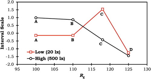
Moreover, Thurstone case V (Thurstone Citation1994) was used to derive an interval scale of the four light settings at each illuminance level based on the judgments made by the observers, as shown in . Coupled with the statistical tests, it can be found that the observers had the lowest preference for light setting D, regardless of the illuminance level. A and B were the most preferred at 500 lx, and C was the most preferred at 20 lx.
Fig. 7. Interval scales of the four stimuli judged by the observers at each illuminance level, derived using Thurstone case V method (Thurstone Citation1994). The scales were standardized, with a mean of zero and a standard deviation of 1 for the four stimuli at each illuminance level.
4. Discussion
The preference judged by the observers at 500 lx in this study well corroborated the findings in Wei and Houser (Citation2017), Royer, Wilkerson, and Wei (Citation2017), and Royer, Wilkerson, Wei, et al. (Citation2017). Both stimuli A and B had Rf, Rg, and Rcs,h16 within the range identified in Royer, Wilkerson, and Wei (Citation2017). Both stimuli C and D, however, oversaturated the colors and caused lower preference in comparison to stimuli A and B. Particularly, though stimulus C had an Rf of 75 and an Rg of 118, the high values in both Rcs,h1 and Rcs,h16 were expected to oversaturate the red colors in the oil painting.
The observers’ judgments clearly indicated the interaction between illuminance and enhanced saturation by using a same set of stimuli under two illuminance levels. As shown in and , the artwork was rated to be less preferred under stimulus C than under stimuli A and B at 500 lx, whereas it had a similar preference under stimuli A, B, and C at 20 lx. In other words, a same stimulus—stimulus C—did not cause oversaturation at 20 lx but caused oversaturation at 500 lx. This suggested that the perceived saturation changed with illuminance, which corroborated the Hunt effect (Hunt Citation1952). Thus, a source with a larger gamut was likely to compensate for the Hunt effect under the lower light level, making the color appearance of the artwork appear more similar to that under a higher illuminance. Based on the findings in this study and the Hunt effect, it is likely that the preference for sources that can enhance the saturation of colors, in comparison to a reference illuminant, found in past studies could be due to the illuminance levels (Islam et al. Citation2013; Jost-Boissard et al. Citation2015; Judd Citation1967; Liu et al. Citation2013; Ohno et al. Citation2015; Sanders Citation1959; Szabo et al. Citation2014; Teunissen et al. Citation2016; Wei, Houser, Allen, and Beers Citation2014; Wei, Houser, David, and Krames Citation2014), because the illuminance levels between 200 and 500 lx employed in these studies were significantly lower than daylight illuminance, which can be as high as 1 × 10⁵ lx (DiLaura et al. Citation2011). The evaluations made by the observers in a recent study also suggested that the perceived saturation of 42 color samples under an exterior daylight condition (with a luminance of 13,050 cd/m2 for a reference white) were generally higher than those under an indoor lighting condition (Ou Citation2016). Thus, we hypothesize that little saturation enhancement is needed when the light level is close to daylight. Such a hypothesis was never carefully tested before, because it requires lighting facilities that can produce stable light stimuli with systematically varied color rendition at high light levels.
Last but not least, lighting professionals, in practice, commonly identify white light light sources or lighting products with good color rendition using specification criteria, such as Ra ≥ 80 (DiLaura et al. Citation2011) or Rf ≥ 75, Rg ≥ 98, and −7% ≤ Rcs,h1 ≤ 15% (Royer, Wilkerson, and Wei Citation2017), without considering light level. The interaction between illuminance and enhanced saturation under sources with large relative gamut area found in this study revealed the importance of considering illuminance with color rendition, especially when an application requires low light level and good color quality (for example, museum lighting). For applications like museum lighting, using sources with excessively large gamut at a low light level may not only enhance color preference but also allow a longer exposure of artworks.
5. Summary and conclusion
Four nearly metameric light stimuli with a CCT of 3000 K and a Duv of −0.005 were carefully created to cover a range of relative gamut area (that is, IES Rg) from 100 to 125 with well-controlled gamut shape to enhance the saturation of red and green colors. Twenty-one observers evaluated the color appearance of an oil painting under pairs of light stimuli using a forced choice protocol at two illuminance levels (that is, 20 and 500 lx).
The evaluations made by the observers at 500 lx generally corroborated numerous past studies. The stimuli that can slightly enhance the color saturation (that is, the stimuli with an Rg of 100 and 110) were generally preferred, whereas the stimuli with excessively large relative gamut (that is, the stimuli with an Rg of 118 and 125) caused oversaturation and were not preferred. The illuminance, however, was found to significantly affect observers’ evaluations. The stimuli with an Rg of 118 was no longer not preferred when the illuminance was reduced from 500 to 20 lx, which implied that humans’ perception to color saturation was affected by light level.
The important role of illuminance in evaluating light source color rendition identified in this study suggested that light level should be considered when specifying light source color rendition. For lighting applications that require low light level and good color rendition, such as museum lighting, sources with excessively large gamut can be used to enhance color preference. The findings also led to an interesting hypothesis regarding whether humans’ preference to an enhanced color saturation was caused by the relatively low illuminance (for example, 200 to 500 lx) in comparison to daylight illuminance (for example, 1 × 10⁵ lx). In addition the change in color appearance of surface colors under excessively high illuminance has not been systematically studied before.
Disclosure statement
The authors report no declarations of interest.
Additional information
Funding
Related Research Data
References
- Airola A. 1975. Changing the colour rendering properties of the light of incandescent lamps in a preferred direction by means of a special absorption method. Saehikoe. 47:283–284.
- Bhattacharjee A., Pal S. 2017. Review on Sustainable Lighting Design in Art Galleries to Balance Between Visibility and Conservation of Light Sensitive Art Exhibits. In: Chakrabarti A., Chakrabarti D. (eds) Research into Design for Communities, Volume 2. ICoRD 2017. Smart Innovation, Systems and Technologies, vol 66. Springer, Singapore.
- Chen H, Chou C, Luo H, Luo M. 2016. Museum lighting environment: designing a perception zone map and emotional response models. Lighting Res Technol. 48(5):589–607. doi:10.1177/1477153515596456.
- [CIE] Commission Internationale de l’Eclairage. 1995. Method of measuring and specifying colour rendering properties of light sources. Vol. 13.2. 20 pp. Vienna (Austria): Commission Internationale de l’Eclairage.
- [CIE] Commission Internationale de l’Eclairage. 2004. Control of damage to museum objects by optical radiation. Vol. 157. 35 pp. Vienna (Austria): Commission Internationale de l’Eclairage.
- David A, Fini PT, Houser KW, Ohno Y, Royer MP, Smet KAG, Wei M, Whitehead L. 2015. Development of the IES method for evaluating the color rendition of light sources. Opt Express. 23(12):15888–15906. doi:10.1364/OE.23.015888.
- DiLaura DL, Houser KW, Mistrick RG, Steffy GR. 2011. The lighting handbook reference and application. 10th ed. 1328 pp. New York (NY): Illuminating Engineering Society of North America.
- European Committee for Standarization. 2014. Conservation of cultural heritage. Guidelines and procedures for choosing appropriate lighting for indoor exhibitions. PD CEN/TS 16163:2014. London (UK): British Standards Institution.
- Houser KW, Wei M, David A, Krames MR, Shen XS. 2013. Review of measures for light-source color rendition and considerations for a two-measure system for characterizing color rendition. Opt Express. 21(8):10393–10411. doi:10.1364/OE.21.010393.
- Huang Z, Liu Q, Westland S, Pointer M, Luo MR, Xiao K. 2017. Light dominates colour preference when correlated colour temperature differs. Lighting Res Technol. doi:10.1177/1477153517713542.
- Hunt RW. 1952. Light and dark adaptation and the perception of color. J Opt Soc Am. 42(3):190–199. doi:10.1364/JOSA.42.000190.
- Islam M, Dangol R, Hyvärinen M, Bhusal P, Puolakka M, Halonen L. 2013. User preferences for LED lighting in terms of light spectrum. Lighting Res Technol. 45(6):641–665. doi:10.1177/1477153513475913.
- James WG. 1984. Incandescent lamps with neodymium oxide vitreous coatings. Google Patents. Patent number US4441046A.
- Jost-Boissard S, Avouac P, Fontoynont M. 2015. Assessing the colour quality of LED sources: naturalness, attractiveness, colourfulness and colour difference. Lighting Res Technol. 47(7):769–794. doi:10.1177/1477153514555882.
- Jost-Boissard S, Fontoynont M, Blanc-Gonnet J. 2009. Perceived lighting quality of LED sources for the presentation of fruit and vegetables. J Mod Opt. 56(13):1420–1432. doi:10.1080/09500340903056550.
- Judd DB. 1967. A flattery index for artificial illuminants. Illum Eng. 62(10):593–598.
- Lin Y, He J, Tsukitani A, Noguchi H. 2014. Colour quality evaluation of natural objects based on the feeling of contrast index. Lighting Res Technol. 48(3):323–339. doi:10.1177/1477153514564097.
- Lin Y, Wei M, Smet KAG, Tsukitani A, Bodrogi P, Khanh TQ. 2015. Colour preference varies with lighting application. Lighting Res Technol. 49(3):316–328. doi:10.1177/1477153515611458.
- Liu A, Tuzikas A, Zukauskas A, Vaicekauskas R, Vitta P, Shur M. 2013. Cultural preferences to color quality of illumination of different artwork objects revealed by a color rendition engine. IEEE Photonics J. 5(4):6801010–6801010. doi:10.1109/JPHOT.2013.2276742.
- Loe DL, Rowlands E, Watson N. 1982. Preferred lighting conditions for the display of oil and watercolour paintings. Lighting Res Technol. 14(4):173–192. doi:10.1177/096032718201400401.
- Ohno Y, Fein M, Miller C. 2015. Vision Experiment on chroma saturation for color quality preference. Proceedings of CIE 28th Session; 2015 Jun 28–Jul 4; Manchester, UK.
- Ou L-C. 2016. A comparison of color preference between indoor and outdoor environments. Proceedings of CIE 2016 Lighting Quality & Energy Efficiency; 2016 Mar 3–5; Melbourne, Australia.
- Rea MS, Freyssinier JP. 2010. Color rendering: beyond pride and prejudice. Color Res Appl. 35(6):401–409. doi:10.1002/col.v35:6.
- Royer M, Wilkerson A, Wei M. 2017. Human perceptions of colour rendition at different chromaticities. Lighting Res Technol. doi:10.1177/1477153517725974.
- Royer MP, Wilkerson AM, Wei M, Houser KW, Davis RG. 2017. Human perceptions of color rendition vary with average fidelity, average gamut, and gamut shape. Lighting Res Technol. 49(8):966–991. doi:10.1177/1477153516663615.
- Sanders CL. 1959. Color preferences for natural objects. Illum Eng. 54(7):452–456.
- Scuello M, Abramov I, Gordon J, Weintraub S. 2004. Museum lighting: why are some illuminants preferred? J Opt Soc Am A. 21(2):306–311. doi:10.1364/JOSAA.21.000306.
- Smet KAG, Ryckaert WR, Pointer MR, Deconinck G, Hanselaer P. 2011a. Colour appearance rating of familiar real objects. Color Res Appl. 36(3):192–200. doi:10.1002/col.v36.3.
- Smet KAG, Ryckaert WR, Pointer MR, Deconinck G, Hanselaer P. 2011b. Correlation between color quality metric predictions and visual appreciation of light sources. Opt Express. 19(9):8151–8166. doi:10.1364/OE.19.008151.
- Szabo F, Keri R, Schanda J, Csuti P, Mihalyko-Orban E. 2014. A study of preferred colour rendering of light sources: home lighting. Lighting Res Technol. 48(2):103–125. doi:10.1177/1477153514555536.
- Teunissen C, van der Heijden F, Poort S, de Beer E. 2016. Characterising user preference for white LED light sources with CIE colour rendering index combined with a relative gamut area index. Lighting Res Technol. 49(4):461–480. doi:10.1177/1477153515624484.
- Thurstone LL. 1994. A law of comparative judgment. Psychol Rev. 101(2):266–270. doi:10.1037/0033-295X.101.2.266.
- Veitch JA, Whitehead LA, Mossman M, Pilditch TD. 2014. Chromaticity-matched but spectrally different light source effects on simple and complex color judgments. Color Res Appl. 39(3):263–274. doi:10.1002/col.v39.3.
- Wei M, Houser KW. 2016. What is the cause of apparent preference for sources with chromaticity below the blackbody locus? LEUKOS. 12(1–2):95–99. doi:10.1080/15502724.2015.1029131.
- Wei M, Houser KW. 2017. Systematic changes in gamut size affect color preference. LEUKOS. 13(1):23–32. doi:10.1080/15502724.2016.1192402.
- Wei M, Houser KW, Allen GR, Beers WW. 2014. Color preference under LEDs with diminished yellow emission. LEUKOS. 10(3):119–131. doi:10.1080/15502724.2013.865212.
- Wei M, Houser K, David A, Krames M. 2014. Perceptual responses to LED illumination with colour rendering indices of 85 and 97. Lighting Res Technol. 47(7):810–827. doi:10.1177/1477153514548089.
- Wei M, Houser KW, David A, Krames MR. 2017. Color gamut size and shape influence colour preference. Lighting Res Technol. 49(8):992–1014. doi:10.1177/1477153516651472.