
ABSTRACT
Light renders art visible in museums. At the same time, light also interprets. In this regard curators, architects, conservators, lenders, artists, and visitors often have differing expectations about how art should be appropriately displayed. This article is based on the aesthetics of image and exhibition and presents six categories of display—ranging from the objective reception of art to hyperrealism and the dynamic communication of art treasures. Differentiation occurs based on three aspects: The content within the artworks, formal aspects of the image medium, and the spatial and temporal surroundings of the work. By analyzing the artwork’s brightness, contrast, and light atmosphere, curators can appropriately specify lighting for the room and exhibit to aesthetically establish a common link between the observer and the artwork or to realize a modification for emphasizing a conceptual idea. The analysis also offers criteria as to what extent the lighting concept communicates an authentic impression in relation to the perception of how the artist created the picture.
1. Introduction
Each method of museum lighting serves to communicate a conceptionally based approach to art. Even exhibition spaces with a neutral atmosphere represent a particular curatorial attitude, where, for example, only diffuse daylight is available as the light source or uniformly illuminated walls project a sense of calm. The same applies to highly pervasive accent lighting that presents art as a collection of individual works. The decision about how to interpret the display of artworks with light is, however, frequently linked to an extensive design process because highly different interests often clash (Garside et al. Citation2017). Architects demand an acknowledgment of the building itself, lighting designers place the importance of light in the foreground, curators aim to make a contextual statement about the collection as a whole, conservators try to avoid any damage to the exhibits, collectors as lenders are keen to communicate a particular sense of aesthetics, and the artists themselves insist on the suitable display of their individual works (Lippert Citation2009). Added to this are various generations of visitors whose general interest in culture hinges on the expressiveness of a presentation (Kesner Citation1993).
With light, exhibition organizers are presented with an influential tool that is able to define the atmosphere for viewing art, establish a sense of drama to support its reception, and generally contribute to the success of the exhibition. For this reason, the question for all participants rapidly arises as to which criteria should be used to achieve a suitable lighting concept: the light atmosphere within the specific artwork? Or the light in which the work was created? And what is appropriate for art that was originally created in candlelight and that should now be displayed in an attractive way? Should an individual work serve as the benchmark or, indeed, the primary theme of the complete exhibition? How can the impact and interaction with art be stimulated with light? When does light appear authentic and in what circumstances might it change the meaning of the exhibit?
To appreciate the context of exhibition lighting, changes to the room, form of display, and exhibit are initially presented. Six lighting concepts demonstrate how presentations can range from the pretense of objective art appreciation to the dynamic communication of art.
1.1. Museum Architecture
Museum architecture as a platform for the display of art has drastically changed since the 1990s (Barreneche Citation2005; MacLeod Citation2005). Many institutes have expanded, and visitors no longer come for the exhibits alone but also for the architecture. Following an era when museums were constructed as monuments, and in the 1960s and 1970s as flexible instruments for displays within white rooms, architecturally expressive forms were created that were also intended to adopt an important municipal function (Macdonald Citation2006). I.M. Pei, for example, designed a striking orientation point for tourists and visitors with the pyramid of the Louvre in Paris illuminated during the evening hours (Schielke Citation2017). The so-called Bilbao effect was achieved with Frank Gehry’s Guggenheim Museum that many museums subsequently attempted to emulate in their striving for comparable cultural and economic success (Jencks Citation2005).
1.2. Changes in Exhibition Design
Exhibition design and lighting has developed and progressed in parallel to changes in the architecture (Steiner Citation2004). The desire for movement and flexibility came about at an early stage, although extensive implementation was seldom realized (Grau et al. Citation2017). The artist and architect Friedrich Kiesler appropriately summarized these flexible expectations of the museum directors: “One should be able to change the heights and the widths of the rooms at will. If possible, automatically. Skylight, daylight from the side, should not be excluded. All in all, an ideal museum would be changeable to any size and dimension, and the lighting, too” (Kiesler Citation1966, p. 94).
The orientation of museums in past decades has also significantly changed from institutions that preserve our cultural heritage to being a service for the public sphere (Hoare et al. Citation2016). This also has consequences for lighting design because the latter needs to comply with the various demands of presentation and display. Part of this transition also includes, for example, the comprehension of visitors as customers desiring entertainment, offering a platform for private persons and companies aiming to attain a cultural sheen for the appearance of their events, establishing the museum as a presentation interface to sponsors, and understanding exhibitions as a location for educating groups or conference participants (Hooper-Greenhill Citation2000; Voorhies Citation2017).
A special challenge is also placed on museums with regard to the presentation of many exhibits. Due to the high number of visual stimuli in the surroundings, observer fatigue can occur because mental effort is required for the reception of objects (Kaplan and Kaplan Citation1982). The decreasing interest in exhibitions in connection with phenomena such as satiation, stress, information overload, and competition between multiple objects is therefore also termed “museum fatigue” (Bitgood Citation2009). One factor able to reduce fatigue consists of appropriate illumination of the spaces and exhibits in order to render the surroundings more readable (Lam Citation1977).
Furthermore, scenographic exhibition concepts with suitable lighting are an important method of offering visitors an appealing stay. This strategy includes surprises to communicate new ways of accessing content, orientation to make the concept behind an exhibition more understandable, special events where visitors can become familiar with exhibits at night within a different context, or reduction to achieve a new level of sensitivity with regard to brightness or color (Dicks Citation2003; Reinhardt and Teufel Citation2010).
1.3. Art Exhibited
Pictures and sculptures usually comprise the essential exhibits of art museums. When displaying artworks with light, three aspects are of interest in addition to conservation requirements from the point of view of the curator: (1) What relationship does the work of art have to the room and the observer? (2) How can the materiality of the artwork be appropriately accentuated? (3) Which art theory aspects are relevant? The first question relates to the arrangement of objects and how the picture frame establishes a separation between the artwork and observer. The second aspect is exemplarily demonstrated with paintings from the Middle Ages and shows how certain pigments, colors, and painting techniques demand appropriate lighting. The third question is explained in the next section from the point of view of the artist and illustrates how an artist interprets light in different ways and use this in his or her works.
A noticeable change in the method of presenting art since the end of the 19th century and in the relationship between the artwork and the observer came about with the omission of the picture frame with modern paintings (Washburn Citation1965). The heavy gold frames tended to emphasize the work of art and also separated it from its surroundings. The illusion of depth was also created by the oblique angle of the frame. Because the works were isolated by the frames, this also enabled tight salon-style hangings without conflicts in pictorial content. In the modern era, the comprehension of pictures has significantly changed as a result of their increasing size, as can be seen by the New York school of action painting. Doing without a frame meant that a separation between the image and observer was annulled to establish a coherent unit, explained Washburn (Citation1965). Modern paintings are more suitable for wide spacing within very wide rooms compared to works of the Renaissance, for example, typified by heavy frames and tight arrangements in palaces or museums. Washburn (Citation1965) also even sees a significant misunderstanding with modern works of art if the paintings are grouped closely together to impact more of an ensemble than single works.
If the perspective is changed from picture frame to picture content, the rendition of color and texture on the pictorial surface comes to the foreground. To enable the gold ground in religious paintings from the Middle Ages to appear shiny, sumptuous, and valuable, for example, light similar to candlelight in old churches is indispensable (Schöne Citation1983). Schöne (Citation1983) also comments that very bright accents detract from the impact and effect of such paintings. The effect would also be modified by replacing the original diffused, colored church windows with clear glass. For the perception of luminous glass window art and mosaics, the light in the room is just as decisive as for works with gold. Schöne (Citation1983) also criticizes that with paintings from the 16th to 18th centuries the standard method of hanging these on very bright walls degrades the light effect of the painting to the benefit of its color impact because the bright walls outshine the work of art. Schöne (Citation1983) claims, on the other hand, that with modern painting where the color is more important than the light, using bright walls is understandable.
1.4. Light in Painting
The perception of how artists interpret light is important for the design of exhibitions to derive to what extent an atmosphere corresponding to the artistic position can be communicated to the museum visitors in the room. The notion of light with artists is characterized by two aspects: Firstly, how light guides the attention and, secondly, how the eye perceives light (Arnheim Citation1960). If, for example, intensive solar rays fall between leaves onto a forest floor, our attention and direction of view immediately change. For artists the subjective perception of light via the eye is also in contrast to the scientific view of physical reality (Arnheim Citation1960).
If uniformly illuminated objects are observed, they appear not to gain their brightness from another source. Arnheim (Citation1960) describes this property as inherent. However, to differentiate between objects and light, Arnheim (Citation1960) classifies into “object brightness” and “illumination”. In works of art these two aspects are not necessarily linked: There may be a light source within the picture but the picture shows no illuminated objects. Alternatively, the source of light may be outside the image space but the objects are still lit. When viewing artworks, a further component must also be considered—the light source that illuminates the room containing the artwork and the observer. The type of lighting in which the artist painted the picture and the lighting in which the observer analyzes the artwork can therefore either create a unit or be in contrast. In a way similar to how light is a foil for the symbolism of day or night, clarity or secrecy, shadows also have meaning and relevance for pictorial content and rooms (Binet et al. Citation2002).
In the history of art, various phases concerning the handling of light can be identified. In early Greek or Egyptian antiquity, a contrast in brightness exists between figures in the foreground and background, but this impression is achieved via object brightness, not via the lighting (Arnheim Citation1960). The use of shadows only came about with the progression of time. In the Middle Ages, the light in the image is decisively influenced by the materiality of the gilded ground.
In the transition to Renaissance times, a significant determination of the terms of light and shadow came about thanks to Leonardo da Vinci: “luce” is the light source of a candle and “lume” is the light of the illuminated side of a sphere (Richter and Leonardo Citation1989). Accordingly, there is also a differentiation with shadows into “ombra primitiva” as shadow that adheres to the side of the sphere in shadow and “ombra drivativa” as the cast shadow of an object that assumes space and falls onto the floor. In the early Renaissance, light was essentially used to model volume prior to light adopting an important symbolic role in Chiaroscuro, as can be seen in an early phase with Leonardo’s “Last Supper” and later in expressive form with the works of Rembrandt (Arnheim Citation1960). The bright and luminous works of the Impressionists, on the other hand, show a different understanding of light. This development reached its zenith in pointillism whereby the pictorial impact was established via dots of brightness and color.
1.5. Methods for Differentiating between Light Concepts
Scientific literature concerning museum lighting frequently analyzes technical aspects such as the visibility of paintings, suitable luminaire arrangements, conservational issues, or correct color rendering (Cannon-Brookes Citation2000; Cuttle Citation1996; Rawson-Bottom and Harris Citation1958). The analyses partly reference the problem in that they analyze a single work of art or dissimilar artworks or sections of a painting or reference a specific painting technique or certain period, but a generalization with several artworks and differing painting techniques is usually not available in practice. The rise of light emitting diode (LED) technology has also enabled the spectrum to be modified and color temperature to be adapted to the pictorial content and matched to daylight (Csuti et al. Citation2015; Nascimento and Masuda Citation2014).
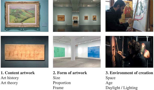
As criteria concerning the suitability of various light concepts for works of art, this article analyzes three aspects: (1) The content within the artworks resulting from art history and art theory, (2) formal aspects of the image medium such as size and proportion, and (3) the spatial and temporal surroundings in which the work was created and the type of light that dominated at that time. Brightness, angle of incidence, light distribution, and the spectrum are included in the last point. A subdivision into six categories is applied for differentiation of the light concepts. These range from objective to expressive presentation. Essentially, this differentiation is implemented based on luminance distribution ranging from very wide to narrow light distributions. The spectrum is also considered for purposes of further differentiation, ranging from one light color to a combination with colored light.
The analysis concerning impact and effect is based on gestalt (composition) psychology and the laws of design such as the law of similarity or the law of good gestalt (Wertheimer Citation1923). The visual patterns created from various luminance distributions and light concepts can also be used to create different surroundings; for example, with a focus on coherence, complexity, legibility, and mystery (Kaplan and Kaplan Citation1982). The lighting is also interpreted with the aid of semiotics and is comprehended as a symbol of communication by which objects change their meaning via light (Hill Citation1999; Schielke Citation2018).
2. Lighting Concepts
A classification of lighting solutions into six categories, ranging from the objective reception of art and hyperrealism to the dynamic communication of artistic treasures, illustrates the diversity of design possibilities and also helps with orientation in the concept phase of exhibition planning (). Introducing the categories begins with the appearance of art and space and then describes the atmosphere from the point of view of the museum visitor. Notes on suitable lighting tools indicate how concepts can be specifically implemented. If a method of presentation and display was derived exclusively from the content of the artwork, critics would justifiably suggest the allegation of formalism. The model of six categories, on the other hand, proposes an approach that indicates how differently light is able to impact on the appreciation of art and how important differentiation is to suitably communicate culture.
Table 1. Characteristic properties (x) for the six types of display: (1) white cube, (2) minimalist accenting, (3) dramatic display, (4) black box, (5) hyperrealism, and (6) dynamism.
2.1. The Pretense of Objective Art Appreciation
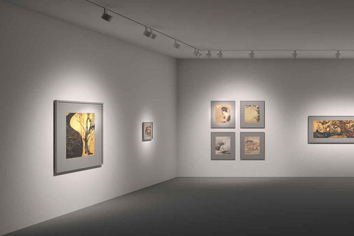
The sober, empty, white-walled rooms of exhibitions evoke the impression of a factual and objective method of displaying art. Large-format paintings such as works from the American Color Field movement from the 1950s have a particularly positive impact in galleries, often termed “white cubes,” because the wall becomes an extension of the artwork itself (O’Doherty Citation1976; Wilkin and Belz Citation2007). Works from the Minimal Art movement or the realistic photographic works of Bernd and Hilla Becher, for example, also achieve a high level of impact if the conceptual attitude of the works comes together, a sense of cloudy sky and diffuse daylight emanating from the soft atmosphere of the room (Lange Citation2006).
Any attempt to emphasize the special features of an individual artwork within such neutrally displayed exhibitions is neglected in favor of a uniform presentation of the exhibits (). Visitors experience a spatial impact even in completely neutral presentations of art—the brightly lit, peripheral white surfaces attract the eye of exhibition visitors. This in turn lends the architecture a level of validity similar to that of the artworks. The artwork as a darker object is able to break away from the bright background and therefore blends visually into the foreground. In terms of atmosphere, the uniform brightness of the white space is reminiscent of test laboratories where any form of external emotional influence is excluded in the striving for objective evaluation. Viewers of art can also concentrate on interpreting the exhibits in a similarly undisturbed way. The monotony of the diffusely illuminated room can, however, stir a sense of boredom because the light atmosphere resembles an overcast sky on a dismal day (Lam Citation1977). The contrast in brightness is unfavorable with wallwashing on white walls displaying dark paintings. Soft shadowing in pictures depicting darkness may also break up and disintegrate to a certain extent if such artworks are illuminated in very bright light.
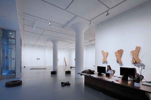
Fig. 1. The exhibition spaces as white cubes support the objective viewing of art. The uniform wallwashing does not differentiate between the art and the wall plane to give a generous spatial impression. Richard Nonas/Donald Judd exhibition in the Fergus McCaffrey gallery, New York. Photography: Edgar Zippel. © ERCO GmbH.
One of the classic daylight solutions for neutrally lit rooms with a uniform distribution of brightness is skylights—either with diffuse glazing or structures aligned northwards so that direct sunlight cannot enter the exhibition space, thus avoiding the danger of glare (Cuttle Citation2007). However, with diffuse daylight, sculptures lack a sense of modeling that comes from shadowing, and any three-dimensional details in paintings are also obscured. Other criteria such as the brilliance of glossy surfaces are diminished.
With the use of electric lighting, museums often install wallwashers to achieve light effects comparable to diffuse daylight (Schielke Citation2013). The homogeneous distribution of brightness in the vertical plane creates a contemplative atmosphere with a deep spatial impression (). To achieve good illumination of the wall surfaces, a distance to the wall consisting of one third of the room height is recommended for wallwashers. The luminaire spacing or distance between the luminaires is generally equal to the distance to the wall. However, according to the particular luminaire, this may also be up to one-and-a-half times the wall distance. Indirect lighting fixtures or light ceilings are alternatively used to create diffused light in exhibition spaces, although wallwashers are able to chisel more details out of paintings and can also emphasize the sense of brilliance on works. Light sources with a color rendering of Ra above 90 are considered to be neutral and very good for museum lighting, whereas Ra values below 80 are regarded as unsuitable (Society of Light and Lighting Citation2015).
Fig. 2. Concept 1—White cube: Uniform spatial impression due to homogenous wallwashing. Rendering: Axel Groß. © ERCO GmbH.
2.2. Minimalist Accenting—The Subtle Emphasizing of Artworks and Motifs
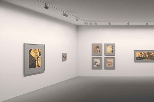
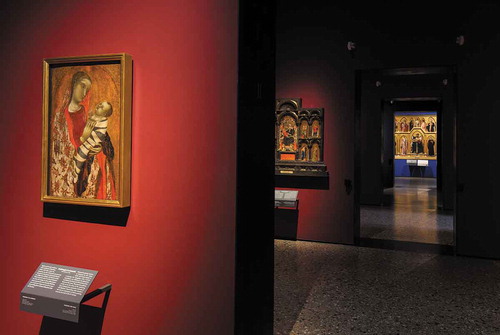
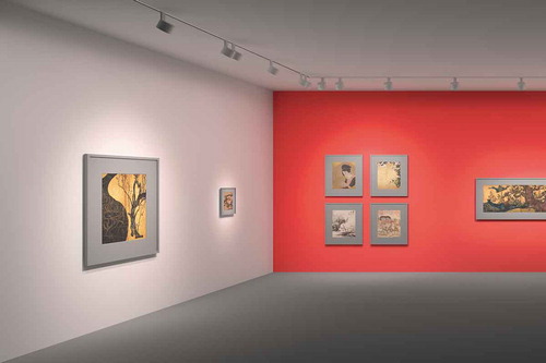
To disassociate from the uniformity of the white cube concept without taking on a more theatrical form of presentation, an approach has developed that works with bright surroundings but subtly emphasizes individual works or conceptional motifs. In this regard, two varying strategies are used in addition to general brightness in the room: Firstly with the background that differentiates itself from the artworks via the luminance and color tone of its wall color and secondly with the use of discreet accent lighting ( and ). Visitors to historic museums presenting classic art are frequently subjected to a very inconspicuous but effective method of presentation. With dark wall colors, the paintings often seem brighter on their own due to the contrast in luminance compared to displaying them on white walls. Another variant consists in the use of color contrasts, where, for example, paintings with warm color tones are displayed on walls with cool colors. This effect can be highlighted with supplementary accent lighting. In the world of art, subtle differences in brightness are found, for example, in the Gothic era with Giotto di Bondone or in the Renaissance with Sandro Botticelli, Michelangelo, and Leonardo da Vinci (Sciacca Citation2012). Such artworks feature very soft shadow modeling.
Fig. 3. Accent lighting at the Louvre Lens museum emphasizes the exhibits below the daylight ceiling in a very subtle way to create a peaceful atmosphere. Architecture: SANAA, Tokyo. Exhibition design: Studio Adrien Gardère. Museum lighting and installation: ACL Alexis Coussement. Lighting design: Arup, London. Photography: Iwan Baan. © ERCO GmbH.
Fig. 4. The foreground achieves a harmonious relationship between the gold color and red wall while the artwork significantly distances itself from the wall in the background. Pinacoteca di Brera, Milan. Architecture: Alessandra Quarto/Angelo Rossi. Photography: Dirk Vogel. © ERCO GmbH.
Curators use pinpoint light accents to lend the works a greater sense of presence in relation to the wall surfaces. The same method can also be used to emphasize central works in the space, thus attracting the attention of visitors to essential exhibits and discreetly communicating the general motif of the exhibition. In contrast to a consistent white cube approach, the room adopts a sense of calm but without sterility or monotony due to the visual dynamism of the unobtrusive contrasts in light.
Individual works or complete groups can be accentuated to establish relationships. Another feasible approach is to discreetly accent a section of a painting to reference the theme of the exhibition, for example, although a cultural–philosophical question arises in such situations—How far can a curator go in modifying an artwork’s statement via lighting? Would perhaps the artist disapprove of such an encroachment and see it as manipulation? Making the right decision demands a degree of experience and sensibility concerning art and artists.
To establish hierarchies of perception that discreetly structure and prioritize the information, exhibition organizers often adopt accent lighting dimmed in a nuanced way as a supplement to general lighting (). Striking contrasts in illumination are achieved with a illuminance ratio from 1:10 upwards between the accent light and its surroundings (Cuttle Citation2007). Though this ratio seems exaggerated for the subtle emphasizing of individual works, a contrast of 1:2, for example, has almost no effect for perception purposes. For this reason, an illuminance ratio of 1:5 is assumed to be ideal. If the nominal reflectivity of the work of art or its surroundings differs due to a very bright or dark color, it is advisable to adjust the illuminance. Dimmable spotlights are indispensable for achieving differentiated contrasts between the exhibit and the room. Decisive, however, for an appropriate result is the overall visual impression of the artwork in the space rather than a painstaking glance at the instrument measuring illuminance. It is recommended to begin with the darkest painting with the highest conservational requirements when setting the illuminance and to match the light to the maximum permissible illuminance (IES Citation2017). The illuminance can then be individually set for the other artworks in accordance with the reflectance of the material colors. In this way, a homogenous overall luminance impression can be created in a room with paintings having different degrees of reflectance. At the same time, the illuminance for bright paintings can be minimized for conservational purposes.
Fig. 5. Concept 2—Minimalist accenting: Subtle accenting via a combination of uniform wallwashing and dimmed accent lighting. The colored wall establishes an additional contrast with the warm-toned picture and red background. Rendering: Axel Groß. © ERCO GmbH.
Softly diminishing graduations on light beams also support the impression of curatorial encroachments taken with care. Discreet accent lighting gives a new impact to sculptures in particular because their silhouettes and surfaces are modeled by the shadowing and radiance. Another form of discreet interpretation is in the shape of the light beam. If, for example, related artworks are grouped together using an oval light beam, the observer rapidly identifies contextual references, whereas this might not be the case with individual light accents pinpointing the individual meaning of the work. With exhibition spaces where daylight enters from one side only, subtle displays of artworks can be achieved, for example, if the lighting adopts this light direction along with its associated distribution of brightness and indeed simulates this with appropriate illuminances on the specific walls. As a result, the wall opposite the window facade gains a higher illuminance than the wall segments between the windows.
2.3. Strong Contrasts in Light Achieve Dramatic Presentations
Both painters and photographers take advantage of intensive contrasts in light and shadow to achieve a sense of tension in their image compositions. Transferring this ambiance to the exhibition room suggests itself to provide visitors with holistic experiences of art. The Chiaroscuro style developed in the Late Renaissance and Baroque eras typical, for example, of many works by Caravaggio or Rembrandt attempted to achieve dramatic image effects with use of intensive bright–dark (Kelleher et al. Citation1985). Such high-contrast light and shadow effects are also an essential part of the photographic style of many works by the fashion photographer Mario Testino (Testino Citation2015). In a time in which exhibitions have become a popular leisure activity, rich-contrast presentations, as used on the stages of theaters, for example, also achieve a stimulating, entertaining allure.
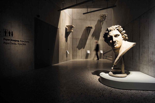
If this approach is transferred to an exhibition room, the artwork becomes the center of attention and the peripheral space recedes to disappear into the surrounding darkness (). The darker the wall color, ceiling, and floor, the more intensive the spatial impact. Each work of art is given its own grand entrance with the use of accent light. In terms of atmosphere, the dark room involuntarily creates an impression of nighttime in which the light beams bring the art to life (similar to using a flashlight outside at night). Just as a projector in theatrical productions spotlights the principal actor on stage, so the focus is placed on the specific individuality of the art. The intensive contrast in brightness establishes a dramatic atmosphere for visitors, exerting a sense of fascination akin to a stage performance, and in this way even the composure and dispassion of sober art works can be divested. Here again, though, curators must ask themselves how far they can go in emotionalizing the apparently objective visual language of the artist in an attempt to achieve high-profile exhibitions. In dark environments, when does the feeling of a fascinating secret deteriorate into a sense of loss and disorientation? For sculptures that explicitly depend on spatial perception, the general use of high-contrast accent lighting in achieving an intensive play between light and shadow on the exhibit is often simpler than with paintings.
Fig. 6. The intensive play of light and shadow is reminiscent of a theater production with actors on the stage. Schweizerisches Nationalmuseum/Landesmuseum Zurich. Photography: Moritz Hillebrand. © ERCO GmbH.
Directed light from spotlights is essential for exhibits if rich-contrast, bright–dark presentations are aimed for (). Each source of diffuse light in the room would impair the impact of dark surroundings. The intelligent selection of specific light beams enables the surface to be illuminated to be ideally matched to the size and shape of the works of art. Spotlights with replaceable light distributions are ideal for such requirements because they enable simple modification in both temporary and permanent exhibitions (Schielke Citation2011). Narrow spot beam angles of <10° are suitable for accenting very small objects or for bridging larger distances between the luminaire and the work of art. In contrast, spot or flood beam angles are used for larger objects. High illuminances may occur with the concentration or grouping of very narrow light distributions that might have a damag-ing impact on light-sensitive exhibits (CIE Citation2004; Thomson Citation2013).
Fig. 7. Concept 3—Dramatic display: Intensive bright–dark contrast exclusively via accent lighting. The dark wall color emphasizes the bright–dark effect between the picture and its background. Rendering: Axel Groß. © ERCO GmbH.
A further option for linear-shaped objects is oval floodlight distribution for the ideal illumination of wide paintings and statues. Even wider light distributions such as wide flood are available, but these are less suitable for creating high-contrast, bright–dark atmospheres because they excessively brighten the room. Wide light distributions are usually only used by curators when displaying exhibits covering the height of the room, such as tapestries, and predestined for such purposes are lens wallwashers that achieve a uniform distribution of brightness on the wall. However, in this context, dark floors and ceilings are needed to create an intensive sense of tension in the room based on bright–dark contrasts. With sculptures, the sense of drama can be increased with shadows and extreme light directions—either with the steep incidence of grazing light for emphasizing textures or with a very wide angle of incidence for sculptures that generates very long shadowing (Michel Citation1996). In general, a 30° angle of incidence has proved ideal for paintings and sculptures to achieve good modeling and avoid overshadowing (Thomson Citation2013).
2.4. The Black Box: Magically Illuminating Works of Art
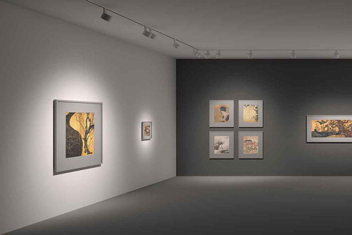
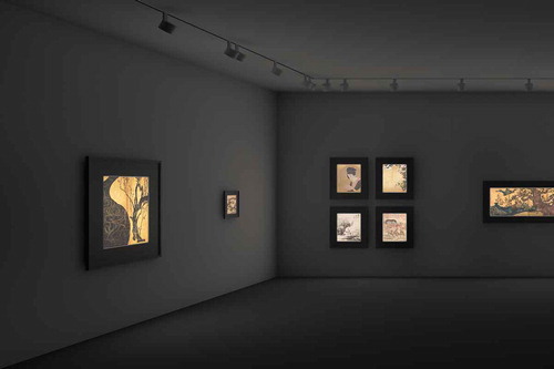
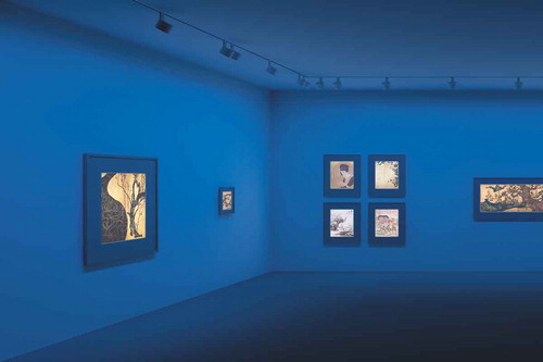
Very dark exhibition spaces seem to exude a secretive atmosphere where works of art arouse in observers the impression of being illuminated from within. The concept of a black box where exhibited objects are illuminated as jewels in a form of treasure box represents the opposite approach to the white box. Photographs gain the impression of having been installed in front of light boxes. The Canadian artist Jeff Wall, for example, shows his photographs in illuminated boxes (De Duve et al. Citation2010). This automatically arouses associations with the cinema, television, and neon advertising.
If artworks seem to only illuminate from within, they disassociate themselves completely from their architectural surroundings (). It is as if only the art itself is important, although its effect is strongly based on this magical method of presentation. This approach creates an artificial context because artists seldom create their works in comparable conditions, and luminous surfaces in this form do not occur in nature.
Fig. 8. Contour spotlights enable works of art to impressively illuminate from within. Hangaram Design Museum, the Seoul Arts Center, Seoul. Photography: Sebastian Mayer. © ERCO GmbH.
With this method, curators dispense completely from attempting to display art in a realistic way in favor of dramatic effects. Works of art gain a highly emotional, slightly mystical effect because only these are illuminated and their surroundings remain completely dark.
Contour spotlights are indispensable for such effects because they have a framing attachment that projects circles of light or contours with highly crisp edges () (Krautter and Schielke Citation2009). The attachment on the head of the luminaire is used to individually modify the projected area to the specific artwork. The crisp edge of the light beam is modified by sliding the lens, and the framing attachment is initially precisely focused when illuminating pictures. Slight defocusing is then carried out to achieve softer transitions, especially with wide picture frames. If luminaires have a closed contour attachment, museum visitors can hardly see them in dark exhibition spaces.
Fig. 9. Concept 4—Black box: Display of artworks with projection spotlights that only illuminate the picture surface via their crisp beam contours. The pictures seem to illuminate from within because both the picture frames and the room lie in darkness. Rendering: Axel Groß. © ERCO GmbH.
2.5. Interpreting Artworks with Hyperrealism
Visitors are confronted with an exaggerated sense of reality within hyperrealistic display strategies. Hyperrealism is an art movement that originated in the United States and Europe in the 1970s (Bredekamp and Stafford Citation2006). The hyperrealistic style emphasizes details and themes that are artificially reinforced and thus have a stronger impact than in the real world. The painter Chuck Close, with his oversized portraits, and the sculptor Duane Hanson, with his life-sized human figures reflecting scenes and situations from everyday life in America, are among the founders of hyperrealism (Duane et al. Citation1999; Russell Taylor and Bollaert Citation2009). The British artist Matthew Penn also classifies his works as belonging to hyperrealism (Terstiege Citation2015). The artist emphasizes gradations of brightness in his portraits with the use of lighting to achieve greater clarity and a stronger, more subtle definition of details (). This creates an astounding interplay between the multiple layers of oil colors and the precise alignment of several contour spotlights with varying color temperatures. With Penn, the illumination of the artwork becomes a fixed component of his art.
Fig. 10. The British artist Matthew Penn classifies his works as hyperrealistic, highlighting gradations in brightness using several contour spotlights for each work. Photography: Matthew Penn. © Matthew Penn.
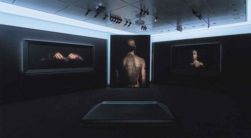
Artworks subjected to hyperrealistic display situations are intentionally exposed to transformations that aim to increase visual perception, often to an excessive extent. In contrast to the lighting concepts outlined above that concern the relation between the artwork and the space, hyperrealism works exclusively with the object itself and its redefined statement. With discreet interpretations, an uncanny or even frightening mood is sometimes created because visitors discover striking resemblances to reality. In an environment in which people interested in art are diversely stimulated by theme-related worlds, curators are faced with the question of how far they can proceed to contributing to a new method of experiencing art using hyperrealism, in striving for exhibition success achieved by reinterpreting the exhibits or emphasizing the guiding philosophy of an exhibition. If artists utilize light for a hyperrealistic effect in the context of their image concept, the light becomes an integral part of the work of art. However, if lighting designers and curators retrospectively decide to display a work of art in a hyperrealistic way in the context of the exhibition, this concerns an interpretation of the work of art—even if artists or curators fall back on similar lighting techniques.
With hyperrealistic exhibition concepts, lighting designers experiment with special brightness distributions or the light spectrum itself, for example (). With the former, the painstaking analysis of brightness distribution on the painted surface is paramount. In comparison to the lighting concepts described above in which the light beams achieve a fairly uniform distribution of illuminance on the image surface, hyperrealism brings the lighting effect of the individual parts of the image more to the fore and emphasizes these in a differentiated way. If the work of art contains a variety of contrasts, a correspondingly greater number of luminaires with narrow light beams are used. Contour spotlights are ideal for such applications because the projected area can be adjusted in shape, size, and focus by modifying the lens position. A potentiometer on the spotlight allows the brightness of each luminaire to be individually matched to the specific area of the painting. It is recommended to invest sufficient time with such scenarios when setting up the exhibition.
Fig. 11. Concept 5—Hyperrealism: Display of pictures via very narrow accent lighting on parts of two pictures (painting on the left and painting at top left on the rear wall) as a supplement to accent lighting for the individual paintings. The spectra of the two outer accent spotlights differ from the others and intensify the warm colors of the painting to achieve a sense of hyperrealism. Rendering: Axel Groß. © ERCO GmbH.
The second option for emphasizing the impression of color via the light spectrum requires luminaires with several individually controllable color channels. In the period before LED technology, lighting designers exerted influence on the spectrum via their specification of the light source with, for example, fluorescent or incandescent lamps and with the use of filters in order to influence the color saturation on paintings. However, this procedure did not allow easy adaptation to changing exhibitions. Luminaires with individually controllable color channels simplified handling. With this method, color consistency remains constant across several luminaires that target different zones within the artwork. However, the composition of the light spectrum is modified on each individual spotlight using the various color channels—the result is that certain material colors in individual zones of the image or within an exhibition have a different effect and that color rendering is therefore modified (Csuti et al. Citation2015; Houser et al. Citation2016; Schanda et al. Citation2016). This process enables single colors—for example, a blue sky—to be emphasized in terms of color impression while avoiding the shifting of colors toward blue elsewhere in the image or on other artworks in the exhibition room. This phenomenon is known as “metamerism”—working with identical color constancy while simultaneously modifying the spectral composition (Staniforth Citation1985). The spectrum of warm white LEDs generates a neutral impression of color in contrast to many discharge lamps because these spectral distributions are irregular. With the red, green, and blue LEDs of RGBW modules, the same warm white light color can be created by mixing the three colors, but the spectrum exhibits three peaks that can intensify color impression of colored materials. Light control enables lighting designers to individually define the color channels of RGBW luminaires to achieve hyperrealistic color impressions. Light control and appropriate luminaires gives the curator the option of individually setting color fidelity (Rf) and color gamut (Rg). Artists could also use luminaires with multicolor LEDs for dynamic presentations of their artwork and exhibitions and introduce sequences of color patterns.
2.6. Dynamically Communicating Exhibitions
In today’s society, education and entertainment are increasingly merging to become a single entity. To motivate a younger public whose everyday existence is dominated by digital devices and multimedia experiences, museums are looking more closely at innovative forms of presentation (Mattern Citation2014). Visitors equipped with tablets and mobile phones already have their own interfaces to access further information, to discover exhibits in a playful way using apps and augmented reality and to even interactively influence presentations. The interest in avoiding a static atmosphere in exhibitions and influencing the attention of the public when they visit exhibitions and museums has a long tradition. However, modern technology has much simplified the implementation of dynamic display concepts and also enabled new forms and methods.
Peggy Guggenheim used dynamic light in her first New York gallery, “The Art of This Century,” in 1940 with the intention of creating a new method of access to art and visually communicating the pulsating character of life by using pulsating light (Bogner et al. Citation2005). Movement can also be a component of the pictorial content (Kepes Citation1965). Alternatively, the image technology can suggest a dynamic staging. A work of art by David Hockney in the Smithsonian American Art Museum or the works of the Italian Studio Carnovsky, for example, achieve changes in reception because they function with alternating light colors in order to make various patterns visible (Moreno Citation2010; Smithsonian American Art Museum Citation2003). A step further is the kinetic art, in which the viewer can experience the dynamics directly.
Artworks as singular static objects disappear, to be replaced by dynamic backdrops for high-impact and informative overall experiences (). The exhibition space is transformed into a stage for visitors that gains in aesthetic quality from the redesigned choreography of the works of art. With such concepts, visitors may gain the impression that the lighting itself dominates in the form of light art, to the detriment of the exhibits. Furthermore, if the main focus of artistic communication shifts away from the actual display of the works toward an atmosphere of entertainment, an impression of kitsch is rapidly created for the art aficionado.
Fig. 12. Varying the brightness and light color creates dynamic light with a pulsating atmosphere for celebrating the experience of culture. MAMUZ Living Museum for Prehistory, Schloss Asparn/Zaya, Asparn an der Zaya. Exhibition architecture: Atelier Christoph Cremer, Vienna. Photography: Gustavo Allidi Bernasconi. © ERCO GmbH.
Designing dynamic lighting concepts is, on the one hand, based on modifiable lighting parameters and, on the other, based on the complexity of the interaction. Accordingly, suitable light control systems with sensors and controllable luminaires are selected. Three types of interaction can be identified: dynamic, responsive, and interactive (Seitinger and Weiss Citation2015). Presentations using dynamic light consist of preset sequences; for example, a high level of illuminance at midday that recedes toward the evening. This change can be implemented via daylight or via the lighting. This in turn enables visitors to register the changing course of the day outside.
Visitors are exposed to a responsive lighting situation when sensors modify the light; for example, if people enter a dimmed exhibition space and a motion sensor then increases the accent lighting—either due to conservational considerations or to enable observers to individually view artworks. A different light direction or a change from accent lighting to wallwashing in the room is also feasible. If, for example, daylight enters an atrium housing sculptures, the direction of the light and its brightness change automatically over the course of a day. To achieve a stronger sense of emotion when entering the space, another possibility would be supplementing warm white accent lighting for good color rendering of the pictures with cool or even blue general lighting or wallwashing, thus further intensifying the focus on the exhibits beyond the color contrast itself ().
Fig. 13. Concept 6—Dynamism: A combination of projection spotlights for the individual paintings with uniform blue wallwashing. The crisp-contoured accent lighting enables good color rendering of the paintings. Rendering: Axel Groß. © ERCO GmbH.
Museums can provide interactive lighting situations via apps; for example, where visitors modify the light over their own smartphones. If the observer selects a particular motif in the room, appropriate artworks or sections of pictures are then emphasized with higher illuminance. With regard to museum-based education, quizzes are feasible where visitors enter their responses into the app and the accent lighting indicates the correct answer. If level-of-interest profiles are available to visitors, this enables further situations where the majority decides whether an artwork is displayed in a peaceful, neutral atmosphere or alternatively with a possibly rich-contrast, theatrical ambience.
3. Conclusion
The rise of new art forms and other aesthetic ideals is reflected in methods of art communication and in the changes that exhibition concepts have undergone. The innate diversity of art presentations with light ranges from sober, neutral atmospheres achieving an objective impression to hyperrealism and dynamic presentations that celebrate the interaction with cultural assets as experiences (). Three factors can be used as criteria when selecting a lighting concept: The (1) content within the artworks, (2) formal aspects of the image medium, and (3) spatial and temporal surroundings in which the work was created (). By analyzing the artwork’s brightness, contrast, and light atmosphere, curators can specify a similar method of lighting for the room and the exhibit—for example, rich-contrast accent lighting for expressive Chiaroscuro effects. If, on the other hand, the size of the artwork and its picture frame are considered, lighting can also be selected that corresponds to the aesthetic approach; for example, wide-area wallwashing for large, minimalist paintings or narrow distribution accent lighting for small portraits with striking, historic frames. A suitable color temperature and lighting method can also be derived from the particular era and its historic background; for example, either natural daylight or candlelight in a studio. The analysis based on pictorial artworks is also applicable to sculptures. An important criterion with light when aiming for authentic presentations is the question of whether the artist perceived the artwork in that way at the time of creating the work, whether the lighting concept being considered could lead to a falsifying of the artistic statement, and whether the lighting solution distracts from the essential reception of the art.
Table 2. Overview of the methods of display with regard to effect on the artwork, atmosphere of the room, and lighting design.
Fig. 14. Factors for selecting lighting concepts: Content within the artworks, formal aspects of the image medium, and spatial and temporal surroundings in which the work was created.
Disclosure Statement
In accordance with Taylor & Francis policy and my ethical obligation as a researcher, I am reporting that I am employed by a company that may be affected by the research reported in this article. I have disclosed those interests fully to Taylor & Francis, and I have in place an approved plan for managing any potential conflicts that arise.
Additional information
Funding
Related Research Data
References
- Arnheim R. 1960. Art and visual perception - a psychology of the creative eye. Berkeley (CA): University of California Press.
- Barreneche RA. 2005. New Museums. London (UK): Phaidon.
- Binet H, Brandi U, Bunschoten R, Flagge I, Geissmar-Brandi C, Cachola Schmal P. 2002. The secret of the shadow. Light and shadow in architecture. Tübingen (Germany): Ernst Wasmuth Verlag.
- Bitgood S. 2009. Museum Fatigue: A critical review. Visitor Studies. 12:93–111. doi:10.15502724.2014/10645570903203406
- Bogner D, O’Connor FV, Quaintance D, Sharp J, Sonzogni V. 2005. Davidson S, Rylands P. (editor). Peggy Guggenheim & Frederick Kiesler: the story of art of this century. New York (NY): Guggenheim Museum.
- Bredekamp H, Stafford BM. 2006. One step beyond. Hyperrealism. London (UK): Tate etc; p. 76–79.
- Cannon-Brookes S. 2000. Daylighting museum galleries: a review of performance criteria. Light Res Technol. 32:161–168. doi:10.1177/096032710003200311
- CIE. 2004. CIE 157:2004: control of damage to museum objects by optical radiation. Vienna (Austria): Commission International de l’Éclairage.
- Csuti P, Fáy A, Schanda J, Szabó F, Tátrai V. 2015. Colour fidelity for picture gallery illumination, Part 2: test sample selection – museum tests. Light Res Technol. 47:522–532. doi:10.1177/1477153514555425
- Cuttle C. 1996. Damage to museum objects due to light exposure. Light Res Technol. 28:1–9. doi:10.1177/14771535960280010301
- Cuttle C. 2007. Light for art’s sake. Lighting for artworks and museum displays. Oxford (UK): Elsevier.
- De Duve T, Pelenc A, Groys B, Chevrier J-F, Lewis M. 2010. Jeff Wall: complete Edition. London (UK): Phaidon.
- Dicks B. 2003. Culture on display. The production of contemporary visitability. Maidenhead (UK): Open University Press.
- Duane H, Pamer L, Livingstone M. 1999. Duane Hanson: A survey of his work from the ’30s to the ’90s. Lauderdale (UK): Museum of Art.
- Garside D, Curran K, Korenberg C, MacDonald L, Teunissen K, Robson S. 2017. How is museum lighting selected? An insight into current practice in UK museums. J Inst Conserv. 40:3–14. doi:10.15502724.2014/19455224.2016.1267025
- Grau O, Coones W, Rühse V. 2017. Museum and archive on the move. Changing cultural institutions in the digital era. Berlin (Germany): De Gruyter.
- Hill R. 1999. Designs and their consequences. Architecture and Aesthetics. New Haven (CT): Yale University Press.
- Hoare N, Milliard C, Niemojewski R, Borthwick B, Watkins J. 2016. The New Curator. London (UK): Laurence King Publishing.
- Hooper-Greenhill E. 2000. Changing Values in the Art Museum: rethinking communication and learning. Int J Herit Stud. 6:9–31. doi:10.15502724.2014/135272500363715
- Houser K, Mossman M, Smet K, Whitehead L. 2016. Tutorial: color Rendering and its applications in lighting. Leukos. 12:7–26. doi:10.1080/15502724.2014.989802
- Illuminating Engineering Society. 2017. Recommended practice for museum lighting. RP-30-17. New York (NY): Illuminating Engineering Society.
- Jencks C. 2005. The iconic building: the Power of enigma. London (UK): Frances Lincoln.
- Kaplan S, Kaplan R. 1982. Cognition and Environment. New York (NY): Praeger Publishers.
- Kelleher BD, O’Neill JP, Shultz E. 1985. The Age of Caravaggio. New York (NY): The Metropolitan Museum of Art.
- Kepes G. 1965. The nature and art of motion. New York (NY): G. Braziller.
- Kesner CW. 1993. Museum exhibition lighting: visitor needs and perceptions of quality. J Illum Eng Soc. 22:45–54. doi:10.15502724.2014/00994480.1993.1074801
- Kiesler F. 1966. Inside the endless house. New York (NY): Simon and Schuster.
- Krautter M, Schielke T. 2009. Light perspectives between culture and technology. Lüdenscheid (Germany): ERCO.
- Lam WMC. 1977. Perception and lighting as formgivers for architecture. New York (NY): McGraw-Hill.
- Lange S. 2006. Bernd and Hilla Becher. Cambridge (MA): The MIT Press.
- Lippert W. 2009. Light follows the curator – not the reverse. Lüdenscheid (Germany): Lichtbericht; p. 16–19.
- Macdonald S. 2006. A companion to museum studies. Malden (MA): Blackwell Publishing.
- MacLeod S. 2005. Reshaping museum space. Architecture, design, exhibitions. London (UK): Routledge.
- Mattern S. 2014. Animated Spaces. Senses Soc. 9:131–150. doi:10.2752/174589314X13953118734742
- Michel L. 1996. Light: the shape of Space. Designing with space and light. New York (NY): Van Nostrand Reinhold.
- Moreno S. 2010. Filtered Frescos. Amsterdam (NL): Frame; p. 230–233.
- Nascimento SMC, Masuda O. 2014. Best lighting for visual appreciation of artistic paintings—experiments with real paintings and real illumination. J Opt Soc Am A. 31:A214. doi:10.1364/JOSAA.31.00A214
- O’Doherty B. 1976. Inside the white cube. The ideology of the gallery space. Berkeley (CA): University of California Press.
- Rawson-Bottom WE, Harris JB. 1958. Artificial lighting as applied to museums and art galleries. Light Res Technol. 23:6–27. doi:10.1177/147715355802300102
- Reinhardt UJ, Teufel P. 2010. New exhibition design 02. Ludwigsburg (Germany): avedition.
- Richter JP, Leonardo Da V. 1989. The noteboooks of Leonardo Da Vinci. Vol. 1. New York (NY): Dover Publications.
- Russell Taylor J, Bollaert M. 2009. Exactitude: hyperrealist art today. London (UK): Thames & Hudson.
- Schanda J, Csuti P, Szabó F. 2016. A new concept of color fidelity for museum lighting. Leukos. 12:71–77. doi:10.1080/15502724.2014.978503
- Schielke T. 2011. Interchangeable lenses allow for differentiated light distribution in architectural lighting. LEDs Magazine. [ accessed 2018 Jul 20]. https://www.ledsmagazine.com/articles/print/volume-8/issue-6/features/interchangeable-lenses-allow-for-differentiated-light-distribution-in-architectural-lighting-magazin.html
- Schielke T. 2013. Tutorial: rationale, concepts, and techniques for lighting vertical surfaces. Leukos. 9:223–243. doi:10.1582/LEUKOS.2013.09.04.001
- Schielke T 2017. Cubism to clarity. From dark concrete voids to luminous glass pyramids: the evolution of light in IM Pei’s museums. London (UK): Light Magazine. 49:18–41.
- Schielke T. 2018. The language of lighting: applying semiotics in the evaluation of lighting design. Leukos. doi:10.1080/15502724.2018.1518715
- Schöne W. 1983. Über das Licht in der Malerei. Berlin (Germany): Gebr. Mann Verlag.
- Sciacca C. 2012. Florence at the Dawn of the renaissance painting and illumination, 1300-1350. Los Angeles (CA): J. Paul Getty Museum.
- Seitinger S, Weiss A. 2015. Light for public space. Eindhoven (NL): Philips Lighting.
- Smithsonian American Art Museum. 2003. Snails Space with Vari-Lites, “Painting as Performance.” Smithson Am Art Museum. [ accessed 2018 Feb 21]. https://americanart.si.edu/artwork/snails-space-vari-lites-painting-performance-71863.
- Society of Light and Lighting. 2015. Lighting for the built environment. LG8: lighting for museums and art galleries. London (UK): Society of Light and Lighting.
- Staniforth S. 1985. Retouching and colour matching: the restorer and metamerism. Stud Conserv. 30:101–111. doi:10.1179/sic.1985.30.3.101
- Steiner J. 2004. Kunstausstellungen inszenieren. In Szenografie in Ausstellungen und Museen. DASA (Bundesanstalt für Arbeitsschutz und Arbeitsmedizin), Kilger G (Ed.). Essen (Germany): Klartext Verlag; p. 90–104.
- Terstiege G 2015. Matthew Penn’s sense of light. ERCO. [ accessed 2017 Nov 20]. http://www.erco.com/projects/focus/report/matthew-penn-s-sense-of-light-6084/en/.
- Testino M. 2015. Mario Testino: in your face. Cologne (Germany): Taschen.
- Thomson G. 2013. The Museum Environment. Oxford (UK): Butterworth-Heinemann.
- Voorhies J. 2017. Beyond objecthood. The exhibition as a critical form since 1968. Cambridge (MA): The MIT Press.
- Washburn GB. 1965. Structure and continuity in exhibition design. In The nature and art of motion. Kepes G (Ed.). New York (NY): G. Braziller; p. 168–175.
- Wertheimer M. 1923. Untersuchungen zur Lehre von der Gestalt. Berlin (Germany): Psychologische Forschung Zeitschrift für Psychologie und ihre Grenzwissenschaften; p. 301–350.
- Wilkin K, Belz C. 2007. Color as Field: american Painting, 1950-1975. New Haven (CT): Yale University Press.