 https://orcid.org/0000-0003-1241-318X
ABSTRACT
Technology has transformed maps into interactive tools for exploring and understanding the world. In this article, we present the user experience (UX) design process for Flyover Country (http://flyovercountry.io), a mobile mapping application that visualizes information about the Earth’s geology and history, allowing users to save and then access the information offline while flying, driving, or hiking. Specifically, the paper presents a UX design study that tracks the conceptualization, implementation, and revision of Flyover Country, and employs scenario-based design to walk through a pair of use case scenarios that informed our UX design: science outreach to the general public and field trip guides for geoscience education. In the paper, we note UX design insights that are potentially transferable to other mobile mapping contexts, organizing insights by mobile representation design (scale, projection, symbolization, and typography) versus mobile interaction design (map entry point, bottom navigation, floating action button, and pull-up information panel).
1. Introduction & background: mobile UX design for maps
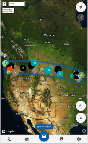
Flyover Country (http://flyovercountry.io/) is a free mobile mapping application that visualizes public data resources about the Earth’s geology and history as users observe the landscape from an airplane window seat, during a road trip, or while on a field trip (). Today, maps are more than a visual depiction of static data: they are interactive information repositories that illuminate our experience of the world. User experience (UX) design describes the range of decisions that enable users of an interactive product to achieve their desired outcomes (CitationGarrett, 2010). UX is as much about the user’s journey as their destination, with designers carefully thinking through user needs and use case scenarios to ensure a productive and satisfying experience as users work towards their goals (CitationElzakker & Ooms, 2018).
Figure 1. Screenshot of Flyover Country, a mobile mapping app for geoscience outreach, education, and data discovery. Flyover Country is freely available for Android and iOS at: http://flyovercountry.io/
Cartographers are increasingly assuming the role of UX designers for interactive products with central mapping components (CitationHaklay, 2010), such as Flyover Country. Cartographers are natural UX designers, as mapmaking is explicitly user-facing and many recommendations for representation design of the visual encoding of data also extend to interaction design of the user interface for manipulating this data. While researchers in cartography and geoinformatics are beginning to address UX design questions (e.g. CitationGriffin et al., 2017; CitationRoth, Çöltekin, et al., 2017), few tried-and-true recommendations exist to inform map-based UX and UI design (MacEachren, Citation2013). To this end, scholars in UX design as well as information visualization and usability engineering call for design studies that highlight insights from a real-world design process that may be transferable to other design contexts with similar motivations and constraints, positioning design studies as a complement to basic scientific research claiming generalizable insights applicable across design (see CitationMunzner, 2009; Sedlmair, Meyer, & Munzner, Citation2012 ). We contribute to this gap by reporting on a UX design study that tracks the conceptualization, implementation, and revision of Flyover Country.
Our work on Flyover Country specifically contributes to mobile UX. Mobile devices make it possible to acquire geospatial information while situated in the landscape (CitationArmstrong & Bennett, 2005; Reichenbacher, Citation2004). In this way, mobile maps augment the real world, providing context about geographic features while making visible otherwise hidden geophysical processes. Thus, the potential for mobile mapping for geoscience research, education, and outreach is substantial (CitationMyrbo et al., 2018). There is a small but growing literature on the constraints that mobile platforms impose on map design (CitationChittaro, 2006; CitationHuang et al., 2018; Meilinger et al., Citation2007; CitationMeng et al., 2005; CitationReichenbacher, 2001, Citation2003; Ricker Citation2019; CitationRicker & Roth, 2018; Roth et al., Citation2018; Stevens et al., Citation2013; CitationVan Elzakker et al., 2008), including small screens, reduced processing and memory, reduced bandwidth and network connectivity, limited battery, and post-WIMP (windows, icons, menus, points) touchscreen interaction. Many cartographic design conventions need to be rethought for the mobile context (CitationMuehlenhaus, 2013), making UX design studies on mobile maps particularly pressing.
We began development of Flyover Country (version 1.0) in 2015, with the app garnering over 350,000 downloads as of November 2020. We received U.S. National Science Foundation (NSF) support in 2017 to undertake a significant redesign of Flyover Country in support of NSF’s ‘Broader Impacts’ mission to utilize discoveries and data products derived from basic science for improved outreach and education (NSF 15-008). The redesign allows us to use the two versions (v1.0: 2015–17; v2.0: 2017–present) as reference points for critical discussion about mobile map UX. In Section 2, we outline Flyover Country’s data sources, functionality, and evaluation. Following tenets of scenario-based design (CitationMacEachren et al., 2008; CitationRosson & Carroll, 2002), we then walk through two ‘Broader Impacts’ use case scenarios in Section 3: geoscience outreach to the general public and geoscience education with field trip guides (Shneiderman et al., Citation2020). In Section 4, we summarize UX design insights from our work with Flyover Country that may be transferable to other mobile mapping contexts, organizing insights by representation versus interaction design. We summarize and conclude in Section 5.
2. Case study: designing Flyover Country
We originally designed Flyover Country to augment the view from an airplane window, caching maps and supplemental information for offline viewing during a flight. Flyover Country also works from the ground while on a road trip, during a hike, or as a data exploration tool from home. Flyover Country uses the mobile device’s GPS location (which functions in airplane mode) to update the map display and orientation, following the pre-loaded path. Flyover Country also is valuable for research and education, bringing together disparate geoscience data in the field to support situated learning, or lessons that take place in realistic environmental, logistical, and technological settings (CitationAnderson et al., 1996; CitationGriffin, 1995).
Flyover Country uses mobile technology to visualize data from community curated data repositories (CCDRs) within the geosciences for public awareness and classroom education about our changing planet (CitationGoring et al., 2018; CitationWilliams et al., 2018). Flyover Country integrates nearly a dozen CCDRs – each curated by associated expert geoscience communities () – to facilitate cross-disciplinary, data-driven exploration and discovery experiences for users.
Table 1. Data types, descriptions, and sources available in the Flyover Country app as of May 2019.
Development of Flyover Country v1.0 (: left) began in 2015 using free and open-source (FOSS) technologies and Cordova (cordova.apache.org) (CitationLoeffler, 2018). Cordova supports cross-platform development (iOS, Android, web) from a single codebase of HTML, CSS, and JavaScript while still allowing the use of native mobile device functionality such as GPS and internal storage. We developed the user interface and navigation using the Ionic Framework (ionicframework.com), a mobile UI library based on AngularJS (angularjs.org). We used OpenLayers (openlayers.org) for map functionality, which supports rendering of vector layers atop standard raster map tilesets. Vector layers included geologic polygons (using Macrostrat) as well as landscape points of interest (POIs). To reduce visual complexity on the map, we used an OpenLayers clustering plugin to collapse POIs into scale-dependent, regional clusters for further interactive drill-down inspection. Main app functionality (e.g. loading data, saving data) was accomplished by tapping buttons incorporated into the top navigation bar. App pages not associated with the map were located in a side menu accessible by tapping the ‘hamburger’ menu in the upper left-hand corner of the screen.
Figure 2. Visual comparison of Flyover Country v1 (left) and v2 (right). Both versions are preserved for provenance: https://z.umn.edu/FCv1JoM (v1) and https://z.umn.edu/FCv2JoM (v2).
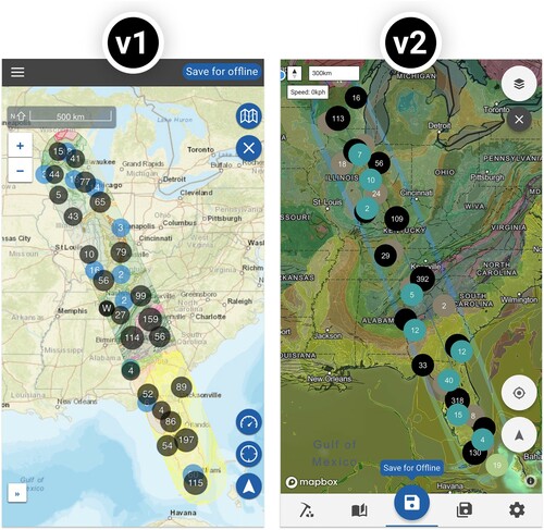
In support of the NSF Broader Impacts mission, we planned redesign of Flyover Country v1 (: left) in 2017 to address persistent UX design issues identified through an in-app feedback form and app store reviews. To confirm these issues and troubleshoot potential solutions, we conducted a two-stage UX evaluation at the University of Minnesota (UMN) Usability Lab following tenets of usability engineering (see CitationNielsen, 1994).
First, we performed a talk aloud study with nine UMN students and two UMN faculty (n = 11 total) during which participants were given preliminary versions of the two use case scenarios (see the following section) and asked to talk aloud as they walked through each scenario. We installed Flyover Country v1 on a Google Nexus 6p smartphone with the Android operating system, with the same device used by each participant. We observed verbal externalizations and mobile map interaction through a one-way glass mirror, as well as video feed showing the device’s screen. After each participant’s time, the team debriefed and noted lessons learned from observations of the participants interactions with the app. The talk aloud study lasted a maximum of 30 min per participant, with 10–25 min debriefing sessions after each.
Second, we held an unstructured focus group with fourteen UMN students (n = 14) about their impressions and issues with Flyover Country v1. We instructed participants to install and use the app before the focus group, resulting in a mixture of Android and Apple devices. We recorded suggestions and critical incidents as participants discussed their collective experiences using the app. The focus group study lasted one hour. Following the two-stage evaluation, we held an all-hands workshop to triangulate key mobile UX insights from user feedback (treated in detail in the discussion below) and to set priorities for UX design and technology revisions given available project resources.
Flyover Country v2 again used Cordova and Ionic for app development, but switched to Mapbox GL JS (mapbox.com) for map functionality. Mapbox supports multiscale vector tiles, improves geocoding on partial search text strings, and provides enhanced map interactivity, such as map and label rotation to an egocentric, oblique viewpoint. We now incorporate functionality for configuring the map into a central-located floating action button, streamlining the initial sequence of map interactions such as loading and saving data points. All primary app pages are now accessible via tabs located at the bottom of the screen. We have preserved the two versions discussed in this paper for provenance (Roth, Citation2019): https://z.umn.edu/FCv1JoM (v1) and https://z.umn.edu/FCv2JoM (v2). Note these versions are not optimized for use in web browsers, and are best viewed in mobile development mode.
3. Use case scenarios
The following section presents the pair of use case scenarios informing our redesign of Flyover Country (CitationMacEachren et al., 2008; CitationRosson & Carroll, 2002). The scenarios represent the two NSF ‘Broader Impacts’ missions for Flyover Country: geoscience outreach to the general public and geoscience education with field trip guides. As stated previously, we developed preliminary scenarios for the first stage of the UX evaluation before beginning redesign of Flyover Country. We updated the following use case scenarios to reflect the revised Flyover Country v2 design.
3.1. Scenario #1: general public flight use case
Sally is a travel enthusiast from Minneapolis (U.S.) who chooses window seats when flying because she is interested in viewing new places and landscapes. She has followed the inflight maps available in seatbacks before, but wishes she could learn more about the geographic features she sees out the window. Sally read an article about Flyover Country and downloaded the app to her mobile phone for a flight to Seattle (U.S.). She opens the app while on airport wi-fi to save her trip path for offline use before boarding.
Sally finds a default satellite map of the world upon opening Flyover Country, displaying the global coverage of the app (A). Her eye is directed to the bottom of the screen, which includes a set of tabs with a blue circular ‘+’ button in the center with a startup ‘Create Path’ tooltip. Sally taps the button, opening the ‘Create Path’ page. The page contains options for mode of travel and different kinds of data layers (B). Sally selects the app’s ‘Airplane Mode’ and unchecks options for oceans and lake cores, given her flight across the northwestern U.S. At the bottom of the screen, she chooses to enter the path by ‘Search for Places’ rather than ‘Tap the Map’. She then is directed to the ‘Search Places’ screen with a pair of input boxes requesting ‘To’ and ‘From’ locations (C). Using the device keyboard, Sally first enters her departure airport code ‘MSP’ and selects the correct suggested location from the dropdown menu. She then enters ‘Seattle’ into the second box, having forgotten the airport code, and selects ‘Seattle-Tacoma International Airport (SEA)’ from the dropdown list of options. Sally taps the large blue ‘Create Path’ button that spans the bottom of the screen, which closes the search page and returns her to the map interface, with the map zoomed and recentered to her path (D).
Figure 3. Using Flyover Country on a flight. (A) The default map view upon opening Flyover Country, emphasizing its global coverage. (B) Tapping ‘Create Path’ startup tooltip opens the ‘Create Path’ page, with options for creating the path by ‘Tapping the Map’ or ‘Searching for Places’. (C) The ‘Searching for Places’ page enables text input of ‘To’ and ‘From’ origins and destinations, including waypoints in between. (D) Creating a path returns the user to the map interface, with the map zoomed and recentered to her path. (E) Tapping the ‘Save for Offline’ main button opens the ‘Save for Offline’ page with options for caching the map view for offline. (F) Flyover Country recognizes when the mobile device is offline and prompts the user to ‘Load a Saved Path’. (G) Saved paths are stored in the ‘Saved Paths’ page for offline access. (H) The white ‘crosshairs’ geolocate button zooms and recenters the map on the user’s current location, symbolized by a blue dot. (I) The white button with the triangular ‘navigation’ icon toggles into tracking mode, which reorients and tilts the map as it updates during the flight. (J) Clicking on a point of interest in the map activates a pullup information window containing text and images. (K) Flyover Country also includes tips for identifying cloud and landscape patterns viewable from above. (L) The app contains points of interest from many different sources – shown here is information about Mt Rainier from the Smithsonian Institution.
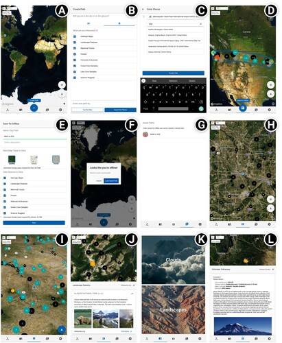
Looking at the map, Sally sees many colorful data points within a strip from Minneapolis to Seattle. She notices that the blue circular button has changed from a ‘+’ to a ‘floppy disk’ symbol, including a new tooltip prompting her to ‘Save Offline’. She again taps this main button, activating the ‘Save for Offline’ page containing several saving options (E). Sally changes the auto-generated pathname to ‘MSP to SEA’ for easier reference and selects both the ‘satellite’ and ‘terrain’ basemap options. She presses the large blue ‘Save’ button and waits as the download progress bar climbs to 100%. She then exits the app after receiving confirmation that the path is saved and prepares for her flight.
After boarding the plane and finding her seat, Sally puts her device into airplane mode and reopens Flyover Country. The app recognizes the device’s offline status, and prompts Sally to ‘Load a Saved Path’ (F). She navigates to the ‘Saved Paths’ page and selects the ‘MSP to SEA’ path she downloaded before boarding (G). The app returns to the map interface with the cached path reloaded. She presses the conventional white ‘crosshairs’ geolocate button to center the map on her current location, symbolized by the conventional blue dot, and zooms into the map (H).
After take-off, she holds her phone near the window to reacquire the GPS signal. Once the signal is acquired, she watches the information display in the top-left corner of the app as the airplane climbs, updating her current speed and altitude. Upon noticing that the blue dot indicating her position is updating as the plane travels away from the city, she toggles into tracking mode by clicking on the white triangular symbol, which reorients the map to an egocentric view so that the direction of travel is forward or ‘up’ on the map (I). Tracking mode also tilts the perspective of the map to an oblique view, making it easier for Sally to relate features out the window to information in the map.
Sally explores the map and its information while watching out the window. After learning about the geology and geography of the Dakotas, the plains of the Upper Midwest give way to the rugged Rocky Mountains. She consults the app for information about the first major mountain range she passes and discovers that she is flying over Glacier National Park (J). She clicks on a Wikipedia article and reads about Glacier National Park’s geology, ecosystems, and human imprint – including the devastating impact of anthropogenic climate change on the namesake glaciers – with the background information coming to life through vivid imagery of native flora and fauna, historical archives, and epic vistas. Sally then clicks on the geology map layer and learns that the rocks constituting the tallest peaks were formed over one billion years ago and makes a mental note to add Glacier National Park to her bucket list.
After crossing the Rockies, the plane passes over a layer of clouds. Sally clicks on the ‘Pages’ icon to the left of the map icon to find two additional features: ‘Clouds’ and ‘Landscapes’ (K). These additional features provide helpful tips for understanding patterns viewed from the air. She identifies the clouds as stratocumulus. The clouds partially break as the plane begins its descent and she notices a massive peak in the distance. She clicks on the map interface one last time to learn that the peak is Mt. Rainier, a stratovolcano that last erupted in 1450 (L). Sally closes Flyover Country and the plane lands. Wow, that felt like a short flight!
3.2. Scenario #2: educational self-guided field trip use case
Emily is an undergraduate student in an introductory geology course at the University of Minnesota (U.S.) with a broad interest in geoscience. She heard about the course from a friend, who recommended it due to the fun, self-directed field trips in the Minneapolis area. During the first lecture, Emily’s professor introduces the syllabus and provides instructions for installing Flyover Country to access the self-directed field trip itineraries required for the course. Emily installs the app on her mobile device and, out of curiosity, creates a small path in driving mode for the Minneapolis area (A). Emily is greeted with a message on the top of the interface ‘There are field trip guides in your path!’, and notices that the digging icon to the left of the bottoms tabs is now highlighted with a number ‘3’. Emily clicks on the icon and finds three guides for the area, which correspond to the three field trips on the course syllabus (B).
Figure 4. Finding and navigating a field trip guide in Flyover Country. (A) Spatial field trip guide discovery and alerts (toast message, top, and red number badge, lower left) when guides intersect the path shape during loading. (B) Field guide search and selection interface. Guides that intersect a currently loaded path are highlighted at the top of the list. (C) Field trip content displayed in the information pullup. (D) Overview sections, as well as stops, can contain figures, captions, and descriptions. (E) Selecting stops on the map (purple ‘G’ icons) scrolls the information pullup to the selected stop and expands its content. Tapping the locate icon next to the stop title centers the map view on that stop’s coordinates. (F) Other data sources can be toggled on and off by tapping the layer button in the upper right of the map interface.
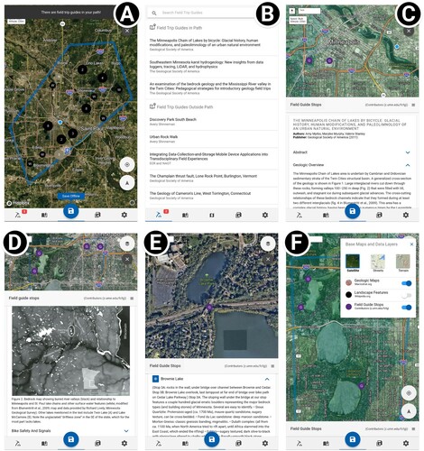
Excited about the course, Emily decides to go on the first field trip after lecture, eager to get started before cold winter weather sets in for the semester. The first field trip is a bicycle tour around a chain of lakes in the Minneapolis area formed at the end of the last glaciation. Emily selects ‘The Minneapolis Chain of Lakes by Bicycle’ (CitationMyrbo et al., 2011), which loads the planned stops along the guided tour and relevant data layers into the map (C). The content for the field trip guide is displayed in a ‘pullup’ information panel that includes an introductory overview of the local geology as well as an important note on bicycle safety.
With her helmet on, Emily is ready to begin the bike tour. She taps the first stop on the field trip, Brownie Lake, which populates the pullup information window with text descriptions, figures, and captions associated with Brownie Lake (D). She clicks the blue ‘crosshairs’ geolocate button within the window (not the white geolocate button atop the map itself), which recenters the map view on Brownie Lake (E). Emily notes the location and begins bicycling, stopping several times along the way to check her current position relative to the stop location using the two geolocate buttons in the map interface. Reaching the first stop, Emily locks her bike and explores Brownie Lake, toggling different map layers using the stacked ‘layer’ button in the upper right corner of the screen (F). She also captures photos and text notes with her mobile device to help her complete the field trip assignment. She returns home from the field trip with a new sense of the geology and history surrounding campus. Wow, a bike trip is a great way to add to the classroom experience!
4. Discussion: mobile UX design insights
Our experience designing, developing, and refining Flyover Country revealed several notable insights for mobile maps that are potentially transferable to other design contexts. Because the screen is the interface (and vice versa) on mobile devices, we organize discussion by two fundamental dimensions of mobile map UX design: representation and interaction. Representation describes the visual (or haptic, sonic, etc.) encoding of data (CitationMacEachren, 1995), capturing design decisions in a traditional cartographic workflow. Interaction describes the request and response sequence between user and map (CitationRoth, 2012), capturing design of the visual interface for manipulating the map. While insights regarding representation design are specific to cartography and visualization, some insights regarding interaction design extend to all mobile apps.
4.1. Mobile map representation design
4.1.1. Scale
Emerging mobile convention loads the map at a large scale (i.e. ‘zoomed in’) centered on the user to provide local context (CitationAbraham, 2019). We defied this convention in v2 – reducing the default scale (i.e. ‘zoomed out’) to a world map on load (A) – for two reasons: to depict the wider paths enabled by air travel and to advertise the global coverage of Flyover Country. This revision highlights the value of design studies for cartography, as our UX design process revealed a nuance for the default scale that is not generalizable to all mobile maps, but instead transferable to similar mapping contexts. Because the smaller map scale results in larger data caches and symbol overplotting, we added interface functionality for selecting task-relevant data layers before caching (B). Further, we automatically adjust the buffer query to account for different scales of mobility: flying mode uses a 200-mile spatial buffer on either side of the path, driving mode uses a 20-mile buffer. Driving mode also snaps trip paths to road networks and loads higher resolution linework for the geologic map given the user’s closer proximity to the landscape.
4.1.2. Projection
We implemented a tracking mode to change scale and data complexity when the user is in motion, explicitly accounting for the user’s mobility in the landscape. Tracking mode centers the map on the user (like the geolocate function) and reprojects the map to an egocentric, oblique view with ‘forward’ rather than north as ‘up’ (CitationPeterson, 2014), a feature made possible through the switch to vector tiling in v2. The oblique projection shifts map reading from cardinal (e.g. west, east) to embodied (e.g. left, right) directions, improving association of features in the landscape with mobile map symbols (CitationVan Elzakker et al., 2008). The 60° oblique angle reduces the viewshed when in motion, enlarging nearer POIs while shrinking farther ones and keeping points over the horizon offscreen to reduce visual clutter (I).
4.1.3. Symbolization
The move from a ‘terrain’ to a ‘satellite’ default basemap in v2 changed the look and feel of Flyover Country (). The darker basemap fills the majority of the screen real estate and reduces screen luminescence, saving battery life (CitationHoarau, 2011). Minimizing energy consumption aligns with broader efforts in green computing to reduce carbon emissions and their impact on climate change (CitationWilliams & Curtis, 2008). Reducing energy consumption is particularly poignant for mobile maps like Flyover Country, as a dead battery is a fatal discontinuation in the user experience, potentially leaving the user stranded without connectivity while wayfinding through an unfamiliar area or after arriving in an unfamiliar destination (Roth et al., Citation2018). We implemented a two-level, light UI visual hierarchy across the map and other dialog windows to maintain contrast between the map and interface: blue indicates the primary interaction for the current screen and white represents other available interactions (additional details below).
POI symbolization continues to be a representation challenge in v2. We used a clustering plugin in v1 that collapsed POIs into regional clusters colored by data type, numerically marking the frequency within each cluster symbol to communicate cluster (dis)aggregation when zooming across scales. We explored several alternative cluster representations using other visual variables (e.g. shape, size, transparency), but their utility was limited due to the mobile constraints of small screens, touch-based interaction (requiring larger UI footprints), and changes to the clustering across scale. Instead, we relied on interactive techniques to reduce overlap between regional cluster symbols and other map features, such as the data throttling techniques introduced above (e.g. data layer filtering, oblique projection, differential buffer distance by driving mode). We also reduced point collisions between map features through intelligent detection in the Mapbox vector tiling service, although collisions still occur in areas of dense POIs.
4.1.4. Typography
Vector tiling provides greater control over the stacking order of all features, including map labels. In v1, we rendered context labels as part of the basemap raster tileset to minimize data volume, pushing labels to the lowest level of the visual hierarchy where they frequently were obfuscated by POIs and the geology basemap. We now use the Mapbox vector tiling ‘z-index’ stacking order to place labels above the multiresolution geologic map layer as well as to apply collision detection between points and labels, further clarifying individual POIs and regional clusters. Vector tiles quickly are becoming a web mapping standard (Diamond, Citation2019), and they are essential for mobile maps given the increased control over visual hierarchy on smaller screen sizes and lower screen resolutions as well as reduced impact on data plans and local memory (CitationRicker & Roth, 2018). Providing labels as a stand-alone layer also allows them to remain upright in tracking mode and during other interactive map rotation to maintain legibility, an advantage specific to mobile mapping (CitationMuehlenhaus, 2013).
4.2. Mobile map interaction design
4.2.1. Map entry point
To improve map interaction design for Flyover Country, we first clarified the map entry point for first-time users (after CitationRoth, Hart, et al., 2017). By entry point, we mean the initial screen presented to users as well as what their first interaction with the app, which should be loading a path for Flyover Country. We originally thought that the direct-tap interaction that loads the trip path was a potentially novel UI solution. Direct-tap took advantage of touch-based interactions native to mobile devices, but the lack of visual affordances for direct manipulation and the unavailability of probing tooltips (i.e. on ‘mouse-over’) on post-WIMP interfaces meant that many users missed this functionality. The lack of a clear map entry point in v1 resulted in a high user bounce rate.
In v2, we added a ‘+’ button to the top of the UI visual hierarchy, with a startup ‘Create Path’ tooltip (CitationMead, 2014). Tapping this button navigates the user to the ‘Create Path’ dialog window, presenting options for path loading, including a search feature. Although the redesign required a longer sequence of interactions to load a path,the revised UX strategy ensures first-time users recognize how to load a path. Users who want to bypass this more cumbersome solution still can directly tap the map, enabling user flexibility for executing the first interaction (CitationCooper & Reimann, 2003).
4.2.2. Bottom navigation
While the ‘+’ Create Path button was placed at the top of the UI visual hierarchy, making it the most visually salient interface widget, it was not at the top of the UI layout. Conventional Western reading of maps suggests scanning from the top-left of the layout through the optical center and to the bottom-right (CitationDent et al., 1999). For interactive maps designed for non-mobile devices, this often prescribes placement of configuration UI controls (i.e. functionality used before exploring the map) at the top or left and contextual UI controls (i.e. functionality used after interpreting the map) at the right or bottom (CitationRoth, Hart, et al., 2017). Arguably, the handheld characteristic of mobile devices has shifted primacy from visual scanning to the pointer position, in this case the position of the thumb, resulting in an emerging convention of bottom navigation for mobile. UI widgets located at the bottom of the layout can be tapped by the thumb and thus are more accessible because they do not require two hands (CitationHoober, 2013). Accordingly, we moved important configuration functionality, located at the top of the layout or hidden behind a side menu, from the top left corner (v1) to the bottom (v2). Bottom navigation then contains tabs to access different conceptual pages in the app.
4.2.3 Floating action button (FAB)
While bottom navigation improved handheld interaction for mobile, there were too many core functions to align as buttons along the bottom panel. Accordingly, we redesigned the ‘+’ UI as a floating action button (FAB) to direct users through a linear sequence of essential interactions. The FAB is a popular post-WIMP UI solution for mobile (CitationMcCormack et al., 2010). The FAB sits at the top of the UI visual hierarchy and represents the most context-appropriate interaction for the user at each stage of interaction.
A key feature of Flyover Country is the offline caching of georeferenced geoscience content to the mobile device. Given the size of these data (100+ MB/path), the file transfer can be quite large, a concern for user data plans and local memory. File transfer also pauses map interactivity while loading. Thus, ‘Create Path’, ‘Press to Load’, and ‘Save Offline’ interactions sequence through the FAB (A–D). Once a path is loaded and saved, the FAB reverts to a map tab as part of the bottom navigation. The design of the floating action button imposes interface constraint (i.e. only one action can be completed at a time) to clarify how the application works and reduce user errors, as compared to the interface flexibility we implemented for the entry point (CitationKrug, 2000). This balance of constraint and flexibility through a FAB appears particularly transferable to other mobile UX design contexts targeting general audiences.
4.2.4. Pull-up information panel
A final notable insight regarding mobile UX design is our delivery of POI details. Shneiderman’s (Citation1996, p. 337) information seeking mantra of ‘overview first, zoom and filter, then details-on-demand’ provides general guidelines for UX design in big data contexts. While perhaps not as voluminous as some big datasets, the CCDRs used in Flyover Country are large (hundreds of thousands of records) and exhibit qualities of velocity, variety, and veracity complicating their visualization (CitationRobinson et al., 2017). However, common solutions to coordinated, multiview visualization with complex interface filters do not translate well to the reduced screen size and post-WIMP interactions of mobile devices, limiting application for visualizing the CCDRs in Flyover Country.
In v1 of Flyover Country, we managed big data exploration by filtering the geoscience databases through user-defined paths and then clustering records by database to reduce visual complexity. For WIMP interfaces, there are three primary solutions for retrieving details: an information popup or dynamic label that opens above a hover or click, an information panel that opens next to a click with a stem linking the window to the selected feature, and an information panel docked to a designated area of the layout. As the amount and complexity of retrieved information increases, the recommended solution for retrieving details moves from popup to window to panel (Roth, Citation2017). For post-WIMP interfaces, user-generated information popups on hover are not possible and information windows often fall partially offscreen.
In v2, we enhanced our detail retrieval solution by implementing a pull-up information panel. In contrast to a pull-down panel for top navigation, the pullup information panel utilizes thumb-based interactions and bottom navigation to pull up a scrollable list of details about POIs in the selected cluster. The POIs are sorted based on the article content, and the pull-up information panel can be expanded or minimized to review more or fewer records. Selection of a POI preview from the pull-up panel opens the complete record using a dialog window that covers the screen. Thus, the design distinction between pull-up information panel versus information dialog window should be employed for mobile, post-WIMP interfaces in a manner similar to the distinction between information windows and interface panels for non-mobile, WIMP interfaces.
4.3. Summary
This article reported on a UX design study of the Flyover Country mobile mapping application. Redesign of Flyover Country followed tenets of scenario-based design to meet the needs of two use case scenarios: science outreach to the general public and field trip guides for geoscience education. Our work generated several UX design insights that are potentially transferable to other mobile mapping contexts, including clarification of the entry point, thumb-based bottom navigation, and emerging mobile-first UI controls like floating action buttons and pull-up information panels. Flyover Country remains in active development, and we are looking into ways to improve the workflow and UI/UX both in the app itself and in potential spinoff projects.
Software
Flyover Country is a hybrid mobile app built using the Ionic Framework. Apps built with the Ionic Framework operate in a webview, allowing the same code (HTML, Javascript, CSS) to run on all major platforms (iOS, Android, web). Offline functionality is accomplished through plugins that allow access to the device’s file system. Cordova plugins provide this functionality, as well as access to other ‘native’ functionality like the GPS location system. The mapping library used is a forked version of Mapbox GL JS, that has been modified slightly for offline functionality. The previous version of the app used the Openlayers mapping library.
JoM_map.pdf
Download PDF (261.2 KB)Acknowledgments
This material is based upon work supported by the National Science Foundation under Grant Nos. 1550843, 1550855, 1550913, and 1555267. Any opinions, findings, and conclusions or recommendations expressed in this material are those of the author(s) and do not necessarily reflect the views of the National Science Foundation. We also thank the UMN Usability Lab for supporting the evaluation of Flyover Country v1.
Disclosure statement
Mr. Loeffler is a co-founder of Flyover Country Inc, the company that has a license from the University of Minnesota to commercialize. These interests have been reviewed and managed by the University of Minnesota in accordance with its Conflict of Interest policies.
Additional information
Funding
Related Research Data
References
- Abraham, L. (2019). Where do we go from here? Understanding mobile map design, geography. University of Wisconsin-Madison.
- Anderson, J. R., Reder, L. M., & Simon, H. A. (1996). Situated learning and education. Educational Researcher, 25(4), 5–11. https://doi.org/https://doi.org/10.3102/0013189X025004005
- Armstrong, M. P., & Bennett, D. A. (2005). A Manifesto on mobile computing in geographic education*. The Professional Geographer, 57(4), 506–515. https://doi.org/https://doi.org/10.1111/j.1467-9272.2005.00495.x
- Birlenbach, D., Cook Shinneman, A., Loeffler, S., & Amy, M. (2019). Flyover country: Creating flexible field experiences using a mobile geoscience App. In the Trenches.
- Chittaro, L. (2006). Visualizing information on mobile devices. IEEE Compuer, 39(3), 40–45. https://doi.org/https://doi.org/10.1109/MC.2006.109
- Cooper, A., & Reimann, R. (2003). About face 2.0: The essentials of interaction design. Wiley.
- Dent, B. D., Torguson, J. S., & Hodler, T. W. (1999). Cartography: Thematic map design. WCB/McGraw-Hill New York.
- Diamond, L.. (2019). Vector formats and sources. In J. P. Wilson (Ed.), Geographic information science & technology body of knowledge (4th Quarter 2019 Edition). UCGIS. https://doi.org/https://doi.org/10.22224/gistbok/2019.4.8
- Elzakker, C. P. J. M. v., & Ooms, K. (2018). Understanding map uses and users. In A. J. Kent, & P. Vujakovic (Eds.), The Routeledge handbook of mapping and cartography (pp. 55–67). Routeledge.
- Fils, D., Noren, A., Lehnert, K., & Diver, P. (2016). Open Core data: Connecting scientific drilling data to scientists and community data resources. Paper read at AGU fall meeting abstracts.
- Garrett, J. J. (2010). Elements of user experience, the: User-centered design for the web and beyond. Pearson Education.
- Goring, S. J., Graham, R., Loeffler, S., Myrbo, A., Oliver, J. S., Ormond, C., & Williams, J. W. (2018). The Neotoma paleoecology database: A research outreach nexus. Cambridge University Press.
- Griffin, M. M. (1995). You can’t get there from here: Situated learning, transfer, and map skills. Contermporary Educational Psychology, 20(1), 65–87. https://doi.org/https://doi.org/10.1006/ceps.1995.1004
- Griffin, A. L., Robinson, A. C., & Roth, R. E. (2017). Envisioning the future of cartographic research. Taylor & Francis.
- Haklay, M. M. (2010). Interacting with geospatial technologies. John Wiley & Sons.
- Hoarau, C. (2011). Reaching a compromise between contextual constraints and cartographic rules: Application to sustainable maps. Cartography and Geographic Information Science, 38(2), 79–88. https://doi.org/https://doi.org/10.1559/1523040638279
- Hoober, S. (2013). How do users really hold mobile devices. http://www.uxmatters.com/mt/archives/2013/02/how-do-users-really-hold-mobile-devices.php
- Huang, H., Gartner, G., Krisp, J. M., Raubal, M., & Van de Weghe, N. (2018). Location based services: Ongoing evolution and research agenda. Journal of Location Based Services, 12(2), 63–93. https://doi.org/https://doi.org/10.1080/17489725.2018.1508763
- Krug, S. (2000). Don’t make me think: A common sense approach to web usability (2nd ed.). New Riders Publishing.
- Loeffler, S. (2018). Improving geoscience data access and interoperability through the Flyover Country mobile app.
- MacEachren, A. M. (1995). How maps work. The Guilford Press.
- MacEachren, A. M. (2013). Cartography as an academic field: A lost opportunity or a new beginning? The Cartographic Journal, 50(2), 166–170. https://doi.org/https://doi.org/10.1179/0008704113Z.00000000083
- MacEachren, A. M., Crawford, S., Akella, M., & Lengerich, G. (2008). Design and implementation of a model, web-based, GIS-enabled cancer atlas. The Cartographic Journal, 45(4), 246–260. https://doi.org/https://doi.org/10.1179/174327708X347755
- McCormack, M. J., Bryant, C. W., Miller, A. R., Coggins, R. E., & Gardner, S. T. (2010). Floating action buttons: Google Patents.
- Mead, R. (2014). Expert perspectives on the design and use of learning materials for neocartographic interfaces. University of Wisconsin.
- Meilinger, T., Hölscher, C., Büchner, S. J., & Brösamle, M. (2007). How much information do you need? Schematic maps in wayfinding and self localisation. In T. Barkowsky, M. Knauff, G. Ligozat & D. R. Montello (Eds.), Spatial cognition, lecture notes in computer science (pp. 381–400). Spring-Verlag.
- Meltzer, A. (2003). Earthscope: Opportunities and challenges for earth-science research and education. The Leading Edge, 22(3), 268–271. https://doi.org/https://doi.org/10.1190/1.1564533
- Meng, L., Zipf, A., & Reichenbacher, T. (2005). Map-based mobile services: Theories, methods, and implementations. Springer.
- Muehlenhaus, I. (2013). Web cartography: Map design for interactive and mobile devices. CRC Press.
- Munzner, T. (2009). A nested process model for visualization design and validation. IEEE Transactions on Visualization and Computer Graphics, 15(6), 921–928. https://doi.org/https://doi.org/10.1109/TVCG.2009.111
- Myrbo, A., Loeffler, S., Shinneman, A. L. C., & McEwan, R. (2018). Outreach and educational opportunities created by open-data resources. Past Global Change Magazine, 26(2), 74–75. https://doi.org/https://doi.org/10.22498/pages.26.2.74
- Myrbo, A., Murphy, M., & Stanley, V. (2011). The Minneapolis chain of lakes by bicycle: Glacial history, human modifications, and paleolimnology of an urban natural environment. Field Guides, 24, 425–437.
- Nielsen, J. (1994). Usability engineering. Elsevier.
- Peters, S. E., Husson, J. M., & Czaplewski, J. (2018). Macrostrat: A platform for geological data integration and deep-time earth crust research. Geochemistry, Geophysics, Geosystems, 19(4), 1393–1409. https://doi.org/https://doi.org/10.1029/2018GC007467
- Peters, S. E., & McClennen, M. (2016). The paleobiology database application programming interface. Paleobiology, 42(1), 1–7. https://doi.org/https://doi.org/10.1017/pab.2015.39
- Peterson, M. P. (2014). Mapping in the cloud. Guilford Press.
- Reichenbacher, T. (2001). Adaptive concepts for a mobile cartography. Journal of Geographical Sciences, 11(1), 43–53. https://doi.org/https://doi.org/10.1007/BF02837443
- Reichenbacher, T. (2003, August 10–16). Adaptive methods for mobile cartography. Paper read at 21st international cartographic conference, Durban, South Africa, 2003.
- Reichenbacher, T. (2004). Mobile cartography: Adaptive visualisation of geographic information on mobile devices. Verlag Dr. Hut München.
- Ricker, B.. (2019). Mobile devices. In J. P. Wilson (Ed.), Geographic information science & technology body of knowledge. UCGIS. https://doi.org/https://doi.org/10.22224/gistbok/2019.3.8
- Ricker, B., & Roth, R. (2018). Mobile maps and responsive design. Geographic Information Science & Technology Body of Knowledge:CV 40.
- Robinson, A. C., Demšar, U., Moore, A. B., Buckley, A., Jiang, B., Field, K., Kraak, M.-J., Camboim, S. P., & Sluter, C. R. (2017). Geospatial big data and cartography: Research challenges and opportunities for making maps that matter. International Journal of Cartography, 3(sup1), 32–60. https://doi.org/https://doi.org/10.1080/23729333.2016.1278151
- Rosson, M. B., & Carroll, J. M. (2002). Scenario-based design. In J. Jacko, & A. Sears (Eds.), The human-computer interaction handbook: Fundamental evolving technologies and emerging applications (pp. 1032–1050). Lawrence Erlbaum Associates.
- Roth, R. E. (2012). Cartographic interaction primitives: Framework and synthesis. The Cartographic Journal, 49(4), 376–395. https://doi.org/https://doi.org/10.1179/1743277412Y.0000000019
- Roth, R. E. (2019). How do user-centered design studies contribute to cartography? GEOGRAFIE, 124(2), 133–161. https://doi.org/https://doi.org/10.37040/geografie2019124020133
- Roth, R. E. (2017). User interface and user experience (UI/UX) design. In J. P. Wilson (Ed.), The geographic information science & technology body of knowledge (2nd quarter 2017 edition). https://doi.org/https://doi.org/10.22224/gistbok/2017.2.5
- Roth, R. E., Çöltekin, A., Delazari, L., Filho, H. F., Griffin, A., Hall, A., Korpi, J., Lokka, I., Mendonça, A., & Ooms, K. (2017). User studies in cartography: Opportunities for empirical research on interactive maps and visualizations. International Journal of Cartography, 3(sup1), 61–89. https://doi.org/https://doi.org/10.1080/23729333.2017.1288534
- Roth, R. E., Hart, D., Mead, R., & Quinn, C. (2017). Wireframing for interactive & web-based geographic visualization: Designing the NOAA Lake level Viewer. Cartography and Geographic Information Science, 44(4), 338–357. https://doi.org/https://doi.org/10.1080/15230406.2016.1171166
- Roth, R., Young, S., Nestel, C., Sack, C., Davidson, B., Janicki, J., Knoppke-Wetzel, V., Ma, F., Mead, R., & Rose, C. (2018). Global landscapes: Teaching globalization through responsive mobile map design. The Professional Geographer, 70, 1–17. https://doi.org/https://doi.org/10.1080/00330124.2017.1416297
- Ryan, W. B., Carbotte, S. M., Coplan, J. O., O’Hara, S., Melkonian, A., Arko, R., Weissel, R. A., Ferrini, V., Goodwillie, A., & Nitsche, F. (2009). Global multi-resolution topography synthesis. Geochemistry, Geophysics, Geosystems, 10(3). https://doi.org/https://doi.org/10.1029/2008GC002332
- Schnurrenberger, D. W., Kelts, K. R., Johnson, T. C., Shane, L. C., & Ito, E. (2001). National lacustrine core repository (LacCore). Journal of Paleolimnology, 25(1), 123–127. https://doi.org/https://doi.org/10.1023/A:1008171027125
- Sedlmair, M., Meyer, M., & Munzner, T. (2012). Design study methodology: Reflections from the trenches and the stacks. IEEE Transactions on Visualization and Computer Graphics, 18(12), 2431–2440.
- Shinneman, A. L., Loeffler, S., & Myrbo, A. E. (2020). Self-guided field trips allow flexibility in undergraduate student introductory field experiences. Journal of Geoscience Education, 68. https://doi.org/https://doi.org/10.1080/10899995.2020.1768006
- Shneiderman, B. (1996, September 3–6). The eyes have it: A task by data type taxonomy for information visualization. Paper read at IEEE conference on visual Languages, Boulder, CO..
- Stevens, J. E., Robinson, A. C., & MacEachren, A. M. (2013, August 25–30). Designing map symbols for mobile devices: Challenges, best practices, and the utilization of skeuomorphism. Paper read at international cartographic conference, Dresden, Germany.
- Van Elzakker, C. P., Delikostidis, I., & van Oosterom, P. J. (2008). Field-based usability evaluation methodology for mobile geo-applications. The Cartographic Journal, 45(2), 139–149. https://doi.org/https://doi.org/10.1179/174327708X305139
- Williams, J., & Curtis, L. (2008). Green: The new computing coat of arms? IT Professional, 10(1), 12–16. https://doi.org/https://doi.org/10.1109/MITP.2008.9
- Williams, J. W., Grimm, E. C., Blois, J. L., Charles, D. F., Davis, E. B., Goring, S. J., Graham, R. W., Smith, A. J., Anderson, M., & Arroyo-Cabrales, J. (2018). The Neotoma paleoecology database, a multiproxy, international, community-curated data resource. Quaternary Research, 89(1), 156–177. https://doi.org/https://doi.org/10.1017/qua.2017.105