
Abstract
The replacement of Times New Roman (TNR—serif) with Calibri (sans serif) as default typeface on Microsoft Office Word reflects the growing prevalence of screen-based reading. The change also points to a festering conflict in the literature on the readability and legibility of serif and sans serif typefaces in print and computer-based platforms. The study examines preference of TNR and Calibri among Nigerian students whose universities prescribe TNR for all academic works. Studies show that learning institutions seldom consider the effects of typefaces on learners who also rarely contribute to institutional decisions on typeface choice. The study focuses on influence of text platform (screen or print) on reading speed, the effects of familiarity with typeface, and perceived importance of institutional requirements on typeface preference. Based on significant influences of text platform on reading speed and typeface preference, we make new propositions on how screen-based reading and type size may introduce new perspectives in perceptions of serifs as visual stimuli. We conclude therefore that the introduction of Calibri may resolve the persisting theoretical and empirical differences on the legibility and readability of serif and sans serif typefaces.
PUBLIC INTEREST STATEMENT
In contemporary Microsoft word application, Calibri has replaced Times New Roman (TNR) as the typeface that appears on a blank new document when one starts to type. While the development certainly did not go unnoticed, it has yet to enter scholarly discourse, and remains apparently ignored among universities, which continue to require TNR for computer-based academic works. The study situates the TNR-to-Calibri transition within persisting debates on the preference of different typefaces. We consider the factors that influence preference of one typeface over the other in view of Microsoft’s position that Calibri is easier to see and to read on modern computer screens. This study attempts to call the attention, if not the interest, of academic institutions to the differences between print and screen reading as the basis for choice of typefaces. As it stands, institutional culture seems to negate technological and empirical reality.
1. Introduction
The choice of suitable typefaces for written texts has been an art of its own since the 14th century advent of mechanical printing (Bigelow, Citation2019). Studies report that typefaces give form and substance to thought and to language. Though their effects are often subtle, typefaces are in fact crucial to text legibility, comprehension, retention and attitudes to written messages among learners (Dobres et al., Citation2017; Dressler, Citation2019; Haenschen & Tamu, Citation2019; Larhmaid et al., Citation2018). However, there is a lack of consensus among several studies on the reading speed and legibility of serif and sans serif typefaces on different platforms. This has triggered calls from researchers for a clearer definition of the relevance of type choice for print and computer screen texts (Haenschen & Tamu, Citation2019). Remarkably, the switch from Times New Roman (TNR, a serif) to Calibri (a sans serif) as default typeface beginning with Microsoft Office 2007 drew further attention to this call and emphasized screen reading as a rapidly growing trend (Bigelow, Citation2019). It also revitalized a milestone marked in 2005 as the year in which the one-billionth person in the world officially began to use digital resources to consume written communication (De Argaez, Citation2006; Larhmaid et al., Citation2018). Has the introduction of Calibri resolved or further complicated the lack of consensus on the readability and legibility of serif and sans serif typefaces in print and computer screen platforms? Serif typefaces are those with ornamental curves or finishes to their strokes such as on the rightmost end of the letters r and g. Strokes are the major parts or lines of a letter. The strokes of serif typefaces are not eqaul in weight; some are light and some are heavy as in the leter “V” whose left stroke is heavier than the right stroke. Sans serif typefaces have uniform strokes, which also do not end with serifs.
Calibri is one of the seven new (ClearType) typefaces developed between 2002 and 2004 to enhance text reading on liquid-crystal display monitors on personal computers (Microsoft, Citation2017). As said, Calibri replaced TNR in Office Word and also replaced Arial (a sans serif type) as default type in other Office applications such as PowerPoint, Excel, Outlook and Wordpad. That is, Calibri automatically begins to show as one starts typing on the keyboard on a new Microsoft Word document or other Office applications. Though computer users are free to change a default type setting to any other type of choice, there are circumstances (e.g., institutional requirements) that may becloud knowledge of students’ preferences and personal judgments about typeface effects. Similarly, a Microsoft Word application, in the course of typing, may intermittently and automatically change a computer user’s paragraph or whole page from TNR to Calibri, thereby affecting the liberty of the user to change a default typeface setting.
In the midst of it, studies report that academic institutions seldom consider the effects of typefaces on learners (Dressler, Citation2019; Haenschen & Tamu, Citation2019; Larhmaid et al., Citation2018). Scholars believe that learning institutions have greater opportunity to leverage students’ exposure to digital technologies to address emerging issues in digital consumption of academic material (Bamidele & Salihu, Citation2019; Larhmaid et al., Citation2018). Many scholars therefore observe that learners should contribute meaningfully in, or feel comfortable with, institutional decisions on packaging academic works in the digital and offline environments (Bourdieu, Citation1977; Haenschen & Tamu, Citation2019). Scholars also believe that students have personal learning objectives and many ideas to remember long after school (Halin, Citation2016; Haque et al., Citation2018). The present study focuses on preference of typefaces (between TNR and Calibri) among Nigerian university students who learn in an environment that still requires TNR in all academic works for screen and print presentations. None of the studies (Arditi, Citation2004; Campbell et al., Citation2005; Mansfield et al., Citation1996; Morris et al., Citation2012) done so far on typeface preference considered Nigerian university students. Being the country with one of the world’s highest internet penetrations (126 million active users by 2019, [Chow, Citation2020]), learning in Nigeria should be of interest to website developers around the world who target African learners (Burns, Citation2019).
The study examines preference, reading speed and error detection rates for the two typefaces based on platform of presentation (screen and print). It considers the factors that influence preference of one typeface over the other in view of the said reasons for replacing TNR with Calibri. This is also in view of the need to orient the interest of school authorities towards the distinctions between print and screen reading as the basis of arguments on choice of typeface. The study recognizes the importance of social forces (e.g., institutional requirements) in technology use as we have explained in a later section using Venkatesh et al.’s (Citation2003) unified theory of acceptance and use of technology (UTAUT). Due to the difficulty in measuring preference when choice for a certain typeface is mandatory, the study examines how students’ perceived importance of institutional requirements impact preference between TNR and Calibri. This also led to the consideration of theoretical perspectives in perception.
2. Between institutional requirements, typeface choice and readability/legibility
Studies show that typeface can contribute significantly in dictating reader attitudes to a written text, in maintaining reader focus, and sometimes in helping readers to unwittingly internalize information (Diemand-Yauman et al., Citation2011; Gigante, Citation2013). Generally, the majority of studies show that typeface can evoke human emotions, and can reflect gender, aesthetic and expressive qualities (Arditi, Citation2004; Conover, Citation2003; Zamzuri et al., Citation2013). Type can reinforce a message, detract from intended meaning, entice or revolt and describe who we are (Zamzuri et al., Citation2013). As Li (Citation2009, 7) observes: “the choice of typefaces could make one’s message cheerful, relaxed, friendly, confident or even harsh.”
Scholars have also linked choice of typeface with disparities in how teachers appreciate and grade the work of students even in institutions with prescribed typeface (Gigante, Citation2013; Mangiafico, Citation2008). The New York Times once reported an experience in which Phil Renaud, a web enthusiast and student, began to earn higher points in his essays after changing the typeface to Georgia in the last 23 of his 52 essays without essentially increasing the time and energy put into the later essays (Morris, Citation2012). Renaud formerly used Times New Roman (for 11 articles) and Trebuchet MS (for 18 articles) which were prescribed by his institution. To further buttress Renaud’s experience, a New York Times experiment indicated that the same article set in six different typefaces elicited trust, doubt, contempt and disregard to the message among different readers (Morris, Citation2012). The experiment involved a passage in the newspaper, which, by means of a computer program, changed typefaces as different readers accessed it. Results from 45,000 readers indicated that type choice could influence reader perception of truth (Morris, Citation2012).
According to Li (Citation2009), there are three broad classes of type, namely, serif, sans serif and decorative type (). Serif is “the typeface with small features at the end of strokes within letters. The typefaces without serifs are considered sans serif” (Li, Citation2009, 7). The decorative typeface is considered ornamental and is used more for the sake of beauty than for legibility. Increasingly, however, improvements in on-screen reading are forcing designers to optimise both legibility and aesthetics in given typefaces thereby moving decorative typefaces from being only ornamental type to new frontiers in learnability and legibility (Bigelow, Citation2019; Bragg et al., Citation2017). Similarly, digital consumption of written communication requires a reading context for easy engagement with content and with technology, compelling typographers and content developers to maximize screen text readability (text clarity), legibility (vividness of letters) and aesthetic value (beauty) of type (Dobres et al., Citation2017; Tavakoli & Kheirzadeh, Citation2011).
Table 1. Examples of serif, sans serif, and decorative typefaces
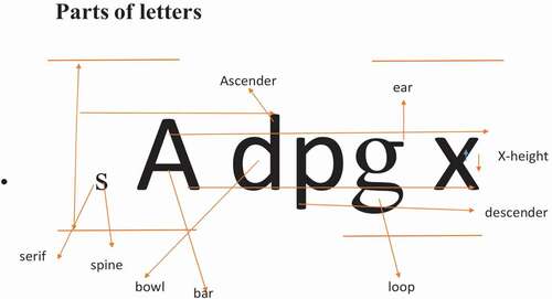
As shown in , from the top of the letter x to its base is the x-height. Various typefaces have different x-height. In addition to the length of extenders, x-height, as the optical size of type, accounts for the differences in legibility between typefaces with the same size. This is why x-height is seen as the optical size (how much the eye can see), while type size, measured in points, is the mechanical size—which can be increased or reduced, especially on a computer. The ear is a distinctive finish on some letters such as g and r. Serifs appear on the ear and other end-points of small letters, helping to give different serif typefaces distinct personality. According to some studies, serifs also help the human perceptual system (the eye and the brain) to more easily recognize letter pairs, words and phrases (Bigelow, Citation2019; Bragg et al., Citation2017). The introduction of screen reading, high resolution levels, colour and type motion has, however, contributed to existing questions on the legibility and preference of serif and sans serif typefaces.
Figure 1. Parts of letters
Remarkably, research findings are still heavily divided on the significant differences in the legibility and readability of type in screen and in print, with some viewing the distinctions as unnecessary (Arditi & Cho, Citation2005; M. Bernard et al., Citation2001; Wilson, Citation2001). Ali et al. (Citation2013) found no significant difference in the readability of Georgia (serif) and Verdana (sans serif) typefaces on a computer screen. They also found no significant difference in the readability of Times New Roman (serif) and Arial (sans serif) on a computer screen. Several other studies involving preference tests between serif and sans serif typefaces focused on the impact of type sizes on error detection, reading speed, comprehension, task completion and legibility (Arditi & Cho, Citation2005; Diemand-Yauman et al., Citation2011). Generally, the studies found no significant differences in any of these indices. Even where reader visibility levels and platforms for depositing printed texts were controlled for, results still showed that there was no significant typeface effect on reading speed. Some researchers have observed that using hard-to-read typefaces and sizes leads to deeper processing of learning material and significantly improves learning among students because students feel a greater urge to master the difficult material than the simpler one (Diemand-Yauman et al., Citation2011). They have however warned against making a reading material too difficult to read.
Studies have also tested for the effect of type familiarity on preference. Some studies indicate that familiarity (as a result of constant use or institutional requirement) with typeface has no effect on typeface preference based on legibility (Campbell et al., Citation2005). Unger (Citation2007) however found that reader familiarity with typeface has an effect on readability. Unger pointed out that when people always do things the same way, they no longer have to think before doing it. The task thus becomes uninterrupted. With regard to readability, it makes it much easier to focus on the content and switch to the “unconscious automatic form that is an essential element of a successful reading experiment” (p. 47). While studies on type legibility and preference on-screen (Geske, Citation2000; M. L. Bernard et al., Citation2003) found no significant difference in legibility, they found that TNR was less preferred to Arial and that default typeface has no familiarity influence on the preferred choice.
The study by M. L. Bernard et al. (Citation2003) compared the effects of text size and format on undergraduate students’ perceived readability, preference, legibility and sharpness of computer-displayed TNR and Arial texts (both in 10 and in 12 points). The study found no significant difference in legibility. However, the 12-point Arial text was generally the more preferred, while the 10-point Arial text was slower to read. Although there were no significant main effect preference differences between the two typefaces, TNR was recurrently less preferred than Arial. The study also found that 57% of the 35 participants used 12-point TNR as everyday default typeface; 8.6% used 12-point Arial font as default typeface; 8.6% used 10-point TNR; 2.9% used another typeface as default, while 22% did not know the default typeface they used. They therefore concluded that default typeface had no familiarity influence on typeface choice given that the majority used TNR as default typeface, yet it was not the typeface preferred by the majority.
Geske (Citation2000) conducted an experimental study on the readability of body text in computer mediated communication (on-screen texts) using Palatino, a serif typeface and Helvetica a sans serif typeface, in point sizes 10, 12 and 14. Using content and comprehension (with approximately 225 words) developed specially for the experiment and placed on the world wide web (www), he tested 78 subjects which were majorly college age participants. The findings from the reading tests disproved his hypothesis that 14-point type would be more legible than 12-point type which would in turn be more legible than 10-point type. Instead, both typefaces were read at an average of 79 seconds in 14-point-type, while in 12-point size, they were read at an average of 74 seconds, in the 10-point size, there was an average reading time of 82 seconds. At the 14-point size, the serif typefaces were read faster than the sans serifs, while at 10 points, sans serifs were read slightly faster than serifs. This suggests that increase in point size makes the serif faces more readable than the sans serif faces on screen texts.
In addition to testing for the effect of familiarity, the present study brings in the context of print vs. screen texts given that the majority of existing familiarity studies were based either on print texts or screen texts. Particularly, TNR and Calibri have not been considered together in previous research with students as study subjects. As noted, Microsoft’s major reason for introducing Calibri was due to its suitability for computer screen reading. Has Microsoft been proven right, especially among populations such as students who are still predisposed to TNR as the institutionally prescribed typeface?
3. Visual impacts of serifs and sans serifs
The learning environment in different communication contexts requires knowledge and use of words and texts, which are the symbolic currency to trade in linguistic markets (Bourdieu, Citation1977; Herring & Zelenkauskaite, Citation2009). Being symbolic constructs, studies on legibility and readability dwell essentially on typeface as a visual element (Bernard & Mills, Citation2000; Bigelow, Citation2019; Geske, Citation2000). Visibility measurements using eye tracking models show that reading is saccadic, i.e., done by consuming groups of words, not individual letters (Moen, Citation1995; Otto et al., Citation2019). However, studies using print texts indicate that the right parts and upper portions of letters (where serifs occur) are crucial in word and letter recognition, making serifs important in typeface legibility (Banerjee et al., Citation2011; Gigante, Citation2013; Mangiafico, Citation2008; Moen, Citation1995). A study under the aegis of the American Newspaper Publishers Association (Moen, Citation1995) found that serif typefaces (Imperial, Royal and Corona) were read seven to 10 words per minute faster than sans serif typefaces (Helvetica, Furtura, Sans Heavy and News Sans).
Some perception studies show that people interpret or construct the sensory images reaching them based on stored information in addition to the stimuli themselves. This is the top-down approach to perception according to Gregory (as cited in McLeod, Citation2018). Sensory information is also rich enough to form a complete basis for interpreting sensory stimuli (McLeod, Citation2018). Consequently, humans have sufficient information from the environment to fully interpret the world around them directly. McLeod (Citation2018) notes that the frequently ambiguous nature of stimulus from the human environment makes it imperative to use higher cognitive information from previous experiences or stored knowledge to make sense of what we see. Researchers (especially with regard to print text reading) therefore believe that serifs in serif typefaces function as stored visual stimuli that make it easier to recognize letter strokes in contrast to the indistinctiveness occasioned by the strong vertical flow of sans serif typefaces (Banerjee et al., Citation2011; Moen, Citation1995).
By contrast, some scholars (especially in the computer era) believe that the serifs in serif typefaces are additions that detract from reading speed, word spacing, word recognition, and, as a result, are visual noise (Geiger and Lettvin [as cited in O’Brien et al., Citation2005]; Perea et al., Citation2011; Moret-Tatay & Perea, Citation2011). This is partly why the computer era needs more studies to further address emerging issues in typeface on different platforms, hence the present study. The question is whether the computer screen has introduced visual realities that counter any (print-era) legibility effects of serifs possibly because of the dependence on screen resolution and type size rather than on serifs for visual impact.
Perhaps, that is why some studies (Banerjee et al., Citation2011; Josephson, Citation2008; Rabinowitz, Citation2006) suggest that sans serif typefaces are better for computer screens in terms of legibility, while serifs are better for printed text (Čerepinko et al., Citation2017). A few (e.g., Conover, Citation2003; Yoshida, Citation2000) suggest a combination of both in designing websites. The differences in studies may thus imply that one of the effects of screen reading is a redefinition or further narrowing of the differences between readability and legibility, which have all become affected by the computer screen (Bigelow, Citation2019; Dobres et al., Citation2017). Some studies indicate that low resolution initially made screen reading more tiring than reading in print, making it imperative to develop a typeface that is suitable for screen reading (Ferrari & Short, Citation2002; Rabinowitz, Citation2006). Thus, studies have found that higher and better screen resolutions (as a result of new technology) can render serif typefaces as brightly as sans serif typefaces leading to insignificant differences in reading speed between serifs and sans serifs (Rabinowitz, Citation2006).
Despite the conflict in the literature, scholars still note the importance of efforts to identify the better typeface for any platform (Čerepinko et al., Citation2017; Rabinowitz, Citation2006). The present study keys into this research need by testing for reading speed as well as by examining the interplay of institutional requirements and students’ personal preferences of typefaces. Theories and models of technology and user preferences recognize social forces (such as institutional requirements) as important in the use of technology. Accordingly, after a synthesis of eight major theories of technology acceptance, Venkatesh et al. (Citation2003) formulated the unified theory of acceptance and use of technology (UTAUT) in which voluntariness (along with gender, age, experience) was found to be a moderating influence on the predictive power of other factors such as perceived usefulness and perceived ease of use. Voluntariness refers to behavioural control or the extent to which a person believes they have the capacity of control over given behavioural choices. The UTAUT views organizational support among other contextual variables as factors affecting system usage as a dependent variable (Venkatesh et al., Citation2003, Citation2012).
Studies thus indicate that incorporating the four moderators (voluntariness, gender, age, experience) in models have not always worked (Dwivedi et al., Citation2017), because organizational requirement implies mandatory use of technology, which makes voluntariness impossible. This situation is noticed in the present study, where institutional requirement is an inherent determinant of typeface (TNR) use in Nigerian universities. Therefore, including organizational requirements in the same model as other predictors will confound the findings since variations may not be noticed in other moderators because use is based on force or mandatory requirement. Hence, we attempted to ascertain how students’ perceptions of the importance of institutional requirement influence preference between TNR and Calibri. The study was guided by the following hypotheses.
H1: Platform of presentation (print or onscreen) will influence preference between TNR and Calibri
H2: Platforms of presentation (print or onscreen) will moderate the effects of familiarity with the fonts on preference for TNR as well as for Calibri.
H3: Perceived importance of academic requirements of schools will influence preference between TNR and Calibri
H4: There is a relationship between the effects of platform of presentation and perception of typeface features on preference of Calibri and TNR
4. Design and sampling procedure
A quasi experimental design and survey were implemented in the study. This was because of the need to administer a reading test on students before using the questionnaire to elicit data based on the test. Undergraduate students of four randomly selected tertiary institutions in Southeast Nigeria served as the universe of the study. The institutions were: (1) Chukwuemeka Odumegwu Ojukwu University (COOU), established in 2000 and situated in Uli, a town in Anambra State. (2) Abia State University (ABSU), founded in 1981 and situated in Uturu, a town in Abia State. (3) Ebonyi State University (EBSU), founded in 1999, and situated in Abakaliki, the state capital. (4) University of Nigeria, Nsukka (UNN), established in 1960 and situated in Nsukka, Enugu State. Using the Australian National Statistical Service (ANSS) online calculator, a sample size of 389 was computed from a combined population of 91,523 (COOU—19,458; EBSU—22,358; ABSU—20389; UNN—29,318).
The faculties in the universities were stratified into departments. Three departments were selected in each institution through the simple random sampling method, i.e., table of random numbers. Selected departments received copies of the questionnaire based on the proportionate population strength of the respective institutions as follows: ABSU, 89; EBSU, 98; UNN, 128; COOU, 85. The proportional method takes care of the relative population strength of each institution. Thus, the population of students in each university (e.g., 19,458 for COOU) was divided by the total population of students in the four universities (91,523) and multiplied by the total sample size for the study (389). The selected departments were visited with consent letters to enlist willing participants, whose phone numbers were eventually compiled.
Individual participants were selected through the simple random and systematic sampling methods from a stratified pool of phone contacts of those who accepted to participate in the study. After selecting the first phone number on a list through the simple random method, the systematic technique was used to select the required number of participants for the study in each institution. A sampling fraction was obtained for each institution by dividing the sample size for each institution by the total sample size for the study. The denominator in each of the four sampling fractions became the kth element for the systematic sampling. By simply contacting the numbers, meetings were scheduled for the reading test. Participants who did not show further interest during invitation were replaced through a simple random selection. Ethical approval was also granted by the Faculty of Arts Research Ethics Committee, University of Nigeria, Nsukka, with the number, UN/FA/FAREC/11232019. Four trained postgraduate students, used as research assistants, helped to schedule meetings with participants, and to eventually educate them on the reading test and questionnaire completion. The assistants were taught how to use timers to record participants’ reading speed. The study recorded high (78%) questionnaire return rate.
5. Measures
The dependent variable, preference of typefaces, was operationalized as participants’ degree of likeness or choice between TNR and Calibri. The variable was measured on a continuous scale. We asked participants to indicate their preference for each typeface (TNR and Calibri) in terms of neatness, readability, and attractiveness on a 9-point scale (ranging from 1 = Like extremely to 9 = Dislike extremely). The Cronbach’s alpha reliability score in this present study was high (α = .89). Further to this, platform of typeface presentation was defined as specific platforms on which texts written in particular typefaces are laid out for users to read or work on. More specifically, platform was regarded as a nominal variable with two levels (1 = screen platform, 2 = print platform). Also, familiarity with typefaces was described as the level to which readers are exposed to the typefaces. To elicit the level of familiarity with typefaces, participants were asked: “Based on your experience, how would you rate your familiarity level with both typefaces (TNR and Calibri)?” Responses (1 = “far below average” to 5 = “far above average”) were treated as an ordinal/continuous scale. Perceived importance of academic requirements of schools was also measured in the study. We asked a question: “Are the institutional requirements of schools about typefaces important at all?” Response options for the item was categorical (1 = “yes” and 2 = “no”). In addition, reading speed was measured as the number of words participants reported reading less than one minute (60 seconds).
6. Materials
The experiment was conducted using personal laptops (i.e., HP and Dell products). The screen resolution was 1400 × 1050 at 60 Hz refresh rate and 120 dpi resolution (the intended optimal resolution for the typefaces.) The participants read the documents on laptop screens both TNR and in Calibri, 12 points each, one-line spacing and one-inch space on all sides. They read the documents, which was set in black against a white background. The laptop screen was positioned vertically and the text was presented at eye-level for each participant using an adjustable chinrest. The participants equally read the documents on papers in both TNR and in Calibri, 12 points each, one-line spacing and one-inch space on all sides. The print text appeared in black ink on white background, A4 papers. The text read by the students was extracted from The Richest Man in Babylon by George Samuel Clason (Citation1926). The text was selected after pretests indicated that there was very low likelihood that some participants would have familiarity advantage with the text. This way, the study attempted to avoid measurement bias in reading speed that could be introduced by familiarity with the text.
There were a few modifications done to accommodate the errors inserted for assessment. Errors were inserted to measure the objective of the study on rate of error detection for the two typefaces, which has been a measure of legibility used in previous studies (Dobres et al., Citation2017; Morris et al., Citation2012). The errors were: improperly used words (as in number 1 below); “curious” words that should never have appeared in a passage like the one given (number 2); improperly used pronouns (number 3); words that should naturally be unfit in a succeeding sentence in view of descriptions given in a preceding one (number 4); words that were correctly spelt, but were improper or in fact misspellings in the context used (number 5); and errors caused by adding a letter to a word to cause a misspelling such as in numbers 6 to 8.
In the pages of history there lives no city more glamorous than Babylon.
Nigeria possessed just two natural resources—a fertile soil and water in the river.
Fortunately, during his long existence, Babylon was ruled by successive lines of kings to whom conquest and plunder were but incidental.
One naturally pictures such a poor city [after just describing Babylon as a city of wealth and splendour] located in a suitable setting of tropical luxury, surrounded by rich natural resources of forests, and mines.
These clay tablets, as they are commonly palled, were used much as we use modern forms of writing.
There to stay and bfight until wounded or dead they came down once more.
Upon the fifth night of the fourth week the clamor without biminished.
There was no nistaking its meaning.
7. Analysis
Descriptive analyses were done using data distribution tables. Chi-square, Independent Samples t Test, and a series of regression analyses were conducted to test the hypotheses raised in the study. In particular, a moderation analysis was carried out to examine whether the observed effect of familiarity with the typefaces on preference for TNR as well as for Calibri was moderated by platforms of presentation (print and onscreen). Moderation analysis was conducted using the Macro Process in SPSS 23. Moderation is established when the effect of the predictor variable (familiarity with the typefaces) on the outcome variable (preference for TNR as well as for Calibri) is less when the moderating variable (platform of presentation [print and onscreen]) is entered in the regression equation than when the predictor variable is entered on its own (Baron & Kenny, Citation1986). A total of 315 participants were each used for analyses following validly completed copies of the questionnaire for both onscreen test and print test. The same group of students was used for onscreen and print tests with a time lag of only one hour between the two tests. Because of the difference in the platform of presentation (screen and paper) it was assumed that the little time lag would not affect responses.
8. Results
As shown in , the average time (secs.) taken to read each of the typefaces in print was lower for Calibri, M = 96.2[SD = 63.8] than for TNR, M = 98.7[62.1]. Additionally, an Independent Samples t Test shows that there was no statistical difference in the times taken to finish across both typefaces (t[628] = 0.286, p = .071). Furthermore, reading speed was measured in terms of the number of words participants were able to read in a minute. The average reading speed was higher for TNR; M = 194.4[SD = 101.6] than it was for Calibri; M = 180.3[SD = 115.3]. The difference between Calibri and TNR with regard to reading speed reached statistical significance (t[628.54] = 3.661, p = .001). On the other hand, the average time (secs.) taken to read each of the typefaces in screen text was higher for Calibri, M = 99.8[SD = 63.4] than for TNR, M = 98.8[67.2]. Result of t test shows that there was no statistical difference (t[628] = 0.086, p = .622). There was also no significant difference in reading speed even though mean scores for Calibri; M = 185.4[SD = 99.6] was higher than scores for TNR; M = 184.3[SD = 108.6] (t[628] = 0.017, p = .301). Comparing both platforms, there was an indication that reading in print was faster than reading on screen for TNR and vice versa when Calibri served as the reading medium.
Table 2. Reading speed for TNR and Calibri
A total of 8 errors each was inserted into each passage, print and on-screen. No participant detected less than 3 errors. The average number of errors detected () in the typefaces in print was lower for Calibri, M = 3.4[SD = 1.9] than for TNR, M = 3.6[1.2]. The result of a t test reveals that there was no statistical difference (t[628] = 0.015, p = .093). On the contrary, the mean scores recorded for the number of errors detected in the typefaces on-screen was higher for Calibri, M = 3.9[SD = 0.8] compared to TNR, M = 3.8[1.0]. The result of a t test shows that the difference was not statistically significant (t[628] = 0.134, p = .354).
Table 3. Number of errors detected
For the on-screen reading, the majority of the respondents (78.4%) were more familiar with TNR (), which was also tipped as the far more beautiful (93%), but much less readable typeface (22.2%). A slight majority chose Calibri as the better typeface for academic assignments (53.6%). For the print test, TNR had higher figures for all four features, making it the preferred choice in terms of familiarity (97.1%), beauty (61.3%), readability (91.1%) and academic assignments (97.5%). With regard to Calibri, the majority of participants suggested an increase in type size to enhance screen reading. At 12 points, therefore, most of the participants saw Calibri as too small on-screen. For TNR, the suggestion was to increase line spacing on-screen. For the print text, for both typefaces, the suggested improvement was increase in type size.
Hypothesis one: Platform of font presentation (print or onscreen) will influence preference between TNR and Calibri
Table 4. Preference of type features
An Independent Samples t Test was conducted to compare the preference for TNR scores for on-screen and for print platforms. There was a significant difference in the scores for screen reading (M = 32.04, SD = 3.29) and print (M = 43.04, SD = 2.19; t[313] = 9.76, p = .000) in the preference for TNR. The magnitude of the differences in the means was very large (eta squared = 0.23). Again, the same statistical procedure was used to ascertain whether a difference existed between screen and print platforms across the Calibri preference scores. The result shows that the scores for the platforms reached statistical significance, with those in the screen group (M = 45.24, SD = 2.00) scoring higher than those (M = 35.04, SD = 5.31; t[313] = 12.51, p = .000) in the print category. The Cohen’s d effect for the difference observed was very large (0.33). A look at both outcomes suggests that preference for typeface was significantly influenced by platform of presentation.
Hypothesis two: Platforms of presentation (print or onscreen) will moderate the effects of familiarity with the typefaces on preference for TNR as well as for Calibri.
Moderation analyses were conducted to ascertain whether the platforms of presentation (print or screen) mediated the effects of familiarity with the typefaces on preference for TNR as well as for Calibri. Findings show that familiarity with typefaces predicted preference for TNR (b = 3.5612, t = 7.621, p = .001) and for Calibri (b = 5.3121, t = 13.272, p = .001). The R2 shows that scores on familiarity of typeface explained 15.6% and 8.3% of the variances in preference for TNR and Calibri respectively. Findings also show a direct relationship between platforms of presentation and measures on familiarity with the typefaces (b = 1.6342, t = 3.168, p = .001). However, familiarity with the typefaces did not have a significant effect on preference for Calibri (b = −0.3421, t = 0.141, p = 1.852) but did have an effect on preference for TNR (b = −0.5514, t = −1.321, p = .004) when the platform of presentation (print or screen) was included in the model. This implies that the platforms on which the participants read the passages (print or screen) does at least partially mediate the effect of familiarity with typefaces on preference for one typeface (TNR).
Hypothesis Three: Perceived importance of academic requirements of schools will influence preference between TNR and Calibri
An Independent Samples t Test was performed to ascertain the difference in scores regarding preference for TNR between those who perceived the academic requirements on type choice as important and those who did not. Findings shows that there is a significant difference in the scores for those who recognized such importance (M = 29.09, SD = 5.15) and those who did not (23.16, SD = 6.13; t[313] = 56.68, p = .000) in their preference for TNR. The extent of the differences in the mean scores was very large (eta squared = 0.91). The difference in the mean scores is an indication that those who did not perceive institutional requirements on type choice as important scored lower on preference for TNR. The same statistical tool was used to compare the difference between participants who perceived academic requirements of schools as important and others who did not across their Calibri preference scores. The result shows that the scores for Calibri was statistically different between those who perceived academic requirements of schools as important (M = 27.16, SD = 4.00) and those who did not (M = 21.64, SD = 6.04; t[313] = 34.32, p = .001). The degree of the difference in the mean scores was very large (0.79). As in the case of TNR scores, participants who perceived academic requirements as important were likely to score higher in their preference for Calibri than those who did not hold such perception. A look at both outcomes suggests that preference for typefaces was significantly influenced by participants’ perceived importance of academic requirements on choice of typefaces.
Hypothesis four: There is a relationship between the effects of platform of presentation and perception of typeface features on preference of Calibri and TNR (as distinct type without comparing between the two)
The results for the three-way contingency table involving preferred features, preference of the typefaces and mode of presentation as factors are displayed in . The Likelihood Ratio Chi-square, with value of 12.244 and p-value of 0.00 at 3 degrees of freedom, indicates that preferred features were significantly influenced by platform of presentation. Further evaluation of the relationship between typeface features, typeface preference and platform of presentation was achieved by testing their proportions using Z-test for proportion.
Table 5. Preferred features * Mode of presentation * Typeface Contingency Table
There was significant difference in the proportions of participants who, based on familiarity, readability and “better for academic assignments,” prefer Calibri on-screen to print. Based on familiarity and readability features, there was more preference for Calibri on screen than print while a higher number of participants preferred Calibri in print than on-screen in terms of being better for academic assignments (though not the prescribed typeface). On the other hand, there was significant difference between proportions for Calibri on-screen and print based on the feature, more beautiful. A higher number saw Calibri as more beautiful in print than on-screen.
For TNR, there was significant difference between the proportions of participants who, based on readability and “better for academic assignments,” prefer TNR on-screen to print. There was higher preference for TNR in print than on-screen for readability while in terms of academic assignments, TNR on-screen was preferred to print. Furthermore, there was no significant difference in the proportions of TNR on-screen and print based on familiarity and “more beautiful”.
In general, preference for screen and print platforms based on familiarity was a significant feature for Calibri but not a significant feature for TNR, though proportions for TNR on-screen and print were higher than those of Calibri, indicating more familiarity of participants with TNR. Readability was a significant feature for both Calibri and TNR where those who perceived Calibri as more readable preferred it on-screen while those who perceived TNR as more readable preferred it in print. “More beautiful” was perceived by the participants as not being a significant feature of both Calibri and TNR on-screen and in print, though higher proportion preferred TNR to Calibri as being more beautiful. Also, perception of a typeface as “better for academic assignments” was perceived as a significant feature of Calibri and TNR on screen and in print.
9. Discussion of findings
The study examines the factors affecting choice between TNR and Calibri typefaces based on platform of text presentation, institutional requirements, familiarity and perception of typeface features. Results indicate that there was a significant difference in preference of TNR and Calibri based on platform (screen and print). The preference tended to tip in favour of TNR while reading in print and Calibri while reading on screen. Similar to this, the average reading speed was higher for TNR in print than it was for Calibri and the difference between Calibri and TNR with regard to reading speed was statistically significant in print. By implication, print reading was faster than screen reading for TNR, while screen reading was faster than print reading for Calibri.
Furthermore, the findings of our second hypothesis suggest that the category of platforms on which the participants read the passages (print or onscreen) does at least partially mediate the effect of familiarity with typeface on preference for one typeface (TNR). To an extent, this outcome highlights the importance of reading medium on typeface preferences among students in tertiary institutions (Bigelow, Citation2019; Dobres et al., Citation2017). Studies such as that of Čerepinko et al. (Citation2017) have emphasized that reading on paper could influence varying levels of preferences especially in terms of readability and legibility of texts. We also found (third hypothesis) that preference for typefaces was significantly impacted by perceived importance of academic requirements on typeface. Significant results were reported in both typeface categories (TNR and Calibri). This supports the view that organizational requirements are important predictors of technology use (Venkatesh et al., Citation2003, Citation2012)
Test of hypothesis four shows the relationship between the features of the typefaces, typeface preference and platform of presentation. Preference for Calibri (as a distinct typeface without comparison to TNR) on screen and print was based more on familiarity (commonness of type) than on other features. For TNR, preference was based more on perception of typeface as better for school assignment than on other features (regardless of whether or not it is the recommended typeface). Calibri was preferred to TNR due to readability, especially on-screen even though it is not the recommended typeface. In line with the outcome of hypothesis one, interpretation of readability was according to platform of presentation, and this affected preference for different purposes. That is, those who perceived Calibri as more readable preferred it on screen while those who perceived TNR as more readable preferred it in print. Readability and familiarity were therefore more significant in influencing preference based on platform of text presentation than on perception of beauty. This is without prejudice to the fact that more participants saw TNR as more beautiful.
The foregoing results align with existing studies. M. L. Bernard et al. (Citation2003) did an on-screen comparison between serif (TNR) and sans serif (Arial) typefaces and concluded that even though the majority of participants used the TNR daily, they still preferred Arial over and over again. This was also the position of Bernard and Mills (Citation2000) that despite the absence of any significant difference in reading speed and comprehension of screen-based texts, participants still preferred the sans serif typeface (Arial) over the serif font (TNR).
In support of the present study also, Arditi and Cho (Citation2005) found that in type sizes above 12 points, there was no major difference in legibility and readability of serif or sans serif typefaces, but in type sizes below 12 points, serifs interfere slightly with reading speed, causing the sans serif to be read faster at 12 points and below. Accordingly, Josephson (Citation2008) suggests that as far as legibility and readability were concerned, sans serif should be used when long texts are read from a computer screen. An experimental study by Zamzuri et al. (Citation2013) similarly suggests that TNR would be good for printing when compared with other serif and sans serif typefaces. The researchers actually called TNR “the printing font”.
The reduced reading speed and error detection in the on-screen assessment of TNR aligns with the conclusion of Morris et al. (Citation2012) that serifs slow reading a bit, especially when being consumed digitally, and might actually be counter-productive to the retina of the readers. As a result, they strongly discouraged the use of TNR for on-screen materials, especially for type sizes less than 12 points. This tends to respond to our earlier question. That is, screen reading may have introduced visual realities that counter the effects of serifs perhaps because of greater dependence on screen resolution and type size rather than on serifs for visual impact (Banerjee et al., Citation2011; Bigelow, Citation2019; Dobres et al., Citation2017). This may explain why the recommended improvements by the respondents for Calibri and TNR on-screen revolved more around type size and line spacing than on aesthetics. But for the print text, there were no findings to back the assumption that serifs slow reading.
The present study still supports the position that whether in print or on-screen, type readability and legibility are essentially visual components that depend on the human perceptual system (Geske, Citation2000; Gregory [as cited in McLeod, Citation2018]). However, Calibri may possess more vividly distinctive optical features (such as x-height and extenders) than other sans serif typefaces used in existing pre-Calibri studies (e.g., Arial, Verdana), which did not produce significant differences in legibility when compared with serif typefaces (TNR, Georgia) on-screen (Arditi & Cho, Citation2005; Wilson, Citation2001). The choice of Calibri as default typeface may therefore douse the lack of consensus in results of legibility studies between serifs and sans serifs, further lending credence to the position of Microsoft that ClearType fonts (which include Calibri) were introduced to enhance digital consumption and screen readability. Moreover, with the possibility of increasing text size (without increasing type size) by zooming the computer view, type size may no longer be of much significance on-screen. Given that zoom size affects resolution and aesthetics, future studies on legibility on-screen may dwell more on zoom size rather than on type size (Dobres et al., Citation2017).
10. Conclusion
In accordance with existing studies, results of the present study show that platform of presentation has significant influence on preference of typefaces. Calibri may be a point of consensus at the intersection of agreements and disagreements on the legibility and readability of serif and sans serif typesfaces. Comparisons between Calibri and TNR may have also helped to better understand the important distinctions in perceptions of typeface as a visual component on-screen and in print. However, the choice of Calibri as default typeface for Microsoft Office may have improved digital consumption of reading material in terms of speed and error detection, but there is no definite finding to show that tertiary students in Nigeria significantly consume materials digitally at present in comparison with the pre-Windows 2007 era. Is this the reason that many journals and universities in Nigeria still recommend TNR for on-screen and print assignments? This is a point to be investigated by future research to ensure that institutional culture does not negate empirical reality.
In addition, the present study has only considered print and screen tests of TNR and Calibri. Further studies can look at preference of Calibri and Arial, in print and on-screen, in other environments such as PowerPoint and Excel where Calibri also replaced Arial as default typeface. More studies may also be needed to further highlight the effects of screen resolution on serifs in serif typeface. This may involve experiments on the effect of light on paper and on-screen to clarify how screen reading is redefining or further narrowing the differences between readability and legibility of serif and sans serif typefaces.
Disclosure statement
The authors report no conflict of interest.
Additional information
Funding
Notes on contributors
Michael O. Ukonu
Michael Onyekachi Ukonu (Ph.D) is a senior academic at the Department of Mass Communication, University of Nigeria, Nsukka, with teaching and research interest in journalism, media and communication studies. He has 10 contributions to books of reading as well as over 37 articles in referred journals, with more than 25 of them in journalism and media analysis. He has also published remarkably in health communication. His over 17 years teaching experience has been marked with robust discussions with students on the dialectics of news design and typography, leading to the production of two books - Graphics of mass communication, and News editing & design. The present work aims to portray the established influences of typeface on teaching and learning, in the hope that choice of typeface – so often ignored – may intermittently permeate institutional parleys on students’ needs and techniques of pedagogy.
References
- Ali, A. Z., Wahid, R., Samsudin, K., & Idris, M. Z. (2013). Reading on the computer screen: Does font type have effects on web text readability? International Education Studies, 6(3), 3.
- Arditi, A. (2004). Adjustable typography: An approach to enhancing low vision text accessibility. Ergonomics, 47(5), 469–17. https://doi.org/https://doi.org/10.1080/0014013031000085680
- Arditi, A., & Cho, J. (2005). Serifs and font legibility. Vision Research, 45(23), 2926–2933. https://doi.org/https://doi.org/10.1016/j.visres.2005.06.013
- Bamidele, G., & Salihu, I. (2019). Teachers’ perception of the impact of English language skills of students on media and information literacy. Ianna Journal of Interdisciplinary Studies, 1(1), 95–102. https://www.iannajournalofinterdisciplinarystudies.com/index.php/1/article/view/22
- Banerjee, J., Majumdar, D., Pal, M. S., & Majumdar, D. (2011). Readability, subjective preference and mental workload studies on young Indian adults for selection of optimum font type and size during onscreen reading. Al Ameen Journal of Medical Sciences, 4(2), 131–143. https://www.researchgate.net/publication/50853367_
- Baron, R., & Kenny, D. (1986). The moderator-mediator variable distinction in social psychological research: Conceptual, strategic, and statistical considerations. Journal of Personality and Social Psychology, 51(6), 1173–1182. https://doi.org/https://doi.org/10.1037/0022-3514.51.6.1173
- Bernard, M., & Mills, M. 2000. So what size and type of font should I use on my website? Usability News, 2.2, 2000, Software Usability Research Laboratory (SURL), Wichita State University. http://wsupsy.psy.twsu.edu/surl/usabilitynews/2S/font.htm.
- Bernard, M., Mills, M., Peterson, M., & Storrer, K. 2001. A comparison of popular online fonts: Which are best and when? Usability News. http://psychology.wichita.edu/surl/usabilitynews//32/font.asp
- Bernard, M. L., Chaparro, B. S., Mills, M. M., & Halcomb, C. G. (2003). Comparing the effects of text size and format on the readability of computer-displayed TNR and Arial text. International Journal of Human Computer Studies, 59(6), 823–835. https://doi.org/https://doi.org/10.1016/S1071-5819(03)00121-6
- Bigelow, C. (2019). Typeface features and legibility research. Vision Research, 165, 162–172. https://doi.org/https://doi.org/10.1016/j.visres.2019.05.003
- Bourdieu, P. (1977). The economics of linguistic exchanges. Social Science Information, 16(6), 645–668. https://doi.org/https://doi.org/10.1177/053901847701600601
- Bragg, D., Azenkot, S., Larson, K., Bessemans, A., & Kalai, A. (2017). Designing and evaluating livefonts. Proceedings of the 30th annual ACM symposium on user interface software and technology (pp. 481–492). ACM. https://doi.org/https://doi.org/10.1145/3126594.3126660
- Burns, M. 2019. Finding your type: Fonts and their influence on learning. eLearning Industry. https://elearningindustry.com/fonts-influence-learning-finding-type
- Campbell, K. A., Cutler, F., McDonald, R., Putt, C., Rewak, M., Strong, G., & Whitton, H. (2005). Typographic legibility research project: Clear print report. CNIB/OCAD Research.
- Čerepinko, D., Keček, D., & Periša, M. (2017). Text readability and legibility on ipad with comparison to paper and computer screen. Tehnicki Vjesnik, 24(4), 1197–1201. DOI:https://doi.org/10.17559/TV-20160225140202
- Chow, J. 2020. Online shopping, ecommerce, and internet statistics (2020) you should know. Web Hosting Secret Revealed. https://www.buildthis.io/online-shopping-ecommerce-internet-stats
- Clason, G. (1926). The richest man in Babylon. Penguin Books.
- Conover, C. (2003). Designing for print: An in-depth guide to planning, creating and producing successful design projects. John Wiley & Sons.
- De Argaez, E. (Ed.). 2006. Usage and population statistics. InternetWworld Stats News, No. 14. In http://www.internetworldstats.com/pr/edi014.htm#3/
- Diemand-Yauman, C., Oppenheimer, D., & Vaughan, E. (2011). Fortune favors the bold (and the italicized): Effects of disfluency on educational outcomes. Cognition, 118(1), 111–115. https://doi.org/https://doi.org/10.1016/j.cognition.2010.09.012
- Dobres, J., Chahine, N., & Reimer, B. (2017). Effects of ambient illumination, contrast polarity, and letter size on text legibility under glance-like reading. Applied Ergonomics, 60, 68–73. https://doi.org/https://doi.org/10.1016/j.apergo.2016.11.001
- Dressler, E. 2019. Understanding the effect of font type on reading comprehension/memory under time-constraints PhD dissertation. University of Nebraska at Omaha. https://digitalcommons.unomaha.edu/university_honors_program/70
- Dwivedi, Y., Rana, N., Jeyaraj, A., Clement, M., & Williams, M. (2017). Re-examining the unified theory of acceptance and use of technology (UTAUT): Towards a revised theoretical model. Information Systems Frontiers, 21(3), 719–734. https://doi.org/https://doi.org/10.1007/s10796-017-9774-y
- Ferrari, T. G., & Short, ca. 2002. Legibility and readability on the World Wide Web. http://bigital.com/english/files/2008/04/web_legibilty_redeability.pdf
- Geske, J. 2000. Readability of body text in computer mediated communications: Effects of type family, size and face. Retrieved http://www.public.iastate.edu/~geske/scholarship.html
- Gigante, M. 2013. How typefaces influence perception and persuasion. www.mdgadvertising.com/marketing-insights/how-typefaces-influence-perception-and-persuasion
- Haenschen, K., & Tamul, D. J. (2019). What’s in a font? Ideological perceptions of typography. Communication Studies, 71(2), 244-261. https://doi.org/https://doi.org/10.1080/10510974.2019.1692884
- Halin, N. (2016). Distracted while reading? Changing to a hard-to-read font shields against the effects of environmental noise and speech on text memory. Frontiers in Psychology, 7(1196), 570–590. https://doi.org/https://doi.org/10.3389/fpsyg.2016.01196
- Haque, E., Haque, M., Razali, H. S., Ishak, K. I., Ariffin, M. A., Ajis, M. N., Than, M., & Islam, Z. (2018). Effect of font style on memory among the preclinical students of UniKL RCMP, Malaysia. International Journal of Pharmaceutical Research & Allied Sciences, 7(4), 108–113. www.ijpras.com
- Herring, S., & Zelenkauskaite, A. (2009). Symbolic capital in a virtual heterosexual market: Abbreviation and insertion in Italian iTV SMS. Written Communication, 26(1), 5–31. https://doi.org/https://doi.org/10.1177/0741088308327911
- Josephson, S. (2008). Keeping your readers’ eyes on the screen: An eye-tracking study comparing san serif and serif typefaces. Visual Communication Quarterly, 15(1&2), 67–79. https://doi.org/https://doi.org/10.1080/15551390801914595
- Larhmaid, M., Thiburce, J., & Ursi, B. (2018). The Impact of print vs. digital resources on Moroccan university students’ reading habits, uses, and preferences. SHS Web of Conferences, 52, 02001. https://doi.org/https://doi.org/10.1051/shsconf/20185202001
- Li, Y. 2009. Typeface personality traits and their design characteristics. Master’s dissertation. Concordia University Montreal.
- Mangiafico, P. 2008. Do serif fonts get you better grades?. Duke University Libraries. https://blogs.library.duke.edu/blog/2008/01/15/do-serif-fonts-get-you-better-grades
- Mansfield, J. S., Legge, G. E., & Bane, M. C. (1996). Psychophysics of reading XV: Font effects in normal and low vision. Investigative Ophthalmology and Visual Science, 37(8), 1492–1501. https://pubmed.ncbi.nlm.nih.gov/8675391/.
- McLeod, S. A. (2018). Visual perception theory. In Simply Psychology. https://www.simplypsychology.org/perception-theories.html
- Microsoft. 2017. Typography: ClearType font collection. https://docs.microsoft.com/en-us/typography/cleartype/clear-type-font-collection
- Moen, D. (1995). Newspaper layout and design: A team approach (3rd ed.). Iowa State University.
- Moret-Tatay, C. M., & Perea, M. (2011). Do serifs provide an advantage in the recognition of written words? Journal of Cognitive Psychology, 23(5), 619–624. https://doi.org/https://doi.org/10.1080/20445911.2011.546781
- Morris, E. 2012. Hear, all ye people; Hearken, o earth (part 1). The New York Times. https://opinionator.blogs.nytimes.com/2012/08/08/hear-all-ye-people-hearken-o-earth/?utm_source=slashdot&utm_medium=slashdot&utm_campaign=slashdot
- Morris, R., Aquilante, K., Yager, D., & Bigelow, ca. 2012. “Serifs slow RSVP reading at very small sizes, but don’t matter at larger sizes.” Society for Information Display (pp. P–13). https://doi.org/https://doi.org/10.1889/1.1830242
- O’Brien, B. A., Mansfield, J. S., & Legge, G. E. (2005). The effect of print size on reading speed in dyslexia. Journal of Research in Reading, 28(3), 332–349. https://doi.org/http://dx.doi.org/10.1111/i.1467-9817.2005.00273.x
- Otto, L., Jarkko, H., Hämäläinen, A., & Paavo, H. (2019). influence of reading skill and word length on fixation-related brain activity in school-aged children during natural reading. Vision Research, 165, 109–122. https://doi.org/https://doi.org/10.1016/j.visres.2019.07.008
- Perea, M., Moret-Tatay, C., & Gómez, P. (2011). The effects of inter letter spacing in visual word recognition. ActaPschologica, 137(3), 345–351. https://doi.org/http://dx.doi.org/10.1016/j.actpsy.2011.04.003
- Rabinowitz, T. (2006). Exploring typography. Thomson Delmar Learning.
- Tavakoli, E., & Kheirzadeh, S. (2011). The effect of font size on reading comprehension skills: Scanning for key words and reading for general idea. Theory and Practice in Language Studies, 1(7), 915–919. https://doi.org/https://doi.org/10.4304/tpls.1.7.915-919
- Unger, G. (2007). While you are reading (1st ed.). Mark Batty.
- Venkatesh, V., Morris, M. G., Davis, G. B., & Davis, F. D. (2003). User acceptance of information technology: Toward a unified view. MIS Quarterly, 27(3), 425–478. https://doi.org/https://doi.org/10.2307/30036540
- Venkatesh, V., Thong, J. Y., & Xu, X. (2012). Consumer acceptance and use of information technology: Extending the unified theory of acceptance and use of technology. MIS Quarterly, 36(1), 157–178. https://doi.org/https://doi.org/10.2307/41410412
- Wilson, R. F. 2001. HTML e-mail: Text font readability study. Practical Ecommerce. http://www.wilsonweb.com/wmt6/html-email-fonts.html
- Yoshida, K. B. 2000. Avoiding typeface error. Society for technical communication proceedings. http://www.stc.org/confproceed/2000/PDFs/00006.pdf
- Zamzuri, A., Ali, M., Wahid, R., Samsudin, K., & Idris, M. Z. (2013). Reading on the computer screen: Does font type have effects on web text readability? International Education Studies, 6, 3. https://doi.org/https://doi.org/10.5539/ies.v6n3p26