Abstract
The novel coronavirus has forced the world to interact with data visualizations in order to make decisions at the individual level that have, sometimes, grave consequences. As a result, the lack of statistical literacy among the general public, as well as organizations that have a responsibility to share accurate, clear, and timely information with the general public, has resulted in widespread (mis)representations and (mis)interpretations. In this article, we showcase examples of how data related to the COVID-19 pandemic has been (mis)represented in the media and by governmental agencies and discuss plausible reasons why it has been (mis)represented. We then build on these examples to draw connections to how they could be used to enhance statistics teaching and learning, especially as it relates to secondary and introductory tertiary statistics and quantitative reasoning coursework.
1 Introduction
The pandemic of the novel coronavirus has gripped the entire world and engaged people in consuming scientific information—perhaps more so than any other event in history. Although researchers have decried the need for statistical literacy among students and society for decades (Wallman Citation1993; Gal Citation2002; Bargagliotti et al. Citation2020), this very truth has now been laid bare for the world to see in the media and social media as the general public grapples with making, and making sense of, data-based arguments around COVID-19. Furthermore, those without the statistical literacy to recognize it, many times, are further convinced that statistics is not a reliable or trustworthy source of evidence. This presents opportunities for statistics educators and statistics teacher educators to reflect on these (mis)representations and leverage them as teaching and learning opportunities to build statistical literacy. In this article, we showcase examples of how data related to the COVID-19 pandemic has been (mis)represented in the media and by governmental agencies and discuss plausible reasons why it has been (mis)represented. We then build on these examples to draw connections to how they could be used to enhance statistics teaching and learning, especially as it relates to secondary and introductory tertiary statistics coursework.
2 Cases of COVID Data Being (Mis)represented
In the sections that follow we will show two cases of widely disseminated data visualizations that (mis)represent the situation they are describing. We also discuss the possible source/motivations behind such (mis)representation of the data. We note that these examples come from the context of the United States as that is the context the authors are most familiar with, however, from scanning the news, these seem to be issues common across the world during this highly politicized global pandemic where people’s lives and politicians’ power are in danger.
2.1 Case 1: Kansas Department of Health and Environment
We start by showing a less obvious example of how having statistical literacy, including an understanding of the art of data visualization, can cause speculation about (mis)representations of data. On August 6, 2020, Rachel Maddow of MSNBC tweeted “Chart: Kansas mask counties versus no-mask mandate counties” (Maddow Citation2020, August 6) along with a link to a plot (see ) created by the Kansas Department of Health and Environment—which was also shared live on The Rachel Maddow Show that same day. The plot compared the number of COVID-19 cases over time for counties in Kansas that had mask mandates versus those that did not.
Fig. 1 Plot shared by Rachel Maddow on Twitter and live on The Rachel Maddow Show on August 6th, 2020.
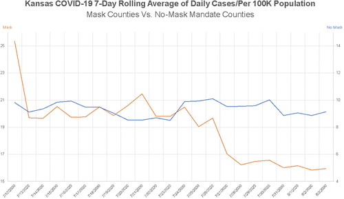
At the first glance, there may appear to not be anything inherently misleading about this plot (see ). A quick look shows that counties with mask mandates (the orange line) in place have shown a stark decline in COVID-19 cases over the course of about 3 weeks that has led to lower case numbers than counties without a mask mandate. It further appears to indicate that counties with no mask mandate have seen relatively no change in number of daily cases. However, upon closer inspection, you might notice that there are two vertical axes. There are two problems with this. First of all, this plot was created for use by the Kansas Department of Health and Environment, and it was showcased during an August 5 press conference (video is available here on their Facebook page), and then this plot and the description of what it means was picked up and amplified by multiple news media organizations. This is problematic because this plot was used to describe statistical trends directly to the general public. A plot with two vertical axes is inherently more complicated to digest, especially in this case, because the two axes are not designed to show a relationship between two different attributes. Tufte (Citation2001) talked about this in his book, The Visual Display of Quantitative Information, making a point that having two vertical axes on a time series plot can be very useful when attempting to show a plausible association between two things. In this case, the goal is not association, but comparison, thereby making it a bit more difficult to initially interpret the data.
The second problem with having two vertical axes is that the two axes are on different scales, despite the fact that, in this case, they are representing the same measurement (daily number of cases). This (mis)representation led to exaggerated claims about changes in cases, which was immediately evident when it was reported that “Kansas counties that have mask mandates in place have seen a rapid drop in cases, while counties that only recommend their use have seen no decrease in cases, the state’s top health official said Wednesday” (Hegeman Citation2020, August 5, emphasis added). Several Twitter users began attempting to make sense of what the data were actually saying. Was there a “rapid decline” in cases?
On August 6, Steven Strogratz posted the following plot on Twitter (see ), which was a recreation of the plot produced by the Kansas Department of Health and Environment with the right side vertical scale removed and both categories of data appropriately placed on the same scale. This plot () shows something quite different than the one shared by the Kansas Department of Health and Environment in the August 5 press conference.
Fig. 2 Steven Strogatz’s Twitter comment to show a recreation of a plot showing the number of daily cases of COVID-19 per 100,000 in the population of Kansas.
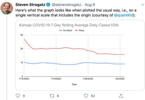
There are two take-aways when comparing the two plots. First, although there was an obvious decline, the word “rapid” is not as justifiable—it is certainly less pronounced. Second, without paying very close attention to the scales of the two vertical axes in the original plot, it would be easy to conclude that counties with mask mandates had dropped below that of those with no mask mandate—an incorrect conclusion. There is also the broader context here, which is counties with mask mandates are oftentimes counties that are more densely populated and are seeing larger numbers of cases prompting them to take action. In this case, there is no way to know if the data were purposefully (mis)represented to support a particular message, or if it were (mis)represented by accident.
2.2 Case 2: Georgia Department of Public Health
When the Georgia Department of Public Health posted this plot (see ), it went viral because of what may have been intentional data manipulation. The source of the initial criticism appears to have come from The Rachel Maddow Show (yes, the same one that shared a poorly crafted data visualization in Case 1, but carefully dissected the (mis)representation in this case), which can be viewed in a short video tweeted on May 15 by Acyn Torabi.
Fig. 3 Tweet on May 16 by Calling Bullshit showing a misleading plot produced by the Georgia Department of Public Health.
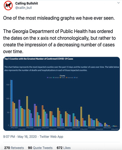
The plot that was originally posted to the Georgia Department of Public Health website (image provided by Twitter user Calling Bullshit, ) appears to show that the number of COVID-19 cases in the top five counties in the state, at the time, were consistently dropping over the previous month. However, closer inspection reveals that the dates along the horizontal axis are not in order of time, with, for instance, May 1 appearing before April 30 and April 26 appearing in between May 7 (on the left) and May 3 (on the right). This example of a misleading use of statistics is perhaps one of the more clear cases of intent to mislead, despite attempts of the administration to make it appear accidental—see May 19 story about the response in The Atlanta Journal-Constitution (Mariano and Trubey Citation2020). However, some have argued that it may have been unintentional (Cairo Citation2020, May 20).
3 Discussion and Implication of Cases
These examples bring up several concepts that are, under the Common Core State Standards for Mathematics (CCSSM) (NGAC & CCSSO 2010), introduced beginning in the sixth grade, such as understanding differences between histograms and bar charts, as well as drawing comparisons between two samples, leading to an understanding of association (for both continuous data and categorical data) and correlation. Moreover, in both the Pre-K–12 and College Report of the Guidelines for Assessment and Instruction in Statistics Education documents (Bargagliotti et al. Citation2020; GAISE College Report ASA Revision Committee Citation2016), there are specific goals related to being a critical consumer or informed citizen—which includes being able to dissect and make sense of statistical information designed for the general public—as well as content expectations around facility with accurate data visualizations. Over the next few paragraphs, we provide some possible ways of using the two previous cases to support learning of comparing samples and association, as well as how data visualizations can (mis)lead both unintentionally and intentionally if the consumer is not critically examining them.
Under the CCSSM, beginning in the seventh grade, students are expected make comparisons between different samples on the same attribute. Moreover, this is a common topic appearing in tertiary introductory statistics courses, as well as courses on quantitative reasoning. Using the pair of graphs in the first case, a question that could spur thinking about these two phenomena—counties with vs without a mask mandate—could be something like: What does this graph (, the one with two axes) make it appear is happening? What would your conclusion be about the importance of a mask mandate? After a discussion, and a conclusion that attempts to make a generalized claim beyond the data (i.e., an inference; also a seventh-grade standard), the adjusted plot () could be shared with questions such as:
Does the conclusion still hold when the plot is adjusted to accurately depict the two situations?
Why did the first plot look so different?
How does the second plot cause you to reconsider the weight of evidence (e.g., Pfannkuch Citation2006; Engledowl and Gorham Blanco Citation2019) supporting your conclusion?
Why might the COVID-19 case rates be higher in counties with mask mandates than those without?
For this last question, it would be important to make sure students are not merely concluding mask mandates lead to higher case rates than not having them. Furthermore, an essential discussion should center around why specific locations may have had a mask mandate versus why others may not have, and to focus attention on the change over time within each group—rather than comparing between the groups.
In a similar fashion, once students have begun to develop an understanding of association—a topic beginning in the eighth grade under CCSSM, and appearing in tertiary statistics as well as quantitative reasoning courses—a time-series plot might be shared, such as the one in taken from this blog post (Acquah Citation2020, May). This is a useful way to show how the use of two vertical axes can aid in visualizing association between two phenomena, particularly because the two vertical axes are different units—allowing for a more accurate comparison. After showing this plot to students, some useful questions could be:
Fig. 4 Plot published in Acquah (Citation2020, May) utilizing two vertical axes to compare ice cream consumption and drowning deaths across time to represent association.
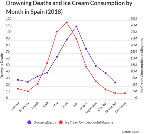
What does this plot show?
What is a conclusion you could draw from this plot that would not make much sense (i.e., pushing them to make the causation error)?
What is a conclusion you could draw from this plot that would be more accurate (i.e., pushing them to consider association or correlation concepts)?
This conversation will support students in then reconsidering the first plots from Case 1 from the Kansas Department of Health (see ), with a new understanding of their usefulness. For further thinking about this topic, I recommend this blogpost (Rost Citation2018, May).
In addition to our cases motivating discussion of association, the plots also offer an important consideration of how scaling modifications can mislead the consumer. In CCSSM, students gain experiences with histograms beginning in grade 6, and they begin comparing multiple plots as early as the seventh grade. In an undergraduate-level context, it is fairly common to reason about side-by-side histograms, or to create them, in statistics courses or quantitative reasoning courses. However, in the case of , because the purpose is to draw attention to the misleading horizontal axis, it can be a useful plot for secondary students who have not yet been exposed to side-by-side histograms. Some useful questions to ask could be:
What information is this plot conveying?
Why is the plot misleading?
What purpose might the Georgia Department of Public Health have had in manipulating the plot in this way?
Although the hope would be that students recognize the misleading horizontal axis, it is important to point attention directly to it so that students begin to learn to dissect such visualizations by being critical of scaling—a common point of intentional or unintentional misrepresentation of data—as they work toward becoming critical consumers.
4 Conclusions
It is our hope that these examples inspire statistics educators and statistics teacher educators to leverage these kinds of examples for use in teaching and learning to support students in working toward statistical literacy within the vision of the Pre-K–12 and College GAISE Reports (Bargagliotti et al. Citation2020; GAISE College Report ASA Revision Committee Citation2016), in particular as it relates to being a critical consumer of statistics. Moreover, we believe these kinds of examples are useful in expanding the toolkit of resources available that are in line with other similar resources, such as the book published by Madison et al. (Citation2012) titled Case Studies for Quantitative Reasoning: A Casebook of Media Articles. Such examples that appear in the purview of the general public have potential for motivating critical discourse around statistics content and interpretation that can lead to further curiosity of more advanced statistical thinking and reasoning.
References
- Acquah, K. (2020, May), “Getting in to a Causal Flow.” Causal Flows: A Causal Introduction to Causal Inference for Business Analytics. Available at: https://www.causalflows.com/introduction/
- Bargagliotti, A., Franklin, C., Arnold, P., Gould, R., Johnson, S., Perez, L., and Spangler, D. A. (2020), Pre-K–12 Guidelines for Assessment and Instruction in Statistics Education II (GAISE II): A Framework for Statistics and Data Science Education. American Statistical Association. https://www.amstat.org/asa/education/Guidelines-for-Assessment-and-Instruction-in-Statistics-Education-Reports.aspx
- Cairo, A. (2020, May 20), “About That Weird Georgia Plot,” Cairo. Available at: http://www.thefunctionalart.com/2020/05/about-that-weird-georgia-chart.html
- Engledowl, C., and Gorham Blanco, T. (2019, September), “Using LOCUS Released Items With Practicing Teachers,” Statistics Teacher. https://www.statisticsteacher.org/2019/09/19/using-locus-released-items/
- GAISE College Report ASA Revision Committee. (2016), Guidelines for Assessment and Instruction in Statistics Education (GAISE) College Report 2016. American Statistical Association. http://www.amstat.org/education/gaise
- Gal, I. (2002), “Adults’ Statistical Literacy: Meaning, Components, Responsibilities,” International Statistical Review, 70, 1–25. DOI: 10.1111/j.1751-5823.2002.tb00336.x.
- Hegeman, R. (2020, August 5), “Kansas Counties With Mask Mandate Show Steep COVID-19 Drop,” AP News. https://apnews.com/f218e1a38cce6b2af63c1cd23f1d234e
- Maddow, R. (2020, August 6), “Chart: Kansas Mask Counties Versus No-mask Mandate Counties [Tweet],” Twitter. https://twitter.com/MaddowBlog/status/1291553722527604736?s=20
- Madison, B. L., Boersma, S., Diefenderfer, C. L., and Dingman, S. W. (2012). Case Studies for Quantitative Reasoning: A Casebook of Media Articles. New York, NY: Pearson Learning Solutions.
- Mariano, W., and Trubey, J. S. (2020, May 19), “Georgia’s Latest Errors in Reporting COVID-19 Data Confounds Critics,” The Atlanta Journal-Constitution. https://www.ajc.com/news/state–regional-govt–politics/just-cuckoo-state-latest-data-mishap-causes-critics-cry-foul/182PpUvUX9XEF8vO11NVGO/
- National Governors Association Center for Best Practices & Council of Chief State School Officers. (2010), Common Core State Standards for Mathematics.
- Pfannkuch, M. (2006), “Comparing Box plot Distributions: A Teacher’s Reasoning,” Statistics Education Research Journal, 5, 27–45. http://www.stat.auckland.ac.nz/∼iase/serj/SERJ5(2).pdf#page=30
- Rost, L. C. (2018, May), “Why Not Use Two Axes, and What to Use Instead: The case Against Dual Axis Charts,” Chartable: A Blog by Datawrapper. https://blog.datawrapper.de/dualaxis/
- Tufte, E. R. (2001), The Visual Display of Quantitative Information (2nd ed.). Cheshire, CT: Graphics Press LLC.
- Wallman, K. K. (1993), “Enhancing Statistical Literacy: Enriching Our Society,” Journal of the American Statistical Association, 88, 1–8.