Figures & data
Figure 1. Treatment (Phase 1) and comparison (Phase 3) Schools.
Note: This figure demonstrates that there is no geographical clustering of schools by phase. We refer here to Phase 1 schools as ‘treatment’ and Phase 3 as ‘comparison’.
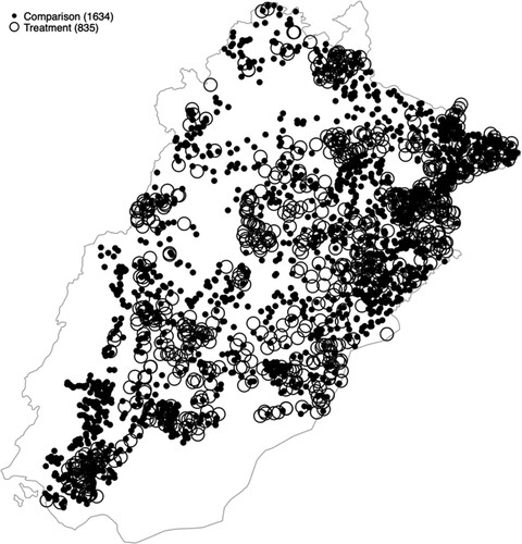
Table 1. PSSP selection criteria.
Table 2. Data and programme timing.
Table 3. Baseline descriptive statistics (2015–16).
Table 4. Effect of treatment on enrolment by grade.
Figure 2. Enrolment trends in treatment & comparison schools. Panel A: PSSP Schools. Panel B: Neighbouring Schools.
Note: The left panel A presents trends in average student enrolment numbers for treatment (Phase 1) schools and comparison (Phase 3) schools. The right panel A presents estimated treatment effects by year (comparing Phase 1 and Phase 3 schools). Data for 2012–2016 is self-reported by head teachers in annual school census carried out in October. Data for 2017 is collected by independent monitors from the school register in August. Panel B repeats this analysis for the closest neighbouring public school of each PSSP school.
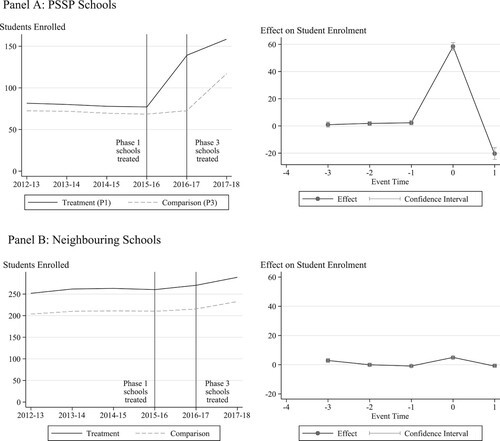
Table 5. Tests for spillovers.
Table 6. Heterogeneity and mechanisms.
Table 7. Treatment effects by operator.
Table 8. Effects on test scores.
Figure 3. Trends in test scores.
Note: The left panel presents trends in average student test scores for PSSP and all schools. Phase 1 schools were converted in the prior year, and Phase 3 schools in April. The right panel presents estimated treatment effects by year, in this case treating the Phase 3 schools (newly converting) as the treatment group and Phase 1 schools (already converted) as the comparison group. Data is from the MEAs for grades 2 and 3.
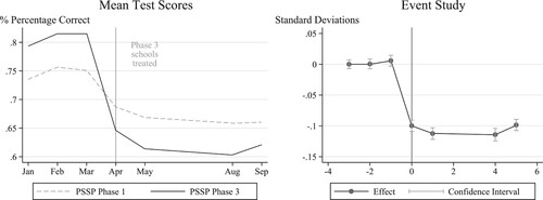
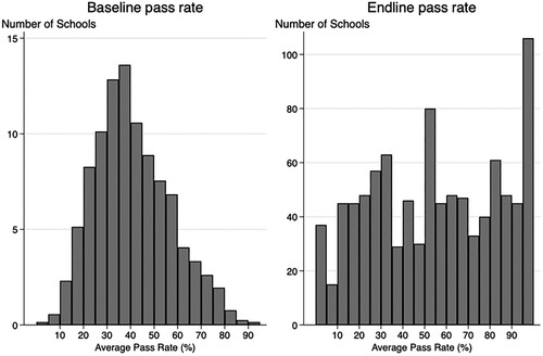
Figure 4. Quality assurance tests (QAT) (2017).
Note: This figure presents the frequency of schools reporting each student pass rate on the QAT test. ‘Endline’ pass rates on the right refer to the end of the school year for schools in Phase 1, conducted in March 2017, and ‘Baseline’ pass rates on the left refer to the start of the school year for schools in Phase 3, conducted in April 2017.