
Abstract
Abstract: The purpose of this study was to identify the method of presentation (text, bar graphs, or pictographs) that best enhances the understanding of medical risk information among Japanese adults. We also investigated the effect of graphic format on understanding by differences in numeracy. This is the first study conducted in Japan to clarify understanding the risks and benefits of treatment. Participants were randomized to receive numerical information about the risks and benefits of a hypothetical medical treatment in one of three formats: text, bar graphs, or pictographs. The main outcome variables were adequate verbatim and adequate gist understanding. In total, 1062 individuals (text, 354; bar graphs, 358; and pictographs 350) were included in the analysis. Pictographs and bar graphs did not show significant differences from text in conferring verbatim information. However, pictographs significantly differed from text in conferring gist information (odds ratio [OR] 1.567, 95% confidence interval [CI] 1.097–2.237), but bar graphs did not significantly differ from text (OR 1.390, 95%CI 0.983–1.964). Numeracy was the factor most strongly associated with adequate verbatim and gist understanding. Our results suggest that although pictographs appear to be an effective option, their effectiveness is limited to people with higher numeracy and people with lower numeracy may have little benefit from pictographs.
PUBLIC INTEREST STATEMENT
Patients are increasingly being asked to make complex decisions about cancer screening, prevention, and treatment. For patients to make informed medical decisions, providers must effectively communicate evidence about benefits and harms, and must ensure that patients can understand the risks and benefits of treatments and make trade-offs between risks and benefits.
This study explored recommendations for how healthcare providers and health educators can best communicate complex medical risk information to patients. This study aimed to identify the method of presentation (text, bar graphs, or pictographs) that best enhances the understanding of medical risk information among Japanese adults, and clarify the effective understanding of graphic format by differences in numeracy. Our results showed that although pictographs appear to be an effective option overall, they are most effective for people with higher numeracy and people with lower numeracy may gain little benefit from pictographs.
1. Introduction
Patients must understand the risks and benefits of their treatment options, including numerical likelihoods, to make informed decisions about their healthcare. However, in the past two decades, many studies have identified a critical problem in that most health and risk communication is written and presented in ways that exceed most patients’ comprehension (Fischhoff et al., Citation2011). For example, most patients have difficulty understanding statistical rates related to the risks and benefits of treatment options. Poor numeracy is widespread and profoundly affects patients’ ability to understand such information (Gigerenzer et al., Citation2007).
Numeracy is the ability to comprehend, use, and attach meaning to numbers (Reyna et al., Citation2009). Individuals with high numeracy skills tend to understand more health information (Hawley et al., Citation2008). For example, they attend to, remember, weigh, and ultimately use quantitative information more in their judgments and decisions than people with low numeracy (Dieckmann et al., Citation2009; Hibbard et al., Citation2007; Lipkus et al., Citation2010). Conversely, less numerate individuals not only have insufficient understanding of numbers but appear more likely to weigh and use sources such as narratives and their own mood states to inform their decision making. Furthermore, although people with both low and high numeracy are susceptible to framing effects, those with low numeracy appear to be more susceptible to such effects (Peters et al., Citation2006). In addition, less numerate participants receiving risk information in a percentage format perceived medication as less risky than when it was presented in a frequency format, whereas highly numerate participants perceived risks similarly in either format. This may be because people with low numeracy have difficulty converting percentages to natural frequency information. In other words, frequency formats elicit greater emotional imagery than percentage formats, which are somewhat abstract and lacking in direct meaning (Peters et al., Citation2011). However, people’s information-processing skills decrease under stress (Fischhoff et al., Citation2011). Therefore, it is necessary to provide easily understandable information for everyone, including individuals with low numeracy.
The above issues have been recognized and addressed in recent years. Several recommendations have been made on how best to communicate quantitative information, with visual aids being one such strategy (Trevena et al., Citation2013). It has been suggested that presenting probability information graphically (e.g., using pictographs or “icon arrays,” bar charts, and flow diagrams) may aid accurate understanding of such information (Trevena et al., Citation2013) and could also allow deeper comprehension. Furthermore, graphic information can help reduce several biases, such as denominator neglect (Garcia-Retamero et al., Citation2010; Trevena et al., Citation2013), framing effects (Garcia-Retamero & Cokely, Citation2011; Garcia-Retamero & Galesic, Citation2009, Citation2010; Trevena et al., Citation2013), and the undue influence of anecdotes (Fagerlin et al., Citation2005; Trevena et al., Citation2013). However, research on graphic effects has been insufficient; available results are inconsistent and difficult to integrate (Stellamanns et al., Citation2017). The superiority of graphics has not been properly demonstrated, and results showing their effectiveness for people with low numeracy are also inconsistent (Dolan et al., Citation2012). Therefore, the efficacy of graphic information remains debatable.
Pictographs and bar graphs have received particular attention in empirical studies of the effects of graphic information; however, there is little consensus on the optimal format (Zipkin et al., Citation2014). A pictograph is a visual display format that aims to represent the size of both the numerator and denominator in a single diagram (Trevena et al., Citation2013). Pictographs show the part-whole relationship and include pictures (icons). Several studies have suggested that pictographs are more effective than bar or pie charts in communicating risk and reducing cognitive biases in risk perceptions (Galesic et al., Citation2009; Hawley et al., Citation2008; Zikmund‐Fisher et al., Citation2008; Zikmund-Fisher et al., Citation2008).
Like pictographs, bar graphs have been shown to enhance understanding and improve communication related to medical risks and benefits. Several studies have indicated that bar graphs are well suited for depicting proportions and making comparisons among risks by using height to depict quantities (Lipkus, Citation2007; Lipkus & Hollands, Citation1999). However, other studies have suggested that there is no difference between bar graphs and pictographs in terms of their effect (Carling et al., Citation2009; Tait et al., Citation2012). This means there is no consensus among the results of those studies.
In summary, visual aids, such as pictographs and bar graphs, can convey statistical information, increase risk understanding, facilitate risk communication, and support decision making compared with text only. However, the advantage of these graphic formats in terms of their effect is debatable and there is no agreement regarding the optimal format. In addition, to our knowledge, no research on how best to communicate quantitative information has been conducted in Japan.
Therefore, this study aimed to identify the method of presentation (text, bar graphs, or pictographs) that best enhances understanding of medical risk information among Japanese adults. We also investigated the effect of graphic format on understanding by differences in numeracy. We hypothesized that regardless of numeracy, pictographs would promote an understanding of both gist (i.e., main point of a message, but not exact numbers) and verbatim understanding (i.e., exact numbers presented in a graph). This hypothesis was based on suggestions from previous studies. First, pictographs are thought to improve understanding of visually and verbally represented risk as a frequency rather than a probability, while simultaneously conveying both the numerator and denominator, compared with other formats. Second, pictographs can double as bar graphs if they are visually laid out to aid comparisons of the areas in two arrays, but they may have an advantage over bar graphs for comparisons of detail.
2. Materials and methods
2.1. Participants
Participants were recruited from among registrants of an Internet research service in Japan. At the beginning of the study, the company had approximately 2.5 million voluntarily registered participants; we aimed to collect data from 1000 men and women aged 20–69 years. In October 2016, potential participants were randomly invited via email to complete a questionnaire anonymously. All participants voluntarily signed an online informed consent form, which had been approved by our institutional review board. This study received approval (16-A011) from the Research Ethics Committee of St. Luke’s International University, Japan.
To ensure demographic diversity and offset the expected large variations in response rates, we drew separate subsamples based on sex, age group, educational level, and residential region. This allowed us to roughly approximate the distribution of those characteristics in the Japanese population. We dynamically adjusted the number of email invitations in each demographic subsample until the quotas were achieved. We accepted email responses from potential participants until we reached the target number of responses. In total, we sent emails to 11,571 potential respondents.
2.2. Experiment design
Participants were randomized to receive numerical information about the risks and benefits of a hypothetical medical treatment in one of three message formats: text, bar graph, or pictograph. Our Internet survey was designed to determine the effect of different message formats on participants’ understanding of the risks and benefits associated with two drugs. After logging on to the survey website, participants were given a brief description of the goal of the survey.
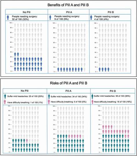
Participants were then asked to imagine the following hypothetical scenario. “You are visiting your doctor for an annual checkup. The doctor tells you that the arteries in your heart are partially clogged. If the arteries remain clogged and the condition worsens, you will need to undergo cardiac surgery. That would be a major operation; it would involve a bypass to avoid the clogged blood vessels to improve the blood flow of the heart. If you underwent that surgery, you would need to stay in hospital for over a week. It would be at least 3 months before you could return to normal life. However, there are treatment options that involve medication rather than surgery. The doctor says he can offer two kinds of medicine (drugs A and B), which can reduce the clogging of the blood vessels. If the medicine is effective, you may not need to undergo surgery. However, a side effect of both drugs is that there is a relatively high frequency of patients developing a mild headache and having difficulty in breathing. The doctor then presents numerical information about the treatment risks and benefits.” This scenario was created based on previous research (Hawley et al., Citation2008; Tait et al., Citation2010a, Citation2010b).
We evaluated the sentences used in that scenario using the Japanese sentence difficulty discrimination system (http://jreadability.net/), with the difficulty set at the intermediate first level (normal). We then randomly assigned participants into three groups according to the format in which they received the risk and benefit information: text, bar graph, or pictograph.
2.3. Graphic design
We designed the graphic material (bar graphs and pictographs) based on previous research (). The pictographs were designed using images created by Iconarray.com (Risk Science Center and Center for Bioethics and Social Sciences in Medicine, University of Michigan). We then added numerical data to amplify the information in the bar graphs and pictographs.
Figure 1. Text format
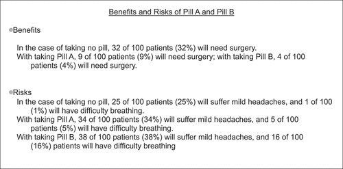
Figure 2. Bar graph format
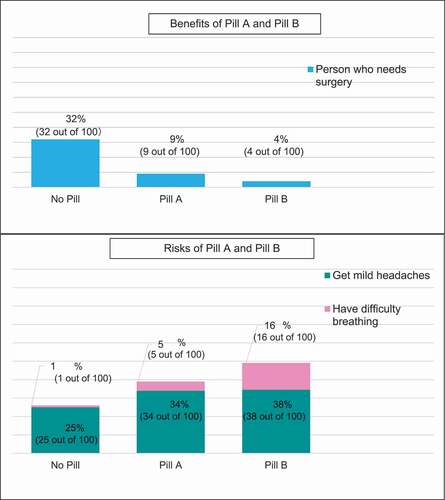
Figure 3. Pictograph format
The cognitive theory of multimedia learning suggests that information is more deeply embedded in the memory when text is combined with illustrations than when text is used alone (Mayer, Citation2003). That theory is based on the idea that people have separate processing systems for verbal and visual information. These systems are individually limited; therefore, combining text with illustrations expands cognitive capacity.
Evidence suggests that when communicating risk information, adding graphic presentation to numerical information can increase accuracy. Garcia-Retamero and Galesic (Citation2010) found similar increases in the accuracy of understanding treatment risk reduction when either icon arrays or bar graphs were added to numerical information. Tait et al. (Citation2010a) tested whether presenting information both verbally and visually improved processing and understanding. They found that people who received information in a graphic format with standard numerical text had greater understanding than those who received text-only formats (Tait et al., Citation2010a). A systematic review also demonstrated the benefit of adding bar graphs or icon arrays to clarify natural frequencies or event rates (Zipkin et al., Citation2014).
3. Measures
3.1. Independent variables
In our analysis, the primary independent variable was type of message format, which we categorized into three groups: text, bar graphs, or pictographs. The remaining independent variables were participant sex, age, highest level of education, and numeracy. We evaluated numeracy using the Japanese version of the three-item Schwartz numeracy scale (Schwartz et al., Citation1997). This scale is a well-known health numeracy scale that focuses on a basic understanding of mathematics and probability; its expanded version is the 11-item Lipkus scale (Lipkus et al., Citation2001).
A survey using Japanese versions of those scales (Schwartz-J and Lipkus-J) found the reliability was comparable with the originals in terms of internal consistency (Cronbach’s α 0.53 for Schwartz-J and 0.72 for Lipkus-J) (Okamoto et al., Citation2012). Convergent validity was suggested by positive correlations with an existing Japanese health literacy measure, which was the Test for Ability to Interpret Medical Information developed by Takahashi et al. (Citation2011) that contained some items relevant to numeracy (Okamoto et al., Citation2012).
We chose the three-item Schwartz scale because Japanese participants’ performance on that scale was much higher than that of the participants in the original study conducted in the United States (80% average item-wise correct response rate for the Schwartz-J and 87% for the Lipkus-J) (Lipkus et al., Citation2001; Okamoto et al., Citation2012). For almost all items in the Lipkus-J, Japanese showed a correct answer rate of 90% or more. Moreover, health numeracy was still associated with framing bias with individuals with a Lipkus-J performance below the median; it was significantly influenced by how probability was framed when they rated surgical risk. A significant association was also found using the Schwartz-J (Okamoto et al., Citation2012). After consulting the developers of the Schwartz-J and Lipkus-J about these results, we chose to use the Schwartz-J.
3.2. Outcome measures
The outcome variables for this study were verbatim understanding and gist understanding. These two outcomes were based on previous studies (Hawley et al., Citation2008; Tait et al., Citation2012, Citation2010a, Citation2010b). The theoretical background of the outcome measures was not explicitly discussed in previous studies; however, we believed that these outcomes implicitly pointed to an underlying dual-process theory. Dual-process theory argues that people process visual and verbal information differently and create separate representations for the two types of information (Clark & Paivio, Citation1991; Mayer, Citation2003). Therefore, we adopted a dual-process perspective and considered two different forms of understanding as the outcome measures.
First, we defined verbatim understanding as the ability to correctly report the actual risk and benefit frequencies of drugs A and B (Hawley et al., Citation2008; Tait et al., Citation2012, Citation2010a, Citation2010b). We included four questions related to verbatim understanding. (1) If 100 patients took drug A, how many would need bypass surgery? (2) Compared with patients who did not take any medicine, how many fewer patients would need to undergo bypass surgery? (3) If 100 patients took drug B, how many would get headaches? (4) Compared with patients who did not take any medicine, how many more would get headaches if they took drug A? Each response was coded as 0 (incorrect) or 1 (correct), and we recorded the total verbatim scores (0–4). We defined adequate verbatim understanding as answering three or four questions correctly, and inadequate verbatim understanding as answering two or fewer questions correctly. This definition of “adequate” was based on that used in several previous studies (Hawley et al., Citation2008; Tait et al., Citation2012, Citation2010a, Citation2010b). The rationale was that because 100% understanding is neither likely nor absolutely necessary for informed decision making, a specified proportion of correct responses could be a more practical measure of understanding (Tait et al., Citation2010a).
Second, we defined gist understanding as the ability to identify the essential meaning about observed differences between the risks and benefits of drugs A and B (Hawley et al., Citation2008; Tait et al., Citation2012, Citation2010a, Citation2010b). We used two questions to assess gist understanding. (1) Who is more likely to need bypass surgery—someone who did not take any medicine, someone who took drug A, or someone who took drug B? (2) Who is more likely to experience difficulty breathing—someone who did not take any medicine, someone who took drug A, or someone who took drug B? We defined adequate gist understanding as answering both questions correctly based on several previous studies (Hawley et al., Citation2008; Tait et al., Citation2012, Citation2010a, Citation2010b). Participants were able to review the risk and benefit information when they responded to the gist and verbatim questions.
4. Statistical analyses
We performed the statistical analyses using SPSS version 24.0 (SPSS Inc., Chicago, IL). We generated descriptive statistics for the dependent and independent variables and expressed the data as percentages, medians, and means ± standard deviations. We also evaluated the distribution of the scores for both measures: verbatim (range: 0–4 questions) and gist (range: 0–2). We separated participants into two groups (adequate or inadequate verbatim understanding and gist understanding) based on the findings of previous studies (Hawley et al., Citation2008; Tait et al., Citation2010a).
First, to compare differences in understanding by graphic type, we compared the proportion of adequate understanding by type of graphic using a chi-square test. We then conducted multiple logistic regression with the dichotomous measure of both verbatim and gist understanding, controlled for graphic type and other individual characteristics (sex, age, education, numeracy). Second, we examined differences in understanding of graphic information according to the level of numeracy. For that analysis, we divided the sample using a median split to classify participants as having higher or lower numeracy skills (Okamoto et al., Citation2012). We then conducted multiple logistic regression with the dichotomous measure of both verbatim and gist understanding stratified by numeracy, controlled for graphic format and other individual characteristics (sex, age, and education). For these regression analyses, the text format served as the reference category.
5. Results
5.1. Sample description
In total, 1062 participants (text, 354; bar graphs, 358; and pictographs 350) gave valid responses and were included in the analyses. The population demographics are presented in .
Table 1. Participant characteristics
5.2. Associations between format type and verbatim or gist understanding
presents the bivariate associations between format type and verbatim or gist understanding. We found a significant difference in gist understanding by format (P = .009). Pictographs were effective for conveying gist information as 76.9% of participants who saw pictographs showed adequate gist understanding. In comparison, 66.7% of those who saw text and 73.2% who saw bar graphs had adequate gist understanding. Regarding verbatim understanding, slightly more participants who saw pictographs had adequate verbatim understanding (72.0%) than the text (68.9%) and bar graphs (64.2%) groups. However, the difference among the formats was not significant (P = .082).
Table 2. Associations between format type and adequate verbatim and gist understanding
5.3. Factors associated with adequate verbatim and gist understanding
shows the multiple logistic regression results for adequate verbatim and gist understanding. In conferring verbatim information, pictographs and bar graphs did not show significant differences from text. Women (odds ratio [OR] 1.381, 95% confidence interval [CI] 1.019–1.874), younger participants (OR 0.985, 95%CI 0.975–0.996), and those with higher educational attainment (OR 1.233, 95%CI 1.038–1.464) or higher numeracy (OR 2.875, 95%CI 2.441–3.388) showed better verbatim understanding than their male, older, lower educational attainment, and lower numeracy counterparts. Numeracy was the factor most strongly associated with adequate verbatim understanding.
Table 3. Multiple logistic regression of verbatim and gist understanding
For gist understanding, pictographs significantly differed from text in conferring gist information (OR 1.567, 95%CI 1.097–2.237), although bar graphs did not significantly differ from text (OR 1.390, 95%CI 0.983–1.964). As with the results for verbatim understanding, participants with higher educational attainment (OR 1.210, 95%CI 1.020–1.435) or higher numeracy (OR 2.196, 95%CI 1.886–2.555) had better gist understanding than their counterparts with lower educational attainment or numeracy. Moreover, numeracy was the factor most strongly associated with adequate gist understanding. Sex and age did not show significant associations with gist understanding.
5.4. Factors associated with adequate verbatim and gist understanding stratified by numeracy
presents the multiple logistic regression of adequate verbatim and gist understanding stratified by numeracy level. For lower-numeracy respondents, pictographs and bar graphs did not significantly differ from text in conferring verbatim understanding (bar graphs: OR 0.700, 95%CI 0.459–1.067; pictographs: OR 0.892, 95%CI 0.579–1.374). However, the significance for bar graphs was borderline, and they were more likely to be less effective in generating gist understanding than text (P = .097). For higher-numeracy respondents, pictographs and bar graphs did not significantly differ from text in conferring verbatim understanding (bar graphs: OR 0.829, 95%CI 0.480–1.434; pictographs: OR 1.412, 95%CI 0.786–2.537).
Table 4. Multiple logistic regression of adequate verbatim and gist understanding stratified by numeracy
Conversely, graphic formats were more likely than text to be associated with adequate gist understanding, although not all associations were statistically significant. Among lower-numeracy participants, although the differences in graphic formats were not statistically significant, participants who viewed bar graphs were more likely to have adequate gist understanding than those who viewed text (OR 1.359, 95%CI 0.885–2.086), as were those who viewed pictographs (OR 1.212, 95%CI 0.783–1.876). Among higher-numeracy respondents, pictographs were significantly better for generating gist understanding than text (OR 2.520, 95%CI 1.398–4.543). Participants who viewed bar graphs were more likely to have adequate gist understanding than those who viewed text (OR 1.356, 95%CI 0.800–2.298); however, the difference was not statistically significant.
6. Discussion
This study is the first to clarify understanding of the risks and benefits of treatment among Japanese adults based on graphic format. We attempted to verify the hypothesis that graphic representation of the risks and benefits of treatment gives better subjective understanding than standard text presentation. We also investigated the effect of the graphic format by differences in numeracy.
First, our results suggest that irrespective of the numeracy level, bar graphs and pictographs tended to result in greater gist understanding than text. Graphs emphasize height and allow easy comparison of numbers in different categories; they facilitate communication of gist information by enabling the representation of quantitative information in spatial locations. Therefore, visual displays facilitate inferences about conceptual relationships in data based on spatial relationships (Tversky, Citation2001). Graphs have also been shown to be better able to convey the essential aspects of information (i.e., “gross-level information”) (Feldman-Stewart et al., Citation2000; Trevena et al., Citation2013) and essential meanings or gist (Reyna, Citation2008; Trevena et al., Citation2013). Our findings support the results of previous studies. In particular, we found that that spatial features of graphics could convey the gist meaning of information independent of the participant’s level of numeracy.
However, in the low-numeracy group, we observed no significant differences between the use of text and the two graphic types. Graphics may result in problems such as poor salience, distraction, ambiguity, and over-complexity (Damman et al., Citation2018). People with low numeracy might have been affected by such factors, whereas these factors may not affect individuals with high numeracy to the same extent. In this study, we did not measure graph literacy skills using our scale; however, the risk understanding we measured reflected graphic literacy in the graphic group, which suggested a relationship with numeracy. Previous investigations have also suggested that numeracy is related to graphic literacy (Nayak et al., Citation2016). Therefore, participants with higher numeracy in the present study may also have had high graphic literacy.
Furthermore, we believed that differences in graphic design influenced participants’ ability to understand pictographs. According to Carpenter and Shah’s model of graph comprehension, the subject must first identify key visual features (e.g., bars or pictographs). Next, the subject must relate those visual features to the conceptual relationships depicted in the graphic. Finally, the subject has to identify the concepts quantified in the graphic (Carpenter & Shah, Citation1998). In pictographs, the key features of the graphic (e.g., human silhouettes) reflect the concepts being represented, which means that graphic viewers with high numeracy may identify important abstract visual features and automatically associate them with a real-world concept. Conversely, the association is not as direct with a bar graph; the subject must refer to additional labels on the axes to infer the meaning of the bars. Therefore, pictographs remove some of the obstacles in the graphic understanding process, allowing easier gist understanding than a bar chart. We believe that understanding was higher in the pictograph group because of these effects.
Second, we observed no significant differences in verbatim understanding among the three groups. Pictographs and bar graphs did not significantly differ from text in conferring verbatim information. However, individuals with lower numeracy might have had reduced understanding of the graphics. As with gist understanding, people who were unused to visual presentation might have had disadvantages from graphic information.
The messages used in this survey did not have any relevance or intrinsic appeal to the participants; therefore, some participants, particularly those with low numeracy, might not have paid attention to minor details such as numbers or icons. Evidence suggests that when an audience is distracted or not highly interested in a topic, it is likely to process information superficially (Fischhoff et al., Citation2011). If a message is not relevant or appealing, viewers may ignore it altogether (Petty & Cacioppo, Citation1986). Therefore, people with lower numeracy may rely on spatial features of graphs (such as the slope of a line or height) rather than on conventional features (such as axis labels and scales), meaning their verbatim understanding could be particularly low.
The bar graph group showed lower understanding than the pictograph group, with this understanding tending to be low regardless of the level of numeracy. Participants had to refer to additional labels on conventional features (e.g., axes and scales) to infer the meaning of the bars; therefore, they might have thought that a bar graph was more difficult to understand than a pictograph. For participants with lower numeracy, pictographs allowed the counting of icons; however, because we also included numeric values, we could not determine whether a participant read an icon, a number, or both. If accompanied by numbers or other text, risk information may be processed through multiple channels (i.e., verbal and visual), which can improve information processing (Otten et al., Citation2015). However, pictographs are a format that is unfamiliar in Japan; it is likely that many participants saw them for the first time in this survey. Therefore, they might have been confused by the pictographs, and it is possible that they did not understand how to deal with them.
People with higher numeracy can more flexibly understand information presented in different formats than those with lower numeracy (Fischhoff et al., Citation2011); therefore, it is possible that for them, pictographs did not have a negative influence compared with individuals with lower numeracy. This would suggest that these individuals have both higher numeracy and graphic literacy skills.
Taken together, our findings suggest that the choice of format may need to depend on the goal of communication. If the goal is to impart more general knowledge (such as which treatment has more side effects or which treatment is better or worse), our results suggest that bar graphs or pictographs are a good choice. Conversely, if the goal is for patients to understand specific numeric risk and benefit information, texts or pictographs may achieve the desired impact. However, in many medical situations, it is important to present both types of numerical information to ensure that patients of varying numeracy levels can make optimal informed decisions. Therefore, our results suggest that pictographs may be a particularly attractive option because they achieve adequate levels of both verbatim and gist understanding across numeracy levels. Clinicians and decision aid developers must provide easily understandable information for everyone, including individuals with low numeracy. Because information-processing skills decrease under stress (Fischhoff et al., Citation2011), it is necessary to make numbers easy to understand and more accessible for all individuals. However, clinicians and decision aid developers need to be aware that the presentation of medical risk and benefit information may be particularly problematic for individuals with low numeracy—even if they receive simple graphic information, such as bar graphs and pictographs. Further studies should identify suitable strategies for communicating health risks to people with low numeracy. To identify helpful strategies related to risks and benefits of treatment among such individuals, it may be necessary to refine the theoretical understanding of the underlying cognitive mechanisms of risk perception.
This study had some limitations. First, all participants were Internet users. It is possible that such users possessed high literacy and numeracy. However, this possibility would also imply that the understanding of numeracy and risk information among general citizens would be even lower. Second, this investigation used a hypothetical scenario. We targeted a wide range of people, and created a scenario that had a health examination as a theme. The results could differ with content directed at a specific target. Third, we did not assess the impact of graphic format on treatment options. For example, we did not clarify the relationship between the type of clearly understood format and medically superior treatment selection. Fourth, we did not investigate how graphic format affected risk perception. Individuals with low numeracy are susceptible to non-quantitative information, such as feelings and atmosphere; therefore, by understanding the emotional response and risk perceptions with the three formats, it would be possible to clarify the factors that affect risk understanding. Fifth, it is possible that many people saw pictographs for the first time in this study because it is an unfamiliar format in Japan. This was an important limitation of this study that could have directly affected the results. Further studies should investigate difficulties in understanding pictographs in such contexts.
7. Conclusions
Clinicians and decision aid developers need to be aware of the different effects of using different types of graphic presentation on patients’ understanding. Our results suggest that although pictographs appear to be an effective option overall, the effectiveness may be limited to people with higher numeracy and people with lower numeracy may gain little benefit from pictographs. Graphic presentation may not be intuitively understood by everyone. Further research is needed to determine the kinds of approaches that can promote understanding among people with lower numeracy.
Acknowledgements
This work was supported by Grant-in-Aid for Scientific Research from the Japan Society for the Promotion of Science (JSPS) KAKENHI Grant Number 16H05569. We thank Edanz Group (https://en-author-services.edanz.com/ac) for editing a draft of this manuscript.
Additional information
Funding
Notes on contributors
Hitomi Danya
Hitomi Danya is a nurse and PhD student in Health Communication.
Her research focuses on finding ways to communicate healthcare risk information correctly and clearly to patients and the public. She aims to provide patient-centered information that is not self-satisfying or one-sided, and make risk information accessible to all people regardless of their literacy level. She also hopes to support people who are faced with healthcare choices so that they can make choices that are truly their own and based on correct information and their own values.
This paper is a part of her master’s thesis and was written with the support of Dr. Nakayama and Dr. Yonekura.
References
- Carling, C. L., Kristoffersen, D. T., Flottorp, S., Fretheim, A., Oxman, A. D., Schunemann, H. J., Montori, V. M. (2009). The effect of alternative graphical displays used to present the benefits of antibiotics for sore throat on decisions about whether to seek treatment: A randomized trial. PLoS Medicine, 6(8), e1000140. doi: https://doi.org/10.1371/journal.pmed.1000140.
- Carpenter, P. A., & Shah, P. (1998). A model of the perceptual and conceptual processes in graph comprehension. Journal of Experimental Psychology. Applied, 4(2), 75–15. doi: https://doi.org/10.1037/1076-898X.4.2.75.
- Clark, J. M., & Paivio, A. (1991). Dual coding theory and education. Educational Psychology Review, 3(3), 149–210. doi: https://doi.org/10.1007/BF01320076.
- Damman, O. C., Vonk, S. I., Van Den Haak, M. J., Van Hooijdonk, C. M. J., . M. J., & Timmermans, D. R. M. (2018). The effects of infographics and several quantitative versus qualitative formats for cardiovascular disease risk, including heart age, on people’s risk understanding. Patient Education and Counseling, 101(8), 1410. doi: https://doi.org/10.1016/j.pec.2018.03.015.
- Dieckmann, N. F., Slovic, P., & Peters, E. M. (2009). The use of narrative evidence and explicit likelihood by decisionmakers varying in numeracy. Risk Analysis, 29(10), 1473–1488. doi: https://doi.org/10.1111/j.1539-6924.2009.01279.x.
- Dolan, J. G., Qian, F., & Veazie, P. J. (2012). How well do commonly used data presentation formats support comparative effectiveness evaluations?. Medical Decision Making, 32(6), 840–850. doi: https://doi.org/10.1177/0272989X12445284.
- Fagerlin, A., Wang, C., & Ubel, P. A. (2005). Reducing the influence of anecdotal reasoning on people’s health care decisions: is a picture worth a thousand statistics?. Medical Decision Making, 25(4), 398–405. doi: https://doi.org/10.1177/0272989X05278931.
- Feldman-Stewart, D., Kocovski, N., McConnell, B. A., Brundage, M. D., & Mackillop, W. J. (2000). Perception of quantitative information for treatment decisions. Medical Decision Making, 20(2), 228–238. doi: https://doi.org/10.1177/0272989X0002000208.
- Fischhoff, B., Brewer, N. T., & Downs, J. S. (2011). Communicating risks and benefits. U.S. Dept. of Health and Human Services, Food and Drug Administration.
- Galesic, M., Garcia-Retamero, R., & Gigerenzer, G. (2009). Using icon arrays to communicate medical risks: overcoming low numeracy. Health Psychology, 28(2), 210–216. doi: https://doi.org/10.1037/a0014474.
- Garcia-Retamero, R., & Cokely, E. T. (2011). Effective communication of risks to young adults: using message framing and visual aids to increase condom use and STD screening. Journal of Experimental Psychology. Applied, 17(3), 270–287. doi: https://doi.org/10.1037/a0023677.
- Garcia-Retamero, R., & Galesic, M. (2009). Communicating treatment risk reduction to people with low numeracy skills: A cross-cultural comparison. American Journal of Public Health, 99(12), 2196–2202. doi: https://doi.org/10.2105/AJPH.2009.160234.
- Garcia-Retamero, R., & Galesic, M. (2010). How to reduce the effect of framing on messages about health. Journal of General Internal Medicine, 25(12), 1323–1329. doi: https://doi.org/10.1007/s11606-010-1484-9.
- Garcia-Retamero, R., Galesic, M., & Gigerenzer, G. (2010). Do icon arrays help reduce denominator neglect?. Medical Decision Making, 30(6), 672–684. doi: https://doi.org/10.1177/0272989X10369000.
- Gigerenzer, G., Gaissmaier, W., Kurz-Milcke, E., Schwartz, L. M., & Woloshin, S. (2007). Helping doctors and patients make sense of health statistics. Psychological Science in the Public Interest, 8(2), 53–96. doi: https://doi.org/10.1111/j.1539-6053.2008.00033.x.
- Hawley, S. T., Zikmund-Fisher, B., Ubel, P., Jancovic, A., Lucas, T., & Fagerlin, A. (2008). The impact of the format of graphical presentation on health-related knowledge and treatment choices. Patient Education and Counseling, 73(3), 448–455. doi: https://doi.org/10.1016/j.pec.2008.07.023.
- Hibbard, J. H., Peters, E., Dixon, A., & Tusler, M. (2007). Consumer competencies and the use of comparative quality information. Medical Care Research and Review, 64(4), 379. doi: https://doi.org/10.1177/1077558707301630.
- Lipkus, I. M. (2007). Numeric, verbal, and visual formats of conveying health risks: suggested best practices and future recommendations. Medical Decision Making, 27(5), 696–713. doi: https://doi.org/10.1177/0272989X07307271.
- Lipkus, I. M., & Hollands, J. G. (1999). The visual communication of risk. Journal of the National Cancer Institute. Monographs, 25(25), 149–163. doi: https://doi.org/10.1093/oxfordjournals.jncimonographs.a024191.
- Lipkus, I. M., Peters, E., Kimmick, G., Liotcheva, V., & Marcom, P. (2010). Breast cancer patients’ treatment expectations after exposure to the decision aid program adjuvant online: the influence of numeracy. Medical Decision Making, 30(4), 464–473. doi: https://doi.org/10.1177/0272989X09360371.
- Lipkus, I. M., Samsa, G., & Rimer, B. K. (2001). General performance on a numeracy scale among highly educated samples. Medical Decision Making, 21(1), 37–44. doi: https://doi.org/10.1177/0272989X0102100105.
- Mayer, R. E. (2003). The promise of multimedia learning: using the same instructional design methods across different media. Learning and Instruction, 13(2), 125–139. doi: https://doi.org/10.1016/S0959-47520200016-6.
- Nayak, J. G., Hartzler, A. L., Macleod, L. C., Izard, J. P., Dalkin, B. M., & Gore, J. L. (2016). Relevance of graph literacy in the development of patient-centered communication tools. Patient Education and Counseling, 99 (3), 448–454. doi: https://doi.org/10.1017/S0738-3991(15)30075-6. [pii].
- Okamoto, M., Kyutoku, Y., Sawada, M., Clowney, L., Watanabe, E., Dan, I., & Kawamoto, K. (2012). Health numeracy in Japan: measures of basic numeracy account for framing bias in a highly numerate population. BMC Medical Informatics and Decision Making, 12(1), 104. doi: https://doi.org/10.1186/1472-6947-12-104.
- Otten, J. J., Cheng, K., & Drewnowski, A. (2015). Infographics and public policy: using data visualization to convey complex information. Health Affairs, 34(11), 1901. doi: https://doi.org/10.1377/hlthaff.2015.0642.
- Peters, E., Hart, P. S., & Fraenkel, L. (2011). Informing patients: the influence of numeracy, framing, and format of side effect information on risk perceptions. Medical Decision Making, 31(3), 432–436. doi: https://doi.org/10.1177/0272989X10391672.
- Peters, E., Vastfjall, D., Slovic, P., Mertz, C. K., Mazzocco, K., & Dickert, S. (2006). Numeracy and decision making. Psychological Science, 17(5), 407–413. doi: https://doi.org/10.1111/j.1467-9280.2006.01720.x.
- Petty, R. E., & Cacioppo, J. T. (1986). Communication and persuasion: Central and peripheral routes to attitude change. Springer New York. doi: https://doi.org/10.1007/978-1-4612-4964-1.
- Reyna, V. F. (2008). A theory of medical decision making and health: fuzzy trace theory. Medical Decision Making, 28(6), 850–865. doi: https://doi.org/10.1177/0272989X08327066.
- Reyna, V. F., Nelson, W. L., Han, P. K., & Dieckmann, N. F. (2009). How numeracy influences risk comprehension and medical decision making. Psychological Bulletin, 135(6), 943–973. doi: https://doi.org/10.1037/a0017327.
- Schwartz, L. M., Woloshin, S., Black, W. C., & Welch, H. G. (1997). The role of numeracy in understanding the benefit of screening mammography. Annals of Internal Medicine, 127(11), 966–972. doi: https://doi.org/10.7326/0003-4819-127-11-199712010-00003.
- Stellamanns, J., Ruetters, D., Dahal, K., Schillmoeller, Z., & Huebner, J. (2017). Visualizing risks in cancer communication: A systematic review of computer-supported visual aids. Patient Education and Counseling, 100(8), 1421–1431. doi: https://doi.org/10.1016/j.pec.2017.02.003.
- Tait, A. R., Voepel-Lewis, T., Brennan-Martinez, C., McGonegal, M., & Levine, R. (2012). Using animated computer-generated text and graphics to depict the risks and benefits of medical treatment. The American Journal of Medicine, 125(11), 1103–1110. doi: https://doi.org/10.1016/j.amjmed.2012.04.040.
- Tait, A. R., Voepel-Lewis, T., Zikmund-Fisher, B. J., & Fagerlin, A. (2010a). The effect of format on parents’ understanding of the risks and benefits of clinical research: A comparison between text, tables, and graphics. Journal of Health Communication, 15(5), 487–501. doi: https://doi.org/10.1080/10810730.2010.492560.
- Tait, A. R., Voepel-Lewis, T., Zikmund-Fisher, B. J., & Fagerlin, A. (2010b). Presenting research risks and benefits to parents: Does format matter?. Anesthesia and Analgesia, 111(3), 718–723. doi: https://doi.org/10.1213/ANE.0b013e3181e8570a.
- Takahashi, Y., Sakai, M., Fukui, T., & Shimbo, T. (2011). Measuring the ability to interpret medical information among the Japanese public and the relationship with inappropriate purchasing attitudes of health-related goods. Asia-Pacific Journal Of Public Health / Asia-Pacific Academic Consortium for Public Health, 23(3), 386–398. doi: https://doi.org/10.1177/1010539509344882.
- Trevena, L. J., Zikmund-Fisher, B. J., Edwards, A., Gaissmaier, W., Galesic, M., Han, P. K. J., & Woloshin, S. (2013). Presenting quantitative information about decision outcomes: A risk communication primer for patient decision aid developers. BMC Medical Informatics and Decision Making, 13(Suppl S2), S7. doi: https://doi.org/10.1186/1472-6947-13-S2-S7.
- Tversky, B. (2001). Spatial schemas in depictions. In M. Gattis (Ed.), Spatial schemas and abstract thought (pp. 79–112). MIT Press.
- Zikmund‐Fisher, B. J., Fagerlin, A., & Ubel, P. A. (2008). Improving understanding of adjuvant therapy options by using simpler risk graphics. Cancer, 113(12), 3382–3390. doi: https://doi.org/10.1002/cncr.23959.
- Zikmund-Fisher, B. J., Ubel, P. A., Smith, D. M., Derry, H. A., McClure, J. B., Stark, A., & Fagerlin, A. (2008). Communicating side effect risks in a tamoxifen prophylaxis decision aid: the debiasing influence of pictographs. Patient Education and Counseling, 73(2), 209–214. doi: https://doi.org/10.1016/j.pec.2008.05.010.
- Zipkin, D. A., Umscheid, C. A., Keating, N. L., Allen, E., Aung, K., Beyth, R., & Feldstein, D. A. (2014). Evidence-based risk communication: A systematic review. Annals of Internal Medicine, 161(4), 270. doi: https://doi.org/10.7326/M14-0295.